Info-graphics: Stunning Thermometer Chart in Excel
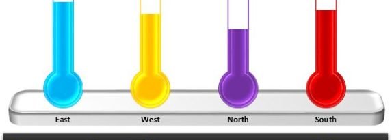
I am back with one more innovative chart which is a Stunning Thermometer Chart. This chart can be used for display KPI metrics. You can display your data by category also like Zone Wise or Month wise etc. We have created it for Zone wise service level. Stunning Thermometer Chart in Excel Below is … Continue reading Info-graphics: Stunning Thermometer Chart in Excel
Copy and paste this URL into your WordPress site to embed
Copy and paste this code into your site to embed