Cloud Migration Services Dashboard in Power BI is a ready-to-use, interactive Power BI dashboard template that empowers IT teams, cloud architects, project managers, and consulting firms to track, analyze, and optimize cloud migration projects across multiple industries and platforms. This powerful Power BI dashboard includes 5 analytical pages with 5 KPI cards, multiple charts, and dynamic slicers — providing complete visibility into cloud migration performance including workloads migrated, downtime hours, satisfaction scores, team size, and actual costs.
Key Features of Cloud Migration Services Dashboard in Power BI
The Cloud Migration Services Dashboard in Power BI is built for organizations that manage complex cloud migration programs across industries like Healthcare, Finance, Manufacturing, Retail, and Technology. It includes 5 interactive dashboard pages — Overview, Platform Analysis, Industry Review, Migration Strategy, and Timeline Trends — each designed to provide deep analytical insights without any coding or advanced technical skills.
Click here to Purchase Cloud Migration Services Dashboard in Power BI
The dashboard tracks 5 key metrics on the Overview page including Workloads Migrated, Avg Downtime Hours, Avg Satisfaction Score, Team Size, and Total Actual Cost. Multiple slicers allow users to instantly filter data by industry, platform, migration type, priority, and project status. The Budget vs Actual Cost comparison feature helps organizations identify cost overruns early, while platform-level analysis reveals which target platforms like AWS, Azure, and GCP are driving the highest workload migration volumes.
Every chart and visual in this dashboard updates instantly when the data source is refreshed, making it ideal for real-time monitoring, executive reporting, and stakeholder presentations.
Dashboard Pages Explanation
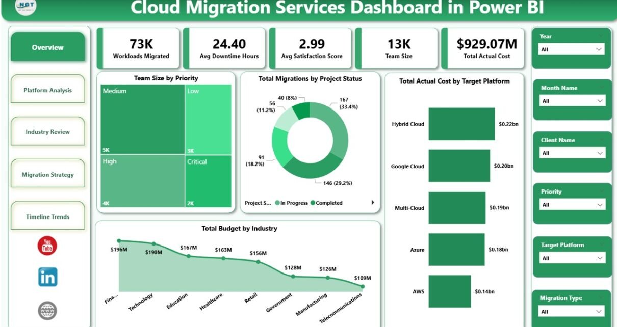
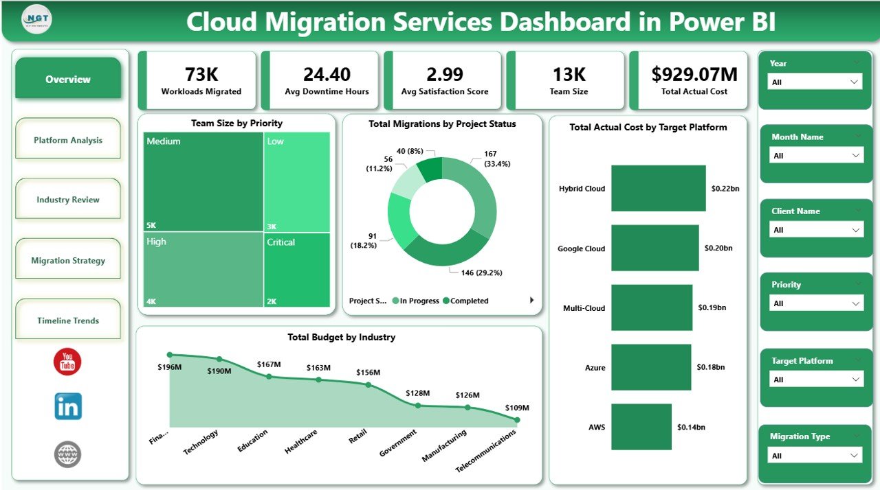
1. Overview Page
The Overview page serves as the executive command center of the dashboard. At the top, 5 KPI cards display Workloads Migrated, Avg Downtime Hours, Avg Satisfaction Score, Team Size, and Total Actual Cost. These cards give a high-level summary of the entire cloud migration portfolio. Below the cards, charts visualize Team Size by Priority, Total Migrations by Project Status, Total Actual Cost by Target Platform, and Total Budget by Industry. Multiple slicers at the top enable instant filtering across all dimensions for quick drill-down analysis.
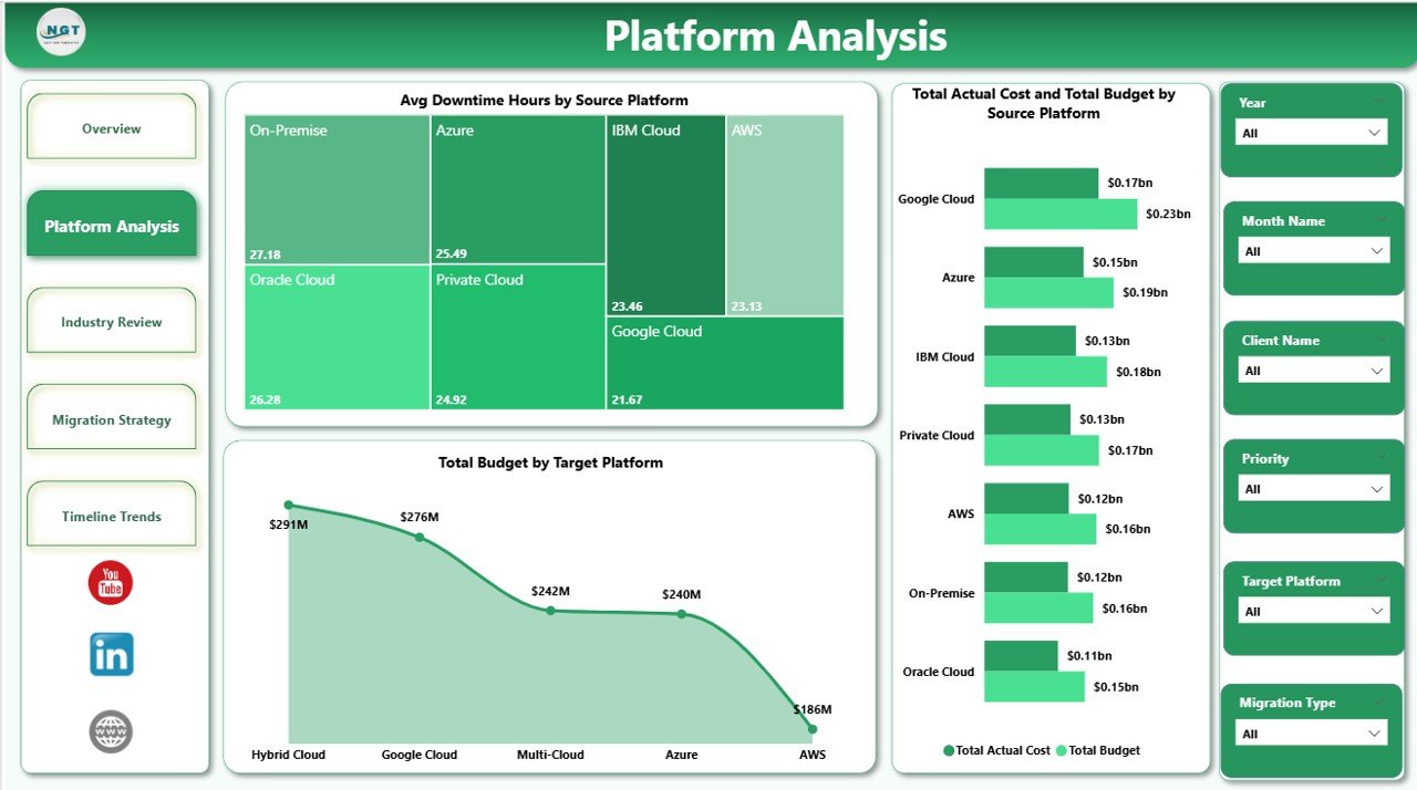
Cloud Migration Services Dashboard in Power BI2. Platform Analysis
The Platform Analysis page provides deep analysis of migration performance across cloud platforms. It includes charts showing Avg Downtime Hours by Source Platform, Total Actual Cost and Total Budget by Source Platform, and Total Budget by Target Platform. This page helps IT teams identify which source platforms experience the most downtime during migration and where planned budgets diverge from actual spending across different target platforms.
 Platform Analysis
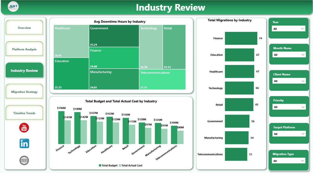
3. Industry Review
The Industry Review page analyzes cloud migration data segmented by industry. It features charts for Avg Downtime Hours by Industry, Total Migrations by Industry, and Total Budget and Total Actual Cost by Industry. This page enables consulting firms and multi-industry organizations to quickly spot which industries face the highest downtime challenges and where budget overruns are most significant, enabling targeted improvement strategies.
 Industry Review
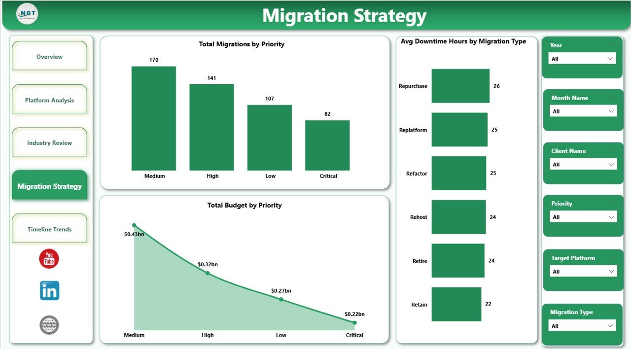
4. Migration Strategy
The Migration Strategy page focuses on analyzing migration approaches and prioritization. It includes charts for Total Migrations by Priority, Avg Downtime Hours by Migration Type, and Total Budget by Priority. Project managers can use this page to evaluate which migration strategies produce the lowest downtime and which priority levels consume the most budget, supporting more informed resource allocation decisions.
 Migration Strategy
5. Timeline Trends
The Timeline Trends page tracks migration performance over time with charts for Avg Satisfaction Score by Industry, Avg Downtime Hours by Project Status, and Total Budget by Month Name. This page is essential for identifying seasonal budget patterns, tracking client satisfaction trends across industries, and monitoring how project statuses evolve month over month to forecast future migration performance.
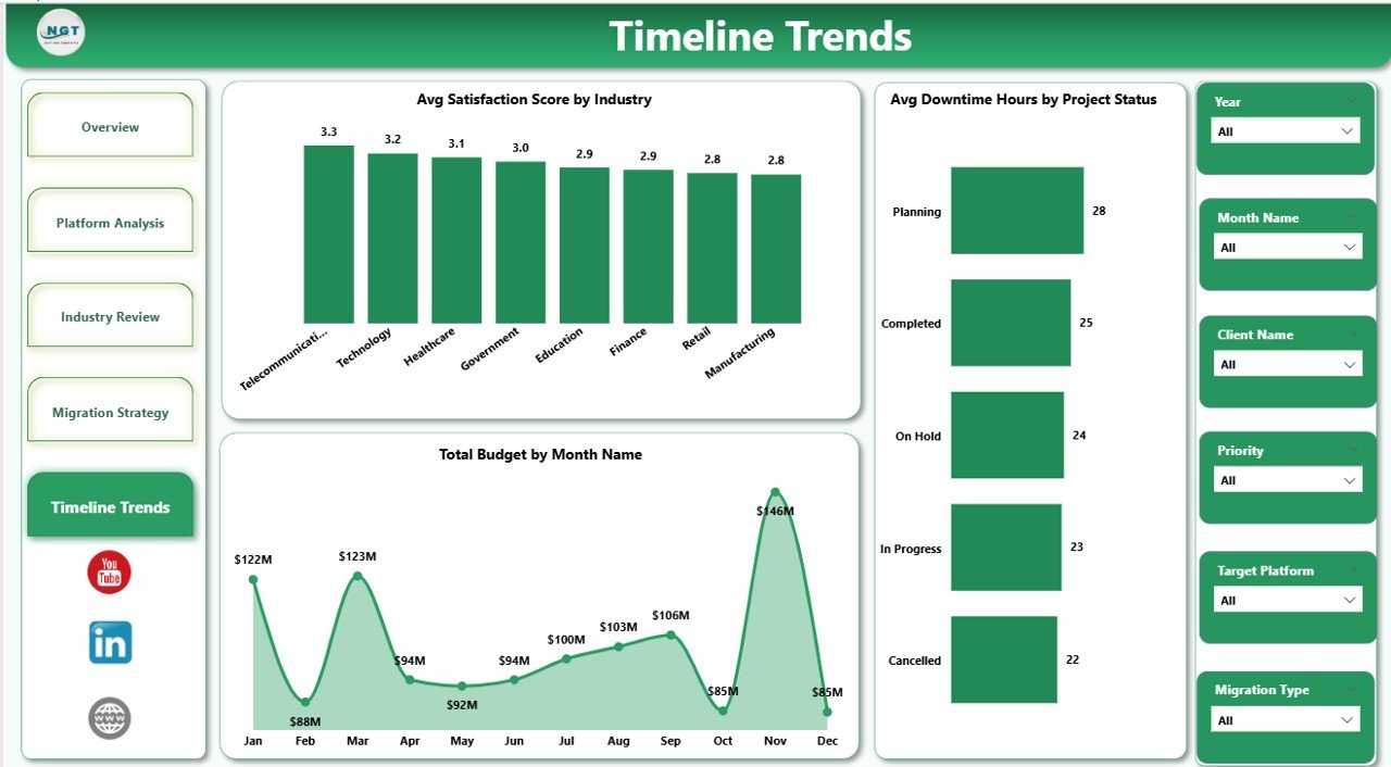 Timeline Trends
Advantages of Cloud Migration Services Dashboard in Power BI
This dashboard centralizes all cloud migration data into a single interactive file, eliminating the need for scattered spreadsheets and manual reports. The 5-page structure ensures that every stakeholder — from cloud engineers to CIOs — can find the analysis they need. The dynamic slicers allow instant filtering without modifying any data, and the instant data refresh capability means your dashboard always shows the latest information. Because it is built in Power BI Desktop, teams can share it via Power BI Service, embed it in Microsoft Teams, or export it as PDF for offline presentations.
Opportunities for Improvement
Organizations can extend this dashboard by integrating real-time cloud monitoring APIs from AWS CloudWatch, Azure Monitor, or Google Cloud Operations. Adding automated email alerts for budget overruns or downtime thresholds would further enhance proactive management. Teams could also add a dedicated security compliance page or a risk assessment matrix to strengthen governance visibility during migration projects.
Best Practices
Click here to Purchase Cloud Migration Services Dashboard in Power BI
For optimal results, update your data source at least weekly during active migration phases and refresh the dashboard before every stakeholder review. Use the slicers strategically to compare performance across industries and platforms rather than viewing data in isolation. Establish target benchmarks for downtime, budget variance, and satisfaction scores early in the project lifecycle so the dashboard serves as a continuous improvement tool rather than just a reporting mechanism.
Explore Relevant Templates
If you are looking for more cloud migration and IT-related templates, explore these options on NextGenTemplates:
- Cloud Migration Services Dashboard in Excel — The Excel version with pivot-powered charts and slicers.
- Cloud Migration KPI Dashboard in Power BI — Track MTD/YTD KPIs with trend analysis.
- Digital Transformation Dashboard in Power BI — Monitor digital project budgets, completion rates, and cost variance.
- Cloud Migration KPI Dashboard in Google Sheets — Collaborative cloud migration tracking in Google Sheets.
Frequently Asked Questions
What is the best Power BI dashboard template for tracking cloud migration projects?
The Cloud Migration Services Dashboard in Power BI is one of the best templates for tracking cloud migration projects. It includes 5 interactive pages covering Overview, Platform Analysis, Industry Review, Migration Strategy, and Timeline Trends with 5 KPI cards tracking workloads migrated, downtime, satisfaction, team size, and actual costs.
How do I use the Cloud Migration Services Dashboard in Power BI?
Simply download the .pbix file, open it in Power BI Desktop (free from Microsoft), replace the sample data with your own cloud migration project data, and click Refresh. All charts, KPI cards, and slicers update automatically with zero coding required.
Can this dashboard track migrations across AWS, Azure, and GCP?
Yes. The dashboard supports all major cloud platforms including AWS, Azure, GCP, IBM Cloud, Oracle Cloud, and hybrid environments. You can add any custom platform names in your data source and the Platform Analysis page will display insights accordingly.
Is this dashboard suitable for IT consulting firms?
Click here to Purchase Cloud Migration Services Dashboard in Power BI
Absolutely. The dashboard includes fields for Client Name, Industry, Project Status, and Priority — making it ideal for consulting firms managing multi-client cloud migration portfolios across different industries.
What is the difference between this dashboard and the KPI Dashboard version?
The Cloud Migration Services Dashboard provides detailed analytical pages with charts covering platform, industry, strategy, and timeline analysis. The KPI Dashboard version focuses on MTD/YTD KPI tracking with target vs actual comparison and trend charts. Both complement each other for comprehensive cloud migration management.
Conclusion
Click here to Purchase Cloud Migration Services Dashboard in Power BI
The Cloud Migration Services Dashboard in Power BI is an essential tool for any organization managing cloud transformation initiatives. With 5 interactive pages, 5 KPI cards, dynamic slicers, and instant data refresh, it transforms raw migration data into actionable insights that drive better decisions, reduce costs, and improve migration outcomes. Whether you are a cloud architect, IT project manager, or consulting firm, this dashboard delivers the visibility you need to succeed.
Click here to Purchase Cloud Migration Services Dashboard in Power BI
Learn more about Power BI from Microsoft Learn.
Visit our YouTube channel for step-by-step video tutorials: Youtube.com/@PK-AnExcelExpert