The Home Inspection Dashboard in Power BI tracks 5 core KPIs across 5 interactive report pages with 16 DAX-driven visuals — covering inspector performance, property defect patterns, service revenue mix, and monthly inspection trends. Home inspection companies managing 2–30 inspectors get portfolio-level analytics for a one-time $17.99, compared to $79–$149 per user per month for field inspection platforms like Spectora or HomeGauge. Setup takes under 10 minutes: open the .pbix file in free Power BI Desktop, point it at your inspection data, and every chart and KPI card refreshes automatically.
✅ Trusted by 8,400+ teams across 40+ countries. Instant download · One-time payment · No subscription · Lifetime access.
Key Features of Home Inspection Dashboard in Power BI
This Power BI dashboard delivers 5 headline metrics — Total Safety Issues, Total Report Cost, Total Major Defects, Total Inspections, and Total Defects Found — as KPI cards visible immediately on the Overview page. All 16 visuals respond in under 1 second when any slicer is applied, making it one of the fastest ways to slice inspection data by region, inspector, service type, or property type without writing a single formula.
The dashboard includes a Completion Rate visual on the Overview page (portfolio-wide) and a Completion Rate by Inspector chart on the Inspector Performance page — a metric that most home inspection analytics tools either bury or charge extra to surface. This dual-level view lets managers spot fulfillment gaps before they reach clients.
Defect analysis runs across three levels: the Overview KPI cards (Total Defects Found, Total Major Defects), the Property Analysis page (defect patterns by property type), and the Monthly Trend page (Avg Defects Per Inspection by Month). This layered approach is standard practice in enterprise property inspection platforms but unavailable in most off-the-shelf spreadsheet templates.
Dashboard Pages Explanation
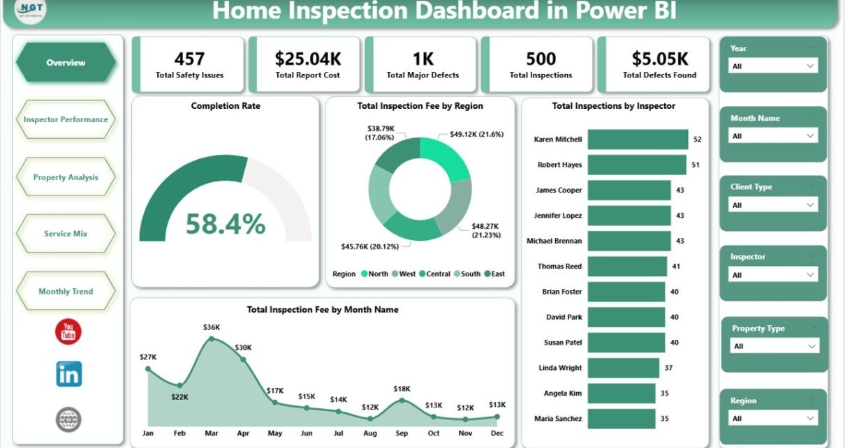
1. Overview Page
The Overview is the command center. Five KPI cards at the top display Total Safety Issues, Total Report Cost, Total Major Defects, Total Inspections, and Total Defects Found. Below the cards, four charts provide high-level analysis: Completion Rate shows the overall job completion percentage for the filtered time period; Total Inspection Fee by Region reveals geographic revenue distribution across all inspection territories; Total Inspections by Inspector compares workload volume across the team; Total Inspection Fee by Month Name exposes 12-month seasonal revenue patterns. Dynamic slicers on the right panel filter every visual simultaneously.
Overview Page — Home Inspection Dashboard in Power BI
2. Inspector Performance Page
The Inspector Performance page analyzes team productivity at the individual level. Three charts provide the key views: Total Inspection Fee by Property Type shows which property categories generate the most fee revenue across the team; Completion Rate by Inspector compares job completion percentages across every team member, identifying top performers and those needing support; Total Report Cost by Inspector measures documentation overhead per inspector to track operational efficiency across the team.
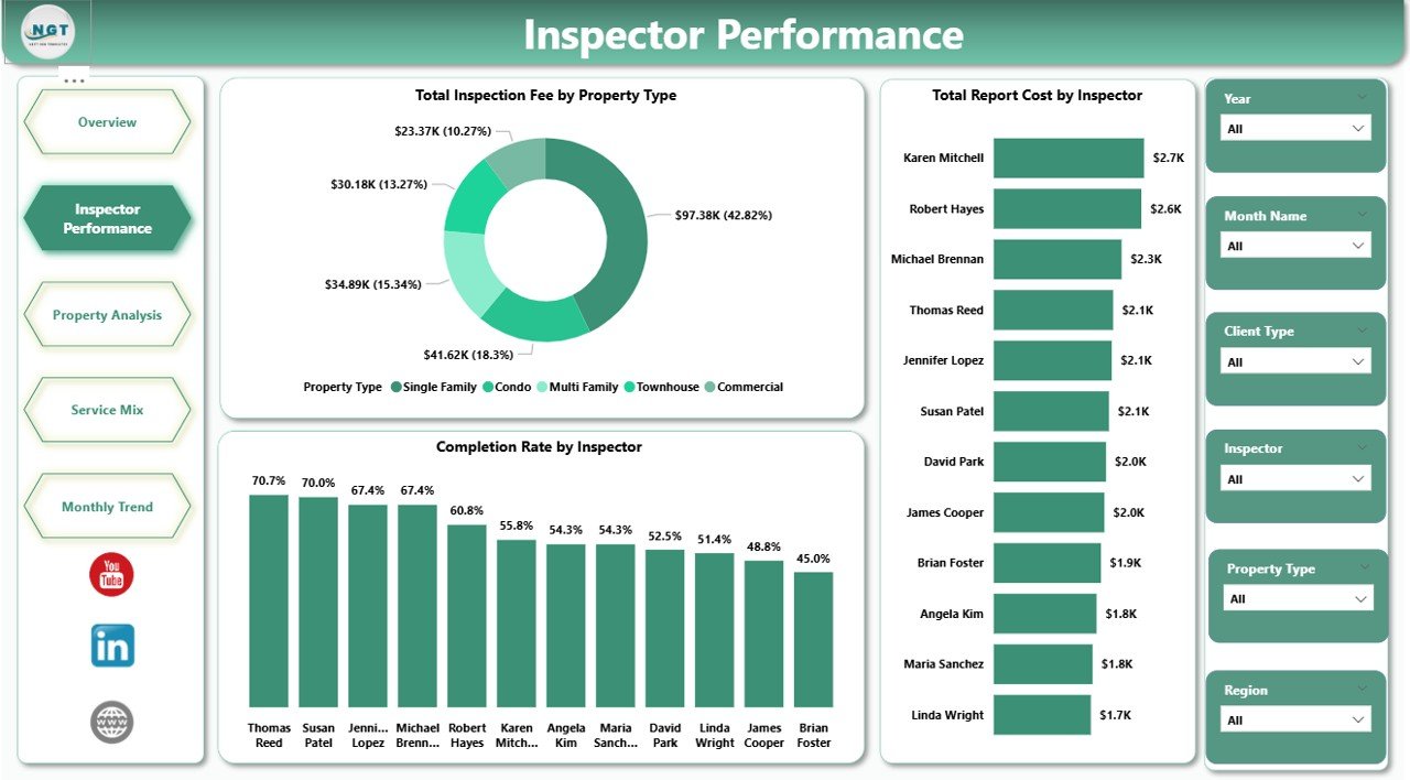
Inspector Performance Page
3. Property Analysis Page
Property Analysis focuses on property-type patterns across fee revenue and documentation costs. Three charts: Total Inspection Fee by Property Type reveals fee differences across residential, commercial, and specialty property categories; Completion Rate by Inspector filtered to property type shows which inspectors handle specific property categories most effectively; Total Report Cost by Inspector broken down by property type highlights where documentation costs concentrate across the portfolio.
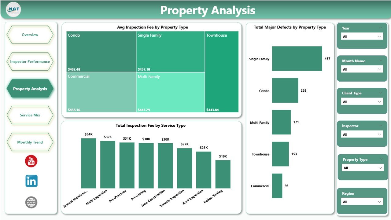
Property Analysis Page
4. Service Mix Page
Service Mix analyzes the revenue structure by service type and client segment. Three charts: Avg Inspection Fee by Service Type shows which inspection service categories command the highest average fee, guiding pricing decisions; Total Inspections by Client Type compares residential vs. commercial vs. investor client volume to inform business development strategy; Total Report Cost by Month Name identifies which months see the highest documentation overhead — useful for staffing and budget planning.
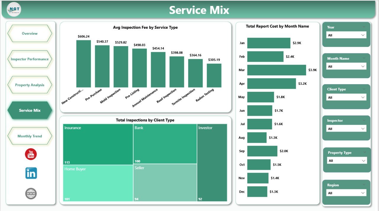
Service Mix Page
5. Monthly Trend Page
Monthly Trend provides the long-range view for forecasting and capacity planning. Three charts: Avg Defects Per Inspection by Month Name surfaces seasonal patterns in defect discovery — critical for understanding when properties have higher failure rates; Total Inspections by Status shows volume split across Completed, Pending, and other statuses to track operational bottlenecks month by month; Avg Inspection Fee by Month Name reveals monthly fee trends to inform revenue forecasting and pricing reviews.
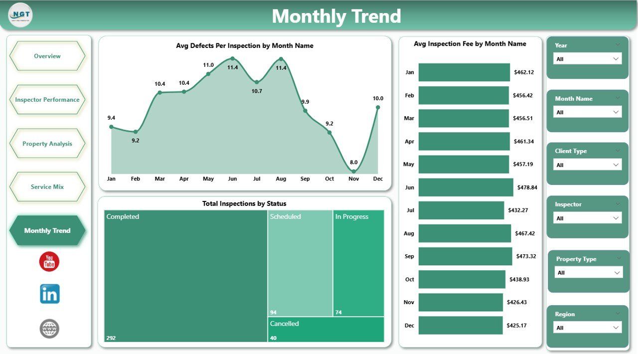
Monthly Trend Page
Home Inspection Dashboard in Power BI vs. Excel Dashboard vs. Spectora — Feature Comparison
| Feature | Home Inspection Dashboard in Power BI | Excel Dashboard | Spectora / HomeGauge |
|---|---|---|---|
| Cost | $17.99 one-time | $17.99 one-time | $79–$149/user/month |
| Platform | Power BI Desktop (free) | Microsoft Excel | Web + mobile app |
| Setup time | Under 10 minutes | Under 10 minutes | 1–3 days onboarding |
| DAX-driven interactivity | ✅ Native Power BI slicers | Pivot slicers | Vendor-defined charts only |
| Customizable measures | ✅ Unlimited DAX | ✅ Pivot formulas | ❌ Vendor-locked |
| Offline access | ✅ .pbix file runs locally | ✅ Yes | ❌ Cloud only |
| Inspector completion rate tracking | ✅ Built-in 2 levels | ✅ Built-in | Basic reports only |
| Year-1 cost at 5 inspectors | $17.99 | $17.99 | $4,740–$8,940 |
For inspection firms that use Power BI and need structured performance analytics without monthly software subscriptions, the Home Inspection Dashboard in Power BI sits in the sweet spot.
Who Should Use This Template
This dashboard is built for:
- Home inspection companies managing 2–30 inspectors who want interactive Power BI reports instead of static spreadsheets
- Solo inspectors already using Power BI Desktop who want a ready-made analytics template without building from scratch
- Operations managers at real estate firms tracking inspection performance across multiple regions or cities
- Real estate investors and landlords who need defect analytics and inspection cost trend visibility across their property portfolios
This template is not a fit if:
- Your team does not have Power BI Desktop installed — use the Home Inspection Dashboard in Excel instead
- You need automated client report dispatch, mobile field capture, or live API feeds from inspection software
- You manage 100+ inspectors and require enterprise-grade SSO and multi-tenant data isolation
Real-World Use Cases
Marcus runs a 12-inspector home inspection firm across 3 regional territories. Each month he opens the Inspector Performance page to compare Completion Rate and Total Report Cost per team member. Top performers get bonuses; those with low completion rates get a coaching conversation. He replaced a $149/user/month Spectora Analytics plan with this $17.99 one-time template after realizing he only needed the reporting layer, not the full CRM.
Priya is a property management operations lead at a commercial real estate company. She uses the Property Analysis and Service Mix pages to present monthly inspection summaries to leadership — which property types surface the most defects, which service lines generate the highest per-inspection fees, and how seasonal patterns affect report volumes. The Service Mix page’s Avg Inspection Fee by Service Type chart feeds directly into her annual pricing review.
Tom is a certified home inspector who runs a solo practice. He updates the dashboard weekly and uses the Monthly Trend page to project his busy seasons (spring and fall), adjust capacity by turning down low-fee jobs during peak weeks, and track Avg Defects Per Inspection to benchmark his inspection quality against his own historical performance.
Advantages of Home Inspection Dashboard in Power BI
The primary advantage over spreadsheet alternatives is Power BI’s cross-filtering engine — clicking any chart element filters every other visual on the page in under 1 second, without any formula or slicer setup. For inspection managers who frequently drill from portfolio-level to individual inspector or property-type views, this interactivity saves significant time compared to Excel’s manual pivot slicer approach.
The template also makes it easy to extend. Because every visual is backed by a DAX measure, adding a new metric — say, Average Time to Complete by Inspector — requires adding one column to your data source and writing a two-line DAX measure. No restructuring of charts or formulas required.
For teams already on the Microsoft Power Platform (Power BI Service, Teams, SharePoint), publishing the report for team access requires one click and a Pro license, with no additional setup.
Opportunities for Improvement
The template is designed for tabular inspection data loaded from an Excel file or flat database. If your data lives in a cloud inspection system with a REST API (Spectora, HomeGauge, ISN), connecting Power BI directly to that API requires additional Power Query configuration not included in the template. For most inspection firms that export data to Excel monthly, this is not an issue.
The current version does not include a geographic map visual. Inspection Fee by Region uses a bar chart rather than a map view. Teams who want pin-map visualization by city or ZIP code would need to add a custom ArcGIS or Bing Map visual with their own geographic data column.
Best Practices
Keep your inspection data in a single flat Excel table with consistent column names matching the sample data. Avoid splitting data across multiple sheets or files — Power BI’s refresh will break if the source structure changes. Add new inspection records as new rows at the bottom of the existing table, then click Refresh in Power BI Desktop to update all visuals. Review the Monthly Trend page at the end of each month before invoicing, as the Avg Inspection Fee by Service Type chart often surfaces pricing inconsistencies that are worth correcting before the next cycle.
Explore Relevant Templates
🔹 Home Inspection Dashboard in Excel — the same 5-page inspection analytics built on Excel pivot tables and slicers. No Power BI Desktop needed.
🔹 Property Management Dashboard in Google Sheets — track rent collection, occupancy, and maintenance across your property portfolio in Google Sheets.
🔹 Real Estate Property Tracker in Google Sheets — 7-page tracker with investment calculator, tenant management, and maintenance log for landlords and property managers. Browse all Power BI Dashboard Templates on NextGenTemplates.
Frequently Asked Questions
What KPIs does the Home Inspection Dashboard in Power BI track?
The Home Inspection Dashboard in Power BI tracks 5 headline KPIs — Total Safety Issues, Total Report Cost, Total Major Defects, Total Inspections, and Total Defects Found — plus 16 supporting visuals across 5 pages covering completion rates, inspection fees by region, inspector performance, service mix, and monthly defect trends. All metrics update instantly when slicers are applied.
How long does setup take?
Setup takes under 10 minutes. Download the .pbix file, open it in free Power BI Desktop, point the data source at your own inspection Excel file keeping the same column names as the sample, and click Refresh. All 5 pages update instantly with your data.
Do I need Power BI Pro to use this dashboard?
No. Power BI Desktop is free from Microsoft and runs the Home Inspection Dashboard in Power BI fully offline. Power BI Pro is only needed if you want to publish the report to Power BI Service and share it with teammates who need browser-based view access.
How does the Home Inspection Dashboard in Power BI compare to Spectora or HomeGauge?
Spectora and HomeGauge are field inspection platforms costing $79–$149 per user per month that include mobile reporting and automated client emails. The Home Inspection Dashboard in Power BI is a $17.99 one-time analytics tool for teams that already capture inspection data and need structured performance reporting without an ongoing software subscription.
Can I add new DAX measures and charts to this template?
Yes. The Home Inspection Dashboard in Power BI uses standard DAX patterns (SUM, DIVIDE, CALCULATE, AVERAGEX) that any Power BI user can extend. You can add new measures, create additional report pages, or modify the data model without restructuring the existing visuals.
Is there an Excel version of this home inspection dashboard?
Yes. The Home Inspection Dashboard in Excel covers the same 5 analysis pages using pivot tables, slicers, and pivot charts in Microsoft Excel — no Power BI Desktop installation required.
Is this a one-time purchase with no subscription?
Yes. The Home Inspection Dashboard in Power BI is a $17.99 one-time purchase with lifetime access. There are no subscriptions, no renewal fees, and no per-user charges. Download once and use across your entire team indefinitely.
About the Author
Built by PK — Microsoft Certified Professional with 15+ years of Excel, Google Sheets, and Power BI experience. Founder of NextGenTemplates, reaching 300K+ subscribers across YouTube channels. Every template is hand-built and tested before release. Learn more at YouTube.com/@PK-AnExcelExpert.
Conclusion
The Home Inspection Dashboard in Power BI delivers structured inspection analytics — 5 KPIs, 16 DAX visuals, 5 interactive pages — for a one-time $17.99 investment. For inspection firms that need Completion Rate tracking, defect trend analysis, and service mix insights without paying $79–$149 per inspector per month, this Power BI template closes the gap between enterprise analytics and affordable reporting.
👉 Click here to Purchase the Home Inspection Dashboard in Power BI
✅ Instant download · One-time payment · No subscription
📅 Last updated: May 2026
🎥 Watch tutorials on Youtube.com/@PK-AnExcelExpert