Managing a clinic today requires more than just excellent medical care. Clinics must also track patient flow, control costs, improve doctor performance, and ensure steady revenue growth. However, when data remains scattered across Excel files, billing systems, and appointment tools, leaders struggle to see the full picture. As a result, decisions become slow and reactive.
That is exactly why a Clinic Dashboard in Power BI has become a game-changer for modern healthcare organizations.
A Clinic Dashboard in Power BI converts raw clinical, operational, and financial data into clear, interactive, and real-time insights. Because Power BI delivers visual clarity, clinics can monitor performance instantly, identify bottlenecks early, and improve patient outcomes continuously.
Click to Purchases Clinic Dashboard in Power BI
In this in-depth and SEO-friendly guide, you will learn what a Clinic Dashboard in Power BI is, why it matters, how it works, what each dashboard page shows, its advantages, best practices, and frequently asked questions. Moreover, this article explains everything in simple and easy language so that clinic owners, administrators, and healthcare managers can apply these insights immediately.
A Clinic Dashboard in Power BI is an interactive analytics solution built using Microsoft Power BI to monitor clinic performance across multiple dimensions such as patients, doctors, departments, locations, time, and revenue.
Instead of reviewing long reports or manually compiling numbers, decision-makers view all key metrics in one centralized dashboard. As a result, clinics gain instant visibility into daily operations and long-term trends.
What Does a Clinic Dashboard Typically Track?
A well-designed Clinic Dashboard in Power BI usually tracks:
-
Patient visits and appointment status
-
Average consultation time
-
Billing and payment collection
-
Treatment costs
-
Doctor and department performance
-
Monthly and location-based trends
Because Power BI supports slicers, filters, and drill-downs, users can analyze data at both summary and detailed levels.
Why Is a Clinic Dashboard in Power BI Important?
Healthcare operations move fast. Therefore, clinics need real-time insights to respond quickly. A Clinic Dashboard in Power BI plays a critical role because it connects operational efficiency with financial performance.
Key Reasons Clinics Need Power BI Dashboards
-
Clinics manage hundreds of patients daily, so manual tracking wastes time
-
Healthcare costs rise continuously, so cost visibility becomes essential
-
Patients expect faster service, so consultation time matters
-
Clinic owners need accurate revenue and collection insights
-
Doctors and departments require fair performance evaluation
Because of these reasons, clinics increasingly rely on Power BI dashboards to stay competitive and patient-focused.
How Does a Clinic Dashboard in Power BI Work?
A Clinic Dashboard in Power BI works by connecting raw clinic data to visual analytics.
Step-by-Step Workflow
-
Data Collection
Clinics collect data from appointment systems, billing software, and treatment records. -
Data Modeling
Power BI cleans, structures, and relates data tables such as patients, doctors, departments, and locations. -
KPI Definition
Clinics define key performance indicators like consultation time, billing amount, and treatment cost. -
Visualization
Power BI converts KPIs into charts, cards, and trend visuals. -
Interaction
Users apply slicers to analyze data by department, doctor, location, or month.
Because this process remains automated, clinics always work with up-to-date information.
What Are the Key Pages in a Clinic Dashboard in Power BI?
A robust Clinic Dashboard in Power BI usually contains multiple analytical pages. Each page focuses on a specific business question and delivers actionable insights.
What Does the Overview Page Show in a Clinic Dashboard in Power BI?

The Overview Page acts as the central control panel for clinic management.
Key Features of the Overview Page
On this page, users can quickly understand overall clinic performance.
KPI Cards
The dashboard displays four KPI cards:
-
Average Consultation Time
-
Total Payment Collected
-
Total Patients Visited
-
Total Treatment Cost
These cards provide instant clarity without scrolling through data.
Charts on the Overview Page
The Overview Page includes four essential charts:
-
Average Consultation Time by Department
This chart helps identify departments with long patient wait times. -
Payment Collected by Patient Type
This visual shows revenue distribution across patient categories. -
Patients Visited by Appointment Status
This chart highlights completed, canceled, and no-show appointments. -
Treatment Cost by Doctor Name
This view helps analyze cost efficiency at the doctor level.
Because slicers sit on this page, users can filter insights by date, department, or location instantly.
Click to Purchases Clinic Dashboard in Power BI
How Does Clinic Location Analysis Improve Decision-Making?
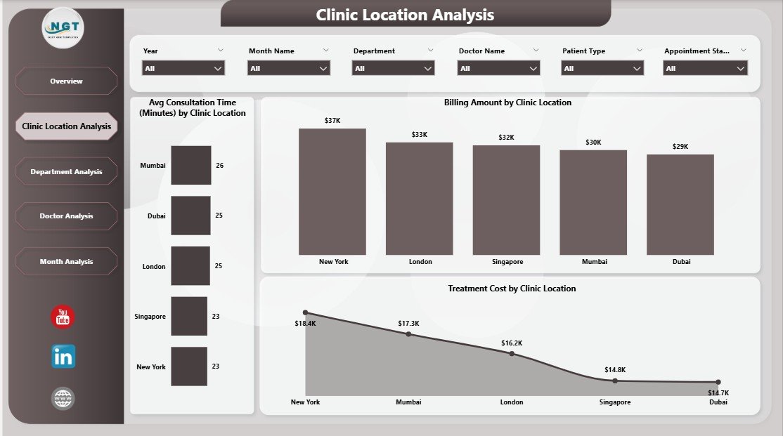
The Clinic Location Analysis page focuses on performance comparison across different clinic locations.
Why Location Analysis Matters
Multi-location clinics often face inconsistent performance. Therefore, comparing locations becomes essential for standardization and growth.
Key Charts in Clinic Location Analysis
This page includes three powerful visuals:
-
Average Consultation Time by Clinic Location
This chart reveals service efficiency at each location. -
Billing Amount by Clinic Location
This visual compares revenue generation across locations. -
Treatment Cost by Clinic Location
This chart highlights cost-heavy locations that need optimization.
Because of these insights, clinic managers can allocate resources more effectively.
What Insights Does Department Analysis Provide?
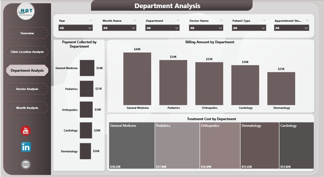
The Department Analysis page helps clinics understand how each department contributes to overall performance.
Why Department-Level Tracking Is Important
Departments differ in patient load, cost structure, and revenue potential. Therefore, department-level insights drive better staffing and budgeting decisions.
Key Charts in Department Analysis
This page includes three focused charts:
-
Payment Collected by Department
This chart shows which departments generate the highest collections. -
Billing Amount by Department
This visual compares billed revenue across departments. -
Treatment Cost by Department
This chart highlights departments with higher operational costs.
Because this analysis remains transparent, clinics can balance cost and quality effectively.
How Does Doctor Analysis Help Clinics Optimize Performance?
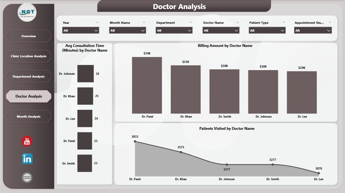
The Doctor Analysis page evaluates individual doctor performance using objective data.
Why Doctor Analysis Matters
Doctors directly influence patient satisfaction, cost, and revenue. Therefore, clinics must track doctor-level metrics fairly and consistently.
Key Charts in Doctor Analysis
This page contains three critical visuals:
-
Average Consultation Time by Doctor Name
This chart helps identify doctors who need workflow support. -
Billing Amount by Doctor Name
This visual shows revenue contribution by each doctor. -
Patients Visited by Doctor Name
This chart highlights patient load distribution.
Because of this page, clinic leadership can support doctors with data-backed decisions.
Click to Purchases Clinic Dashboard in Power BI
Why Are Monthly Trends Crucial for Clinics?
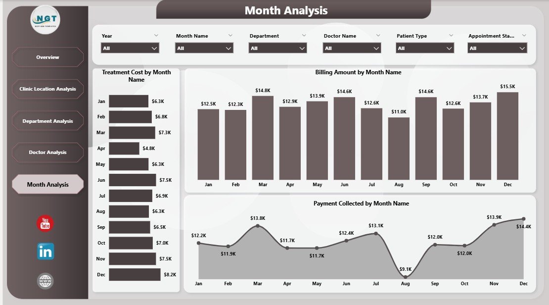
The Monthly Trends page focuses on time-based performance analysis.
Importance of Monthly Trend Analysis
Healthcare performance fluctuates due to seasonality, patient behavior, and operational changes. Therefore, tracking trends helps clinics plan ahead.
Key Charts in Monthly Trends
This final page includes three trend charts:
-
Treatment Cost by Month
This chart helps monitor rising or falling costs. -
Billing Amount by Month
This visual tracks revenue growth over time. -
Payment Collected by Month
This chart shows actual cash inflow trends.
Because of this page, clinics can forecast performance and set realistic targets.
What Are the Advantages of a Clinic Dashboard in Power BI?
A Clinic Dashboard in Power BI delivers value across operations, finance, and patient care.
1. Centralized Performance Visibility
The dashboard brings all clinic data into one place. As a result, decision-makers no longer rely on fragmented reports.
2. Faster and Better Decision-Making
Because insights update in real time, clinics respond faster to issues such as long wait times or revenue gaps.
3. Improved Patient Experience
By tracking consultation time and appointment status, clinics reduce patient waiting and improve satisfaction.
4. Better Cost Control
Treatment cost analysis helps clinics identify inefficiencies and reduce unnecessary expenses.
5. Transparent Doctor Performance
Doctor-level insights support fair evaluation and performance improvement.
6. Scalable and Flexible Analytics
Power BI dashboards scale easily as clinics grow or add new locations.
What Opportunities for Improvement Exist in Clinic Dashboards?
Even the best dashboards offer room for enhancement.
Key Improvement Opportunities
-
Add patient satisfaction scores for service quality tracking
-
Include appointment lead time analysis
-
Track insurance vs self-pay revenue separately
-
Integrate inventory and pharmacy costs
-
Add predictive analytics for patient volume forecasting
Because Power BI supports advanced modeling, clinics can continuously improve dashboards over time.
What Are the Best Practices for the Clinic Dashboard in Power BI?
Following best practices ensures long-term dashboard success.
Best Practices Checklist
-
Define clear KPIs aligned with clinic goals
-
Use consistent data definitions across departments
-
Keep visuals simple and uncluttered
-
Use slicers wisely for easy navigation
-
Refresh data regularly for accuracy
-
Validate data with clinic teams before deployment
-
Train users to interpret insights correctly
When clinics follow these practices, dashboards deliver sustained value.
Who Can Benefit from a Clinic Dashboard in Power BI?
A Clinic Dashboard in Power BI serves multiple stakeholders.
Primary Users
-
Clinic owners and directors
-
Healthcare administrators
-
Operations managers
-
Finance and billing teams
-
Department heads
-
Doctors and medical leads
Because each user can filter insights, the dashboard supports role-based decision-making.
Click to Purchases Clinic Dashboard in Power BI
How Does a Clinic Dashboard Support Strategic Growth?
Beyond daily operations, dashboards support long-term strategy.
Strategic Benefits
-
Identify profitable departments and services
-
Optimize doctor schedules based on patient demand
-
Expand high-performing clinic locations
-
Control costs before they escalate
-
Improve compliance and reporting readiness
Therefore, dashboards act as both operational and strategic tools.
Conclusion: Why Every Modern Clinic Needs a Power BI Dashboard
A Clinic Dashboard in Power BI transforms how clinics manage data, performance, and growth. Instead of relying on intuition, clinics make decisions based on real-time insights. As a result, they improve efficiency, control costs, and enhance patient satisfaction.
Because healthcare continues to evolve, clinics that adopt data-driven dashboards stay ahead of competition. Therefore, investing in a well-structured Clinic Dashboard in Power BI is no longer optional—it is essential.
Frequently Asked Questions (FAQs)
What is a Clinic Dashboard in Power BI used for?
A Clinic Dashboard in Power BI helps clinics monitor patient flow, doctor performance, treatment costs, and financial outcomes in one interactive view.
Can small clinics use a Power BI dashboard?
Yes, small clinics can use Power BI dashboards because they scale easily and require minimal manual effort once set up.
How often should clinic dashboards be updated?
Clinics should update dashboards daily or weekly, depending on data availability, to ensure accurate insights.
Does a Clinic Dashboard replace Excel reports?
The dashboard reduces dependency on static Excel reports, although clinics can still export data when required.
Is Power BI secure for healthcare data?
Power BI offers strong security features, including role-based access and data encryption, which support healthcare compliance needs.
Visit our YouTube channel to learn step-by-step video tutorials