This is where everything from the earlier modules comes together. Nine complete Excel dashboards, each with a free download and a step-by-step video, built with the pivot tables, charts, conditional formatting and formulas you have already learned.
Start with the Quick Dashboard →120+ more dashboard tutorials
What is an Excel dashboard?
An Excel dashboard is a single sheet that summarises a larger data set with KPI tiles, charts and controls such as slicers or drop-downs, so a reader can see status and trends at a glance and interact with the view without touching the raw data. A good dashboard has three layers: a data sheet, a calculation sheet (pivots, SUMIFS, INDEX MATCH) and the dashboard sheet that only displays results.
Course curriculum
Work through them in this order. Each one adds a technique the next one uses.
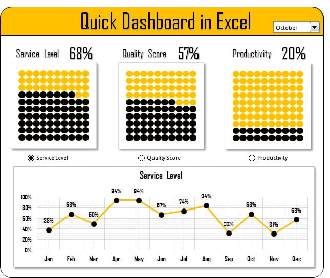
1. Quick Dashboard
Your first dashboard in under an hour: KPI tiles, two charts and a drop-down control.
Learn more →
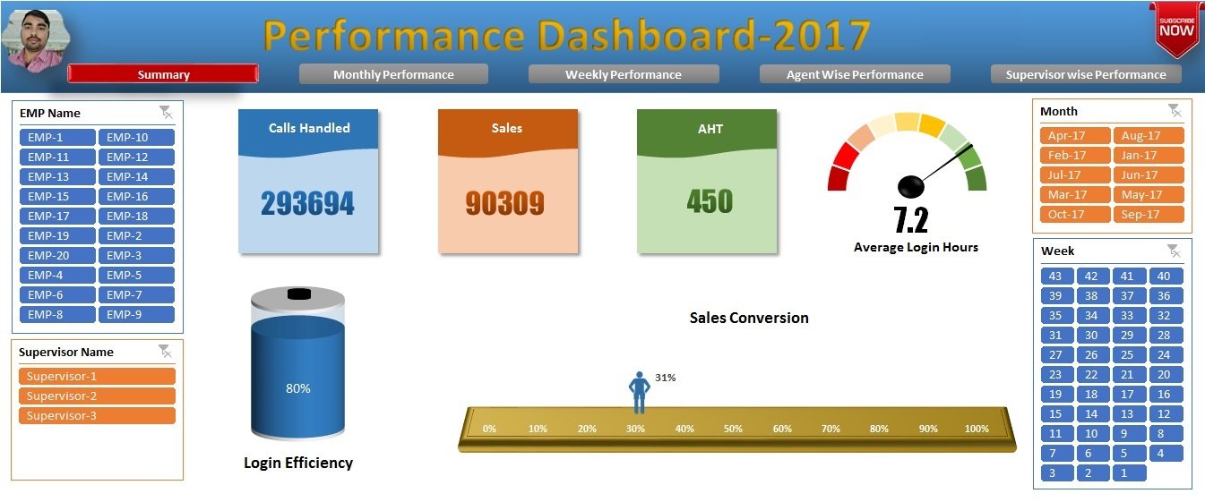
2. Performance Dashboard
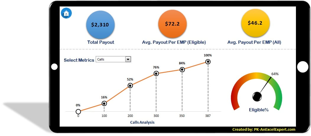
Employee KPIs against targets with dynamic charts and interactive controls.
Learn more →
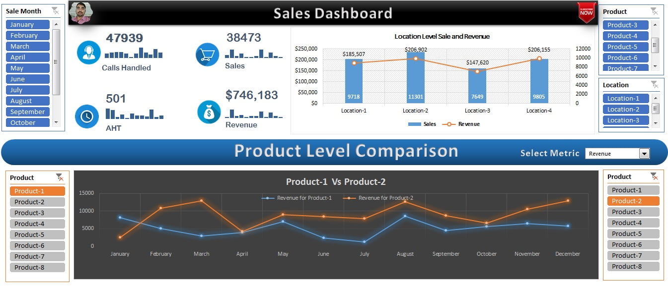
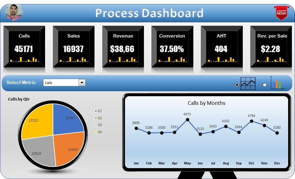
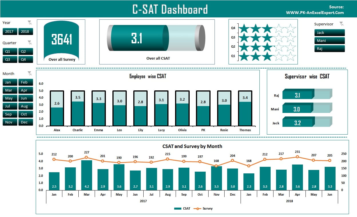
7. C-SAT Dashboard
Customer satisfaction scores down to employee level with trend tracking.
Learn more →
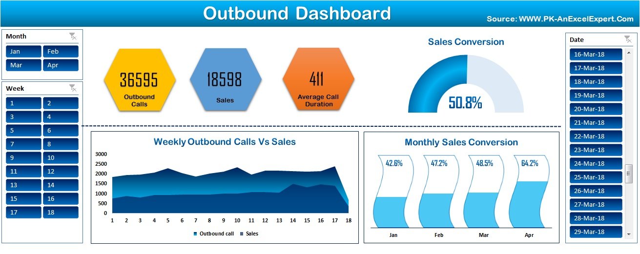
8. Outbound Dashboard
Call-centre metrics: calls, conversions and average handling time.
Learn more →
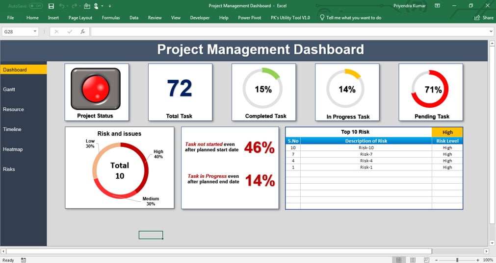
9. Project Management Dashboard
Gantt timeline, milestones, resources and risk in one view. The capstone.
Learn more →
10. Foundations: Excel Dashboard Design Principles
Excel dashboard design principles: the three-layer workbook, how to choose KPIs, one-screen layout rules, colour and number formats, and a review checklist.
Learn more →
Dashboard best practices
- Decide the questions first. A dashboard answers three to five questions. Write them down before you open Excel.
- Separate data, calculations and display. Raw data on one sheet, pivots and formulas on another, the dashboard on a third. Never type numbers on the dashboard sheet.
- Use Excel Tables for the source. Pivots and formulas expand automatically when rows are added.
- One chart, one message. If a chart needs a paragraph to explain, split it.
- Keep colour for meaning. Grey for context, one accent for the current selection, red and green only for good and bad.
- Test with someone else’s data. Paste in a fresh export and check every number still reconciles.
Need a finished dashboard today?
NextGenTemplates has 3,000+ Excel dashboards and 585+ KPI dashboards for HR, sales, finance, manufacturing, healthcare and more, each with a video tutorial. Instant download after checkout.
Frequently asked questions
How do I download the dashboard files?
Open any dashboard above. The download link is at the end of the tutorial, next to the video.
Can I use these dashboards with my own data?
Yes. Replace the data sheet with your own columns in the same layout, then refresh the pivot tables. Each tutorial explains which cells drive the dashboard.
Do the dashboards need macros?
No. All nine are built with pivots, formulas, charts and form controls only. Macro-driven dashboards are covered in the VBA module.
Which Excel version do I need?
Excel 2013 or later on Windows or Mac. Slicers and timelines need 2013+.