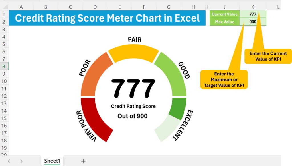
In this article, we will create a visually appealing Credit Rating Meter Chart in Excel. You can display a credit score, a Civil score, or any other key performance indicator (KPI) using this chart. We have created a video tutorial will walk you through the process step-by-step.
Why Use a Credit Rating Meter Chart?
A Credit Rating Meter Chart is a powerful tool for visualizing data in a clear and engaging way. It allows you to present critical information, like a credit score, in a format that is easy to understand at a glance. This type of chart is not only visually appealing but also highly functional, making it a great addition to any report or presentation.
What You’ll Need
Before we start, make sure you have the following:
A dataset that includes the current value and maximum value for your KPI
- Current Value: The current value of your KPI. This could be your current credit score, service level, or any other metric you are tracking.
- Max Value: The maximum value of your KPI. For example, if you are using this chart to display a credit score, the maximum value might be 900.
Click to buy Credit Rating Meter Chart in Excel
Advantages of a Credit Rating Meter Chart
Clarity and Simplicity
The meter chart provides a clear and straightforward visual representation of data. This simplicity ensures that viewers can quickly grasp the information being presented without needing to analyze complex data points.
Dynamic and Interactive
With the dynamic nature of the meter chart, changes in the data are automatically reflected in the chart. This interactivity makes it an excellent tool for live presentations and reports that require up-to-date information.
Versatility
While commonly used for credit scores, this chart can be adapted to display a variety of KPIs, such as customer satisfaction, service levels, or performance metrics. This versatility makes it a valuable addition to your data visualization toolkit.
Professional Appearance
The sleek, modern look of the meter chart adds a professional touch to your reports and presentations, making your data not only informative but also visually appealing.
Conclusion
Using this Credit Rating Meter Chart in Excel is easier than you might think. This is a ready to use template which you can purchase from the below given button. It’s an excellent way to display critical data visually. By following these steps, you can create a dynamic and engaging chart that updates automatically based on the input values. Not only will this chart make your data more accessible, but it will also impress your audience with its professional look and functionality.
Visit our YouTube channel to learn step-by-step video tutorials
Watch the step-by-step video tutorial:
Click to buy Credit Rating Meter Chart in Excel