Project Management Dashboard in Excel: Gantt, Timeline and Risk

Part of the free Module 11: Excel Dashboards · Lesson 9 of 10 · Full Excel course

Updated on 5 September 2026 · Works in Excel 365, 2021, 2019 and 2016 unless noted (the timeline slicer needs Excel 2013 or later).

A project management dashboard in Excel tracks tasks, dates, resources and risks on one screen so a project manager can see status without opening the plan. This Project Management Dashboard has six pages: an overview, a dynamic Gantt chart, resource utilisation, a timeline, a yearly heat map and a risk register. Everything is driven by formulas, conditional formatting and Form Controls, with no VBA. This capstone lesson explains what each page shows, how it is built and how to load your own project data.

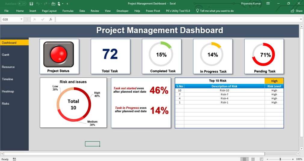
Project Management Dashboard in Excel overview page with status light, task doughnut charts, risk split and top 10 risks

What the dashboard shows

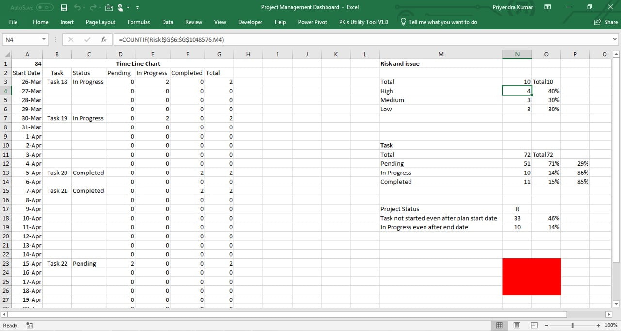
A navigation bar on the right holds six buttons: Dashboard, Gantt, Resource, Timeline, Heatmap and Risk. Each is a shape hyperlinked to its sheet. Three hidden sheets, Data, Settings and Support, hold the inputs and calculations. The overview KPIs are project status as a traffic light, total tasks, tasks completed, in progress and pending, the risk split into low, medium and high, the percentage of tasks not started after their planned start date, the percentage still in progress after their planned end date, and a top-10 risk table filtered by a drop-down.

The workbook structure

Sheet Role What it holds
Data (hidden) Input One row per task: task, owner, planned start and end, actual start and end, status, risk level
Settings (hidden) Input Weekend days, holiday list, employee list, status list
Support (hidden) Calculation Helper formulas for the Gantt window, counts, percentages and the top-10 risk feed
Dashboard, Gantt, Resource, Timeline, Heatmap, Risk Display Cards, charts, conditional formatting grids and the register

How it is built

Element Technique Formula or feature
Task counts COUNTIF on the status column =COUNTIF(Data!$H:$H,"Completed")
Not started late COUNTIFS with TODAY =COUNTIFS(Data!$H:$H,"Pending",Data!$D:$D,"<"&TODAY())/COUNTA(Data!$B:$B)
Status traffic light Nested IF on the late percentages =IF(K2>0.2,"Red",IF(K2>0.1,"Amber","Green")) with conditional formatting on the shape cell
Task and risk doughnuts Doughnut charts on count cells Count and =total-count as the grey remainder
Top-10 risk table INDEX and MATCH on a helper rank =IFERROR(INDEX(Risk!$B:$B,MATCH(ROWS($A$1:A1),Support!$Z:$Z,0)),"")
Gantt bars Conditional formatting on a date grid =AND(F$5>=$C7,F$5<=$D7)
Weekend and holiday shading Second conditional formatting rule =OR(WEEKDAY(F$5,2)>5,COUNTIF(Settings!$B:$B,F$5)>0)
Date and task scrolling Two Form Control scroll bars Linked cells feed =Support!$B$1+COLUMNS($F$5:F$5)-1 for dates and =INDEX(Data!B:B,$C$1+ROWS($A$1:A1)) for tasks
Resource grid COUNTIFS per employee per month =COUNTIFS(Data!$C:$C,$B7,Data!$D:$D,"<="&EOMONTH(F$5,0),Data!$E:$E,">="&F$5)
Timeline Scatter chart with a slicer X = planned end date, Y = row position, three series by status
Heat map Calendar grid with colour scale Spin button changes the year; each cell counts active tasks on that date

Dashboard page

The status traffic light and cards are formulas over the Data sheet. Three doughnut charts show Completed, In Progress and Pending counts, a fourth shows the risk split, and the top-10 risk table uses INDEX and MATCH with a yellow drop-down (Data Validation list) for the risk level. The Support sheet ranks the risks that match the chosen level, and the table reads rank 1 to 10.

Dashboard sheet of the Project Management Dashboard in Excel with status, task doughnuts, risk split and top 10 risks
Dashboard sheet

Gantt page

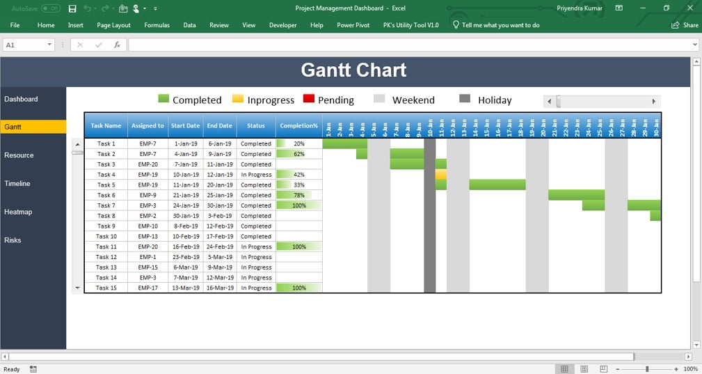
The Gantt chart is not a chart object. It is a grid of narrow date columns shaded by conditional formatting: a cell fills when its column date falls between the row’s start and end dates. A horizontal scroll bar moves the first date in the window and a vertical scroll bar moves the first task, both through linked cells on the Support sheet, so the grid stays a fixed size while the data can grow. A second rule shades weekends and the holidays listed on the Settings sheet, and a third colours completed bars differently from planned ones. A legend sits at the top.

Gantt sheet of the Project Management Dashboard in Excel with scroll bars and conditional formatting bars
Gantt sheet

Resource page

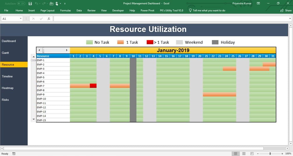
Employee utilisation by month, again with two scroll bars, one for months and one for employees. Names come from the Settings sheet and each cell is a COUNTIFS of tasks assigned to that person whose dates overlap the month. A colour scale makes overloaded months stand out.

Resource sheet of the Project Management Dashboard showing employee utilisation by month
Resource sheet

Timeline page

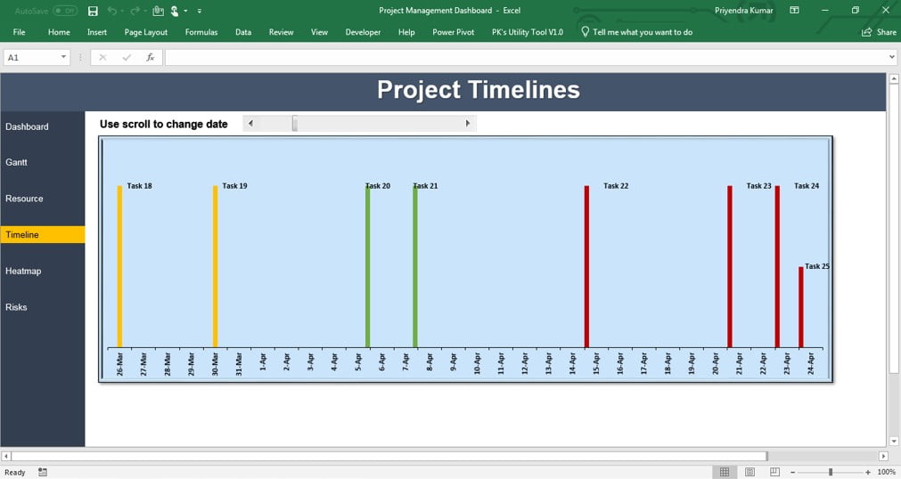
A timeline chart built on a scatter chart and connected to a slicer through a PivotTable feed. Red markers are pending tasks, amber in progress and green completed; each colour is a separate series whose values come from =IF(status="Completed",date,NA()) style formulas, so a task appears on exactly one series.

Timeline sheet of the Project Management Dashboard with colour-coded task markers
Timeline sheet

Heat Map page

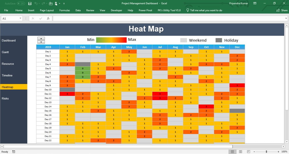
A yearly calendar heat map of task activity. A spin button changes the year in a linked cell, the calendar dates are built from =DATE(year,month,1) onwards, and each cell counts the tasks active on that date with COUNTIFS. A three-colour scale turns the counts into shading.

Heat Map sheet of the Project Management Dashboard with a yearly activity grid and year spin button
Heat Map sheet

Risk page

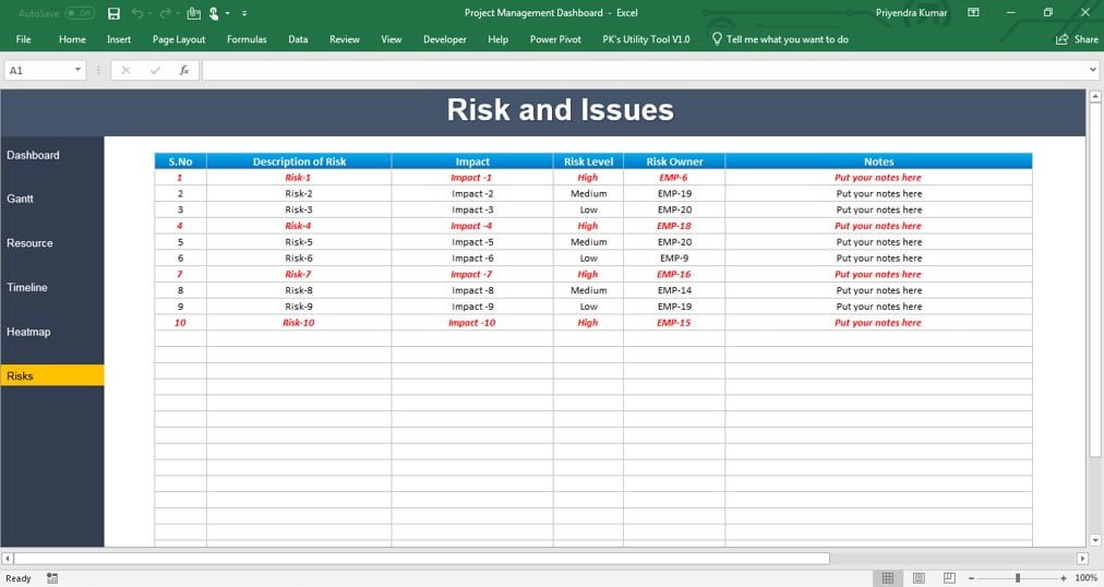
A register where the project manager records risks and issues with owner, level and details. Level is a Data Validation drop-down (Low, Medium, High) so the counts on the Dashboard always match. The Dashboard reads its top-10 table from here.

Risk sheet of the Project Management Dashboard with the risk and issue register
Risk and issues register

Data, Settings and Support (hidden)

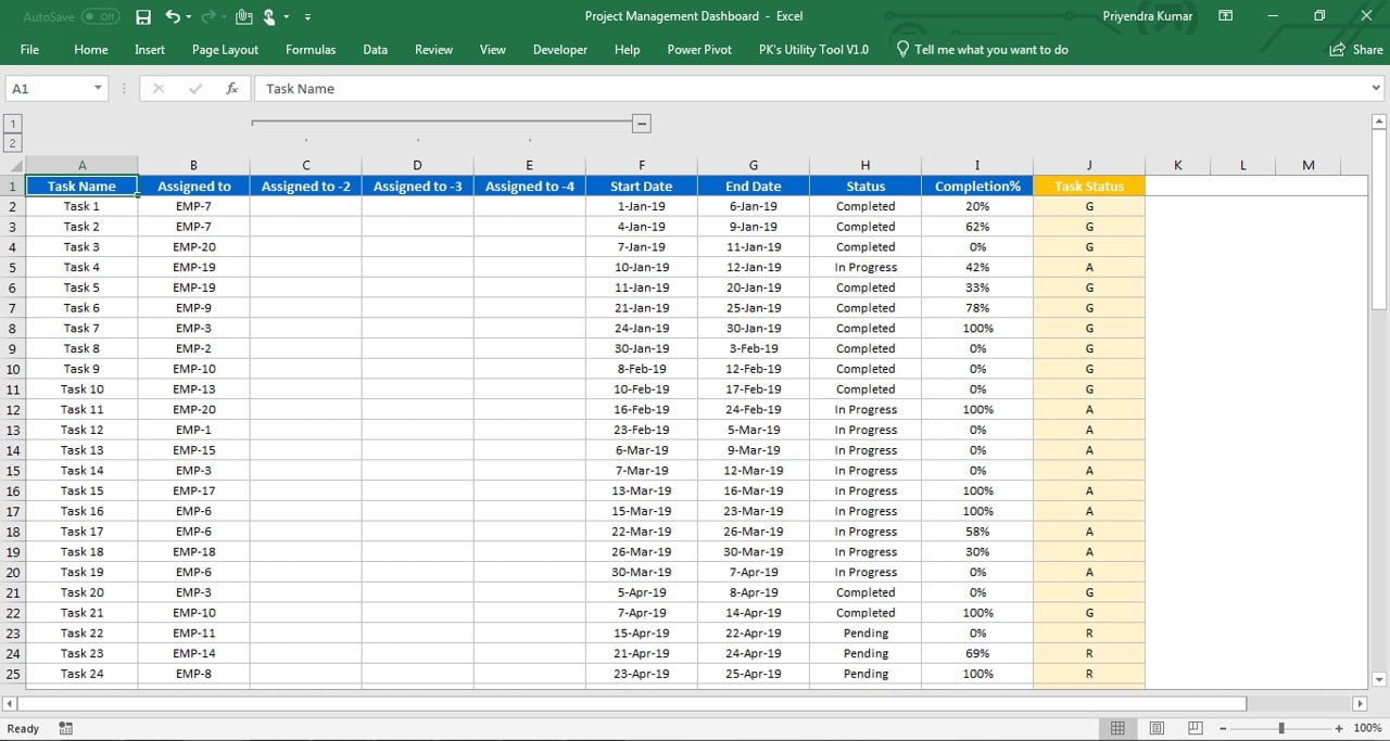
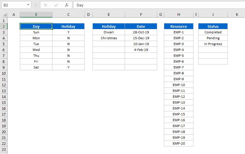
Data holds one row per task with planned and actual dates, owner, status and risk. Settings holds weekends, holidays and the employee list. Support holds the helper formulas; nothing is entered there.

Data sheet of the Project Management Dashboard with one row per task
Data sheet

Settings sheet of the Project Management Dashboard with weekends, holidays and employees
Settings sheet

Support sheet of the Project Management Dashboard with helper formulas
Support sheet

Worked example

Suppose the Data sheet holds these four tasks and today is 5 September 2026.

Task Planned start Planned end Status Working days Flag
Requirements 03 Aug 2026 14 Aug 2026 Completed 10
Design 17 Aug 2026 04 Sep 2026 In Progress 15 Overdue
Build 01 Sep 2026 30 Sep 2026 Pending 22 Late start
Test 01 Oct 2026 16 Oct 2026 Pending 12

Working days come from =NETWORKDAYS(C2,D2,Settings!$B$2:$B$20). The flag column uses =IF(AND(E2="Pending",B2<TODAY()),"Late start",IF(AND(E2="In Progress",C2<TODAY()),"Overdue","")). The Dashboard then reports 4 tasks, 1 completed, 1 in progress, 2 pending, 25 percent not started late (Build) and 25 percent overdue (Design), which pushes the status light to Amber. On the Gantt page, the Design row shades from 17 August to 4 September, with the weekends of 22, 23, 29 and 30 August greyed by the second rule.

How to use it with your own data

  1. Right-click a sheet tab, choose Unhide and open Settings. Enter your weekend days, holidays and team members.
  2. Unhide Data and enter one row per task: name, owner, planned start and end, actual start and end, status and risk level. Use the drop-downs for status and risk.
  3. Fill the Risk sheet with open risks and issues.
  4. Return to Dashboard; every page recalculates automatically. Use the scroll bars, spin button and slicer to explore.
  5. If you have more tasks than the scroll bar allows, right-click it, choose Format Control and raise the maximum value.
  6. Hide Data, Settings and Support again before sharing.

Get the file

The complete Project Management Dashboard workbook is available as a ready-to-use template: Get the Project Management Dashboard in Excel. The six videos below show how it was built, page by page, so you can also rebuild it yourself.

Watch the video

Six-part build tutorial:


Tips and common mistakes

  • Enter real dates, not text. The Gantt, resource grid and heat map compare date serial numbers; a text date never shades.
  • Keep status values exact. Use the drop-down so Completed, In Progress and Pending match the COUNTIF criteria.
  • Add holidays before reviewing the Gantt. Working-day shading and NETWORKDAYS both read the Settings list.
  • Do not insert columns inside the Data table. Add new fields at the right-hand end so the INDEX and COUNTIFS ranges keep their positions.
  • Freeze the task column on the Gantt. Readers lose the row label when they scroll dates otherwise.
  • Use one scroll bar per axis. Two scroll bars with the same linked cell fight each other.
  • Refresh the timeline pivot. The scatter timeline reads a PivotTable feed, so press Data > Refresh All after editing tasks.

Errors and how to fix them

Symptom Cause Fix
Gantt bars missing Dates stored as text, or the rule references are not mixed ($C7 and F$5) Convert with Data > Text to Columns; check the rule anchors
Counts do not add up to total tasks Status spelled differently or has trailing spaces Re-select from the drop-down; wrap the helper in TRIM
Scroll bar stops before the last task Maximum value set for the sample size Right-click, Format Control, raise Maximum value
#N/A in the top-10 risk table Fewer than ten risks at the selected level Wrap the INDEX in IFERROR to return an empty string
Heat map all one colour Spin button year outside the task dates Set the year to one that has tasks; check the colour scale minimum and maximum
Timeline does not respond to the slicer Slicer not connected to the feed pivot Right-click the slicer, Report Connections, tick the pivot

Practice exercise

  1. Add a Milestone column (Yes or No) to the Data sheet and a rule on the Gantt that draws milestone rows in a different colour.
  2. Add a card that shows the number of tasks due in the next seven days using COUNTIFS with TODAY() and TODAY()+7.
  3. Extend the resource grid with a Total row and a conditional formatting rule that flags any employee with more than five active tasks in a month.
  4. Add a Percent Complete column to Data and show the overall project completion as a doughnut chart on the Dashboard.
  5. Replace the year spin button on the heat map with a Data Validation drop-down of years.

Key takeaways

  • A Gantt chart in Excel can be a cell grid and one conditional formatting rule comparing column dates with row dates.
  • Scroll bars linked to helper cells let a fixed-size grid show any part of a large plan.
  • COUNTIF, COUNTIFS and TODAY() produce every status and lateness KPI on the overview.
  • NETWORKDAYS with a holiday list gives honest durations; weekends and holidays are shaded from the same list.
  • Hidden Data, Settings and Support sheets keep the display pages clean and safe to share.
  • Everything here reuses techniques from earlier in the course: cards, feed ranges, Form Controls, pivots and slicers.

Related lessons

Frequently asked questions

Does the Gantt chart use a chart object?

No. It is a grid of cells shaded by conditional formatting. A rule such as =AND(F$5>=$C7,F$5<=$D7) fills a cell when the column date falls inside the task’s date range. Because it is cells, it scrolls smoothly, prints cleanly and can be styled with borders and fonts like any other range.

How many tasks can the dashboard handle?

The scroll bars are set for the sample size, but you can extend the Data table and raise each scroll bar’s maximum under Format Control to several hundred tasks. Performance stays good because each page only calculates the window of rows and dates currently displayed.

Can I change the status colours?

Yes. Edit the conditional formatting rules on the Gantt and Timeline sheets under Home, Conditional Formatting, Manage Rules, and change the fill colours of the doughnut charts on the Dashboard. Keep the same colour for the same status on every page.

How are the late percentages calculated?

Not started late is the count of Pending tasks whose planned start is before today, divided by the total tasks. Overdue is the count of In Progress tasks whose planned end is before today, divided by the total. Both use COUNTIFS with TODAY(), so they update every day the file is opened.

Does this dashboard need macros?

No. The navigation buttons are hyperlinked shapes, the scroll bars and spin button are Form Controls, and every calculation is a worksheet formula. The file is a plain .xlsx that opens without security prompts, although Form Controls cannot be clicked in Excel for the web.

Want the finished version? Ready-made Excel dashboards, trackers and VBA systems are available at NextGenTemplates.com.