Part of the free Module 7: Conditional Formatting · Lesson 6 of 15 · Full Excel course
Updated on 5 September 2026 · Works in Excel 365, 2021, 2019 and 2016 unless noted.
Format all cells based on their values is the first rule type in Excel’s New Formatting Rule dialog. It applies a 2-colour scale, 3-colour scale, data bar or icon set to every cell in a range and, unlike the ribbon galleries, lets you fix the minimum, midpoint and maximum as a number, percent, percentile or formula, so the formatting stays stable as data changes.
What the rule does and when to use it
The ribbon galleries for Color Scales, Data Bars and Icon Sets always scale automatically between the lowest and highest value in the selection. That is fine for a quick look, but a dashboard needs stable limits: a bar that always represents 0 to 200, a colour scale centred on target, or a traffic light that turns green at exactly 150. Format all cells based on their values gives you those controls in one dialog. Every limit can be a Number, Percent, Percentile, Formula, or the Lowest and Highest value, and the dialog is the same in Excel 2016 through Microsoft 365.
The rule never hides a cell or changes its text. It only paints a gradient, draws a bar or places an icon, which is why it is the format of choice for scorecards where the reader must still see the number.
The limit types explained
| Type | Meaning | Use it when |
|---|---|---|
| Lowest Value / Highest Value | The smallest or largest number currently in the range | You want the gallery behaviour, rescaling with the data |
| Number | A fixed value you type, such as 0 or 200 | Limits mean something in the business (target, capacity) |
| Percent | A position between the lowest and highest value, so 50 is halfway along the numeric span | You want a scale relative to the range but centred, e.g. 50 percent |
| Percentile | A position by rank, so 50 is the median cell | One outlier is flattening the colours and you want a fair spread |
| Formula | Any formula that returns a number, such as =$J$1 or =AVERAGE($B$2:$G$9) |
The limit should come from an input cell or a calculation |
| Automatic (data bars only) | Excel picks the axis position and limits itself | Default for bars with mixed positive and negative values |
A Formula limit must use absolute references. Write =$J$1, not =J1: the rule is evaluated for every cell in the Applies to range, and the dollar signs on both the column and the row lock every cell to the same input. With a relative reference each cell would look at a different cell and the scale would break silently.
Step by step: open the New Formatting Rule dialog
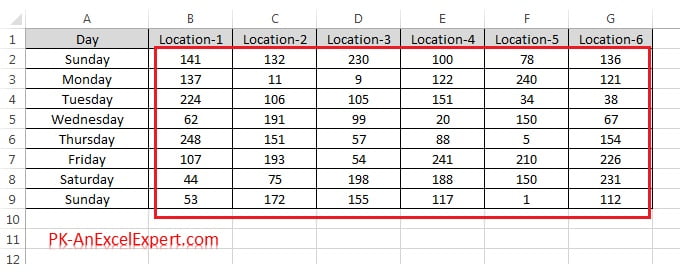
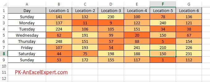
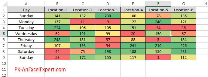
The example uses a day-wise, location-wise sales table in B2:G9.

- Select the range B2:G9.
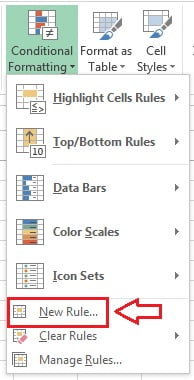
- Go to Home > Conditional Formatting > New Rule.

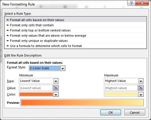
- In the New Formatting Rule dialog, Format all cells based on their values is already selected at the top of the rule type list.

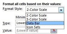
- Open the Format Style drop-down. It offers 2-Color Scale, 3-Color Scale, Data Bar and Icon Sets. The lower half of the dialog changes to match the style you pick.

2-Color Scale with fixed limits
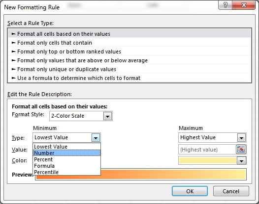
- Keep 2-Color Scale selected. Under Minimum and Maximum, open the Type drop-down and choose Number.

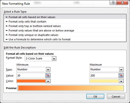
- Enter 20 as the minimum value and 200 as the maximum, and pick the two colours. The preview bar at the bottom shows the gradient.

- Click OK. Values at or below 20 get the minimum colour, values at or above 200 the maximum colour, and everything else is blended in proportion.

3-Color Scale with a midpoint
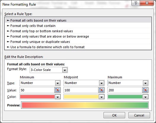
- Choose 3-Color Scale in Format Style. A Midpoint column appears between Minimum and Maximum.
- Set Type to Number for all three and enter your minimum, midpoint and maximum values. A midpoint equal to your target makes above-target cells green and below-target cells red, with the target itself in the middle colour.

- Click OK to apply. The midpoint does not have to sit halfway between the limits; it can be any value between them.

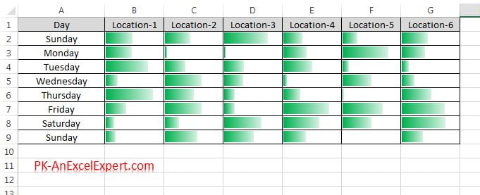
Data Bar with fixed limits and Show Bar Only
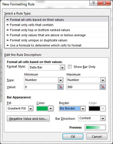
- Choose Data Bar in Format Style. Set the Minimum and Maximum Type to Number and enter the values; a minimum of 0 makes bar length proportional to the actual figure.
- Choose Gradient Fill or Solid Fill, and pick the bar colour, border and Bar Direction (Context, Left-to-Right or Right-to-Left). The Negative Value and Axis button sets a separate colour for values below zero and the axis position.

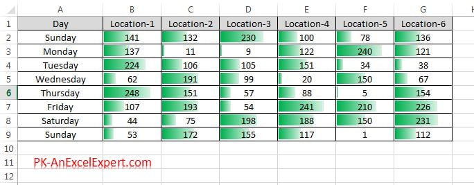
- Click OK. Each cell shows a bar scaled to your fixed limits, so the bars no longer change length when a new maximum appears.

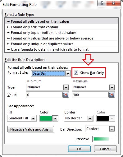
- To hide the numbers and show a pure bar chart in the cells, edit the rule and tick Show Bar Only. The values are still in the cells and still work in formulas.


Icon Sets with number thresholds
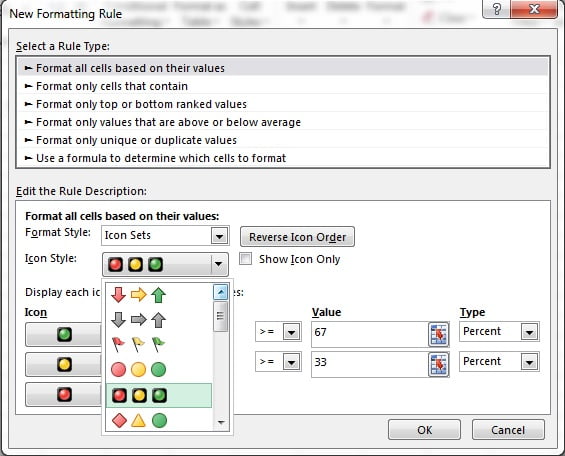
- Choose Icon Sets in Format Style and pick an Icon Style, for example 3 Traffic Lights (Unrimmed).

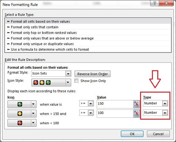
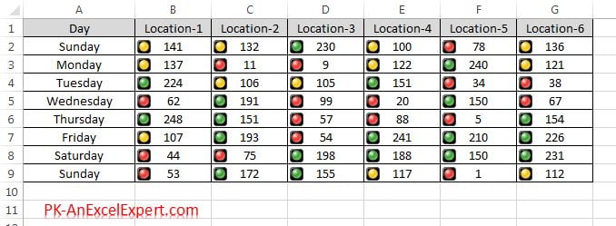
- Change each Type to Number and set the thresholds: green when the value is greater than or equal to 150, yellow when it is less than 150 and greater than or equal to 100, red when it is less than 100. Use the operator drop-downs to switch between >= and >. Thresholds must descend from the top row to the bottom row.

- Click OK. The traffic lights now follow your business thresholds rather than the data range.

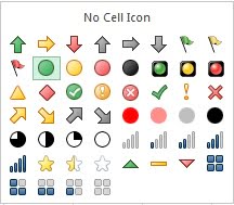
The same dialog offers Show Icon Only, Reverse Icon Order and a per-band icon picker, so you can mix a green tick with a red cross or set a band to No Cell Icon when only one condition deserves a mark. The icon library below has been the same since Excel 2010 and is unchanged in Microsoft 365.

Worked example: a target-driven scorecard
A sales lead keeps the monthly target in cell J1 (150) and wants three things: a 3-colour scale centred on the target, a data bar scaled from 0 to the best possible day (250), and a traffic light that turns green only at or above target. Sample data:
| Day | Location-1 | Location-2 | Location-3 |
|---|---|---|---|
| Monday | 192 | 148 | 176 |
| Tuesday | 165 | 92 | 131 |
| Wednesday | 184 | 171 | 203 |
- Select B2:D4, open New Rule, keep Format all cells based on their values, choose 3-Color Scale.
- Minimum: Type Number, value 50. Midpoint: Type Formula, value
=$J$1. Maximum: Type Number, value 250. Pick red, yellow, green. OK. - With the same range selected, add a second rule: Data Bar, Minimum Number 0, Maximum Number 250, Solid Fill, OK.
- Add a third rule: Icon Sets, 3 Traffic Lights, green when >= Formula
=$J$1, yellow when >= Number 100, red otherwise. OK.
Result: 92 is red with a short bar and a red light; 148 sits just below the target and shows amber with a yellow light; 203 is the greenest cell with the longest bar. Change J1 to 180 and the scale and the lights re-centre at once because the midpoint and the icon threshold both read the same locked cell, while the bars keep their 0 to 250 scale. Three rules of different kinds can coexist on one range because a colour scale sets the fill, a data bar draws over the fill, and an icon sits at the left edge.
Tips and common mistakes
- Set the minimum to Number 0 for quantities. Otherwise the smallest value gets an empty bar or the palest colour even if it is a healthy figure.
- Percent and Percentile are not the same. Percent measures position along the numeric span; Percentile measures position by rank. Use Percentile when one outlier flattens everything else.
- Lock formula limits with dollar signs.
=$J$1works;=J1shifts for every cell and breaks the scale. - Keep thresholds in descending order. Excel refuses an icon set whose second threshold is higher than the first.
- Use the fixed limits for dashboards. Lowest and Highest Value rescale every time data changes, so last month’s green can become this month’s yellow.
- Do not stack two colour scales. A second scale on the same cells simply overrides the first; edit the existing rule instead.
- Show Bar Only hides numbers, not values. Formulas, sorting and filtering still see the numbers.
Errors and how to fix them
| Problem | Cause | Fix |
|---|---|---|
| Message that the threshold order is invalid | Icon thresholds do not descend from top to bottom | Re-enter the values so each band is lower than the one above |
| Every cell has the same colour | Minimum and maximum are equal, or one outlier dominates | Widen the Number limits or switch the types to Percentile |
| Formula limit is rejected | Formula returns text, an error or a relative reference to a blank | Make the formula return a number and use absolute references |
| Bars all look full | Maximum set below the largest value | Raise the Number maximum or use Highest Value |
| Rule does nothing on some cells | Those cells hold text or numbers stored as text | Convert with Data > Text to Columns > Finish |
Practice exercise
Open the course practice file or use any table of numbers, then:
- Apply a 2-Color Scale with Number limits 20 and 200 and compare it with the ribbon preset on a copy of the table.
- Build a 3-Color Scale whose midpoint is a Formula pointing to a target cell, then change the target and watch the colours move.
- Add a Data Bar with Minimum 0 and Maximum 250, then tick Show Bar Only.
- Create an Icon Set with Number thresholds of 150 and 100, then change the middle band to No Cell Icon.
- Switch the 2-Color Scale limits to Percentile 10 and 90 and note how the extremes change.
Key takeaways
- Format all cells based on their values is the New Rule version of colour scales, data bars and icon sets, with control over every limit.
- Limits can be Lowest/Highest Value, Number, Percent, Percentile or Formula; only Number and Formula give stable dashboard limits.
- Formula limits need absolute references such as
=$J$1. - Data bars add Show Bar Only, fill and border colours, bar direction and a negative-value axis.
- Icon thresholds must descend, use >= or >, and can show No Cell Icon for bands that need no mark.
- A colour scale, a data bar and an icon set can all sit on the same range because they paint different parts of the cell.
Related lessons
- Conditional Formatting course hub
- Data Bars: gradient, solid, scale and negative bars
- Color Scales: heat map conditional formatting
- Icon Sets: traffic light conditional formatting
- Manage and Clear Rules
- Excel Dashboard course for scorecards built on fixed limits
- Microsoft Support: Use data bars, color scales, and icon sets to highlight data
Frequently asked questions
What is the difference between this rule and the ribbon presets?
The presets always scale between the lowest and highest values in the selection, so the colours shift whenever the data changes. Format all cells based on their values lets you fix the minimum, midpoint and maximum as numbers, percentiles or formulas, which keeps a dashboard stable from one month to the next and lets the limits mean something, such as a target.
Can I use a formula as the limit?
Yes. Set Type to Formula and enter, for example, =AVERAGE($B$2:$G$9) or a reference to a target cell such as =$J$1. The formula must return a number, and every reference should be absolute with dollar signs, because the rule is evaluated for each cell in the range.
Why does Excel say the threshold order is invalid?
Icon set thresholds must run from the highest band at the top of the dialog to the lowest at the bottom. If the middle band is set to a value higher than the top band, Excel refuses the rule. Re-enter the values so each band is smaller than the one above it, and check that Percent thresholds are between 0 and 100.
Should I use Percent or Percentile?
Use Percent when you want a position along the numeric span, for example the point halfway between the smallest and largest value. Use Percentile when you want a position by rank, so that 90 means the cell that beats 90 percent of the others. Percentile is the better choice when a single very large value would otherwise push every other cell into the pale end of the scale.
Can I combine a data bar and an icon set on the same cells?
Yes. Each is a separate rule, and because a data bar draws behind the number while the icon sits at the left edge, both show at once. A colour scale can be added too. Keep the rules in a sensible order in the Rules Manager and avoid ticking Stop If True, which would suppress the lower rules.
Want the finished version? Ready-made Excel KPI dashboards with fixed-limit scales, bars and traffic lights are available at NextGenTemplates.com.