Part of the free Module 7: Conditional Formatting · Lesson 5 of 15 · Full Excel course
Updated on 5 September 2026 · Works in Excel 365, 2021, 2019 and 2016 unless noted.
Icon sets in Excel are a conditional formatting rule that places a small symbol, such as a traffic light, arrow, flag or star, inside each cell according to its value. Excel splits the range into three, four or five bands and gives every band one icon. You find them under Home > Conditional Formatting > Icon Sets, and the Edit Rule dialog lets you set your own thresholds, hide the number or compare each cell with a target.
What icon sets do and when to use them
An icon set is the visual shorthand of a scorecard. Instead of reading 40 numbers, the eye picks out the red lights or the down arrows in a second. Each cell keeps its value; the icon is drawn on top by the rule and updates as soon as the value changes. That makes icon sets the standard tool for KPI status columns, RAG (red, amber, green) indicators, month-on-month trend arrows and star ratings in dashboards.
Use an icon set when the reader needs a category (good, warning, bad) rather than a magnitude. When the size of the number matters more, a data bar or a colour scale from the previous two lessons is the better choice. All three share the same rule type in the New Formatting Rule dialog, Format all cells based on their values, so the editing skills in this lesson carry over.
The four icon set groups
The gallery holds 20 built-in sets in four groups. The number in the set name is the number of bands the range is split into.
| Group | Sets in the gallery | Icons per set | Best for |
|---|---|---|---|
| Directional | 3 Arrows (Coloured), 3 Arrows (Grey), 3 Triangles, 4 Arrows (Coloured), 4 Arrows (Grey), 5 Arrows (Coloured), 5 Arrows (Grey) | 3, 3, 3, 4, 4, 5, 5 | Trends, variances, growth versus last period |
| Shapes | 3 Traffic Lights (Unrimmed), 3 Traffic Lights (Rimmed), 3 Signs, 4 Traffic Lights, Red To Black | 3, 3, 3, 4, 4 | Status and RAG indicators |
| Indicators | 3 Symbols (Circled), 3 Symbols (Uncircled), 3 Flags | 3, 3, 3 | Pass, warning and fail checks |
| Ratings | 3 Stars, 4 Ratings, 5 Quarters, 5 Ratings, 5 Boxes | 3, 4, 5, 5, 5 | Scores, satisfaction, completion |
Grey arrows are useful on printed reports and in colour-blind friendly layouts because direction alone carries the meaning. The signal-bar style 4 Ratings and 5 Ratings sets are the ones most people reach for when they want a “how full” indicator without a data bar.
Step by step: apply an icon set
The example uses a day-wise, location-wise sales table in B2:G9.
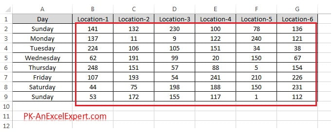
- Select the numeric range, here B2:G9. Leave out the header row and any total row, because text and large totals distort the bands.
- Go to Home > Conditional Formatting > Icon Sets. The gallery opens, grouped into Directional, Shapes, Indicators and Ratings. Hover over any set and the worksheet shows a live preview.
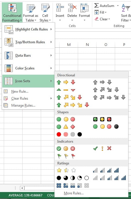
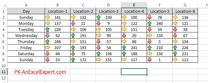
- Click 3 Arrows (Coloured) in the Directional group. Excel adds a green up arrow, a yellow sideways arrow or a red down arrow to every cell.
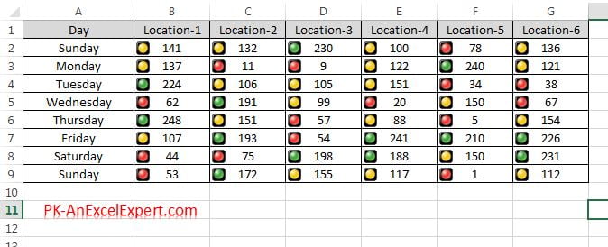
- To switch to a traffic light, keep the range selected and choose 3 Traffic Lights (Unrimmed) from the Shapes group. Picking a second set from the gallery replaces the first rule rather than stacking a new one on top, so you can try several sets without cleaning up afterwards.
How the default thresholds work
Every gallery set starts with Percent thresholds. A percent threshold is a position between the smallest and largest value in the range, not a share of the cell count. If the range runs from 100 to 200, the 67 percent point is 167 and the 33 percent point is 133. The defaults depend on how many icons the set has.
| Icons in the set | Default bands (Percent type) | Example on a 100 to 200 range |
|---|---|---|
| 3 | Top icon at or above 67, middle at or above 33, bottom below 33 | 167 and above; 133 to 166; below 133 |
| 4 | 75, 50, 25, then below 25 | 175; 150; 125; below 125 |
| 5 | 80, 60, 40, 20, then below 20 | 180; 160; 140; 120; below 120 |
Because the bands are relative, one very large or very small value stretches the whole scale and pushes almost everything else into the same band. That is the usual reason a table shows nothing but red lights. Also note that Percent and Percentile are different: Percentile ranks the values, so the top 33 percent of cells by count always get the top icon regardless of how far apart the numbers are.
Change the thresholds through Edit Rule
Real KPIs need fixed limits, so the first edit most people make is to replace the percentages with numbers.
- Select any cell in the formatted range and go to Home > Conditional Formatting > Manage Rules.
- Select the icon set rule and click Edit Rule. The Edit Formatting Rule dialog opens with Format all cells based on their values selected and Format Style set to Icon Sets.
- In the grid at the bottom, each row shows an icon, an operator, a Value box and a Type drop-down. Change Type to one of four options:
- Number: a fixed value, such as 150.
- Percent: the default, a position between the minimum and maximum.
- Percentile: a rank, so 90 means the top 10 percent of cells.
- Formula: an expression that returns a number, such as
=$I$1*0.9.
- Type the limits from the top row down, highest first. Excel rejects a lower band that is larger than the one above it.
- Choose the operator for each band. >= includes the limit in the higher band, so a value exactly on target gets the green light. > excludes it, so an exact match drops to the next icon. For targets, >= is almost always the one you want.
- Click OK twice.
The Value box accepts a cell reference. Click a cell and Excel inserts an absolute reference such as =$I$1. Icon set thresholds do not accept relative references: if you remove the dollar signs Excel shows a message that relative references cannot be used for colour scales, data bars and icon sets.
Show Icon Only, Reverse Icon Order and custom icons
Three more controls live in the same dialog.
- Show Icon Only hides the number and leaves the icon, which then follows the cell’s horizontal alignment. Use it for a dedicated status column that refers to the value with a formula such as
=D2, so the number still exists for calculations. - Reverse Icon Order flips the sequence so the top band receives the last icon. Use it when low is good, for example defect rates, costs or delivery days, so green appears on the smallest values without editing every row.
- Mixing icons: the drop-down beside each band lists every icon from every set. Pick a green tick for the top band, a yellow exclamation mark for the middle and a red flag for the bottom, and the Icon Style box changes to Custom Icon Set.
- No Cell Icon: the same drop-down offers No Cell Icon. Set the two lower bands to No Cell Icon and only the cells that meet the top condition show a symbol, which is the cleanest way to flag “above target” and nothing else.
Custom icon sets and Show Icon Only need Excel 2010 or later. A workbook opened in Excel 2007 falls back to the nearest built-in set, and the old .xls format cannot store icon sets at all.
Icon sets against a target cell with the Formula type
Suppose the monthly target sits in cell I1 and you want green at or above target, yellow from 90 percent of target and red below that. Edit the rule on B2:G9 and set:
- Top band: >=, Value
=$I$1, Type Formula. - Middle band: >=, Value
=$I$1*0.9, Type Formula. - Bottom band: everything else.
The formula is evaluated once for the rule and then applied to every cell in the Applies to range, so it must point at one fixed cell. $I$1 locks both the column and the row, which is why the dollar signs are compulsory here. Change the number in I1 and every icon in the table updates immediately. Excel treats the formula result as the numeric limit for that band; a formula that returns text or an error leaves the band empty and the icons disappear.
When you type in the Value box, the arrow keys insert cell references instead of moving the cursor. Press F2 first to switch to edit mode, then use the arrows to correct the formula.
A per-row target (a different target in column C for each KPI) cannot be referenced directly, because a relative reference such as $C2 is not allowed in icon set criteria. The fix is a helper column that divides actual by target, then an icon set on that column with Number thresholds. The worked example shows exactly that.
Worked example: KPI status column against targets
A monthly scorecard lists five KPIs with an actual and a target. The manager wants a traffic light that turns green at 100 percent of target, yellow at 90 percent and red below that.
| A: KPI | B: Actual | C: Target | D: Achieved | E: Status |
|---|---|---|---|---|
| Revenue | 1,240,000 | 1,200,000 | 103% | Green |
| Gross margin | 38% | 40% | 95% | Yellow |
| New customers | 410 | 500 | 82% | Red |
| On-time delivery | 96% | 95% | 101% | Green |
| Tickets closed | 1,150 | 1,300 | 88% | Red |
- In D2 enter
=B2/C2, format as a percentage and fill down to D6. This turns every KPI into the same 0 to 1 scale regardless of its unit. - In E2 enter
=D2and fill down. Column E will carry the icon; column D keeps the readable percentage. - Select E2:E6 and choose Home > Conditional Formatting > Icon Sets > 3 Traffic Lights (Unrimmed).
- Open Manage Rules > Edit Rule. Set the top band to >= 1 with Type Number, the middle band to >= 0.9 with Type Number, tick Show Icon Only, and click OK twice.
- Centre-align column E so the icons sit in the middle of the cell.
Result: Revenue and On-time delivery show green, Gross margin shows yellow, New customers and Tickets closed show red. Because the limits are fixed numbers, adding a KPI with a huge value does not shift anyone else’s colour, which is the main advantage over the default Percent bands. To let the manager tune the amber threshold, put 0.9 in cell H1 and change the middle band to Type Formula with =$H$1.
Tips and common mistakes
- Select only numbers. A header row or a grand total inside the range stretches the Percent scale and pushes every ordinary cell into the same band.
- Switch to Number thresholds for KPIs. Percent bands move whenever the data changes; a status light should not turn red because someone else had a good month.
- Icons sit at the left edge. Widen the column and right-align the numbers so icon and value never overlap. With Show Icon Only, centre-align the cell.
- Text and errors get no icon. Numbers stored as text, blanks and #N/A cells are skipped silently; convert text to numbers before you blame the rule.
- Keep thresholds in descending order. Excel refuses a middle limit above the top limit and the dialog will not close until you fix it.
- Use Reverse Icon Order, not swapped limits, when low is good. It keeps the limits readable for the next person who edits the rule.
- Do not apply icon sets to whole columns. A rule on a million cells slows every recalculation; apply it to the summary range you actually read.
Errors and how to fix them
| Symptom | Cause | Fix |
|---|---|---|
| Every cell shows the same icon | A text header, a total or an outlier inside the range stretches the Percent bands | Reselect only the data cells, or change Type to Number |
| Some cells have no icon | Numbers stored as text, blanks or error values | Convert with Data > Text to Columns or VALUE; wrap errors in IFERROR |
| Message that relative references cannot be used | A Formula threshold such as =C2 without dollar signs |
Use =$C$2, or move the comparison into a helper column |
| Value exactly on target shows yellow | Operator set to > instead of >= | Change the top band’s operator to >= |
| Cell shows #### instead of icon and number | Column too narrow for both | Widen the column or tick Show Icon Only |
| Icons vanish after saving | Workbook saved as .xls or opened in Excel 2007 with custom icons | Save as .xlsx and use a built-in set for older readers |
| Icons missing where another rule applies | An earlier rule in the manager has Stop If True ticked | Untick Stop If True or move the icon rule up |
Practice exercise
Open the course practice file or use any table of numbers, then:
- Apply 3 Traffic Lights (Unrimmed) to the sales range B2:G9 and note which cells are green with the default 67 and 33 percent bands.
- Edit the rule so green starts at 180 and yellow at 150 using Type Number and the >= operator. Count how many cells changed colour.
- Type 175 in cell I1 and change both thresholds to Type Formula:
=$I$1and=$I$1*0.9. Change I1 to 190 and watch the icons move. - Replace the icons with a green tick, a yellow exclamation mark and No Cell Icon for the bottom band, so only good and warning cells are marked.
- Add a column of delivery days, apply 3 Arrows (Coloured) and use Reverse Icon Order so the fastest deliveries are green.
Key takeaways
- Icon sets split a range into 3, 4 or 5 bands and draw one icon per band; the gallery offers 20 sets in the Directional, Shapes, Indicators and Ratings groups.
- Default thresholds are Percent positions between the minimum and maximum: 67/33 for three icons, 75/50/25 for four, 80/60/40/20 for five.
- Edit Rule lets you switch each band to Number, Percentile or Formula and choose >= or > for each limit.
- Show Icon Only builds a clean status column, Reverse Icon Order handles low-is-good metrics, and the icon drop-downs let you mix icons or use No Cell Icon.
- Formula thresholds must use absolute references such as
=$I$1; for a per-row target, divide actual by target in a helper column and apply Number thresholds.
Related lessons
- Conditional Formatting course hub
- Data Bars in Excel: gradient, solid, scale and negative bars
- Colour Scales in Excel: heat maps and midpoints
- New Rule: Format all cells based on their values
- Manage and Clear Rules
- Excel Dashboard course for building full KPI scorecards
- Microsoft Support: Use data bars, colour scales and icon sets to highlight data
Frequently asked questions
How do I set my own thresholds for the traffic lights?
Select the range, open Home > Conditional Formatting > Manage Rules, select the icon set rule and click Edit Rule. Change the Type of each band from Percent to Number, enter the limits from the top down (for example 150 for green and 100 for yellow) and choose >= so a value exactly on the limit gets the higher icon. Click OK twice.
Can I show only the icon and hide the number?
Yes. In the Edit Formatting Rule dialog tick Show Icon Only. The value stays in the cell for formulas and sorting, and the icon follows the cell’s horizontal alignment, so centre-align the column. For a separate status column, put =D2 in the new column and apply the icon set there.
Why do all my cells show the same icon?
The default bands are percentages of the gap between the smallest and largest value. A header, a grand total or a single outlier in the selection stretches that gap so nearly every ordinary value lands in one band. Reselect only the data cells, or switch the thresholds to Type Number so they no longer depend on the data.
Can an icon set compare each cell with a target in another cell?
Yes, with Type Formula and an absolute reference such as =$I$1 for the top band and =$I$1*0.9 for the middle band. The reference must be locked with dollar signs because icon set criteria do not accept relative references. For a different target on every row, calculate actual divided by target in a helper column and apply the icon set with Number thresholds of 1 and 0.9.
Can I mix icons from different icon sets in one rule?
Yes, in Excel 2010 and later. In the Edit Formatting Rule dialog, open the icon drop-down beside each band and pick any icon from any set, or No Cell Icon to leave a band blank. The Icon Style box then reads Custom Icon Set. Excel 2007 cannot display custom sets and shows the nearest built-in set instead.
Want the finished version? Ready-made Excel KPI dashboards with traffic light status columns built in are available at NextGenTemplates.com.