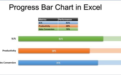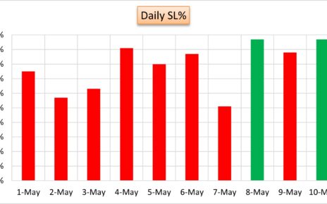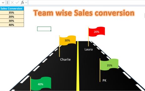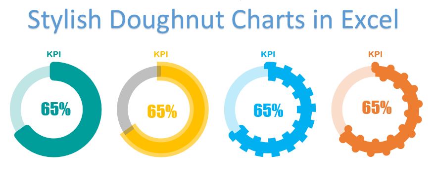
In this article you will learn how to create 4 stylish doughnut charts in Excel. These doughnut charts are used to display the KPI metrics or progress of a project. Stylish Doughnuts can be used to in business dashboard or business presentation.
Stylish Doughnut Charts in Excel
Doughnut Chart-1:
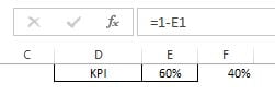
- Let’s say we have a KPI metric on cell D1 and its performance value on cells E1. Here we will take a support column on cell F1.
- Put formula “=1-E1” on cell F1.
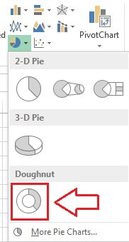
- Select the range D1:F1.
- Go to Insert tab>>Charts>>Insert a doughnut chart.
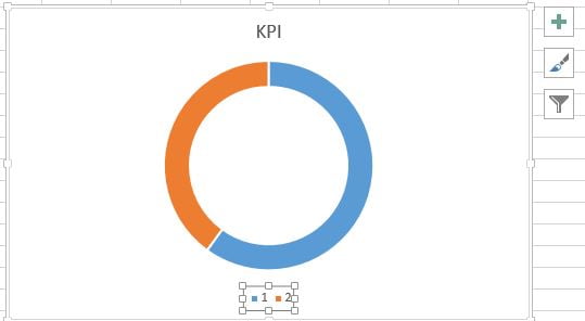
- After inserting the chart successfully, select the legend and press delete.
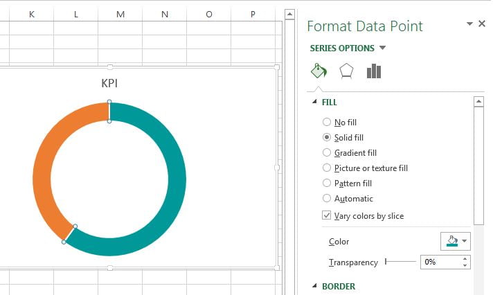
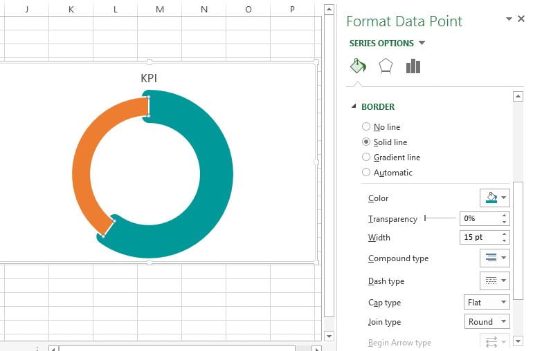
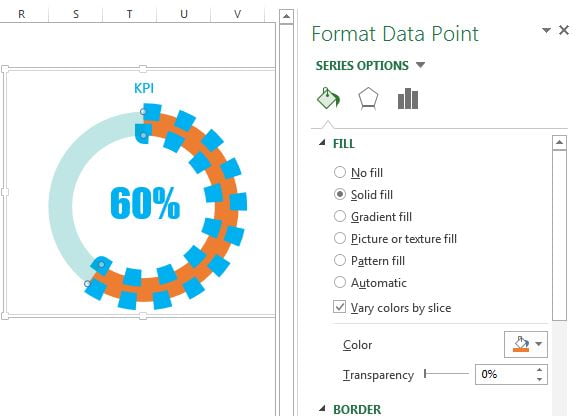
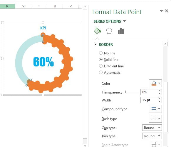
- Now select the blue slice (double click on it)
- Go to the Format Data Points window and fill the Dark Teal color or any other dark color.
- Go to the Border in Format Data Points window.
- Select the Solid line.
- Select the Dark Teal color or the same color was take for Fill.
- Keep the Width as 15pt.
- Select Join Type as Round.
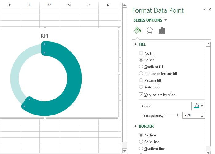
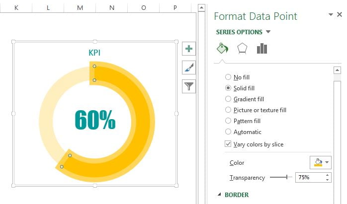
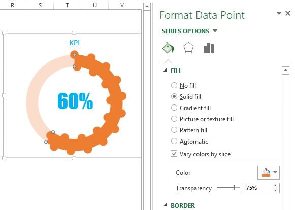
- Now select the orange slice (double click on orange slice)
- Select the Solid fill available under Fill.
- Take the Dark Teal color or the same color which was taken for first slice.
- Keep Transparency as 75%.
- Select No line in Border.
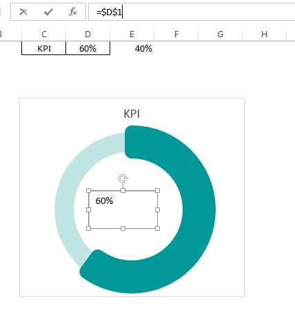
- Insert a Text box from the Insert Tab.
- Drag the Text box in the middle of the chart.
- Select the Text box and go to formula bar and type “=$D$1“
- Text box will be linked with cell D1.
Format the Text box-
- Choose text alignment Center.
- Choose font name “Impact“
- Choose font size 35.
- Choose font color Dark Teal.
- Choose chart title’s font color as Dark Teal.
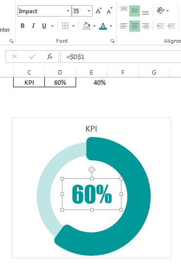
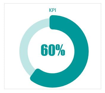
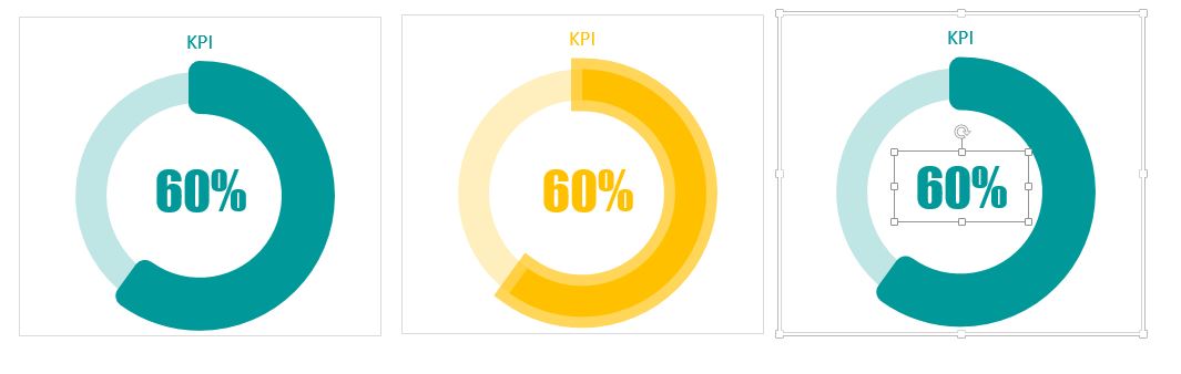
- Our first chart is ready and it will look like below given image.
Doughnut Chart-2:
- To create the 2nd doughnut chart make a copy of first doughnut chart.

- Double click on the big slice (Teal slice) so that it will be selected.
- Go to the Format Data points window and fill the Orange color.
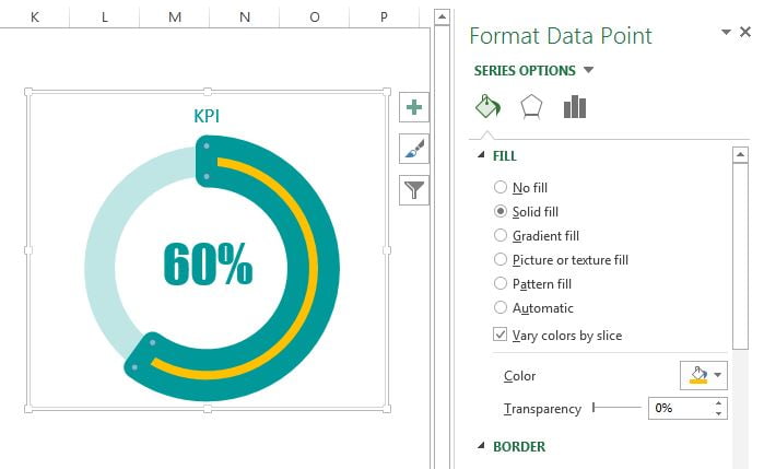
- Go to the Border in Format Data Points window.
- Select the Solid line.
- Select the Orange color.
- Keep Transparency 35%.
- Keep the Width as 15pt.
- Select Join Type as Miter.
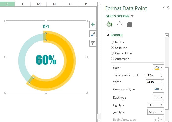
- Now select the Transparent slice and fill the orange color.
- Make sure Transparency should be 75%.
- Change the font color of text box and chart title as orange.
Our 2nd doughnut chart is also ready.
Doughnut Chart-3:
To creating the 3rd doughnut chart make a copy of first doughnut chart.
- Double click on the big slice (Teal slice) so that it will be selected.
- Go to the Format Data points window and fill the light blue color.
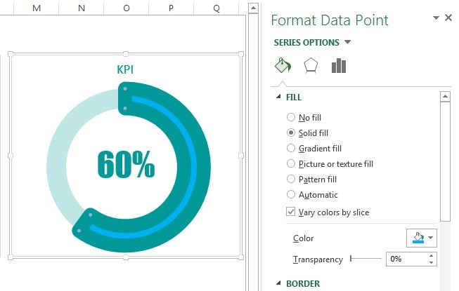
- Go to the Border in Format Data Points window.
- Select the Solid line.
- Select the Light Blue color.
- Keep the Width as 15pt.
- Select Dash type as Round Dot (Second one).
- Change the font color of text box and chart title as light blue.
Our third doughnut chart is also ready and will look like below image.
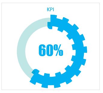
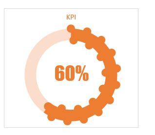
Doughnut Chart-4:
To create the 4th doughnut chart make a copy of 3rd doughnut chart.

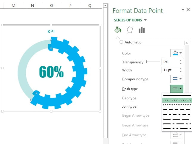
- Double click on the big slice (light blue slice) so that it will be selected.
- Go to the Format Data points window and fill the Orange, Accent 2 color.
- Go to the Border in Format Data Points window.
- Select the Solid line.
- Select the Orange, Accent 2 color.
- Keep the Width as 15pt.
- Select Cap type as Round.
- Now select the Transparent slice and fill the Orange, Accent 2 color.
- Make sure Transparency should be 75%.
- Change the font color of text box and chart title as Orange, Accent 2 color.
Our 4th doughnut chart is also ready and will look like below image.
Click to buy Stylish Doughnut Charts in Excel
Visit our YouTube channel to learn step-by-step video tutorials
Watch the video tutorial of this chart.
Click to buy Stylish Doughnut Charts in Excel