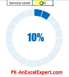
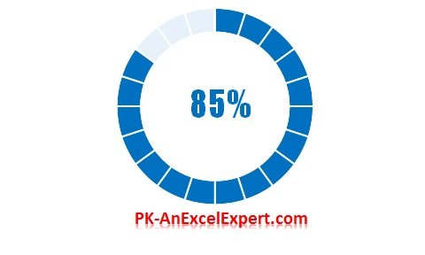
As businesses continue to grow and evolve, they rely on Key Performance Indicators (KPIs) to measure their progress towards achieving specific goals. KPIs are quantifiable measurements used to evaluate the success or failure of a business objective. It’s important to display these metrics in an easily understandable visual format for stakeholders to make informed decisions. The Progress Circle Chart in Excel is a visually appealing way to display KPIs, such as Service Level, and make it easier to understand and analyze.
Creating a Progress Circle Chart in Excel
To create a Progress Circle Chart, follow these steps:
Inserting the chart
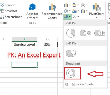
- Insert a blank Doughnut chart from Insert>>Charts>>Doughnut Chart
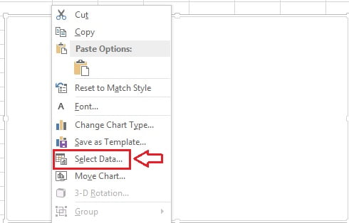
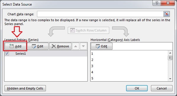
- Right click on the chart and click on Select Data…
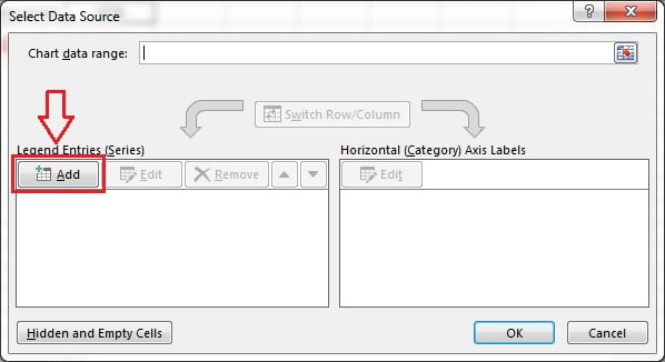
- Click on Add button to add a new series.
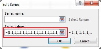
- Keep Series Name blank.
- In Series Values box put 20 times 1 like – {1,1,1,1,1,1,1,1,1,1,1,1,1,1,1,1,1,1,1,1}
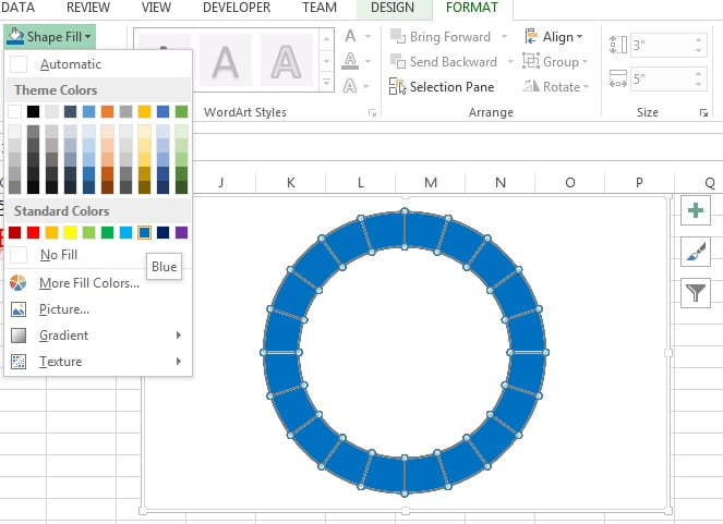
- Once Doughnut Chart is ready, remove the chart elements like Chart Title and Legend.

Formatting the chart
- Click on doughnut and go to Format Tab>>Shape Fill>fill blue color
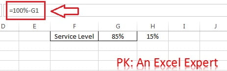
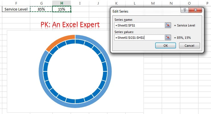
- Put the formula on Range H1 “=100%-G1” (Note : Service Level value is on Range G1)
- Right click on doughnut and click on Select Data…
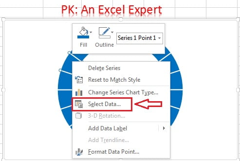
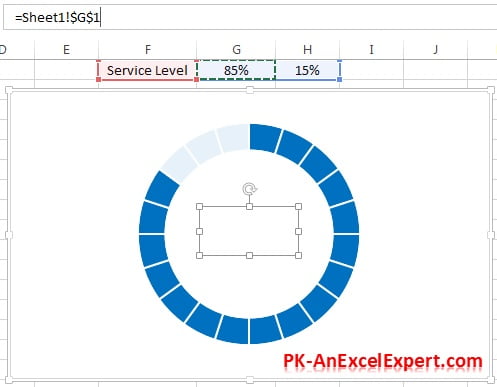
- Click on Add button to add a new series.
- Select range F1 in Series Name box.
- Select range G1:H1 in Series Values option.
- Outside of first doughnut one more doughnut will be created.
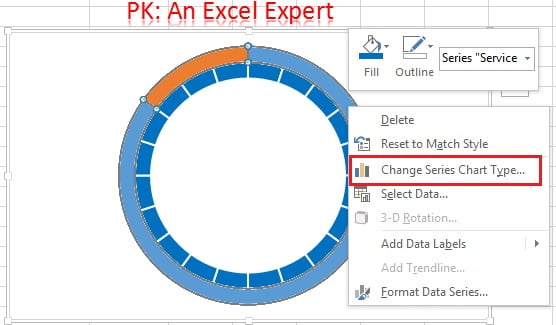
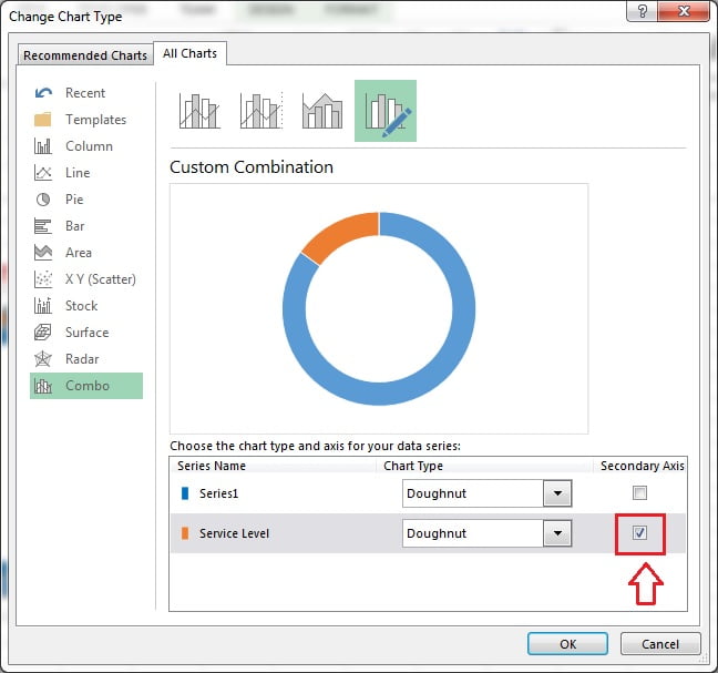
- Right click on outside doughnut and click on Change Series Chart Type…
- Check the Secondary Axis option for Service Level Series.
- Now Service Level Doughnut will be above of first doughnut.
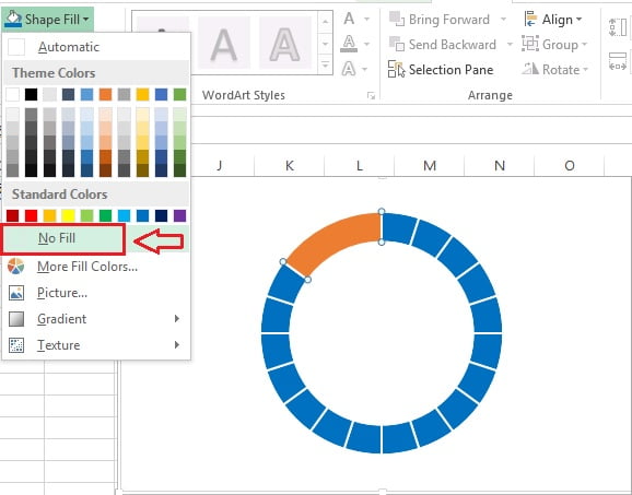
- Select blue slice by double clicking on it
- Go to Format Tab>>Shape Fill>>Fill as No fill
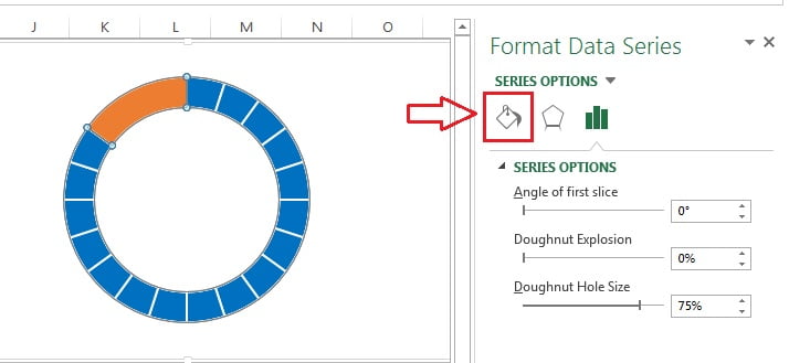
- Double click on orange slice
- Format Data Series window will be opened
- Click on Fill and Line option
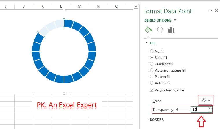
- Select the Solid fill.
- Fill the White Color
- Change the Transparency 10%
Adding the Text in the chart
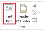
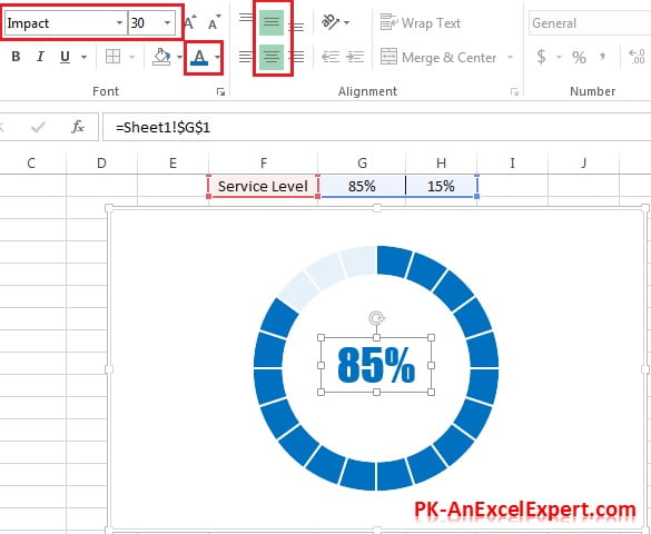
- Go to Insert Tab and insert a text box over the Chart
- Connect the Text box with Service level value
- Select Text Box and go to formula bar and press “=”
- Click on Range G1
Once Text Box is connected with service level value, format the text box
- Select the text box and go to Home Tab
- Take the vertical alignment middle
- Take the horizontal alignment center
- Take font name “Impact“
- Take font size 30
- Take font color blue (Same color which take for first doughnut color)
Changing the Service Level Value
We have created the Progress Circle Chart successfully. We can easily change the service level value and see the progress of the KPI metric. To do this, we can simply change the value in cell G1, and the chart will automatically show the new SL value.
Customizing the Chart
The Progress Circle Chart can be customized in many ways to fit your specific needs. Below are few tips to customize this chart-
Change the colors:
You can change the color of the doughnut and the text box to match your company’s branding or to make the chart easier to read.
Add labels:
You can add labels to the doughnut to show what each section represents, such as “Achieved” and “Remaining”.
Change the font:
You can change the font of the text box to match your company’s branding or to make the text easier to read.
Change the size:
You can change the size of the chart to fit your needs. To do this, simply click on the chart and drag the edges to make it larger or smaller.
Advantages of Progress Circle chart in Excel-
The Progress Circle Chart in Excel is a powerful and effective visual. We can use this to visualize KPI metrics like- service level. Below are few advantages of using the Progress Circle Chart:
Provides a Clear Picture of Performance:
The Progress Circle Chart provides a clear visual representation of the performance of a KPI metric. The chart clearly shows how much progress has been made towards achieving the goal.
Easy to Understand:
It is very easy to understand and can be quickly and easily interpreted by anyone who views it. The chart does not require any type of training or special knowledge to use.
Eye-Catching Design:
The circular design of the chart is eye-catching and attractive. The design makes it a great chart type for presenting KPI metrics in a visually appealing way.
Customizable:
The Progress Circle Chart is highly customizable, allowing users to adjust the chart to fit their specific needs. Users can change the colors, font, and size of the chart, as well as add labels and other visual elements to make the chart more informative and useful.
Conclusion
The Progress Circle Chart is a beautiful and effective way to display KPI metric performance like – service level. By following the simple steps given above, you can create your own Progress Circle Chart in Excel. It is very easy to customize it accordingly to fit your specific needs. This chart is a great tool for managers and executives who need to track the progress of their KPI metrics and communicate that progress to others.
Visit our YouTube channel to learn step-by-step video tutorials
Video Tutorial for Progress Circle Chart: