Process Dashboard in Excel: Dynamic KPI Cards, Sparklines and Charts

Part of the free Module 11: Excel Dashboards · Lesson 4 of 10 · Full Excel course

Updated on 5 September 2026 · Works in Excel 365, 2021, 2019 and 2016 unless noted.

A process dashboard in Excel summarises the health of one process or team on a single interactive page. This Process Dashboard tracks six KPIs (calls, sales, revenue, conversion, average handle time and revenue per sale) in cards with column sparklines, then lets the reader pick a metric from a drop-down and switch the monthly chart between line and column with two option buttons. It uses formulas, Form Controls and charts only, with no VBA and no pictures.

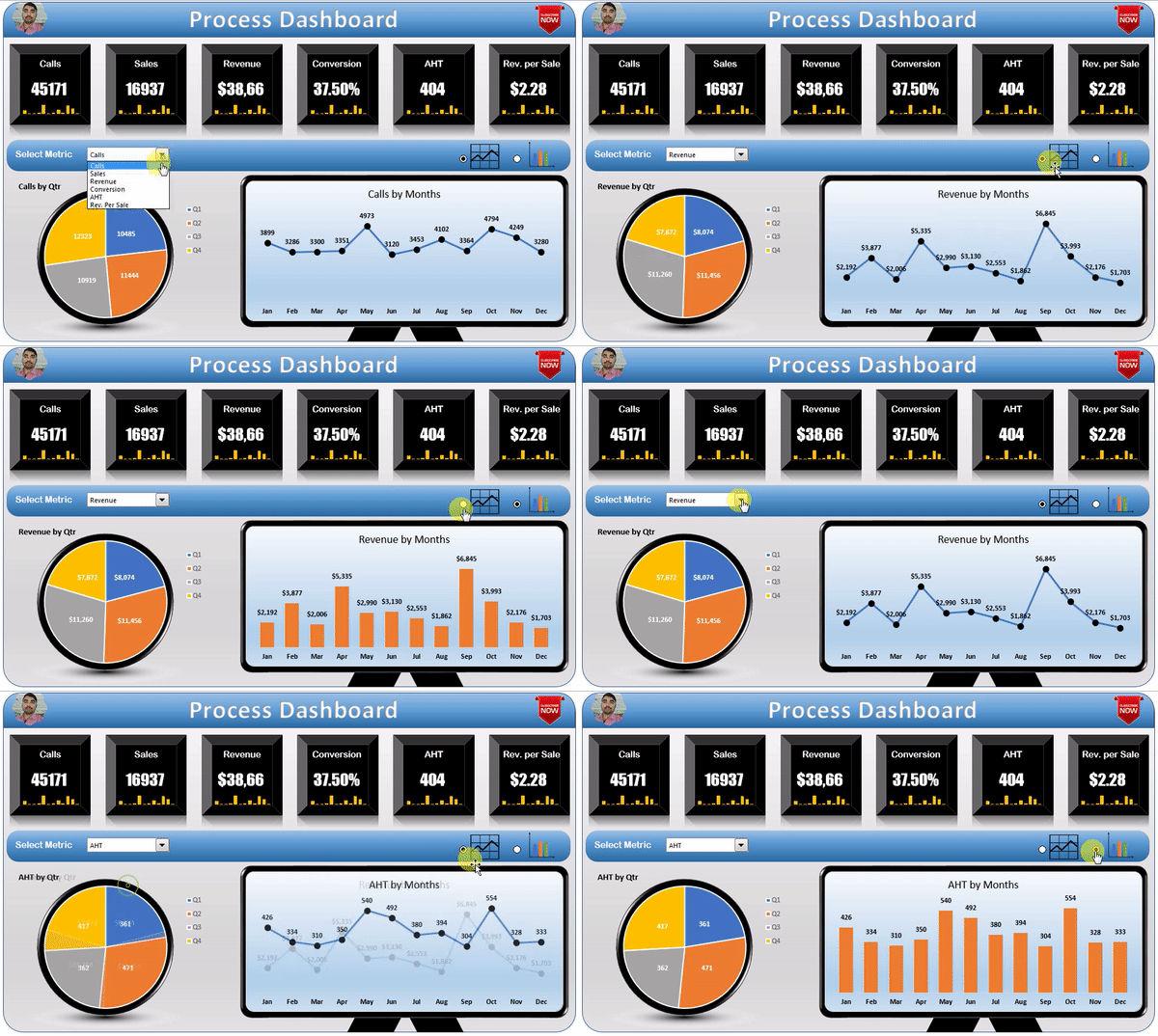
Animated preview of the Process Dashboard in Excel switching metrics and chart types
Process Dashboard in Excel

What the Process Dashboard shows

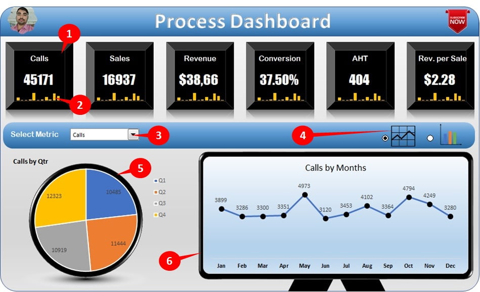
Six KPI cards across the top show the yearly value of each metric with a twelve-month column sparkline inside the card. Below them, the reader picks one metric from a drop-down and sees its quarterly split in a pie chart and its monthly trend in a chart styled as a monitor screen. Two option buttons switch the monthly chart between line and column. The six functional elements are:

  1. Cards: shapes linked to cells for Calls, Sales, Revenue, Conversion, AHT and Revenue per Sale.
  2. Sparklines: column sparklines of the last twelve months inside each card.
  3. Metric drop-down: a Form Control combo box listing the six metrics.
  4. Chart type option buttons: two Form Control option buttons with line and column icons.
  5. Quarterly performance: a pie chart of the selected metric by quarter.
  6. Monthly performance: the selected metric by month as a line or column chart.
Process Dashboard in Excel with cards, sparklines, drop-down, option buttons and charts numbered
Key functionality of the Process Dashboard

The workbook structure

Two sheets do all the work. The Data sheet holds a month-by-metric table and the calculation block; the Dashboard sheet holds the visuals. Because there is no PivotTable, the dashboard recalculates the instant a control changes, which makes it a good model for small data sets that are updated by hand each month.

Element Technique Formula or feature
Derived metrics Calculated columns on Data Conversion =C2/B2, AHT =E2/B2, Revenue per Sale =D2/C2
Yearly card value SUM or ratio of the year =SUM(B2:B13); ratios recomputed from totals, not averaged
Card text Shape linked to a cell Select shape, type =Data!B15 in the formula bar
Sparklines Insert > Sparklines > Column Data range = the metric’s twelve monthly cells
Metric drop-down Form Control combo box Input range = metric names, cell link = Data!$J$1
Chart-feed row INDEX on the combo box link =INDEX(Data!$B$2:$G$13, ROWS($A$1:A1), Data!$J$1)
Quarterly split SUM over three months each =SUM(K2:K4) for Q1, and so on
Line or column switch Option buttons + two feed rows =IF(Data!$J$2=1, K2, NA()) and =IF(Data!$J$2=2, K2, NA())
Monthly chart Combo chart: one line series, one column series The series holding NA() is not drawn

How it is built

Data sheet and derived metrics

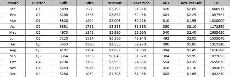
The Data sheet holds twelve rows, one per month, with the four input columns Calls, Sales, Revenue and Handle Time. Conversion, AHT and Revenue per Sale are formula columns beside them. A totals row underneath computes the yearly figures the cards show. For ratios the totals row divides total by total (=SUM(C2:C13)/SUM(B2:B13)) rather than averaging the monthly ratios, which would give every month equal weight.

Raw data table for the Process Dashboard with month-wise metrics and derived columns
Raw data for the Process Dashboard

Cards and sparklines

  1. Draw a rounded rectangle for each KPI, select it and type =Data!B15 in the formula bar so the shape displays the yearly total.
  2. Select the cells beneath the number inside the card area and choose Insert > Sparklines > Column, data range = that metric’s twelve monthly cells.
  3. Set the sparkline colour to match the card and, under Sparkline > Axis, keep Automatic for each sparkline so each metric uses its own scale.

Metric drop-down and chart-feed block

The combo box (Developer > Insert > Form Controls > Combo Box) lists the six metric headers and writes the chosen position, 1 to 6, to a linked cell. A twelve-row chart-feed column uses INDEX to pull that metric’s monthly values. Four SUM cells add the feed into quarters for the pie chart. Because the feed is a single column, the pie and monthly charts never need their source changed.

Switching between line and column

The two option buttons write 1 or 2 to a second linked cell. Two more feed columns test that cell: the line column returns the value when it is 1 and NA() otherwise; the column feed does the reverse. The monthly chart is a combo chart with the first column as a line series and the second as a clustered column series. Excel does not plot #N/A points, so only the selected type appears, and the chart looks as if it has changed type.

Worked example

Month Calls Sales Revenue Handle Time (sec) Conversion AHT Rev per Sale
Jan 1,000 120 60,000 290,000 12.0% 290 500
Feb 900 126 69,300 252,000 14.0% 280 550
Mar 1,100 121 54,450 330,000 11.0% 300 450

Choose Conversion in the drop-down: the linked cell becomes 5, INDEX returns 12.0%, 14.0% and 11.0% for the first quarter, and the Q1 slice of the pie is their sum used as a share of the year. Click the line option button: the line feed column shows the three values, the column feed shows #N/A, and the monthly chart draws a line only. Click column and the two feeds swap.

How to use it with your own data

  1. Open the Data sheet and overwrite the month labels and the Calls, Sales, Revenue and Handle Time columns with your figures; the derived metrics recalculate.
  2. Check the combo box input range if you rename a metric, so the drop-down shows the new name.
  3. Adjust the sparkline axis (Sparkline > Axis) if a metric has a very different scale.
  4. Change the card colours and title to match your branding.
  5. Save as .xlsx; the file contains no macros.

Get the finished file

The finished Process Dashboard workbook is available as a ready-to-use template: Get the Process Dashboard in Excel. The seven videos below build it from scratch.

Watch the video


Visit our YouTube channel for more step-by-step dashboard tutorials.

Tips and common mistakes

  • Use NA(), not zero, in the hidden chart-feed column so the unused chart type disappears instead of drawing a flat line at zero.
  • Link the combo box to a cell on the Data sheet and reference that cell everywhere; never hard-code the metric index.
  • Format the feed columns with the metric’s number format (percent for conversion, seconds for AHT) so data labels display correctly.
  • Ratios in the totals row must be total divided by total, not AVERAGE of the monthly ratio column.
  • Align cards to the grid (hold Alt while dragging) so sparkline cells sit exactly inside the shapes.
  • Test every metric and both chart types after pasting data; a #DIV/0! in one month breaks the whole feed.

Errors and how to fix them

Symptom Cause Fix
Monthly chart shows both line and columns Feed formulas return 0 instead of NA() Use NA() in the FALSE branch of the IF
Chart-feed shows #REF! Combo box link is empty or above the range Pick an item in the combo box; check the cell link
Card shows a raw decimal such as 0.12 Shape inherits General format Format the linked cell as percent; the shape follows it, or use TEXT()
Pie shows one slice Quarterly SUMs point at the wrong rows Check each quarter sums three consecutive months

Practice exercise

  1. Add a seventh metric, Quality Score, to the Data sheet and extend the combo box input range and INDEX range to include it.
  2. Add a third option button that shows the monthly chart as an area chart.
  3. Replace the quarterly pie chart with a doughnut chart and put the yearly total in the centre using a linked text box.
  4. Add conditional formatting to the card cells so Conversion turns red when below 10 percent.

Key takeaways

  • A month-by-metric table plus a totals row is enough back-end for a one-page KPI dashboard.
  • INDEX on a combo box link builds a chart-feed column that any number of charts can share.
  • The NA() trick lets one combo chart switch between line and column with option buttons.
  • Sparklines inside linked shapes give each card a trend without a separate chart.
  • Compute yearly ratios from totals, never from averaging monthly ratios.

Related lessons

Frequently asked questions

How does the chart change from line to column?

The chart is a combo chart with a line series and a column series. Option buttons set a cell to 1 or 2, and IF formulas fill one series while the other returns NA(). Excel skips #N/A points, so only one type is drawn at a time.

Can I add a seventh metric?

Yes. Add the column to the Data table, extend the combo box input range and the INDEX range in the chart-feed column, and add a seventh card with its own sparkline.

Why not use a PivotTable for this dashboard?

The data is already one row per month with no filtering needed, so plain formulas are simpler and recalculate instantly. If your data arrives as transactions, summarise it with a PivotTable or SUMIFS into the same month-by-metric layout and the dashboard works unchanged.

Which Excel versions support this dashboard?

Excel 2010 and later, including Microsoft 365 on Windows and Mac. Sparklines and Form Controls have been available since Excel 2010. Form Controls do not respond in Excel for the web.

Can I use a Data Validation drop-down instead of the combo box?

Yes. Create a list drop-down with the metric names and replace the combo box link with =MATCH(cell, Data!B1:G1, 0). This also makes the dashboard usable in Excel for the web.

Want the finished version? Ready-made Excel dashboards, trackers and VBA systems are available at NextGenTemplates.com.