Quick Dashboard in Excel: Waffle Charts and Form Controls, Free File

Part of the free Module 11: Excel Dashboards · Lesson 1 of 10 · Full Excel course

Updated on 5 September 2026 · Works in Excel 365, 2021, 2019 and 2016 unless noted.

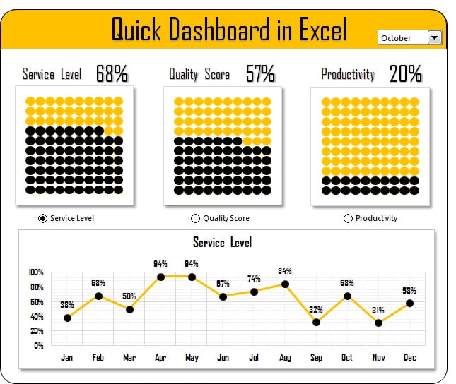
A quick dashboard in Excel is a one-page report built from a small table, a few formulas and one or two Form Controls. This free Quick Dashboard shows monthly Service Level, Quality Score and Productivity in three waffle charts driven by a combo box, plus a twelve-month line chart switched by option buttons. No VBA, no pivot tables, and you can rebuild it in under an hour.

Quick Dashboard in Excel with three waffle charts, a combo box and an option-button line chart

What the Quick Dashboard shows

The dashboard is designed for a small data set: one value per month for three percentage KPIs. Pick a month in the combo box and the three waffle charts fill to that month’s Service Level, Quality Score and Productivity. Below them, the line chart plots the twelve-month trend of whichever metric is selected with the option buttons. It is a good first project because every technique in it (INDEX, conditional formatting, linked cells, a chart-feed range) reappears in the larger dashboards later in this course.

The workbook structure

The file has two working areas. The Data sheet holds the month-on-month table, and the Dashboard sheet holds the controls, the waffle grids, a small calculation block and the chart. Keeping the calculation block on the dashboard sheet (hidden columns to the right) is acceptable for a file this small; the bigger projects in this course move it to a separate sheet.

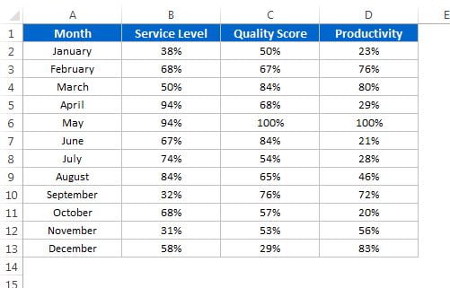
Quick Dashboard data table with month, service level, quality score and productivity columns
Month-on-month data table that feeds the Quick Dashboard
Element Technique Formula or feature
Month selector Form Control combo box Input range = month list, cell link = a helper cell holding 1 to 12
Selected KPI value Lookup by position =INDEX(Data!C2:C13, $B$2) where B2 is the combo box link
Waffle chart 10 x 10 grid + conditional formatting Rule: cell value <= selected KPI, fill colour
Number on the waffle Linked text box Select the text box, type =$F$2 in the formula bar
Metric switch Three option buttons One shared cell link holding 1, 2 or 3
Trend chart feed Row of INDEX formulas =INDEX(Data!$B$2:$D$13, ROW()-1, $B$4) or CHOOSE on the option value
Trend chart Line chart with markers Fixed axis bounds so metrics do not rescale

How the waffle charts are built

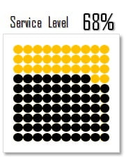
Each waffle is a block of 100 square cells. The bottom-left cell holds 1 percent and the values rise left to right and bottom to top until the top-right cell holds 100 percent. A conditional formatting rule colours a cell when its value is less than or equal to the selected KPI, so a score of 78 percent lights 78 squares. Text in the grid is set to the same colour as the fill so the numbers are invisible.

  1. Select a 10 by 10 block, set the column width and row height to the same pixel size so the cells are square.
  2. Type =ROW(A1)/100 style formulas or fill the values 0.01 to 1.00 in order from bottom-left to top-right and format them as percentages.
  3. Put the selected KPI in a cell beside the grid, for example =INDEX(Data!C2:C13, $B$2), where B2 is the combo box cell link.
  4. Select the grid and go to Home > Conditional Formatting > New Rule > Use a formula. Enter =A10<=$F$2 (top-left cell of the selection, KPI cell absolute) and choose a fill colour.
  5. Add a thin white border to every cell so the squares read as tiles, then draw a text box, click in the formula bar, type =$F$2 and press Enter to show the percentage over the grid.
Waffle chart in Excel built from a 10 by 10 grid with conditional formatting
One waffle chart: 100 cells and a single conditional formatting rule

How the line chart switches metric

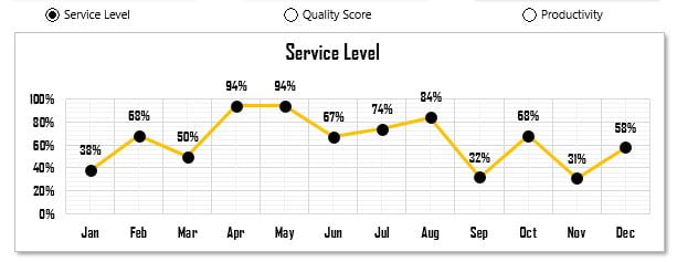
The three option buttons come from Developer > Insert > Form Controls. Because they are drawn on the same sheet they automatically form one group and share one cell link, which holds 1, 2 or 3. A chart-feed range of twelve cells pulls the chosen metric with =INDEX(Data!$B$2:$D$13, ROWS($A$1:A1), $B$4), where B4 is the option button link. The line chart plots that feed range, so it redraws the moment a button is clicked. The chart title is a linked cell too: =INDEX(Data!$B$1:$D$1, $B$4) & " trend".

Line chart in the Quick Dashboard controlled by three option buttons
Twelve-month trend chart switched by option buttons

Worked example

Suppose the Data sheet holds these three rows for the first quarter (the sample file has twelve).

Month Service Level Quality Score Productivity
Jan 82% 91% 76%
Feb 85% 89% 80%
Mar 78% 93% 84%

Choose Mar in the combo box: the cell link becomes 3, =INDEX(Data!B2:B13, 3) returns 78%, and the Service Level waffle colours 78 of its 100 squares. Click the Productivity option button: the link becomes 3, the feed range returns 76%, 80%, 84% for the first three months and the line chart redraws with the title “Productivity trend”.

How to use it with your own data

  1. Download the file below and open the Data sheet.
  2. Overwrite the month labels and the three metric columns with your percentages (values between 0 and 1).
  3. Rename the metric headers; the option button captions read from them, or edit them with right-click, Edit Text.
  4. Pick a month in the combo box and a metric with the option buttons to confirm every visual updates.
  5. Change the waffle colours under Home > Conditional Formatting > Manage Rules if you want a different palette.

Download the free file

Click here to download the Quick Dashboard Excel file. It is a plain .xlsx with no macros.

Watch the video

Three-part build tutorial:


Tips and common mistakes

  • Fill the grid from the bottom up. 1 percent at bottom-left and 100 percent at top-right makes the waffle fill like a container.
  • Keep the cells square. Set column width and row height to the same pixel value (about 18 px) before you add borders.
  • One cell link for all option buttons. If each button has its own link, the selection breaks and two buttons can appear selected.
  • Fix the chart axis. Set the vertical axis bounds to 0.5 and 1 so switching metrics does not rescale the chart and exaggerate small changes.
  • Non-percentage metrics need scaling. Divide by the target or the maximum so the waffle still reads 0 to 100 percent.
  • Do not type numbers on the dashboard sheet. Every visual should trace back to the Data sheet through a formula.

Errors and how to fix them

Symptom Cause Fix
Waffle stays empty KPI cell holds text such as “78%” or the rule references the wrong cell Store the KPI as a number and check the rule uses $F$2 style absolute reference
Every square coloured Grid values are 1 to 100 but the KPI is 0.78 Use the same scale for both: 0.01 to 1.00 or 1 to 100
Combo box shows #REF! Input range moved or deleted Right-click the control, Format Control, reset the input range
Chart does not change Option buttons have different cell links Set all three to the same linked cell

Practice exercise

  1. Add a fourth metric column, Attendance, to the Data sheet with twelve values, and build a fourth waffle chart for it.
  2. Add a fourth option button and extend the INDEX range so the line chart can plot Attendance.
  3. Replace the combo box with a Data Validation drop-down of month names and use MATCH to return the month number.
  4. Add a conditional formatting rule that turns the waffle red when the KPI is below 80 percent.

Key takeaways

  • A waffle chart is nothing more than 100 cells and one conditional formatting rule.
  • Form Controls write a number to a linked cell; INDEX turns that number into data.
  • A chart-feed range lets one chart show several metrics without extra charts.
  • Fixed axis bounds and linked titles make switching feel deliberate rather than jumpy.
  • The same pattern scales up: the later dashboards in this course add sheets, not new ideas.

Related lessons

Frequently asked questions

What is a waffle chart in Excel?

A waffle chart is a 10 by 10 grid of squares where the number of coloured squares equals a percentage. Excel has no built-in waffle chart type, so it is built from cells and a conditional formatting rule. It is clearer than a pie chart for showing a single percentage against 100.

Do I need the Developer tab to use the Quick Dashboard?

No. The combo box and option buttons already exist in the download. You need the Developer tab only to add or edit Form Controls. Enable it under File > Options > Customize Ribbon and tick Developer.

Can I add a fourth metric?

Yes. Add a column to the Data sheet, copy one waffle block and point its INDEX formula at the new column, then add a fourth option button on the same sheet so it joins the existing group and shares the cell link.

Why does the waffle show the wrong number of squares?

The grid values and the KPI are on different scales. If the grid holds 1 to 100 and the KPI is 0.78, only one square colours. Store both as percentages (0.01 to 1.00) or both as whole numbers.

Does this work in Excel for Mac and Excel Online?

The waffle charts and line chart work everywhere. Form Controls work in Excel for Windows and Mac desktop but not in Excel for the web, where the combo box and option buttons appear but cannot be clicked. Use Data Validation drop-downs if the file must run in a browser.

Want the finished version? Ready-made Excel dashboards, trackers and VBA systems are available at NextGenTemplates.com.