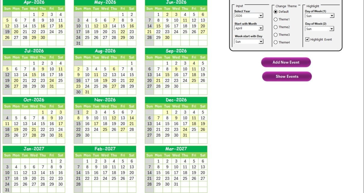
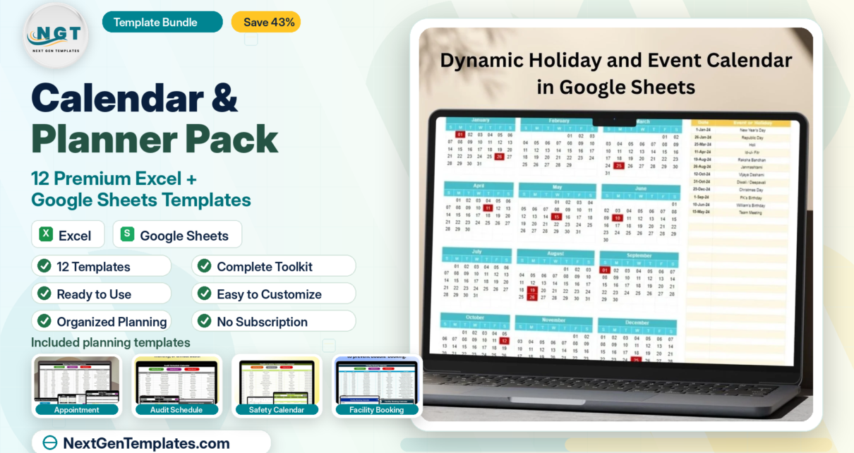
• Advanced Excel
    • Shortcut Keys
    • Useful Formulas
    • Basic Charts
    • Advanced Chart
    • Sort and Filter
    • Pivot Table
    • Data Validation
    • Conditional Formatting
    • Auto Fill and Flash Fill
    • Find and Replace
  • VBA Course
  • Products
    • Restaurant Management
    • PK’s Utility Tool V2.0
    • PK’s Utility Tool V1.0
    • Task Management
    • AMS V1.0
    • AMS V2.0
    • Sale/Purchase Software
    • PK’s Function Kit
  • Blogs
    • Charts and Visualization
    • VBA
    • Excel Tips and Tricks
    • Templates
  • Excel Dashboard
    • Sales Dashboard
    • Process Dashboard
    • Performance Dashboard
    • Project Management
    • Outbound Dashboard
    • Incentive Dashboard
    • Zonal Dashboard in Excel
    • Quick Dashboard
  • Free Templates
  • Power BI
  • About Us
  • Contact Us

PK: An Excel Expert

Excel, VBA, and Power BI tutorials

Tag: Data visualization

On object interaction in Power BI
Power BI

Enhance Your Power BI Experience with On-Object Interaction

March 19, 2023March 21, 2023 PKComments Off on Enhance Your Power BI Experience with On-Object Interaction
In this article, we will discover the benefits of using on-object interaction in Power BI, learn how to enable this feature, and understand the limitations and known issues. What is
Read More
Quick Dynamic Sales by Employees chart with Slicers
Charts and Visualization

Quick Dynamic Sales by Employees chart with Slicer in Excel

March 16, 2023March 16, 2023 PKComments Off on Quick Dynamic Sales by Employees chart with Slicer in Excel
Excel is a powerful tool which can be used for a wide range of business applications, for analyzing data, creating charts and graphs etc. One useful feature in Excel is
Read More
Half Circle KPI
Charts and Visualization

Half Circle KPI Charts in Excel using Doughnut Charts

March 9, 2023March 9, 2023 PKComments Off on Half Circle KPI Charts in Excel using Doughnut Charts
Key Performance Indicators (KPIs) are metrics used to measure the success of a company or a particular project. KPIs can help businesses make informed decisions based on data, improve efficiency,
Read More
Tornado or Butterfly chart
Charts and Visualization

Master the Art of Team Comparison with Tornado or Butterfly Charts in Excel

February 17, 2023February 17, 2023 PKComments Off on Master the Art of Team Comparison with Tornado or Butterfly Charts in Excel
Data visualization is a very important part of data analysis. Microsoft Excel offers a wide range of charts and graphs which can be useful to convey complex information in a
Read More
Simple Dashboard in Excel
Dashboard

One Pager KPI dashboard in Excel

February 15, 2023February 17, 2023 PKComments Off on One Pager KPI dashboard in Excel
Excel is a widely used tool for businesses and individuals for data analysis, tracking, and visualization. Excel Dashboard is an effective way to present complex data in a simplified manner,
Read More
3D Charts for Weekly Sale
Charts and Visualization

3D Chart for Weekly Sale in Excel

September 26, 2021February 5, 2023 PKComments Off on 3D Chart for Weekly Sale in Excel
Data visualization is a robust strategy for presenting and analyzing vast amounts of data, uncovering trends, patterns, and relationships that may have been previously concealed.   3D charts are a
Read More
3D Gauge Chart
Charts and Visualization

3D Gauge Chart in Excel

March 30, 2020February 25, 2023 PKComments Off on 3D Gauge Chart in Excel
In this article, we have created beautiful 3D Gauge Chart. We have used Excel shapes and Pie Chart to create this beautiful visualization. You can use this chart in your
Read More
Disk Pie Chart
Charts and Visualization

3D Disk Pie Chart in Excel

April 11, 2019February 26, 2023 PKComments Off on 3D Disk Pie Chart in Excel
In today's world, data visualization has become an essential part of business presentations and reporting. It helps to communicate complex information in a simple and visually appealing way. One of
Read More
Stylish Circle Chart
Charts and Visualization

Beautiful and Stylish Circle Chart in Excel

March 28, 2019March 14, 2023 PKComments Off on Beautiful and Stylish Circle Chart in Excel
In today's data-driven world, visualization of data is an essential aspect of decision-making. Excel is a powerful tool which can help you to create beautiful and effective visualizations for your
Read More
  • Advanced Excel
    • Shortcut Keys
    • Useful Formulas
    • Basic Charts
    • Advanced Chart
    • Sort and Filter
    • Pivot Table
    • Data Validation
    • Conditional Formatting
    • Auto Fill and Flash Fill
    • Find and Replace
  • VBA Course
  • Products
    • Restaurant Management
    • PK’s Utility Tool V2.0
    • PK’s Utility Tool V1.0
    • Task Management
    • AMS V1.0
    • AMS V2.0
    • Sale/Purchase Software
    • PK’s Function Kit
  • Blogs
    • Charts and Visualization
    • VBA
    • Excel Tips and Tricks
    • Templates
  • Excel Dashboard
    • Sales Dashboard
    • Process Dashboard
    • Performance Dashboard
    • Project Management
    • Outbound Dashboard
    • Incentive Dashboard
    • Zonal Dashboard in Excel
    • Quick Dashboard
  • Free Templates
  • Power BI
  • About Us
  • Contact Us
Copyright © 2023 PK-AnExcelExpert.com - Privacy Policy