Freight insurance reporting can become difficult quickly when premium records, claims, cargo types, policy statuses, provider ratings, and freight lanes are stored in separate spreadsheets. Even a small logistics insurance team may need to review hundreds or thousands of policy records across months, regions, providers, and cargo categories. Without a structured dashboard, teams spend too much time preparing reports and too little time understanding risk.
The Freight Insurance Providers Dashboard in Excel gives cargo insurance providers, logistics analysts, freight brokers, and transportation risk teams a ready-to-use workbook for premium, claims, provider, lane, cargo, and regional analysis. It includes 5 dashboard pages, 5 executive KPI cards, multiple slicers, a Data Sheet, and a Support Sheet with pivot tables.
Click here to view the Freight Insurance Providers Dashboard in Excel.
Key Features of Freight Insurance Providers Dashboard in Excel
- 5 KPI cards: Total Premium, Total Claim Amount, Claim Frequency %, Total Policy Records, and Avg. Provider Rating.
- 5 dashboard pages: Overview Page, Premium Trend, Provider Review, Risk Claims, and Lane Insights.
- Interactive slicers: Filter analysis quickly by provider, policy status, coverage type, cargo type, region, freight lane, month, year, and other available fields.
- Premium analytics: Review premium movement by month, year, quarter, coverage type, provider, region, client segment, and freight lane.
- Claims and risk analytics: Track claim amount, loss cause, loss ratio, claim frequency, cargo type risk, and lane-level exposure.
- Excel workbook structure: Replace sample data in the Data Sheet, refresh all pivots, and use the dashboards for recurring reporting.
Dashboard Pages Explanation
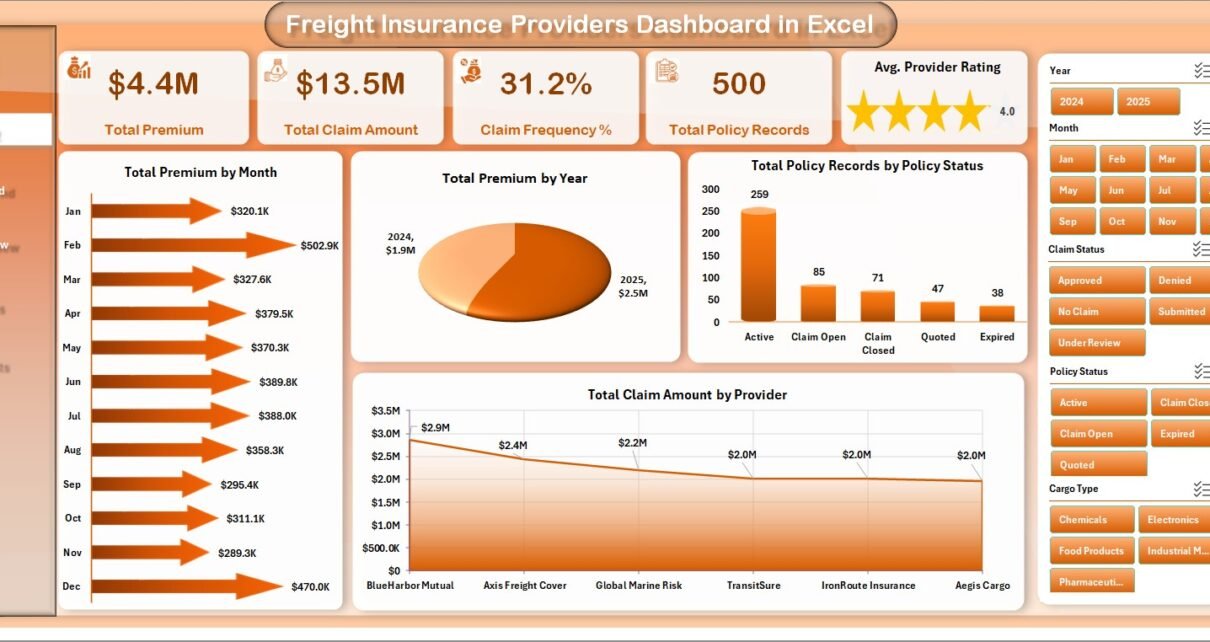
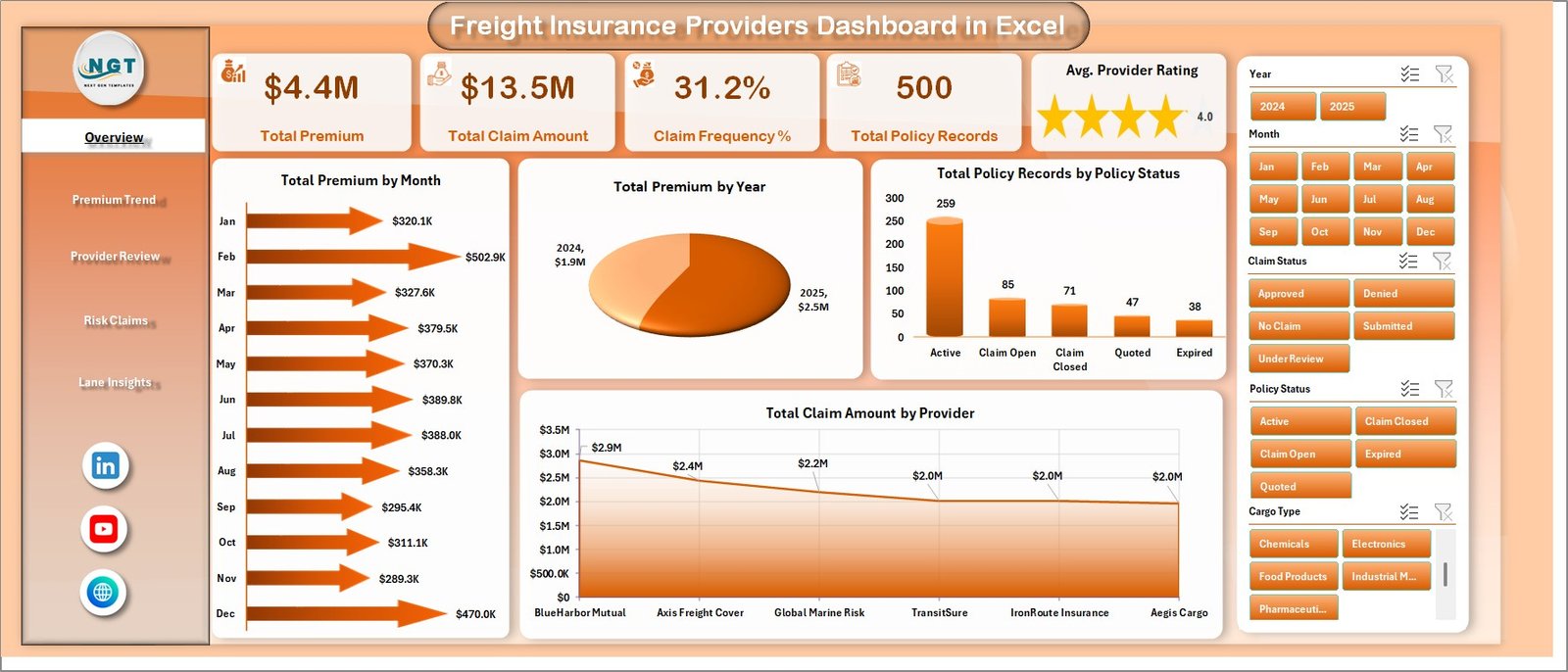
1. Overview Page
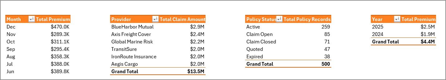
The Overview Page is the executive starting point. The top cards show Total Premium, Total Claim Amount, Claim Frequency %, Total Policy Records, and Avg. Provider Rating so teams can quickly understand premium volume, claim exposure, policy count, and provider quality.
Total Premium by Month shows month-by-month premium movement and helps identify seasonality in insured shipments. Total Premium by Year gives an annual comparison view for longer-term growth or decline. Total Policy Records by Policy Status shows how policies are distributed across active, expired, pending, or other status groups. Total Claim Amount by Provider compares claim value across providers and supports provider review meetings.
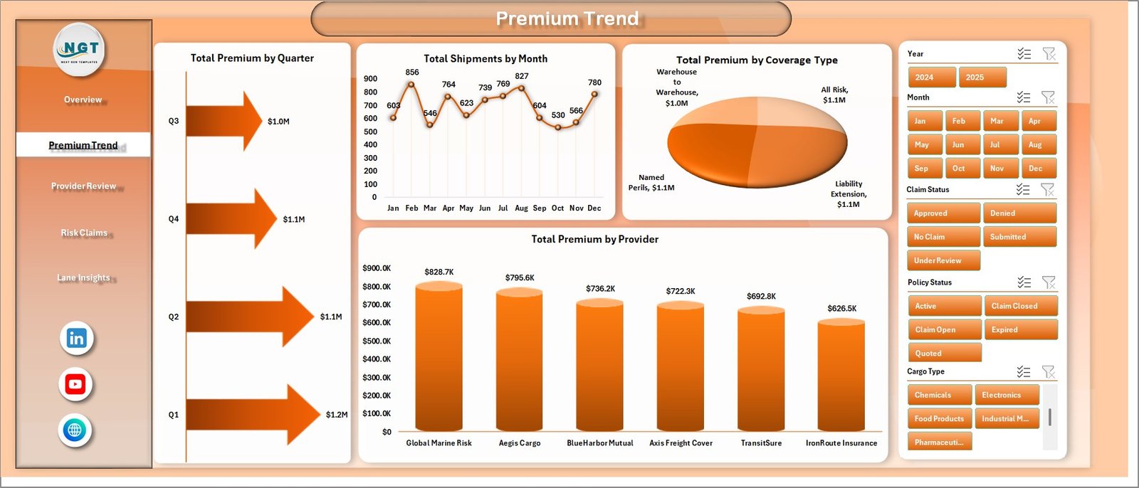
2. Premium Trend
The Premium Trend page focuses on premium and shipment movement over time. Total Premium by Quarter helps insurance teams review quarterly performance and compare premium cycles. Total Shipments by Month shows shipment volume patterns, which can explain changes in premium totals.
Total Premium by Coverage Type compares premium contribution across different insurance coverage categories. Total Premium by Provider ranks providers by premium volume, helping managers understand which providers are driving the largest share of insured freight activity.
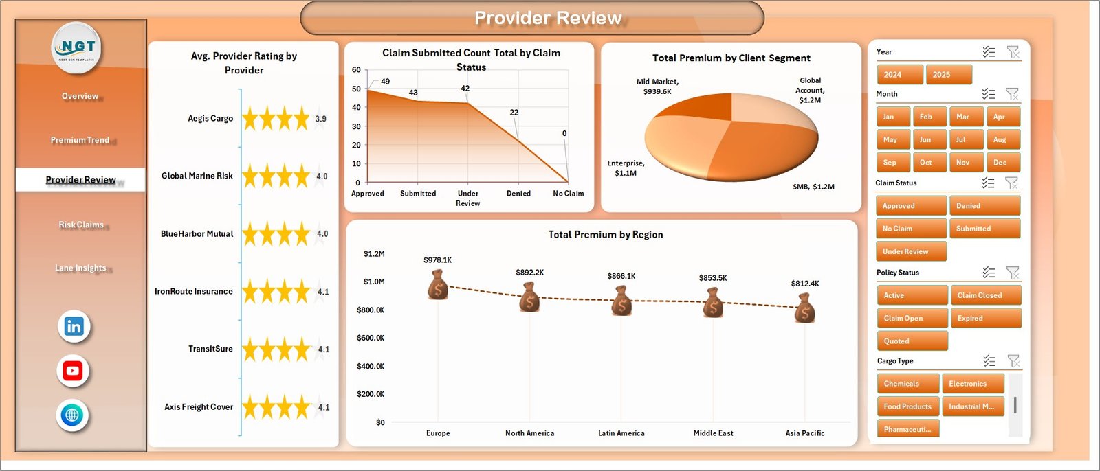
3. Provider Review
The Provider Review page helps compare provider performance and client mix. Avg. Provider Rating by Provider shows provider quality patterns and supports renewal or service-level conversations. Claim Submitted Count Total by Claim Status shows claim workflow status so teams can see submitted, approved, rejected, pending, or closed claim distribution.
Total Premium by Client Segment explains which customer groups contribute the most premium. Total Premium by Region adds a geographic view, making it easier to compare regional activity and exposure.
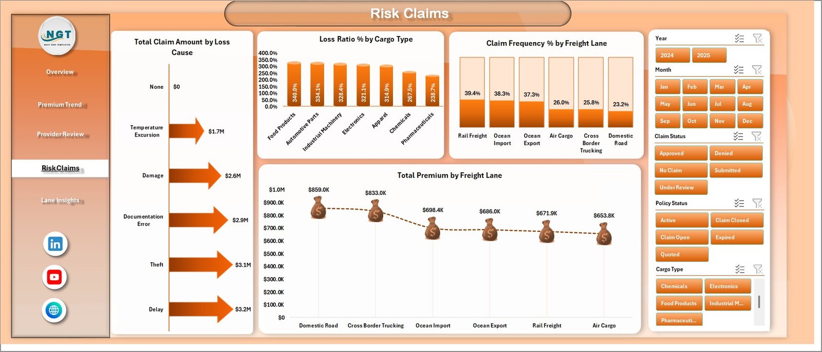
4. Risk Claims
The Risk Claims page brings claims, cargo, and freight lanes together. Total Claim Amount by Loss Cause identifies the reasons creating the largest claim values, such as damage, theft, delay, shortage, or handling issues. Loss Ratio % by Cargo Type compares claim cost against premium by cargo category and helps highlight cargo types that may need pricing review.
Claim Frequency % by Freight Lane shows which routes experience more frequent claims. Total Premium by Freight Lane adds a revenue view so managers can compare lane premium against claim frequency and loss ratio.
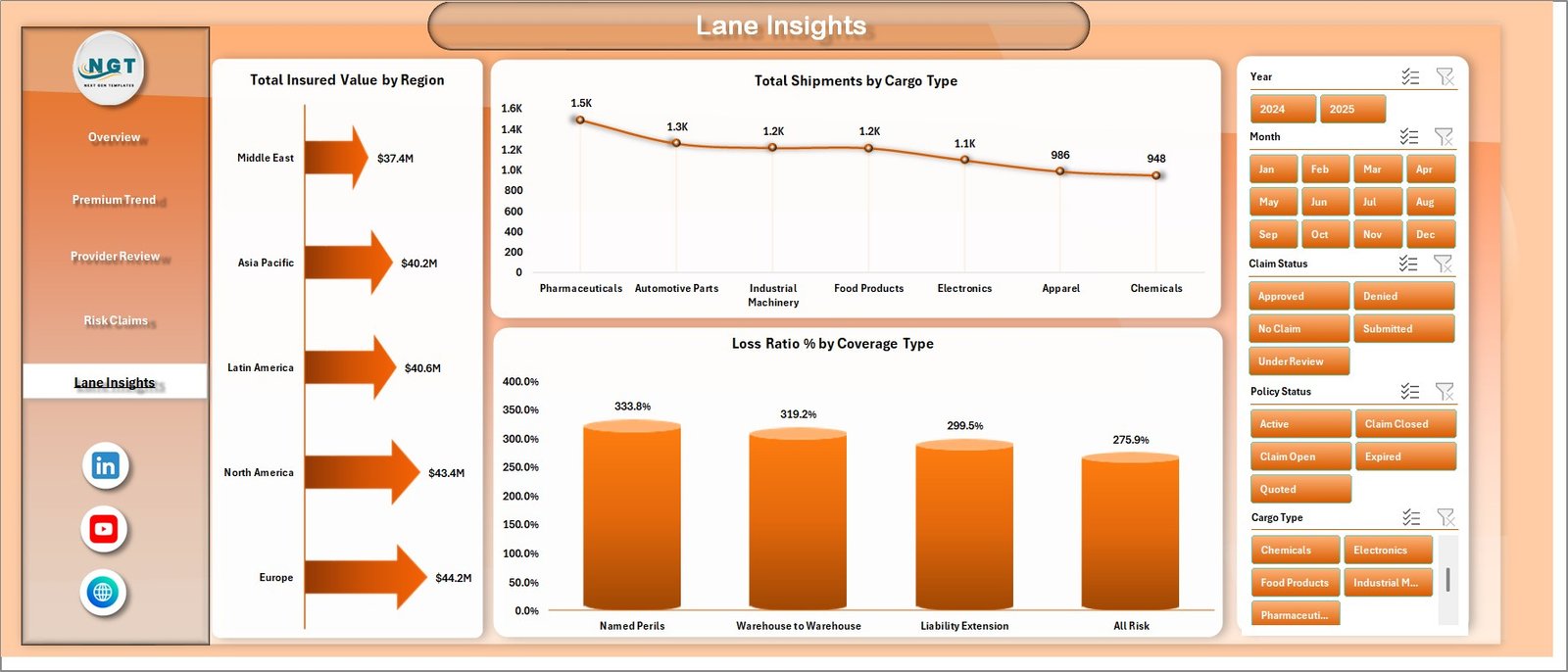
5. Lane Insights
The Lane Insights page focuses on insured value, shipment mix, and coverage risk. Total Insured Value by Region shows where the largest exposure sits geographically. This helps leaders understand where more underwriting review or regional monitoring may be needed.
Total Shipments by Cargo Type explains the operational mix by cargo category. Loss Ratio % by Coverage Type compares claim pressure across coverage categories and supports pricing, policy wording, and provider review discussions.
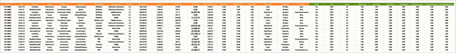
6. Data Sheet Tab
The Data Sheet tab is where users add freight insurance records in the same format as the sample data. Keeping the same column structure is important because the dashboard charts and pivot tables depend on those fields.
7. Support Sheet Tab
The Support Sheet contains the pivot tables used to create the dashboard dynamically. After updating the Data Sheet, users can go to the Data tab in the Excel Ribbon and click Refresh All. The pivots and charts will refresh, and the Support Sheet can be hidden for daily use.
Freight Insurance Providers Dashboard in Excel vs. Google Sheets vs. Paid CRM/SaaS – Feature Comparison
| Feature | Freight Insurance Providers Dashboard in Excel | Google Sheets alternative | Paid insurance SaaS |
|---|---|---|---|
| Cost | $17.99 one-time | Template or custom build | Monthly or annual subscription |
| Platform | Microsoft Excel | Google Sheets | Vendor-hosted application |
| Setup time | Replace sample data and refresh pivots | Import data and adapt formulas | Implementation and onboarding |
| Real-time team collaboration | Possible through OneDrive or SharePoint | Native collaboration | Usually included |
| Mobile access | Excel mobile with limitations | Google Sheets mobile | Vendor app or browser portal |
| Customizable fields | Fully editable workbook | Editable sheet | Limited by vendor configuration |
| Share with link | Possible through Microsoft 365 | Yes | Usually login controlled |
| Year-1 cost at 5 users | $17.99 plus any Microsoft licensing | Template cost plus maintenance | Often hundreds or thousands |
| Freight insurance analysis | Built in across 5 pages | Must be built or adapted | Depends on vendor module |
Who Should Use This Template
This template is useful for freight insurance providers, cargo insurance teams, freight brokers, logistics finance analysts, transportation risk managers, 3PL reporting teams, claims reviewers, and consultants who need an Excel-based reporting layer for premiums, claims, provider performance, lanes, cargo type, coverage type, policy status, and regional exposure.
It is not designed to replace policy administration software, claims workflow software, compliance filing systems, carrier integrations, or live operational systems. It works best as a management reporting dashboard after your source data has already been collected and prepared.
Real-World Use Cases
Neha, cargo insurance manager: Neha uses the Overview Page and Risk Claims page before monthly meetings to review premium, claim amount, claim frequency, loss cause, and loss ratio.
Arjun, logistics finance analyst: Arjun reviews Premium Trend and Lane Insights to explain quarterly premium movement, shipment volume, insured value by region, and coverage type performance.
Maria, freight broker consultant: Maria prepares client-facing summaries that compare provider rating, claim status, premium by client segment, and lane-level risk.
Advantages of Freight Insurance Providers Dashboard in Excel
- Faster reporting: KPI cards, charts, and slicers reduce the time needed to build monthly insurance reports.
- Better risk visibility: Claims, loss ratio, cargo type, and freight lane views help identify where risk is concentrated.
- Provider review support: Provider rating, premium, and claim amount visuals make vendor discussions more data-driven.
- Excel-native flexibility: Users can edit chart styles, formulas, fields, colors, slicers, and pivot tables without special software.
- One-time cost: The template is a one-time purchase instead of a recurring dashboard subscription.
Opportunities for Improvement
This is an Excel template, so the dashboard depends on clean source data and consistent field names. Larger teams may want to connect the workbook to governed data sources, add Power Query automation, store the file in SharePoint, or build a Power BI version for larger datasets and controlled sharing. Teams needing live claims workflows, policy issuance, regulatory filing, or automated integrations should use dedicated insurance systems alongside this reporting workbook.
Best Practices
- Keep the Data Sheet column structure consistent when replacing sample data.
- Validate Total Premium, Total Claim Amount, Claim Frequency %, and Loss Ratio % against source records before presenting results.
- Refresh all pivots after every major data update.
- Use slicers during review meetings to compare providers, regions, cargo types, coverage types, policy statuses, and freight lanes.
- Document any exclusions, manual adjustments, or reporting-period definitions so users interpret the dashboard correctly.
- Use Microsoft guidance when working with Excel tables and pivot tables: Microsoft Support – Create a PivotTable to analyze worksheet data.
Explore Relevant Templates
You may also like the Customs Clearance Agencies Dashboard in Excel, the Logistics Dashboard in Power BI, and the KPI Dashboard Library (Excel). Browse more Excel dashboard templates on NextGenTemplates.
Frequently Asked Questions
What KPI cards are included in this Excel dashboard?
The Overview Page includes Total Premium, Total Claim Amount, Claim Frequency %, Total Policy Records, and Avg. Provider Rating.
How many dashboard pages are included?
The workbook includes 5 dashboard pages: Overview Page, Premium Trend, Provider Review, Risk Claims, and Lane Insights. It also includes Data Sheet and Support Sheet tabs.
Do I need Microsoft Excel?
Yes. This is an Excel dashboard template, so you need Microsoft Excel to use the workbook, update the data, refresh pivots, and customize visuals.
Can I customize the dashboard?
Yes. You can customize charts, slicers, colors, fields, formulas, and pivot tables directly in Excel.
Can this replace insurance claims software?
No. This is a reporting dashboard for analysis and management review. It does not replace policy administration, claims workflow, regulatory filing, or live operational systems.
How do I update the dashboard after adding data?
Add your records to the Data Sheet in the same format, then go to the Excel Data tab and click Refresh All to update the pivot tables and charts.
About the Author
Built by PK – Microsoft Certified Professional with 15+ years of Excel, Google Sheets, and Power BI experience. Founder of NextGenTemplates, reaching 300K+ subscribers across YouTube channels. Every template is hand-built and tested before release.
Conclusion
The Freight Insurance Providers Dashboard in Excel gives freight insurance and logistics teams a practical way to review premiums, claims, provider performance, cargo risk, freight lanes, coverage types, policy status, and regional exposure without starting from a blank workbook. With 5 dashboard pages, KPI cards, slicers, a Data Sheet, and pivot-driven Support Sheet, it turns everyday freight insurance records into cleaner management reporting.
Download the template, replace the sample data, refresh all pivots, and use the dashboard to support clearer provider reviews, claim analysis, premium tracking, and risk conversations.
Visit our YouTube channel for tutorials: YouTube.com/@PKAnExcelExpert