Railway Tech Startups Dashboard in Excel helps railway innovation teams, rail tech founders, accelerators, incubators, and venture analysts turn startup portfolio records into clear management reporting. Railway technology programs often need to compare funding raised, ARR, monthly burn, pilot success, active deployments, readiness score, incidents, operators, regions, customer segments, deployment types, and business models at the same time. When those details sit in separate files, it becomes difficult to see which startups are gaining traction and which pilots need attention.
This ready Excel dashboard gives users 5 dashboard pages, 5 executive KPI cards, multiple slicers, a structured Data Sheet, and a Support Sheet with pivot tables. You can get the product draft here: Railway Tech Startups Dashboard in Excel. For official Excel guidance, Microsoft Support explains how to refresh data connections in Excel.
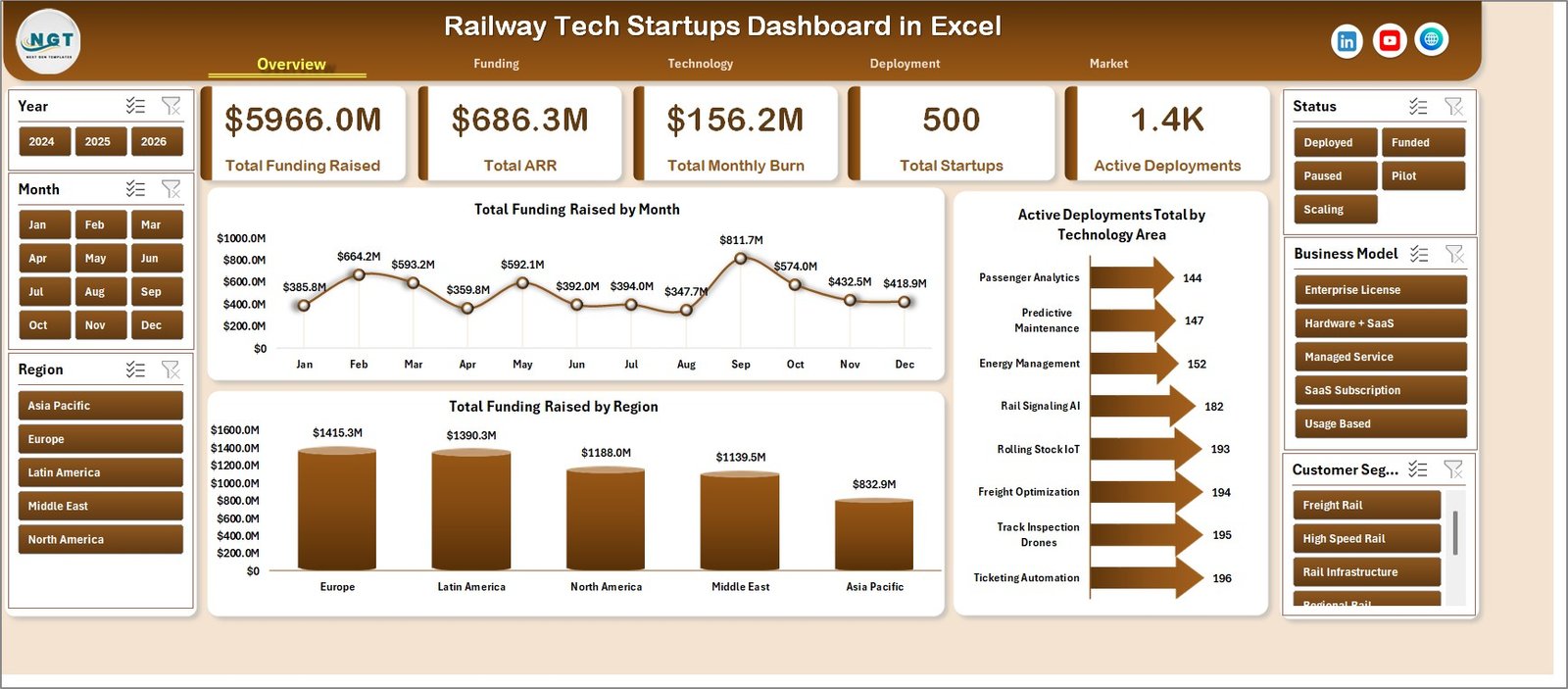
Railway Tech Startups Dashboard in Excel
Key Features of Railway Tech Startups Dashboard in Excel
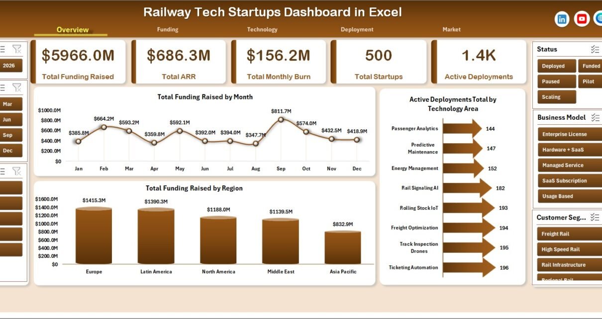
This workbook is built for practical startup portfolio review. It includes pages for Overview, Funding, Technology, Deployment, and Market analysis. The top cards show Total Funding Raised, Total ARR, Total Monthly Burn, Total Startups, and Active Deployments, so users can quickly understand portfolio size, capital raised, recurring revenue, spend pressure, and live deployment activity.
The dashboard also includes slicers for fast filtering. This makes it easier to review the same portfolio by region, operator, technology area, deployment type, customer segment, status, quarter, business model, and other dimensions. Because the file is built in Excel, users can adjust the workbook, review the underlying data, and keep the reporting process familiar.
Dashboard Pages Explanation
1 – Overview Page
The Overview Page is the executive summary of the workbook. The top cards show Total Funding Raised, Total ARR, Total Monthly Burn, Total Startups, and Active Deployments. These cards help managers review funding strength, revenue traction, burn level, startup count, and deployment activity before moving into deeper analysis.
Total Funding Raised by Month: This chart shows how funding changes across months. It helps teams spot stronger fundraising periods and compare monthly capital movement.
Total Funding Raised by Region: This chart compares funding by geography. It helps venture teams and railway innovation units see which regions are attracting more rail technology investment.
Active Deployments Total by Technology Area: This chart shows where live railway deployments are concentrated. It helps users compare technology areas such as asset monitoring, signaling, safety, ticketing, maintenance, planning, and operations tools.
2 – Funding
The Funding sheet focuses on capital efficiency, pilot success, business model comparison, yearly fundraising, and readiness score.
Pilot Success % by Quarter: This chart tracks pilot success rate over quarters. It helps teams see whether startup pilots are becoming more reliable and repeatable over time.
ARR / Funding % by Business Model: This chart compares recurring revenue against funding by business model. It helps users identify which commercial models are turning capital into revenue more efficiently.
Total Funding Raised by Year: This chart shows yearly fundraising movement. It is useful for long-term trend review and portfolio growth discussions.
Avg. Readiness Score by Technology Area: This chart compares readiness across technology areas. It helps decision-makers find solutions that are closer to real-world railway adoption.
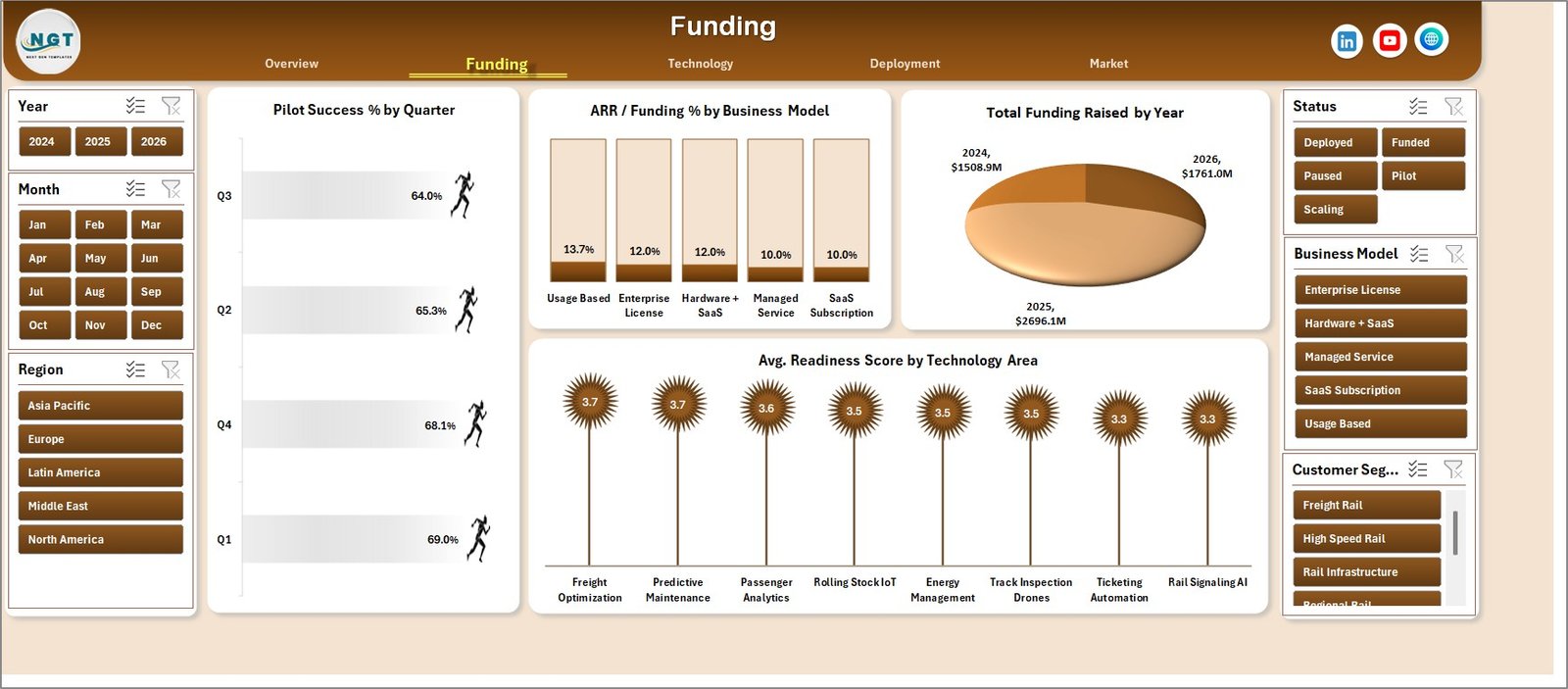
Funding
3 – Technology
The Technology sheet connects pilot outcomes, deployment type, customer segment, operator incidents, and startup status. It is useful for product, safety, operations, and innovation teams that want to understand the technical health of the startup portfolio.
Pilot Success % by Deployment Type: This chart compares success rate by deployment type. It helps users understand which implementation formats are more likely to succeed.
Successful Pilots by Customer Segment: This chart shows successful pilots by customer segment. It helps identify whether railway operators, infrastructure teams, freight units, passenger service groups, or other customers are producing stronger adoption signals.
Total Incidents by Railway Operator: This chart compares incidents by operator. It gives teams a focused starting point for reliability review and operational risk discussion.
Total Startups by Status: This chart summarizes startups by status. It helps managers understand whether the portfolio is mostly active, scaling, paused, graduated, or discontinued.
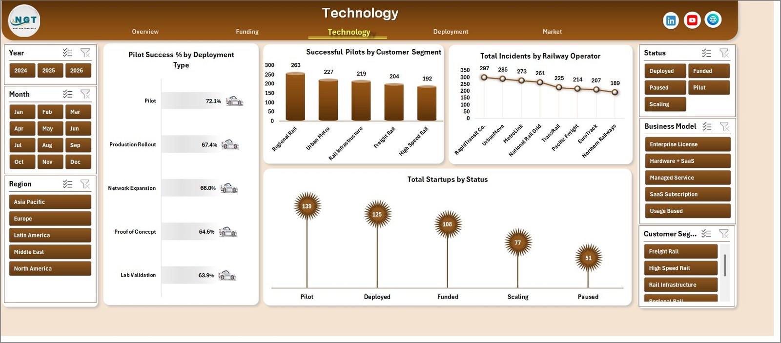
Technology
4 – Deployment
The Deployment page is designed for implementation progress. It reviews active deployments by month, pilot success by region, quarterly funding, and ARR by customer segment.
Active Deployments Total by Month: This chart tracks live deployment activity over time. It helps teams see whether implementation is expanding, flat, or slowing.
Pilot Success % by Region: This chart compares pilot success by region. It helps users identify where railway startup pilots are performing better.
Total Funding Raised by Quarter: This chart shows funding movement by quarter. It helps connect capital cycles with rollout and deployment momentum.
Total ARR by Customer Segment: This chart compares recurring revenue by customer segment. It helps users see which railway customer groups are creating stronger commercial traction.
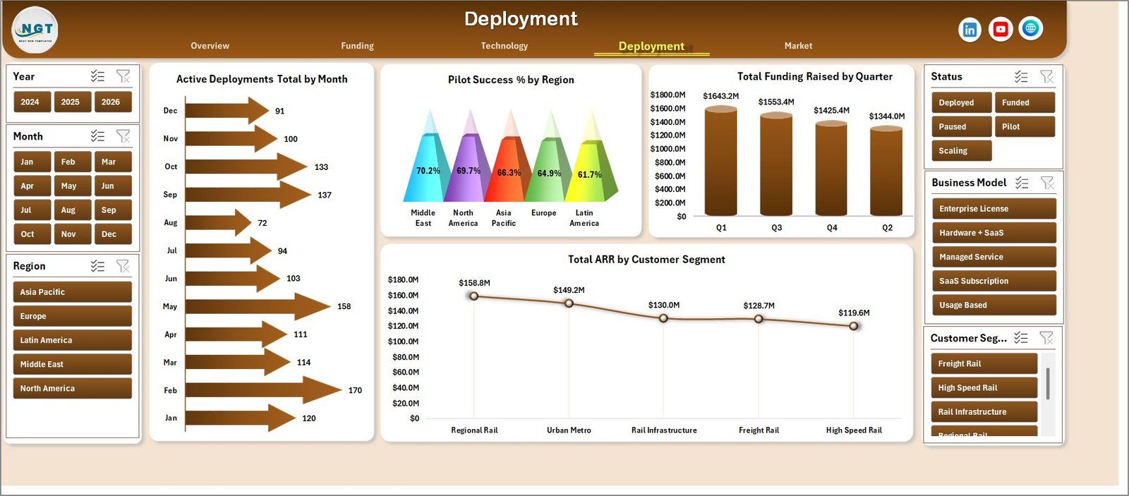
Deployment
5 – Market
The Market sheet focuses on revenue quality, burn efficiency, quarterly ARR movement, and operator-level revenue conversion.
ARR Burn Multiple by Business Model: This chart compares burn efficiency by business model. It helps teams review whether SaaS, hardware, services, platform, or hybrid models are spending in line with revenue traction.
Total ARR by Quarter: This chart tracks recurring revenue by quarter. It helps founders and portfolio teams understand whether revenue momentum is improving.
ARR / Funding % by Railway Operator: This chart compares ARR-to-funding percentage by operator. It helps users review which railway operator relationships are creating better revenue conversion.
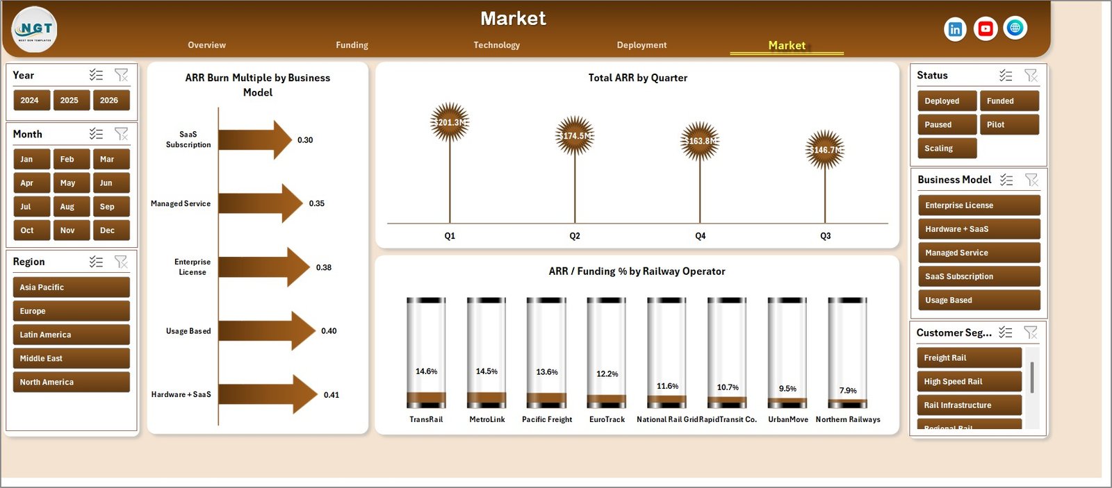
Market
Data Sheet Tab
The Data Sheet stores the source records. Add your railway tech startup data in the same format and keep the columns consistent. After updating the data, refresh the workbook so the pivot tables and dashboard charts update.

Data Sheet tab
Support Sheet Tab
The Support Sheet contains multiple pivot tables used to create the dashboard dynamically. After updating the Data Sheet, go to the Data tab in the Excel Ribbon and click Refresh All. You can keep this sheet hidden after setup.

Support sheet tab
Railway Tech Startups Dashboard in Excel vs. Google Sheets vs. Paid CRM/SaaS – Feature Comparison
| Feature | This Excel dashboard | Google Sheets alternative | Paid startup CRM/SaaS |
|---|---|---|---|
| Cost | One-time template purchase | Low cash cost, but manual build | Recurring subscription |
| Platform | Microsoft Excel | Google Sheets | Vendor cloud platform |
| Setup time | Replace data and refresh pivots | Build sheets, formulas, charts, and filters | Implementation and onboarding |
| Real-time team collaboration | Best through OneDrive or SharePoint | Strong native collaboration | Usually included |
| Mobile access | Limited for complex dashboards | Good browser and mobile access | Usually included |
| Customizable fields | Editable workbook, charts, pivots, and data fields | Editable, but shared formulas can be fragile | Limited by vendor configuration |
| Share with link | Possible through cloud storage permissions | Native link sharing | Usually login controlled |
| Year-1 cost at 5 users | Template cost plus existing Excel licenses | Workspace plan if needed | Often hundreds or thousands per year |
| Railway startup fit | Built for funding, ARR, burn, deployments, pilots, readiness, incidents, operators, regions, and technology areas | Must be built manually | Depends on vendor module fit |
Who Should Use This Template
This template is useful for railway innovation managers, rail tech founders, accelerators, incubators, transport agencies, venture analysts, consultants, and portfolio managers. It is especially helpful when teams need a recurring Excel dashboard for monthly reviews, startup selection, operator pilot tracking, or board reporting.
It is not intended to replace cap table software, accounting systems, investor CRM tools, safety management platforms, railway operations systems, or legal diligence tools. It works best as a reporting and analysis workbook for structured startup data.
Real-World Use Cases
Rail Innovation Manager: Before a monthly steering committee meeting, the manager reviews active deployments, incidents, pilot success, and readiness score by technology area.
Venture Analyst: During startup screening, the analyst compares funding raised, ARR, monthly burn, region, business model, operator relationship, and customer segment.
Accelerator Program Lead: Before demo day, the program lead uses the Funding and Deployment pages to show pilot success, market traction, and portfolio progress.
Advantages of Railway Tech Startups Dashboard in Excel
The biggest advantage is speed. Users start from a ready dashboard instead of building workbook pages, charts, slicers, pivots, and support tables from scratch. The template also keeps reporting transparent because the Data Sheet and Support Sheet remain visible and editable.
Another advantage is cost control. For teams that do not need a full startup CRM or portfolio SaaS system, a one-time Excel dashboard can be enough for review meetings, pilot tracking, and investor or operator updates.
Opportunities for Improvement
This is an Excel dashboard, so it does not include automated CRM workflows, live system integrations, user permissions, audit trails, email notifications, or database-level validation. Teams with strict compliance, multi-user editing, or live operational feeds may need a database-backed solution. However, for structured monthly reporting, Excel is often a faster starting point.
Best Practices
Keep the Data Sheet columns consistent. Add new records below the existing data, avoid deleting Support Sheet structures, and refresh all pivots after each data update. Use slicers during review meetings to compare regions, operators, business models, deployment types, customer segments, technology areas, and quarters. Keep a backup copy before changing formulas, pivots, or chart structures.
Explore Relevant Templates
You can get the product draft here: Railway Tech Startups Dashboard in Excel. You can also browse Excel dashboard templates and Neural Tech Startups Dashboard in Power BI.
Frequently Asked Questions
Can I use this dashboard with my own railway startup data?
Yes. Replace the sample records in the Data Sheet tab using the same column format, then refresh the workbook.
What dashboard pages are included?
The workbook includes Overview, Funding, Technology, Deployment, Market, Data Sheet, and Support Sheet tabs.
Does it include slicers?
Yes. The dashboard includes slicers so users can filter the visuals quickly during analysis and meetings.
Can I hide the Support Sheet?
Yes. The Support Sheet contains pivot tables used by the dashboard and can be hidden after setup.
Is this better than a paid CRM?
It depends on your need. This Excel dashboard is better for quick analysis and reporting. A paid CRM is better for workflow automation, contacts, tasks, permissions, and long-term relationship tracking.
Can I customize the workbook?
Yes. Since it is an Excel file, you can customize charts, slicers, pivots, formulas, colors, and source data columns.
About the Author
Built by PK – Microsoft Certified Professional with 15+ years of Excel, Google Sheets, and Power BI experience. Founder of NextGenTemplates, reaching 300K+ subscribers across YouTube channels. Every template is hand-built and tested before release.
Conclusion
Railway Tech Startups Dashboard in Excel gives railway innovation and startup portfolio teams a practical way to monitor funding, ARR, monthly burn, readiness, pilots, deployments, incidents, operators, regions, business models, and technology areas. It is a useful option for teams that want clear Excel reporting before investing in a larger portfolio management system. For more Excel and dashboard tutorials, visit PK An Excel Expert on YouTube.