HR teams often need to explain workforce cost, employee movement, resignations, engagement, performance, and recruitment patterns in the same meeting. When the data is spread across spreadsheets, HR systems, and manual reports, the analysis becomes slow and hard to compare.
The HR Analytics Dashboard in Power BI gives HR managers and people operations teams a ready-to-use Power BI report with 5 dashboard pages, 5 executive cards, and 16 practical visuals. It helps users review salary, total employees, resigned employees, average salary, average engagement score, attrition, location, department, designation, recruitment source, gender, and monthly trends in one interactive dashboard.
Click here to view the HR Analytics Dashboard in Power BI.
Key Features of HR Analytics Dashboard in Power BI
- 5 Power BI report pages for Overview, Department, Attrition, Recruitment, and Training analysis.
- 5 top-level KPI cards for Total Salary, Total Employees, Resigned Employees, Average Salary, and Average Engagement Score.
- Interactive slicers so users can filter the dashboard quickly without rebuilding visuals.
- HR analytics visuals for employee count, salary, status, attrition, location, department, recruitment source, designation, gender, performance rating, and engagement score.
- Editable PBIX file for users who want to adjust visuals, fields, colors, data connections, or report layout.
- Power BI Desktop workflow for teams that want a professional HR reporting layer without a recurring dashboard subscription.
Dashboard Pages Explanation
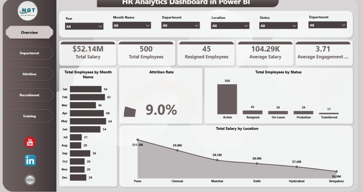
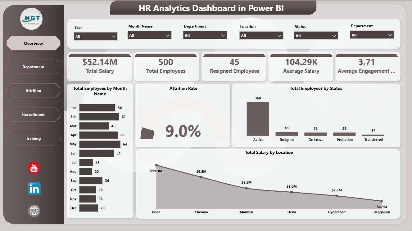
1. Overview Page
The Overview page gives leadership a high-level HR snapshot. At the top, the cards show Total Salary, Total Employees, Resigned Employees, Average Salary, and Average Engagement Score. These cards make it easier to start a review meeting with the most important workforce numbers before moving into the supporting charts.
Total Employees by Month Name: This chart shows employee count across month names. It helps HR teams understand workforce movement over time and spot months where headcount increased or declined.
Attrition Rate: This visual summarizes turnover as a percentage. It helps leaders monitor resignation pressure and compare attrition after applying slicer filters.
Total Employees by Status: This chart groups employees by status, such as active and resigned. It gives a quick view of workforce composition and helps separate current headcount from exits.
Total Salary by Location: This chart compares salary distribution across locations. It is useful for payroll review, location budgeting, and regional cost analysis.
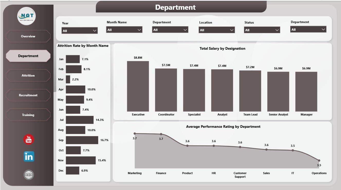
2. Department
The Department page focuses on department and role-level patterns. It is useful when HR leaders want to compare turnover, payroll, and performance across the organization.
Attrition Rate by Month Name: This chart shows how attrition changes across months. It helps HR teams identify months where retention needs deeper investigation.
Total Salary by Designation: This visual compares payroll cost by designation. It helps managers understand which roles or job groups carry the highest salary cost.
Average Performance Rating by Department: This chart compares performance rating by department. It can support manager discussions, coaching plans, and team-level performance review.
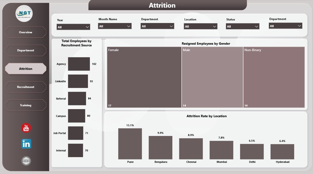
3. Attrition
The Attrition page is designed for retention and resignation analysis. It helps HR teams move beyond a single resignation count and understand where exits are coming from.
Total Employees by Recruitment Source: This chart shows the employee count by recruitment source. It helps recruiters see which hiring channels are contributing to the workforce.
Resigned Employees by Gender: This visual compares resignations by gender. It can support deeper workforce equity, retention, and employee experience conversations.
Attrition Rate by Location: This chart compares attrition across locations. It helps identify offices or regions where managers may need to review employee experience, workload, or local conditions.
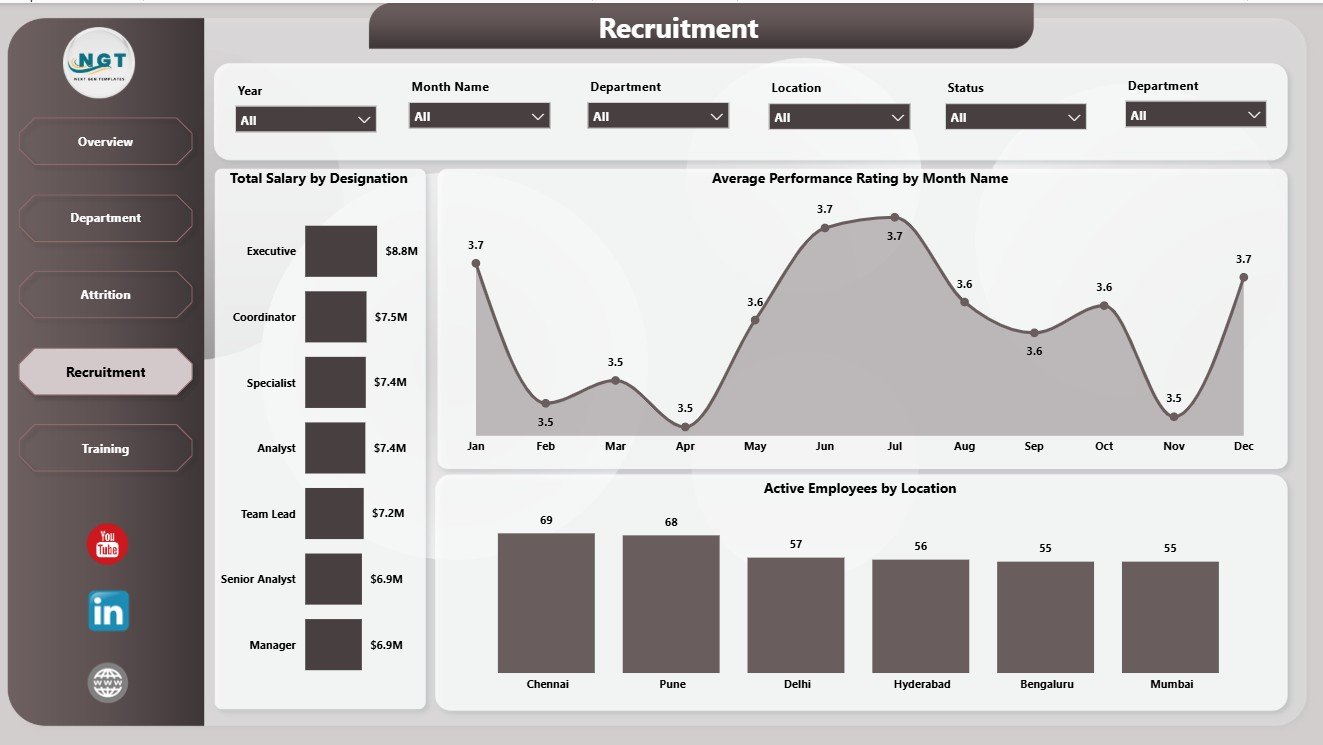
4. Recruitment
The Recruitment page connects salary, performance, and active employee distribution. It helps recruiters and HR leaders review how the active workforce is spread across roles and locations.
Total Salary by Designation: This chart highlights salary cost by designation. It is useful for role-level budget review and compensation planning.
Average Performance Rating by Month Name: This chart tracks performance rating across months. It helps HR teams see whether performance is improving, stable, or declining during the reporting period.
Active Employees by Location: This visual shows current active employees by location. It helps managers understand where the working workforce is concentrated.
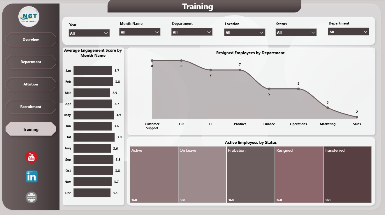
5. Training
The Training page is helpful for L&D teams, HR managers, and people operations teams that want engagement and workforce status insights in one view.
Average Engagement Score by Month Name: This chart tracks engagement score by month. It helps HR teams see whether employee sentiment is rising, flat, or declining over time.
Resigned Employees by Department: This visual shows resignation count by department. It helps leaders identify teams where retention follow-up may be needed.
Active Employees by Status: This chart gives current employee status context. It helps users review the active workforce after applying report filters.
HR Analytics Dashboard in Power BI vs. Tableau vs. Paid HR SaaS – Feature Comparison
| Feature | HR Analytics Dashboard in Power BI | Tableau alternative | Paid HR SaaS |
|---|---|---|---|
| Cost | $17.99 one-time | Requires Tableau setup and licensing | Monthly or annual subscription |
| Platform | Power BI Desktop | Tableau Desktop or Cloud | Vendor-hosted HR platform |
| Setup time | Open PBIX and replace or connect data | Build or adapt dashboards | Implementation and onboarding |
| Real-time team collaboration | Possible with Power BI Service setup | Possible with Tableau Cloud or Server | Usually included by vendor |
| Mobile access | Possible through Power BI Service | Possible through Tableau apps | Usually included |
| Customizable fields | Editable model and visuals | Editable with Tableau skills | Often limited by vendor schema |
| Share with link | Yes, if published to Power BI Service | Yes, if published to Tableau Cloud or Server | Usually yes |
| Year-1 cost at 5 users | $17.99 plus existing Power BI usage | License-dependent | Often hundreds or thousands |
| HR analytics pages | Built in across 5 pages | Custom setup required | Depends on selected module |
Who Should Use This Template
This dashboard is useful for HR managers, HR analysts, people operations teams, recruitment managers, L&D teams, HR consultants, CHRO office teams, and business owners who need a practical Power BI reporting layer for workforce analytics.
It is not a full HRIS, payroll processing system, applicant tracking system, employee self-service portal, or live compliance workflow. It works best when your team already has structured HR data and wants a clear Power BI report for recurring review.
Real-World Use Cases
Priya, HR Manager: She reviews Total Salary, Total Employees, Resigned Employees, Average Salary, and Average Engagement Score before each management meeting.
Daniel, HR Consultant: He customizes the PBIX file for client reporting and uses Department and Attrition pages to prepare workforce planning recommendations.
Anita, L&D Lead: She reviews engagement movement and department-level resignations to connect training efforts with employee experience trends.
Advantages of HR Analytics Dashboard in Power BI
- Faster monthly HR reporting: The report already includes the main HR dashboard pages and visuals.
- Interactive analysis: Slicers let users filter the report quickly during review meetings.
- Editable Power BI model: Users can adjust fields, visuals, measures, and page layout inside Power BI Desktop.
- Lower cost than HR SaaS dashboards: The template is a one-time download instead of a recurring software subscription.
Opportunities for Improvement
This dashboard depends on clean source data. If employee status, department names, designations, locations, recruitment sources, or month fields are inconsistent, the visuals may require cleanup before they tell the right story. It also does not replace a full HRIS or automate employee lifecycle workflows. Teams that need live employee self-service, payroll processing, approvals, or compliance tracking should use a dedicated HR system alongside this dashboard.
Best Practices
Keep the data structure consistent, standardize department and location names, use one format for month values, and validate employee status before refreshing the report. Review the Overview page first, then move to Department, Attrition, Recruitment, and Training pages for deeper analysis. For Power BI learning and publishing guidance, refer to Microsoft Learn: What is Power BI Desktop?.
Explore Relevant Templates
You may also like the HR Analytics Dashboard in Excel and the HR & Workforce Analytics Bundle. You can also browse more Power BI Dashboard templates on NextGenTemplates.
Frequently Asked Questions
What does the HR Analytics Dashboard in Power BI track?
It tracks total salary, total employees, resigned employees, average salary, average engagement score, attrition rate, employee status, location, department, designation, recruitment source, gender, performance rating, and monthly trends.
Do I need Power BI Desktop?
Yes. The PBIX file should be opened in Power BI Desktop. You can then refresh, edit, or publish it based on your workflow.
Can I replace the sample data?
Yes. You can replace the sample data or modify the source connection inside Power BI Desktop.
Can I customize the dashboard?
Yes. You can edit visuals, fields, slicers, measures, colors, page names, and report layout.
Is this a full HR software system?
No. This is a Power BI reporting template. It does not process payroll, manage employee records, or run applicant tracking workflows.
Is this a one-time purchase?
Yes. It is a one-time downloadable product from NextGenTemplates.
About the Author
Built by PK – Microsoft Certified Professional with 15+ years of Excel, Google Sheets, and Power BI experience. Founder of NextGenTemplates, reaching 300K+ subscribers across YouTube channels. Every template is hand-built and tested before release.
Conclusion
The HR Analytics Dashboard in Power BI helps HR teams turn employee, salary, attrition, recruitment, performance, engagement, and training data into a clear visual report. Instead of building every visual from scratch, users can open the PBIX file, connect or replace data, refresh the report, and review insights across five focused pages.
Click here to purchase HR Analytics Dashboard in Power BI.
Visit our YouTube channel to learn step-by-step Excel and Power BI tutorials.