Remote work communities can generate more reporting data than many small teams expect. A community with 1,000 active members, multiple discussion platforms, recurring events, regional groups, membership plans, support activity, and moderator logs can create 12,000+ message, attendance, revenue, and engagement records in a year. The Remote Work Communities Dashboard in Power BI turns that activity into a ready PBIX report for member growth, subscription revenue, engagement, events, operations, support cost, and satisfaction.
Click here to purchase the Remote Work Communities Dashboard in Power BI
This dashboard is built for community managers, coworking network operators, membership analysts, creator community teams, online learning communities, remote-work platform teams, and support leaders who need a practical Power BI report without building measures, slicers, visual pages, and page navigation from a blank file.
Key Features of Remote Work Communities Dashboard in Power BI
- 5 report pages: Overview, Community Growth, Engagement, Events, and Operations.
- 5 executive KPI cards: Active Members, Subscription Revenue, Messages, Attendance Rate, and Satisfaction.
- Multiple slicers: Filter by community, month, region, platform, segment, plan, work style, event type, and status fields.
- Membership reporting: Track active members, subscription revenue, plans, regions, communities, and monthly changes.
- Growth reporting: Analyze new members, new member rate, member base, segment growth, work style, and regional growth.
- Engagement reporting: Review messages, posts, platform activity, member segments, and messages per member.
- Events and operations: Track attendance, fill rate, hosted events, support cost, moderator hours, and community P&L.
Dashboard Pages Explanation
1. Overview Page
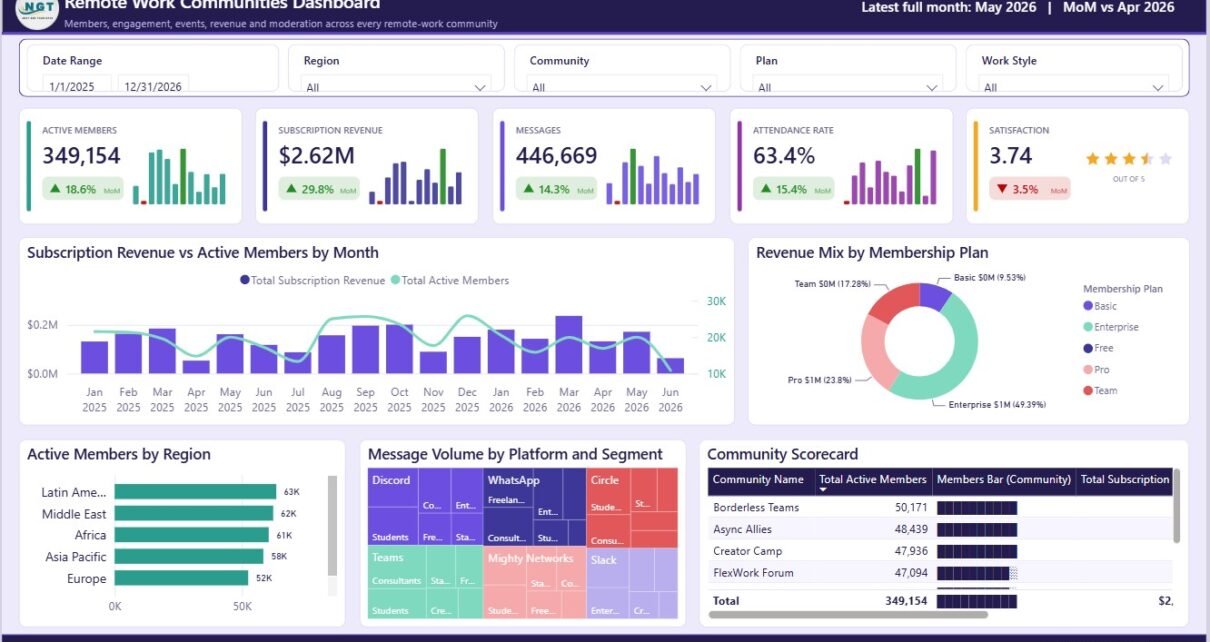
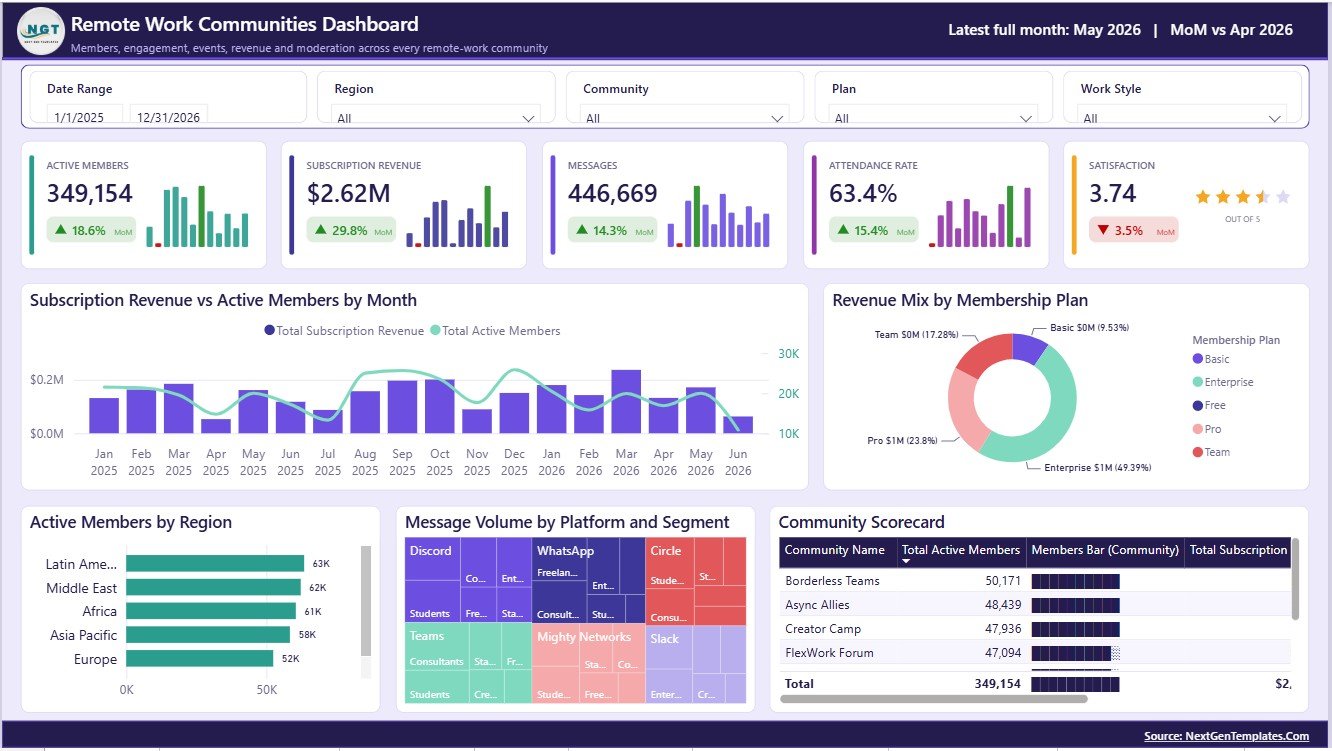
The Overview page gives a high-level view of the complete community. It includes cards for Active Members, Subscription Revenue, Messages, Attendance Rate, and Satisfaction, so leadership can review participation, revenue, event health, and sentiment in one place.
Subscription Revenue and Active Members by Month
This chart compares subscription revenue with active members over time. It helps teams understand whether paid revenue is growing with the member base or drifting away from member activity.
Use this visual during monthly reviews to identify strong growth months, retention dips, and periods where monetization improved without matching member expansion.
Subscription Revenue by Membership Plan
This chart shows how revenue is distributed across membership plans. It helps operators see which plan types contribute the most revenue.
It is useful for pricing reviews, plan redesign, and identifying plans that may need stronger onboarding or clearer benefits.
Active Members by Region
This visual shows the geographic distribution of active members. It helps community teams decide where regional programming, local events, or ambassador support may be needed.
When combined with slicers, it can reveal whether specific regions are growing, flattening, or underperforming compared with the rest of the community.
Message Volume by Platform and Segment
This chart compares conversation volume by both platform and member segment. It helps managers understand which channels and member groups create the most activity.
Use it to plan moderation coverage, content prompts, community manager time, and engagement campaigns by segment.
Active Members and Subscription Revenue by Community
This visual compares community-level member count with subscription revenue. It helps identify communities that are large but under-monetized or smaller communities that generate strong revenue.
It is helpful for prioritizing support, community programming, and commercial follow-up.
2. Community Growth
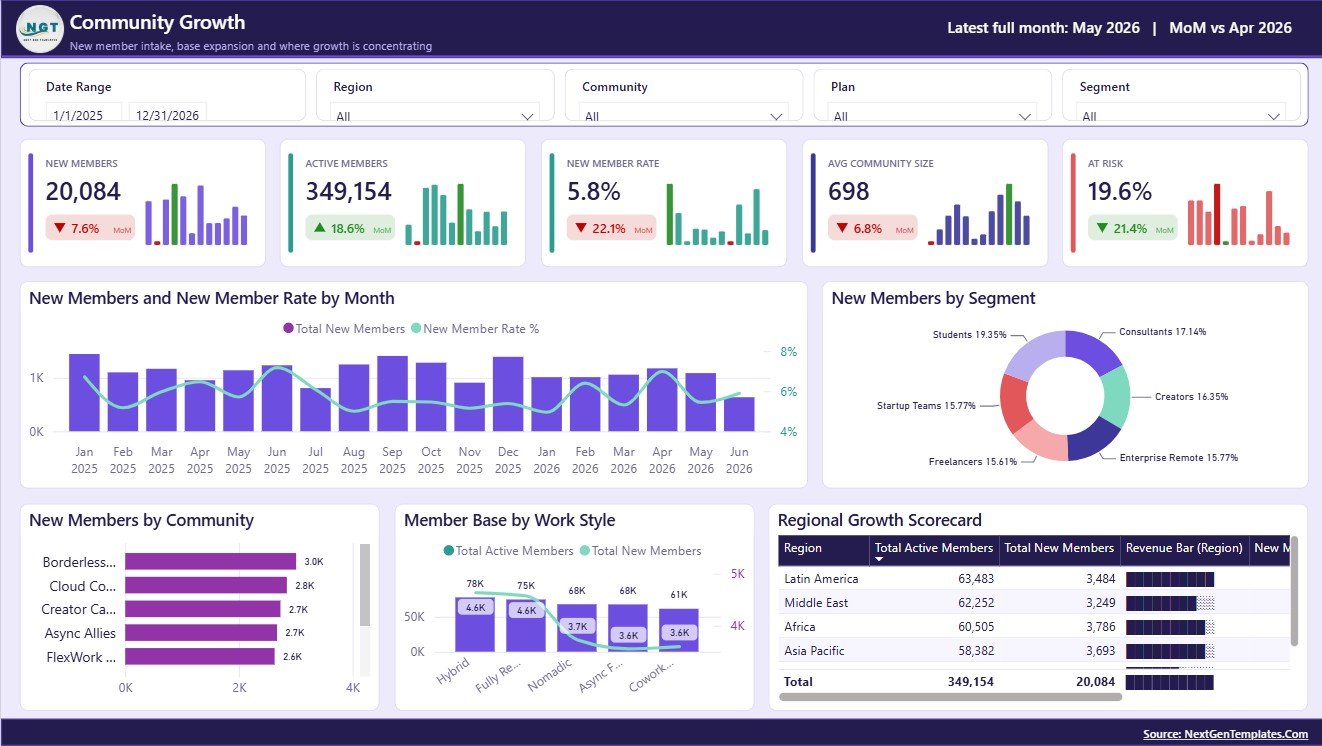
The Community Growth page focuses on acquisition, member base expansion, regional movement, and work-style segmentation.
New Members and New Member Rate by Month: This visual shows new member volume and the rate of growth month by month. It helps teams spot campaign wins, seasonal changes, and periods of slower acquisition.
New Members by Segment: This chart compares new member acquisition by segment. It helps identify the types of members responding best to outreach, referrals, partnerships, or content marketing.
New Members by Community: This visual ranks communities by new member volume. It helps leaders see which groups are expanding and which may need new programming.
Member Base and New Members by Work Style: This chart compares current member base and new member additions by work style. It helps teams understand whether remote, hybrid, freelance, founder, or employee groups are changing over time.
Regional Growth by Region: This visual compares growth across regions. It supports expansion planning and local community investment decisions.
3. Engagement
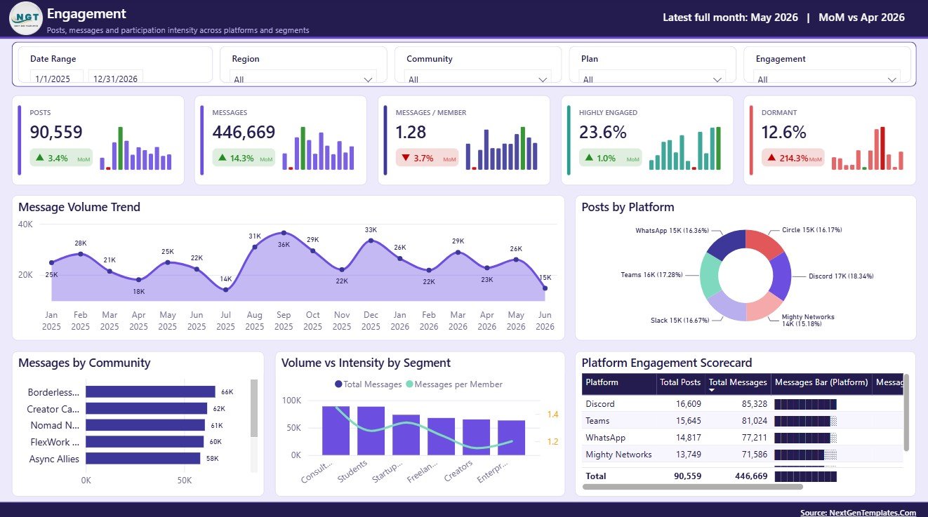
The Engagement page explains how members participate after joining. It focuses on messages, posts, platform behavior, member segments, and message intensity.
Messages by Month: This chart shows monthly message movement. It helps identify whether community conversation is increasing, slowing, or responding to campaigns and events.
Posts by Platform: This visual compares post volume across platforms. It helps teams decide where content prompts, discussion themes, or moderator effort should be focused.
Messages by Community: This chart ranks communities by message volume. It helps identify active groups, quiet groups, and communities that may need reactivation.
Messages and Messages per Member by Segment: This chart compares total participation with participation intensity. It helps separate large segments from highly engaged segments.
Platform Engagement by Platform: This visual summarizes platform-level engagement. It helps teams understand whether Slack, Discord, Teams, forums, or other community spaces are performing as intended.
4. Events
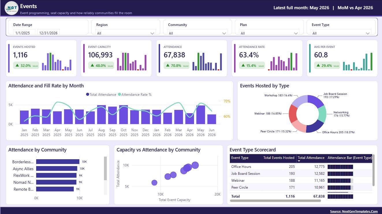
The Events page supports event operations, attendance review, and event type planning.
Attendance and Fill Rate by Month: This chart compares attendance with fill rate over time. It helps teams see whether event demand is rising and whether capacity is being used well.
Events Hosted by Type: This visual compares the count of hosted events by type. It helps review whether the event calendar is balanced across workshops, networking, office hours, webinars, and meetups.
Attendance by Community: This chart compares attendance across communities. It helps identify groups with strong event participation and groups that may need better event fit.
Capacity and Attendance by Community: This chart compares planned capacity with actual attendance. It helps teams decide where to increase capacity, reduce event size, or improve promotion.
Event Type Performance by Event Type: This visual compares event types using performance indicators. It helps decide which event formats should be repeated, revised, or retired.
5. Operations
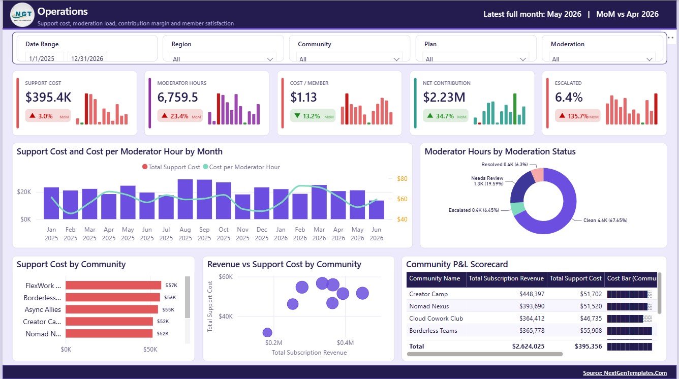
The Operations page connects community performance with support workload, moderation hours, cost, revenue, and P&L.
Support Cost and Cost per Moderator Hour by Month: This chart shows support cost and moderator-hour efficiency over time. It helps teams see whether community operations are becoming more or less expensive.
Moderator Hours by Moderation Status: This visual compares moderator hours by status. It helps managers understand where moderation workload is concentrated.
Support Cost by Community: This chart compares support cost across communities. It helps identify groups that need more resources or better self-service documentation.
Revenue and Support Cost by Community: This visual compares income and cost at the community level. It helps leaders spot communities that are profitable, fragile, or expensive to operate.
Community P&L by Community: This view summarizes community-level profitability. It helps support pricing, staffing, retention, and investment decisions.
Remote Work Communities Dashboard in Power BI vs. Tableau vs. Paid CRM/SaaS – Feature Comparison
| Feature | This Power BI dashboard | Tableau or Qlik alternative | Paid community SaaS |
|---|---|---|---|
| Cost | $17.99 one-time sale price | License cost plus build time | Monthly or annual subscription |
| Platform | Power BI Desktop and optional Power BI Service | Tableau or Qlik | Vendor-hosted web application |
| Setup time | Open PBIX, connect source, refresh | Build model and visuals manually | Onboarding and configuration |
| Real-time team collaboration | Available after publishing to Power BI Service | Available by license plan | Usually included |
| Mobile access | Available through Power BI mobile after publishing | Available by platform | Usually included |
| Customizable fields | Edit model, measures, pages, visuals, and slicers | Editable with analyst skills | Often limited by vendor settings |
| Share with link | Available through workspace permissions | Available through server permissions | Login controlled |
| Year-1 cost at 5 users | Template cost plus Microsoft licensing choice | License cost plus analyst time | Often hundreds or thousands per year |
| Community operations metrics | Members, revenue, messages, attendance, support cost, moderator hours, and P&L | Must be designed manually | Depends on purchased modules |
Who Should Use This Template
Use this dashboard if your team manages an online or remote work community and already collects data from platforms, event tools, payment exports, support records, or spreadsheets. It is useful for community managers, membership analysts, COO teams, founders, support managers, event teams, and Power BI developers who want a faster starting point.
It is not the right fit if you need a live community app, automated billing, direct chat hosting, automated moderation, user authentication, or customer support ticket workflows. In those cases, this dashboard can still act as the reporting layer after data is exported.
Real-World Use Cases
Monthly community health review: A community operations lead reviews active members, subscription revenue, messages, attendance, and satisfaction before a leadership meeting.
Event planning review: An event coordinator compares fill rate, attendance, event type performance, and capacity by community to improve next month’s calendar.
Support cost review: A membership analyst compares support cost, moderator hours, revenue, and P&L by community to support pricing and staffing decisions.
Advantages of Remote Work Communities Dashboard in Power BI
- Power BI handles multi-page interactive reporting better than static spreadsheet screenshots.
- The report can be customized in Power BI Desktop.
- Slicers make it easy to review segments, regions, plans, platforms, and communities.
- Revenue, engagement, events, and operations are shown together instead of in separate reports.
- The one-time template price avoids starting from a blank dashboard file.
Opportunities for Improvement
- Add direct data connections if your community exports are stored in SharePoint, OneDrive, SQL, or cloud storage.
- Add role-level security before sharing sensitive community revenue or P&L data broadly.
- Add scheduled refresh after publishing to Power BI Service.
- Add a KPI definition page if different teams use different definitions for active members, attendance rate, or satisfaction.
Best Practices
- Keep one consistent data structure for member, message, event, revenue, and support records.
- Standardize names for communities, plans, platforms, and regions before refreshing the report.
- Review member growth and engagement together, because new members are less useful if they do not participate.
- Compare event attendance with capacity, not only raw attendance count.
- Use Power BI Service permissions carefully when revenue or P&L metrics are included.
Microsoft’s documentation on Power BI report visualizations is a useful reference if you want to customize charts after downloading the template.
Explore Relevant Templates
Pair this dashboard with the Remote Work Communities Dashboard in Excel, Remote Crop Monitoring Dashboard in Power BI, and Real Estate Crowdfunding Dashboard in Power BI. You can also browse more Power BI Dashboard Templates and Power BI Templates.
Frequently Asked Questions
What is the Remote Work Communities Dashboard in Power BI?
It is a downloadable PBIX dashboard template for analyzing remote work community growth, engagement, events, subscription revenue, support cost, moderator hours, satisfaction, and community P&L.
Do I need Power BI Desktop?
Yes. You need Power BI Desktop to open and edit the PBIX file. Power BI Service is optional for browser sharing, workspace permissions, mobile access, and scheduled refresh.
Can I use my own community data?
Yes. Replace the sample data source with your structured community data and refresh the report.
Can the dashboard be customized?
Yes. You can customize visuals, fields, measures, slicers, pages, colors, titles, and data connections in Power BI Desktop.
Does this replace community management software?
No. It is a reporting dashboard, not a community platform. Use it to analyze prepared community data exported from your existing systems.
Is this a subscription product?
No. It is sold as a one-time downloadable Power BI dashboard template.
About the Author
Built by PK – Microsoft Certified Professional with 15+ years of Excel, Google Sheets, and Power BI experience. Founder of NextGenTemplates, reaching 300K+ subscribers across YouTube channels. Every template is hand-built and tested before release.
Conclusion
The Remote Work Communities Dashboard in Power BI gives community teams a structured way to review membership, revenue, engagement, events, support cost, and satisfaction without starting from a blank Power BI file. It is especially helpful when leaders need a monthly community health view that connects growth, participation, and operating cost in one report.
For more templates and walkthroughs, visit PK An Excel Expert on YouTube.