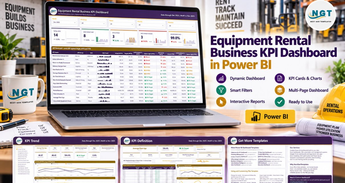
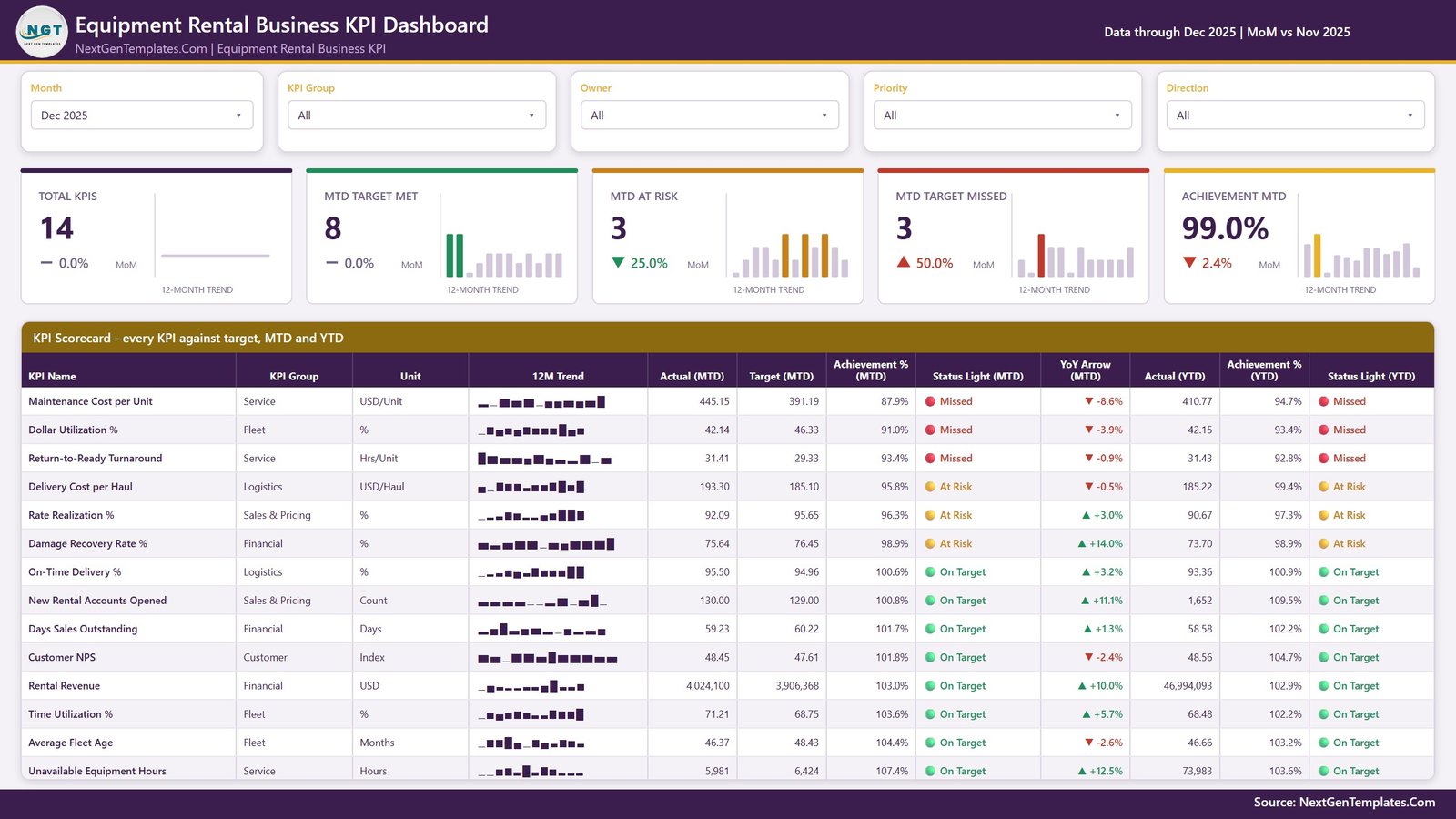
The Equipment Rental Business KPI Dashboard in Power BI is a 4-page report that scores 14 rental KPIs across 6 KPI groups every month. It shows MTD and YTD traffic lights for each KPI, a YoY arrow against the same month last year, and five header cards. In the December 2025 sample view those cards read 14 KPIs, 8 on target, 3 at risk, 3 missed and 99.0% average achievement.
Rental companies live and die by a handful of numbers: how hard the fleet earns, how fast returned units get back on rent, what each delivery costs and how quickly customers pay. Those numbers usually sit in different systems and spreadsheets. This template pulls them into one month-picker scorecard in Power BI, so the monthly review starts with red, amber and green lights instead of a hunt for figures.
This post covers the Power BI KPI Dashboard family, a month-picker KPI scorecard with traffic lights, KPI Trend and KPI Definition pages. If you want transaction-level analysis instead, read our walkthrough of the Rental Services Dashboard in Power BI.
Key Features of the Equipment Rental Business KPI Dashboard in Power BI
- Month picker and four slicers: Month, KPI Group, Owner, Priority and Direction filter the scorecard. The header states the context, for example “Data through Dec 2025 | MoM vs Nov 2025”.
- Direction-aware achievement: higher-is-better KPIs score Actual ÷ Target, lower-is-better KPIs score Target ÷ Actual. Beating a cost or turnaround target therefore scores above 100%.
- Three-state traffic lights: On Target at 100% or more, At Risk from 95% to under 100%, Missed below 95%, shown for both MTD and YTD.
- YoY arrow per KPI: the YoY Arrow (MTD) column flips the sign for lower-is-better KPIs, so an up arrow always means improvement.
- Five header cards with 12-month bars: Total KPIs, MTD Target Met, MTD At Risk, MTD Target Missed and Achievement MTD, each with a MoM chip.
- Fully data-driven model: no KPI is hard-coded. Add, rename or delete KPIs in Data.xlsx and refresh.
The 14 KPIs
- Financial: Rental Revenue, Damage Recovery Rate %, Days Sales Outstanding
- Fleet: Dollar Utilization %, Time Utilization %, Average Fleet Age
- Sales & Pricing: Rate Realization %, New Rental Accounts Opened
- Service: Maintenance Cost per Unit, Unavailable Equipment Hours, Return-to-Ready Turnaround
- Logistics: On-Time Delivery %, Delivery Cost per Haul
- Customer: Customer NPS
Eight of them are higher-is-better and six are lower-is-better, and each carries a named owner, from the Chief Financial Officer to the Yard Supervisor, plus a Critical, High or Medium priority.
Dashboard Pages Explanation
Page 1: KPI Scorecard
The main page combines the five slicers, the five header cards and the scorecard table. For every KPI the table lists KPI Group, Unit, a 12M Trend sparkline, Actual (MTD), Target (MTD), Achievement % (MTD), Status Light (MTD), YoY Arrow (MTD), Actual (YTD), Achievement % (YTD) and Status Light (YTD). In the sample month Rental Revenue reaches 4,024,100 against a 3,906,368 target (103.0%, On Target), while Maintenance Cost per Unit runs at 445.15 against 391.19 (87.9%, Missed).
Page 2: KPI Trend
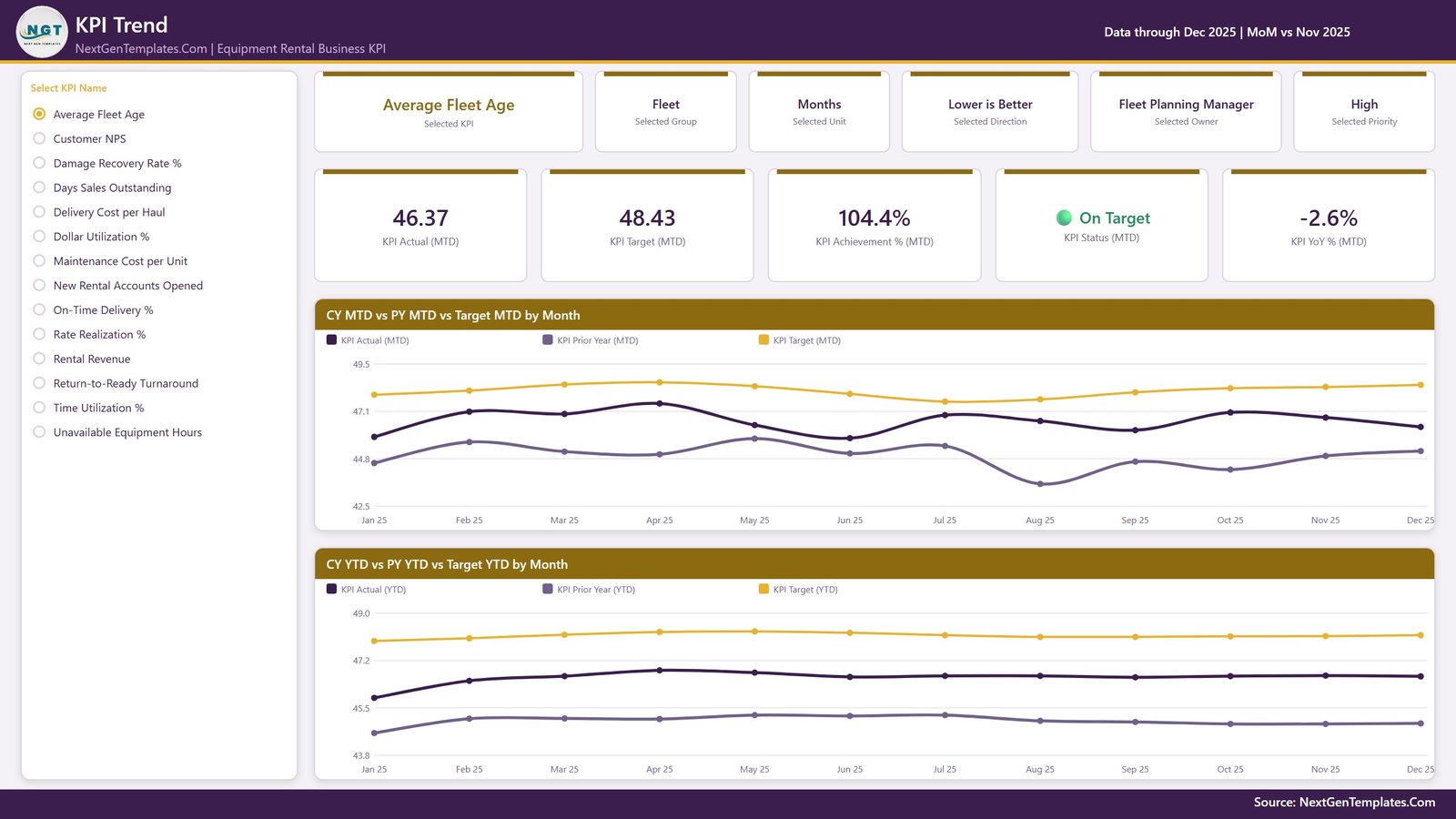
Select a KPI from the list on the left. Six context cards show the selected KPI, group, unit, direction, owner and priority, and five value cards show KPI Actual (MTD), KPI Target (MTD), KPI Achievement % (MTD), KPI Status (MTD) and KPI YoY % (MTD). Two charts follow: CY MTD vs PY MTD vs Target MTD by Month and CY YTD vs PY YTD vs Target YTD by Month.
Page 3: KPI Definition
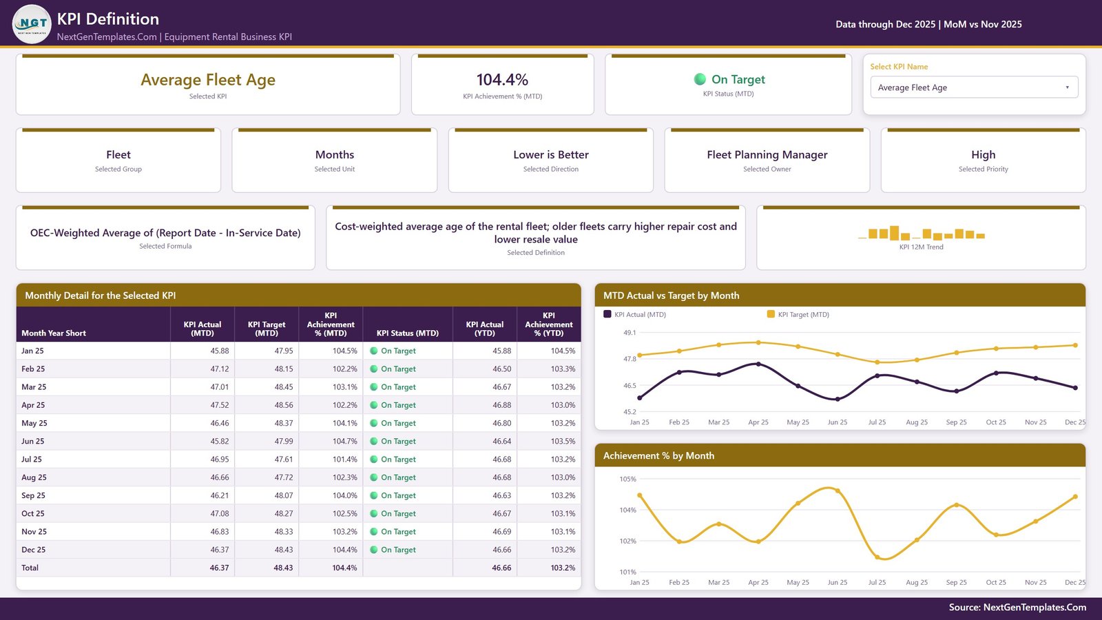
A dropdown picks one KPI and the page documents it: the formula, the plain-language definition, a KPI 12M Trend strip, a Monthly Detail for the Selected KPI table with MTD and YTD figures, and two charts, MTD Actual vs Target by Month and Achievement % by Month. For Average Fleet Age the formula reads “OEC-Weighted Average of (Report Date – In-Service Date)”.
Page 4: Get More Templates
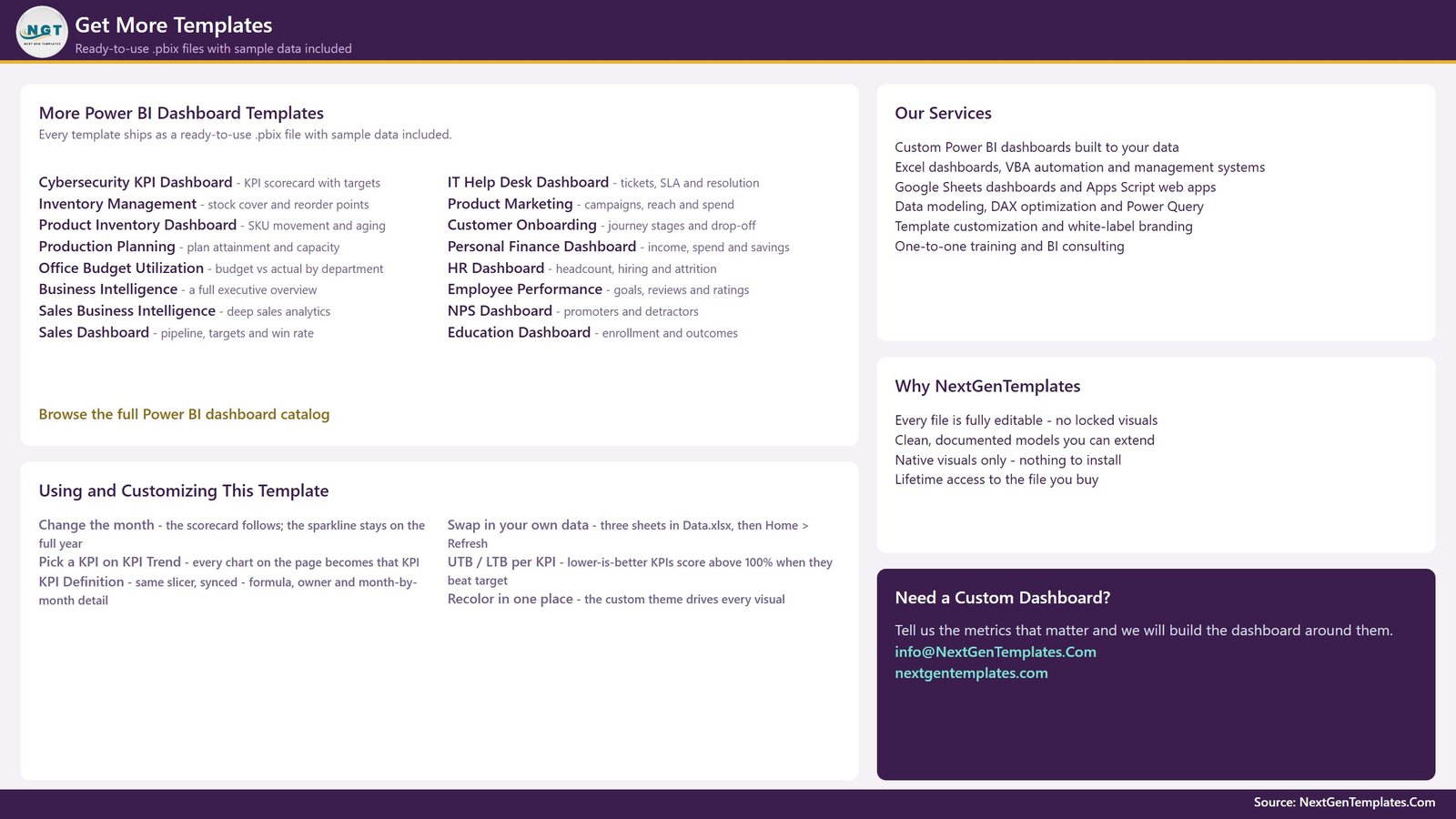
The last page lists tips for changing the month, swapping in your own data and recolouring the theme, plus links to more Power BI dashboard templates and custom dashboard services.
Power BI KPI Template vs. Tableau / Qlik Build vs. Rental Management Software – Feature Comparison
| Feature | Equipment Rental KPI Dashboard (Power BI) | Tableau / Qlik custom build | Rental management software suite |
|---|---|---|---|
| Cost | ✅ $12.99 one-time | Per-user licence plus build time | Quote-based subscription |
| Platform | Power BI Desktop (free, Windows) | Tableau / Qlik | Vendor cloud or server |
| Setup time | ✅ Under an hour with your figures | Days to weeks | Weeks, with onboarding |
| Rental KPI scorecard with traffic lights | ✅ Built in, 14 KPIs | Build it yourself | Depends on the reporting module |
| Lower-is-better scoring | ✅ Built in | Build it yourself | Varies |
| Customizable KPIs | ✅ Edit rows in Data.xlsx | ✅ Yes | Limited to vendor fields |
| Contracts, bookings and invoicing | ❌ Not included | ❌ Not included | ✅ Core feature |
| Share with a team | Share the .pbix, or publish with Power BI Pro | Server or cloud licence | ✅ User accounts |
For rental owners who want a monthly KPI scorecard without buying a new platform, this template sits in the sweet spot.
Who Should Use This Template
Perfect for:
- Owners and general managers of equipment and tool rental companies
- Fleet, service, dispatch and pricing managers who own one KPI group each
- Finance teams reviewing rental revenue, damage recovery and days sales outstanding
- Consultants who build monthly scorecards for rental clients
Not a fit if:
- You need rental management, booking, fleet telematics or invoicing software; this report only scores figures you enter
- You cannot run Power BI Desktop on Windows, or you need live GPS and hour-meter feeds
Real-World Use Cases
Maria owns a three-branch aerial and earthmoving rental company. On the first Monday of each month she selects the latest month, filters the Fleet group and checks Dollar Utilization % and Time Utilization %. When a KPI turns amber she opens KPI Trend to see whether the dip is seasonal or new this year.
Dev is service director at a general tool rental firm. He filters Service to track Maintenance Cost per Unit, Unavailable Equipment Hours and Return-to-Ready Turnaround, and uses the KPI Definition page to agree formulas with his yard supervisors.
Aisha is the credit manager. She watches Days Sales Outstanding and Damage Recovery Rate % on the Financial filter and brings the YTD traffic lights to the quarterly board pack.
Advantages of This Rental KPI Scorecard
- One page for the monthly review: 14 KPIs, two time frames and a YoY arrow replace several spreadsheets.
- Fair scoring for cost KPIs: lower-is-better logic means cost and turnaround KPIs are not shown as failures when they beat target.
- Clear ownership: the Owner and Priority slicers let each manager review only their KPIs.
- No subscription: a one-time purchase that runs in free Power BI Desktop.
- Easy to adapt: the model reads KPI names from Data.xlsx, so a crane or scaffolding business can swap in its own list.
Opportunities for Improvement
- YTD is typed, not calculated: the Input_ Target and Input_ Actual sheets carry a YTD column you fill yourself. The Read Me sheet sets the rule (sum for additive KPIs, average for rates and indexes), but a wrong entry flows straight to the YTD lights.
- Hidden tooltip pages: two tooltip pages, KPI Detail and Trend Detail, are hidden and only appear on hover, which can surprise someone editing the file.
- Header MoM chips compare counts: for example, MTD At Risk shows a 25.0% fall because the count went from 4 to 3, not because a KPI value changed by 25%.
- Manual data entry: there is no direct connector to rental or accounting systems; figures are pasted into Data.xlsx.
- Sample data only: all shipped numbers are fictional, and the template makes no safety, inspection or certification claim.
Best Practices
- Agree each formula with its owner before the first month, and record it in the KPI Definition sheet.
- Load the full prior year so YoY arrows and PY lines have something to compare against.
- Keep units consistent: enter percentages as numbers such as 42.14, not 0.4214, to match the sample.
- Review Critical priority KPIs first, then open KPI Trend for anything amber or red.
- Keep Data.xlsx beside the .pbix. If you move it, update the source as described in Microsoft’s guide to connecting Excel workbooks in Power BI Desktop.
Explore Relevant Templates
- Equipment Rental Business KPI Scorecard in Google Sheets – a separate browser-based build of the same topic.
- Agro Machinery Rental Dashboard in Power BI – see the full Agro Machinery Rental Dashboard walkthrough.
- Elevator Maintenance KPI Dashboard in Power BI – the same KPI scorecard family for a maintenance business.
- Heavy Machinery Dashboard in Google Sheets – fleet analysis in the browser.
More reading on this blog: the Kitchen Remodeling KPI Dashboard in Power BI uses the same scorecard layout, and the Hospital Equipment Leasing Dashboard in Power BI covers a leasing business. Excel editions of this equipment rental template are in preparation.
Frequently Asked Questions
Which KPIs does this Power BI rental scorecard track?
It tracks 14 KPIs in 6 groups: Rental Revenue, Damage Recovery Rate %, Days Sales Outstanding, Dollar Utilization %, Time Utilization %, Average Fleet Age, Rate Realization %, New Rental Accounts Opened, Maintenance Cost per Unit, Unavailable Equipment Hours, Return-to-Ready Turnaround, On-Time Delivery %, Delivery Cost per Haul and Customer NPS.
Do I need a paid Power BI licence?
No. Power BI Desktop is free from Microsoft and opens the .pbix on Windows; see Microsoft’s Power BI Desktop getting started guide. A Pro licence is only required to publish and share the report in the Power BI Service.
How long does setup take?
Most users are running on their own numbers within an hour. Edit the KPI Definition sheet, paste monthly targets and actuals for the current and prior year, then press Home > Refresh.
How does it compare with rental management software?
Rental management suites run contracts, bookings and invoices. This template does none of that; it scores the KPI figures those systems produce, as a one-time $12.99 purchase instead of a subscription.
Can I add or remove KPIs?
Yes. Add a row to KPI Definition with its monthly Target and Actual rows, or delete a KPI from all three sheets, then refresh. Nothing in the report hard-codes a KPI name.
How does lower-is-better scoring work?
For KPIs marked LTB, such as Maintenance Cost per Unit or Days Sales Outstanding, achievement is Target ÷ Actual. Average Fleet Age at 46.37 months against a 48.43 target therefore scores 104.4% and shows On Target.
About the Author
Built by PK – Microsoft Certified Professional with 15+ years of Excel, Google Sheets and Power BI experience and founder of NextGenTemplates, reaching 300K+ subscribers across YouTube channels. Every template is hand-built and tested before release.
Conclusion
A rental business needs a monthly review that covers fleet, service, logistics, pricing, finance and customers without a week of spreadsheet work. This Power BI scorecard gives every KPI an owner, a target, a traffic light and a year-over-year arrow on one page, with trend and definition pages one click away.
👉 Click here to Purchase the Equipment Rental Business KPI Dashboard in Power BI
✅ Instant download · One-time payment · No subscription
🎥 Watch more tutorials at Youtube.com/@PKAnExcelExpert
Last updated: September 2026