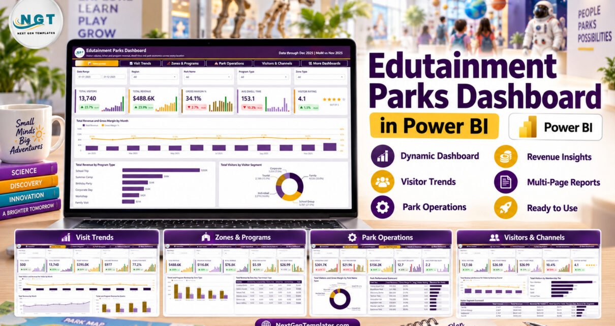
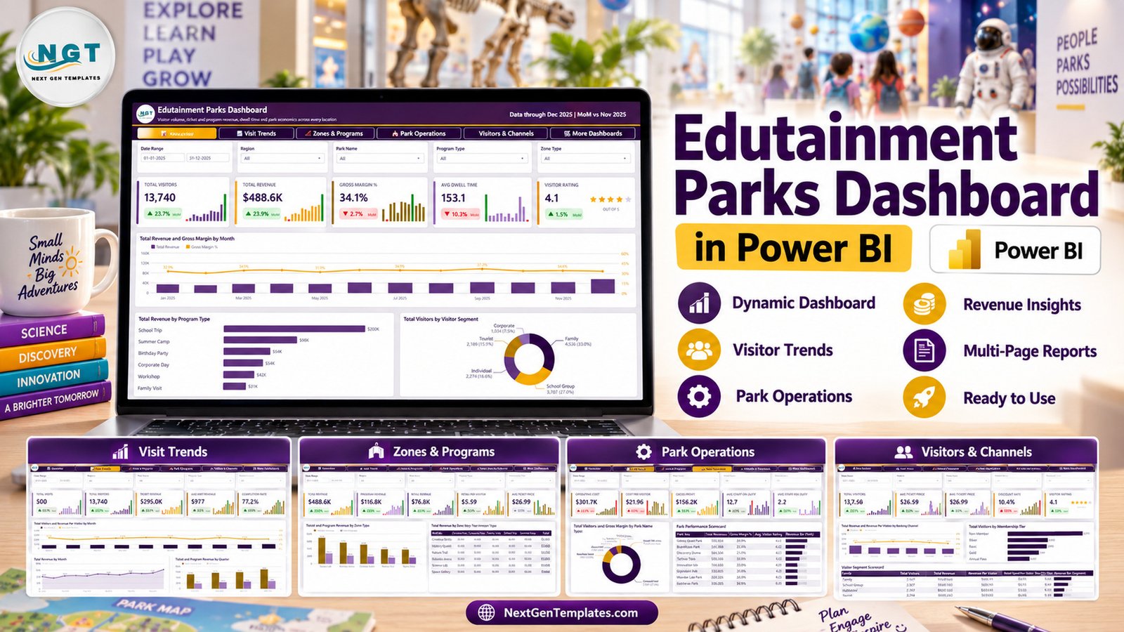
The Edutainment Parks Dashboard in Power BI is a ready-made Power BI Desktop report with 5 analysis pages, 25 KPI cards, 15 visuals and 5 slicers on each page. Its sample data holds 500 visits across 8 fictional parks, 6 zone types and 6 program types, dated 1 January to 31 December 2025, and it adds up to 13,740 visitors and $488.6K of revenue.
Edutainment parks earn money from tickets, school programs and retail at the same time, which makes a single spreadsheet hard to read. This guide walks through every page of the template, shows who it suits and where its limits are, and explains how to load your own numbers. If you work in Excel rather than Power BI, we also cover a separate build of the same topic in our Edutainment Parks Dashboard in Excel article.
Key Features of the Edutainment Parks Dashboard in Power BI
- Five analysis pages with tab navigation. Overview, Visit Trends, Zones & Programs, Park Operations and Visitors & Channels share one tab bar, and a sixth More Dashboards page lists other NextGenTemplates Power BI templates.
- 25 KPI cards. Every page shows five cards. Each card compares the latest month with November 2025 and draws a 12-month mini column trend, so a dip is visible without opening another chart.
- Shared and page-specific slicers. Date Range, Region, Park Name and Program Type sit on all pages. Zone Type, Booking Channel, Membership Tier, Booking Status and Visitor Segment each appear on one page.
- Three revenue streams. Ticket Revenue ($295.0K), Program Revenue ($116.8K) and Retail Revenue ($76.8K) are reported separately and set against Operating Cost ($301.7K) and Gross Profit ($156.2K).
- Two scorecard tables. The Park Performance Scorecard and the Visitor Segment Scorecard add in-cell revenue bars, so ranking parks and segments takes one glance.
- Plain Excel source. The model reads a 21-column Data.xlsx, which keeps the refresh simple for teams that export visits from another system.
Dashboard Pages Explanation
All five pages use the same header, the same four shared slicers and a row of five KPI cards above the charts. Here is what each page adds.
Page 1: Overview
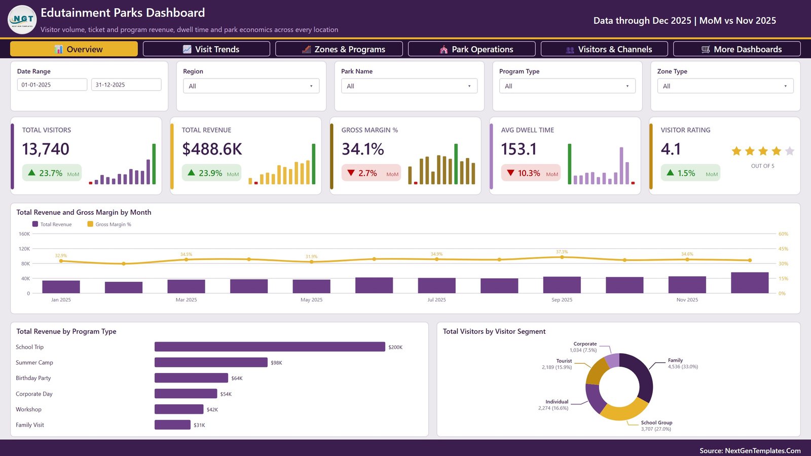
The Overview page shows Total Visitors (13,740), Total Revenue ($488.6K), Gross Margin % (34.1%), Avg Dwell Time (153.1) and Visitor Rating (4.1 out of 5). Its charts are Total Revenue and Gross Margin by Month, Total Revenue by Program Type, where School Trip leads at $200K, and Total Visitors by Visitor Segment, where Family groups account for 33.0% of visitors.
Page 2: Visit Trends
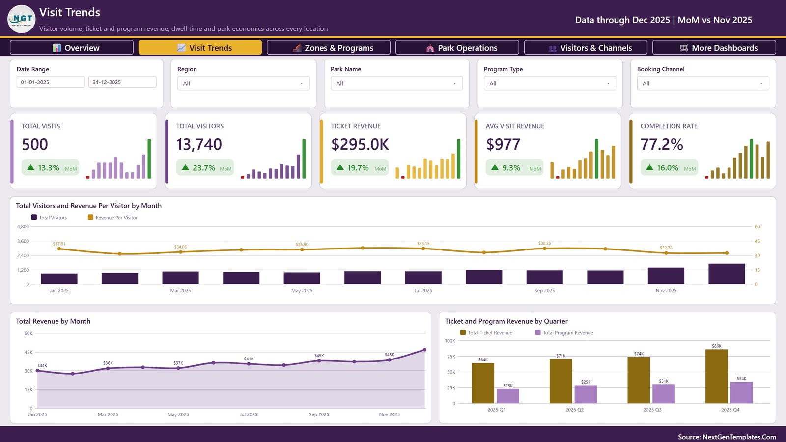
This page counts Total Visits (500), Total Visitors, Ticket Revenue ($295.0K), Avg Visit Revenue ($977) and Completion Rate (77.2%). The charts are Total Visitors and Revenue Per Visitor by Month, Total Revenue by Month and Ticket and Program Revenue by Quarter, which rises from $64K of ticket revenue in Q1 to $86K in Q4. A Booking Channel slicer is added here.
Page 3: Zones & Programs
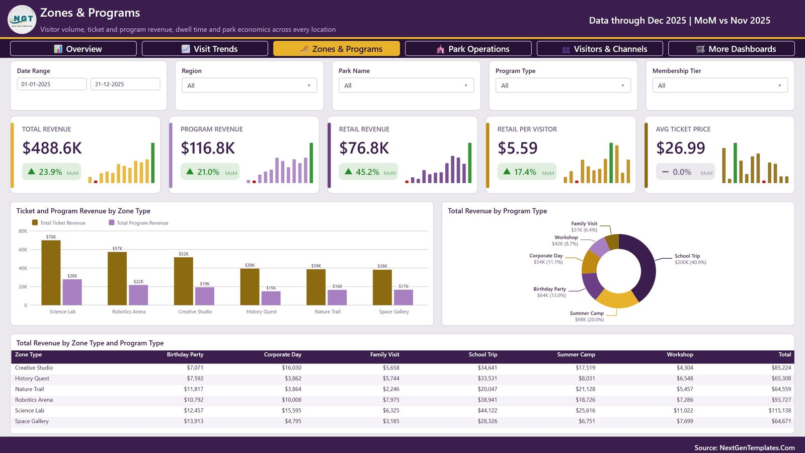
Cards cover Total Revenue, Program Revenue, Retail Revenue, Retail Per Visitor ($5.59) and Avg Ticket Price ($26.99). The visuals are Ticket and Program Revenue by Zone Type, Total Revenue by Program Type and a Total Revenue by Zone Type and Program Type matrix across Science Lab, Robotics Arena, Creative Studio, History Quest, Nature Trail and Space Gallery. Science Lab is the top zone at $115,138. The extra slicer is Membership Tier.
Page 4: Park Operations
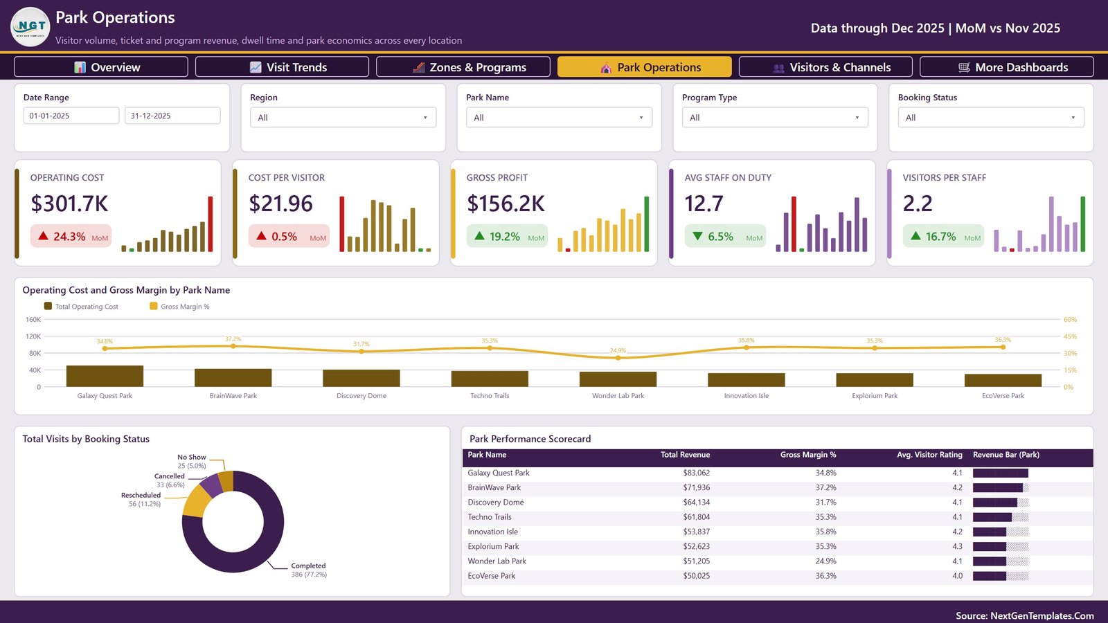
The operations page reports Operating Cost, Cost Per Visitor ($21.96), Gross Profit, Avg Staff On Duty (12.7) and Visitors Per Staff (2.2). The visuals are Operating Cost and Gross Margin by Park Name, Total Visits by Booking Status (386 completed, 56 rescheduled, 33 cancelled, 25 no-shows) and the Park Performance Scorecard. A Booking Status slicer is added.
Page 5: Visitors & Channels
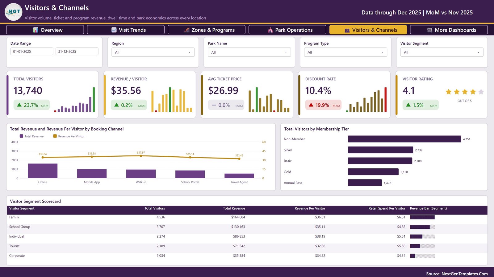
The last analysis page shows Total Visitors, Revenue / Visitor ($35.56), Avg Ticket Price, Discount Rate (10.4%) and Visitor Rating. The visuals are Total Revenue and Revenue Per Visitor by Booking Channel, Total Visitors by Membership Tier and the Visitor Segment Scorecard. Its page slicer is Visitor Segment.
Edutainment Parks Dashboard in Power BI vs. Tableau / Qlik vs. Paid Attractions Software – Feature Comparison
| Feature | Edutainment Parks Dashboard in Power BI | Tableau / Qlik build | Paid attractions analytics software |
|---|---|---|---|
| Cost | ✅ $17.99 one-time | Per-user subscription licences | Recurring subscription, often priced per venue |
| Platform | Power BI Desktop (free, Windows) | Tableau Desktop or Qlik Sense | Vendor web app |
| Setup time | ✅ Open the .pbix, sample data already loaded | Design every page from scratch | Onboarding and integration project |
| Ready-made edutainment pages | ✅ 5 pages, 25 KPI cards, 15 visuals | Blank canvas | Depends on the vendor |
| Customizable fields and visuals | ✅ Every visual and measure editable | ✅ Yes | Limited to vendor options |
| Real-time team collaboration | Needs Power BI Service licences to share | Needs server or cloud licences | ✅ Usually built in |
| Mobile access | Power BI mobile app after publishing | Mobile apps with licences | ✅ Usually built in |
| Share with link | Through the Power BI Service | Through Tableau Cloud or Qlik Cloud | ✅ Yes |
| Live ticketing or POS feed | No – refresh from Data.xlsx or your own source | Depends on your connectors | ✅ Often included |
For attractions that want visitor, revenue and cost analysis without committing to a subscription platform, this Power BI template sits in the sweet spot.
Who Should Use This Template
Perfect for:
- Operations and finance managers at science centres, discovery parks and children’s museums
- Groups running several edutainment sites that need a park-by-park comparison
- School and group sales teams watching School Trip and Summer Camp revenue
- Power BI analysts and consultants who want a working model to adapt for a client
Not a fit if:
- You need ticketing, booking or point-of-sale software – this report does not sell tickets or take bookings
- You want live attendance counts without setting up a data source
- You only use a Mac and have no access to Power BI Desktop on Windows
- You need ride-safety, inspection or certification records – the data model has no such fields
Real-World Use Cases
Maya runs operations for a three-site science discovery centre. Every month she filters Park Operations by Park Name, compares Cost Per Visitor and Visitors Per Staff across her sites and brings the Park Performance Scorecard to the owners’ meeting. When one site’s margin drops, the Operating Cost and Gross Margin by Park Name chart shows whether cost or revenue moved.
Daniel manages school and group sales for a STEM attraction. He opens Visitors & Channels, sets Program Type to School Trip and checks how revenue from the School Portal channel moves month to month before planning his next campaign to teachers.
Priya is a freelance Power BI consultant. She loads a client’s visit export into Data.xlsx, updates the Power Query path, changes the colours to the client’s brand and delivers a five-page report instead of building a model from zero.
Advantages of This Power BI Template
- One purchase, no subscription. You pay once and keep the .pbix.
- Revenue and cost in one model. Ticket, program and retail revenue sit next to operating cost, gross profit and discount rate, so margin conversations use one set of numbers.
- Consistent filtering. Because four slicers repeat on every page, a manager can move between pages without losing the park or program they are looking at.
- Quick to read. Mini trends on every KPI card surface seasonal patterns, such as the December revenue peak in the sample, before anyone opens a detail chart.
- Easy to extend. The report runs on standard Power BI visuals, so analysts can add measures or pages with skills they already have.
Opportunities for Improvement
- No live data connection. The report refreshes from Data.xlsx. A live feed from a ticketing or booking system has to be built separately.
- Windows only for editing. Power BI Desktop runs on Windows, and online sharing needs Power BI Service licences.
- Month-on-month only. KPI cards compare the latest month with the one before; there is no year-over-year comparison or target line in the sample build.
- Dwell time has no unit on the card. Avg Dwell Time is calculated from the Dwell Time Minutes column, so read 153.1 as minutes.
- Fictional sample. The parks and figures are invented, so treat the numbers as a demonstration until your own data is loaded.
Best Practices
- Keep the 21 column headers in Data.xlsx exactly as supplied so every measure keeps working.
- Use one row per visit or booking and fill Visitors, revenue and cost columns as numbers, not text.
- Refresh after each monthly export so the MoM figures on the cards compare the right months.
- Use the Date Range slicer to focus on a season, such as summer camps, before comparing parks.
- Read Microsoft’s guide to slicers in Power BI if you plan to add or sync more filters.
Explore Relevant Templates
This edutainment park Power BI template sits in a wider family of attraction and leisure templates:
- Also available as: Edutainment Parks Dashboard in Excel – a separate Excel workbook build of the same topic, not a copy of this .pbix.
- Edutainment Parks KPI Dashboard in Power BI – a KPI-style template from a different product family; read our Edutainment Parks KPI Dashboard in Power BI article.
- Outdoor Adventure Parks Dashboard in Power BI – see the Outdoor Adventure Parks Dashboard walkthrough.
- Museum Dashboard in Power BI – covered in our Museum Dashboard in Power BI post.
Frequently Asked Questions
What does the Edutainment Parks Dashboard in Power BI show?
It shows 25 KPI cards and 15 visuals across five pages: Overview, Visit Trends, Zones & Programs, Park Operations and Visitors & Channels. Measures include Total Visitors, Total Revenue, Gross Margin %, Completion Rate, Cost Per Visitor, Visitors Per Staff and Discount Rate.
What software do I need?
You need Power BI Desktop, which Microsoft provides free for Windows. Microsoft’s Power BI Desktop getting-started guide covers installation. Sharing the report online through the Power BI Service needs the licences your organisation uses.
How long does setup take?
The file opens with sample data already loaded. To switch to your own data, paste your visits into Data.xlsx under the same 21 headers, update the source path in Power Query and click Refresh. Most of the effort is cleaning your own export.
Is the Excel edition the same report?
No. The Excel edition is a separate workbook build of the edutainment topic, while this template is a Power BI .pbix file with Power BI visuals and slicers. Look at each product’s screenshots rather than assuming the pages match one for one.
Can it connect to a ticketing system?
Not directly. The template reads Data.xlsx, so you export visits from your ticketing or booking system into the same columns or repoint Power Query at another source. It does not sell tickets, take bookings or track ride safety.
How does it compare to paid attractions analytics software?
Subscription platforms include hosting and live feeds for a recurring fee. This template is a one-time purchase that gives you the finished Power BI model and pages; you provide the data and, for online sharing, the Power BI licences.
About the Author
Built by PK – Microsoft Certified Professional with 15+ years of Excel, Google Sheets and Power BI experience and founder of NextGenTemplates. Every template is hand-built and tested before release.
Conclusion
The Edutainment Parks Dashboard in Power BI gives edutainment operators a finished five-page view of visitors, revenue streams, park costs and booking channels, with sample data to explore before loading their own. It is a reporting template rather than a ticketing system, and it is honest about needing Power BI Desktop and your own data source.
👉 Click here to Purchase the Edutainment Parks Dashboard in Power BI
✅ Instant download · One-time payment · No subscription
🎥 Watch more tutorials at Youtube.com/@PKAnExcelExpert
Last updated: September 2026