The Outdoor Adventure Parks Dashboard in Power BI gives park owners, operations managers, finance analysts, safety leads, and guest experience teams a ready reporting structure for revenue, visitors, net profit, operating cost, revenue per visitor, attendance rate, completed visits, weather, staff teams, visitor segments, ticket types, booking channels, regions, parks, and adventure activities. Outdoor adventure parks can process thousands of visits across climbing areas, zip lines, rope courses, group events, ticket channels, and guest service teams. When the data is reviewed in separate files, weekly decisions become slow. This Power BI dashboard brings those signals into 5 focused pages with KPI cards, charts, and slicers.
The report is built as an editable PBIX file. You can open it in Power BI Desktop, replace the sample data with your own approved source, refresh the report, and customize visuals or fields as needed. For more guidance on building and editing reports, see Microsoft Learn Power BI report documentation.
Key Features of Outdoor Adventure Parks Dashboard in Power BI
- 5 Power BI pages: Overview, Revenue, Attendance, Safety, and Guest Exp.
- 5 KPI cards: Total Revenue, Total Visitors, Net Profit, Total Operating Cost, and Revenue Per Visitor.
- Interactive slicers: Filter the dashboard quickly by available park, month, ticket, activity, weather, safety, region, channel, visitor segment, and staff team fields.
- Revenue analysis: Review visits by region, operating cost by booking channel, net profit by ticket type, and revenue by park.
- Attendance analysis: Compare revenue per visitor, visitor segment volume, safety level profit, and attendance rate by activity.
- Safety visibility: Understand how weather, staff teams, parks, regions, and completed visits relate to performance.
- Guest experience view: Track completed visits by staff team, attendance by visitor segment, average satisfaction by park, and monthly cost.
- Editable Power BI file: Customize report pages, visuals, labels, fields, colors, measures, and source connections in Power BI Desktop.
Dashboard Pages Explanation
1. Overview Page
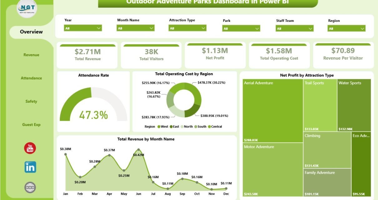
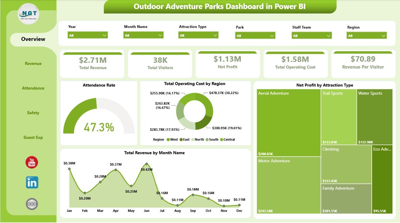
The Overview page is the executive summary of the report. The top cards show Total Revenue, Total Visitors, Net Profit, Total Operating Cost, and Revenue Per Visitor, helping leaders understand demand, cost, profitability, and visitor value before moving into detailed pages.
Attendance Rate by Overall Visits: This chart shows attendance rate against the selected visit base. It helps managers compare how filtered parks, activities, visitor groups, regions, or months are converting visit opportunities into completed attendance.
Total Operating Cost by Region: This visual compares operating cost by region. It helps finance and operations teams spot areas where staffing, maintenance, equipment, or activity support costs may require review.
Net Profit by Attraction Type: This chart compares net profit across attraction categories. It helps operators identify which attraction types produce stronger financial contribution after operating cost is considered.
Total Revenue by Month Name: This trend shows revenue movement by month. It supports seasonality review, promotion timing, capacity planning, and month-to-month performance monitoring.
2. Revenue
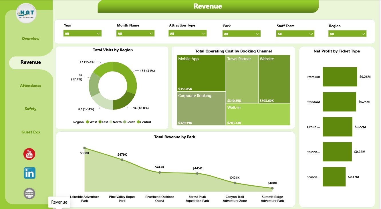
The Revenue page is designed for financial and visitor demand analysis. It helps teams compare where visits come from, which booking channels carry higher operating cost, which ticket types produce stronger net profit, and which parks contribute the most revenue.
Total Visits by Region: This chart shows visitor volume by region. It helps marketing and operations teams understand where guest demand is strongest and where regional promotions may need attention.
Total Operating Cost by Booking Channel: This visual compares cost by booking channel. It helps identify whether direct, online, agent, partner, or other channels are adding different levels of cost pressure.
Net Profit by Ticket Type: This chart shows profitability by ticket category. It helps teams compare standard, group, premium, family, or other ticket types when planning prices and packages.
Total Revenue by Park: This chart compares revenue contribution by park location. It helps multi-location teams identify stronger parks and locations that may need operational or marketing support.
3. Attendance
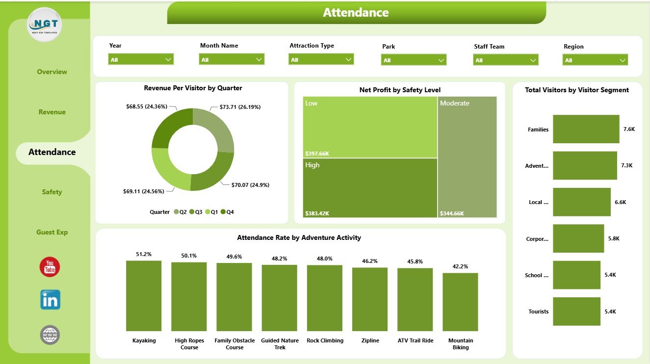
The Attendance page helps users understand visitor value, participation patterns, safety context, and adventure activity engagement. It is useful for operations teams that need to connect guest volume with seasonal trends and activity-level performance.
Revenue Per Visitor by Quarter: This chart shows how average guest value changes by quarter. It helps managers identify seasonal differences in pricing, package mix, upsells, and visitor spend.
Net Profit by Safety Level: This visual compares profit by safety classification. It helps safety and finance teams review whether certain safety levels are linked with higher cost, lower volume, or stronger profit.
Total Visitors by Visitor Segment: This chart compares visitor volume by segment. It helps teams see whether families, schools, tourists, corporate groups, or other segments are driving traffic.
Attendance Rate by Adventure Activity: This chart compares attendance rate across activities. It helps identify the activities that attract stronger participation and those that may need scheduling, staffing, or promotion changes.
4. Safety
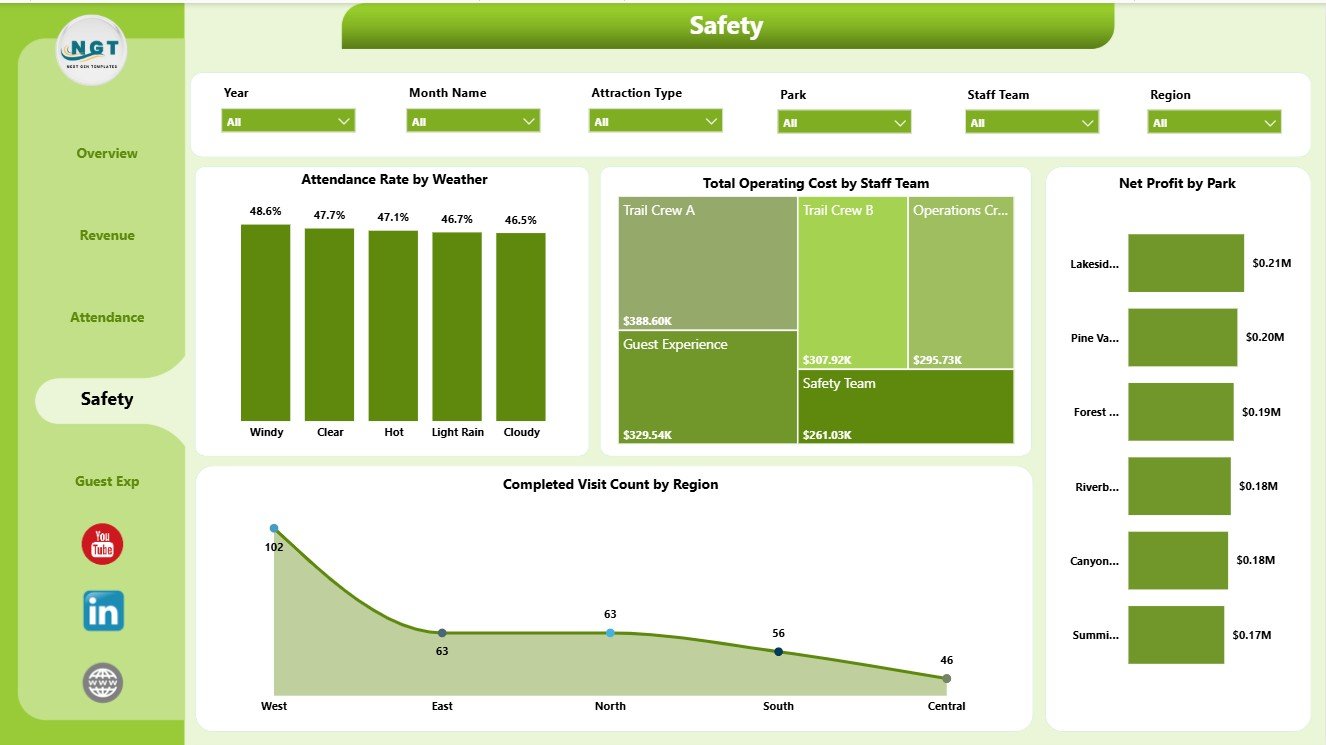
The Safety page connects conditions, staff teams, park profitability, and completed visits. It supports safety leads and operations managers who need to review how weather and staffing context relate to visitor completion and financial outcomes.
Attendance Rate by Weather: This chart shows attendance rate by weather condition. It helps operators understand how rain, clear weather, heat, or other conditions affect turnout and activity completion.
Total Operating Cost by Staff Team: This visual compares operating cost by team. It supports staff planning and helps managers review whether specific teams or shifts are linked with higher cost.
Net Profit by Park: This chart compares park-level profitability. It helps leadership understand which locations are performing better after costs are considered.
Completed Visit Count by Region: This visual shows completed visits by region. It helps teams compare where successful guest completion is strongest and where regional follow-up may be needed.
5. Guest Exp
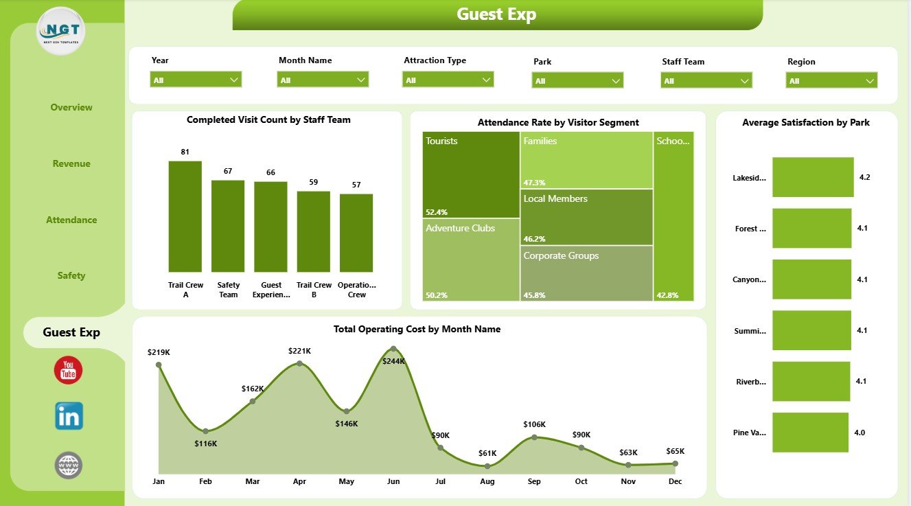
The Guest Exp page focuses on visitor experience, service delivery, satisfaction, and monthly cost movement. It is useful for teams that want to connect operational activity with guest feedback and park-level performance.
Completed Visit Count by Staff Team: This chart compares completed visit volume by staff team. It helps managers review service delivery load and identify teams handling more completed activity.
Attendance Rate by Visitor Segment: This visual compares attendance rate by guest group. It helps teams understand which visitor segments engage most reliably with the park experience.
Average Satisfaction by Park: This chart compares satisfaction by park location. It helps guest experience teams identify strong locations and parks that may need service improvement.
Total Operating Cost by Month Name: This trend shows operating cost by month. It helps leaders review cost seasonality and investigate months where spending increases.
Outdoor Adventure Parks Dashboard in Power BI vs. Tableau vs. Paid CRM/SaaS – Feature Comparison
| Feature | This Power BI dashboard | Tableau or Qlik alternative | Paid park SaaS |
|---|---|---|---|
| Cost | One-time template purchase | License cost plus dashboard build time | Monthly or annual subscription |
| Platform | Power BI Desktop and Power BI Service | BI platform setup required | Vendor cloud system |
| Setup time | Open PBIX, connect data, refresh | Build model, calculations, and visuals | Implementation and onboarding |
| Real-time team collaboration | Available after publishing to Power BI Service | Available through cloud plan | Usually included by plan |
| Mobile access | Available through Power BI mobile/service | Available through vendor apps | Usually included |
| Customizable fields | Editable report pages, visuals, fields, and measures | Editable with BI skills | Often limited by vendor settings |
| Share with link | Possible through Power BI permissions | Possible through platform permissions | Usually login controlled |
| Year-1 cost at 5 users | Template price plus any Microsoft licensing | Usually higher once licenses and build time are included | Often hundreds or thousands |
| Park analytics | Pre-built views for revenue, visitors, cost, profit, attendance, safety, weather, staff teams, satisfaction, parks, tickets, and activities | Requires custom dashboard design | Depends on reporting module |
Who Should Use This Template
This template is best for outdoor adventure park owners, amusement and activity park managers, zip line operators, ropes course managers, tourism operators, finance analysts, safety coordinators, guest experience teams, and consultants who already have structured data and want a repeatable Power BI reporting layer.
It is not a ticketing platform, waiver management system, incident logging product, reservation engine, POS system, CRM, or live operations database. Use it after your park data has been exported, connected, or prepared for Power BI.
Real-World Use Cases
Weekly operations review: A park manager filters by weather, activity, staff team, and visitor segment to understand which conditions are helping or hurting attendance.
Finance review: A finance analyst compares revenue, net profit, operating cost, booking channel, ticket type, attraction type, and park to understand margin movement.
Guest experience planning: A guest experience lead reviews satisfaction by park, attendance by visitor segment, and completed visits by staff team before planning staffing, signage, and guest service improvements.
Advantages of Outdoor Adventure Parks Dashboard in Power BI
- It gives park teams a ready report structure instead of starting from a blank PBIX file.
- It connects finance, visitor demand, safety context, staffing, satisfaction, and activity performance in one dashboard.
- It can be refreshed when new records are connected or added to the source data.
- It uses familiar Power BI functionality, so analysts can customize visuals and measures as reporting needs change.
- It supports recurring reviews because the same metrics can be compared by month, quarter, park, region, activity, and segment.
Opportunities for Improvement
- Add data validation or cleaning rules before loading data so park names, regions, ticket types, visitor segments, activities, and weather values remain consistent.
- Create clear KPI definitions for attendance rate, revenue per visitor, completed visit count, net profit, and operating cost.
- Connect exported data from ticketing, staffing, and guest feedback systems when the team is ready for a more automated refresh workflow.
- Document any custom DAX measures added after purchase so future users understand the calculations.
Best Practices
- Keep source columns consistent with the sample structure before refreshing the report.
- Use the same park names, ticket types, activity names, staff team names, and regions every month.
- Validate totals after replacing the sample source with your own data.
- Use slicers during review meetings instead of duplicating pages for every segment.
- Publish to Power BI Service only after checking workspace permissions, privacy settings, and data governance requirements.
Explore Relevant Templates
You can download the draft product here: Outdoor Adventure Parks Dashboard in Power BI. You may also like Outdoor Adventure Parks Dashboard in Excel, Adventure Tourism Dashboard in Power BI, Eco Lodges Dashboard in Power BI, and Destination Management Companies Dashboard in Power BI.
Frequently Asked Questions
What is included in the Outdoor Adventure Parks Dashboard in Power BI?
It includes 5 Power BI pages: Overview, Revenue, Attendance, Safety, and Guest Exp. The report includes KPI cards, slicers, and charts for revenue, visitors, profit, cost, attendance, safety, staff teams, weather, satisfaction, parks, and activities.
Do I need Power BI Desktop?
Yes. Power BI Desktop is required to open and edit the PBIX file. Power BI Service is optional if you want browser access, sharing, or scheduled refresh.
Can I use my own park data?
Yes. Replace or connect the sample source with your structured adventure park data, then refresh the report.
Can I customize the report?
Yes. You can edit pages, visuals, colors, fields, slicers, measures, labels, and data connections in Power BI Desktop.
Is this a reservation or ticketing system?
No. It is a reporting dashboard template, not a live booking, ticket scanning, waiver, incident, POS, or CRM system.
Can I publish it online?
Yes. You can publish it to Power BI Service if your Microsoft account, workspace, and data permissions support publishing.
About the Author
Built by PK – Microsoft Certified Professional with 15+ years of Excel, Google Sheets, and Power BI experience. Founder of NextGenTemplates, reaching 300K+ subscribers across YouTube channels. Every template is hand-built and tested before release.
Conclusion
The Outdoor Adventure Parks Dashboard in Power BI gives adventure park teams a practical way to review revenue, visitors, operating cost, net profit, revenue per visitor, attendance rate, completed visits, weather, safety level, staff teams, visitor segments, ticket types, booking channels, regions, activities, satisfaction, and park performance in one editable report. It is a strong fit when you already have structured data and need a faster way to turn it into recurring management insight.
For more tutorials, visit YouTube.com/@PKAnExcelExpert.
Last updated: July 19, 2026