The Palliative Care Dashboard in Excel gives healthcare teams a ready workbook for tracking encounters, home visits, cost, hospital admissions, admission percentage, risk level, care setting, diagnosis, payer type, referral source, region, service line, facility, clinician team, and satisfaction score. CMS reported that more than 1.7 million Medicare beneficiaries received hospice care in 2023, with Medicare hospice spending totaling $25.7 billion, so even small reporting improvements can matter when teams review care quality, cost, and capacity.
This template brings the main operational signals into one Excel file with 5 dashboard pages, 5 high-level KPI cards, interactive slicers, a Data sheet, and a pivot-backed Support sheet. Replace the sample data, click Refresh All, and use the pages to review volume, clinical risk, finance, experience, and service-line performance without building the dashboard from scratch.
Download the Palliative Care Dashboard in Excel
Key Features of Palliative Care Dashboard in Excel
- 5 dashboard pages: Overview, Care Volume, Clinical Risk, Financial, and Experience.
- 5 KPI cards: Total Encounters, Total Home Visits, Total Cost, Total Hospital, and Avg. Satisfaction.
- Interactive slicers: Filter the dashboard quickly by the available facility, team, care setting, risk, payer, region, referral, service line, month, and status fields.
- Care volume analysis: Review encounters, hospital admissions, clinician teams, facilities, risk levels, and service lines.
- Clinical risk analysis: Compare admission percentage by diagnosis, admissions by age group, case status, and cost by payer type.
- Financial and experience views: Track cost by care setting, referral source, region, and service line while reviewing satisfaction by setting and month.
- Editable Excel workbook: Customize the data, charts, pivots, slicers, formulas, and layout as your reporting needs change.
Dashboard Pages Explanation
1 – Overview Page
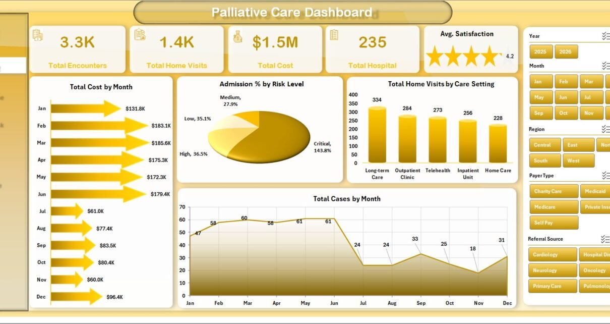
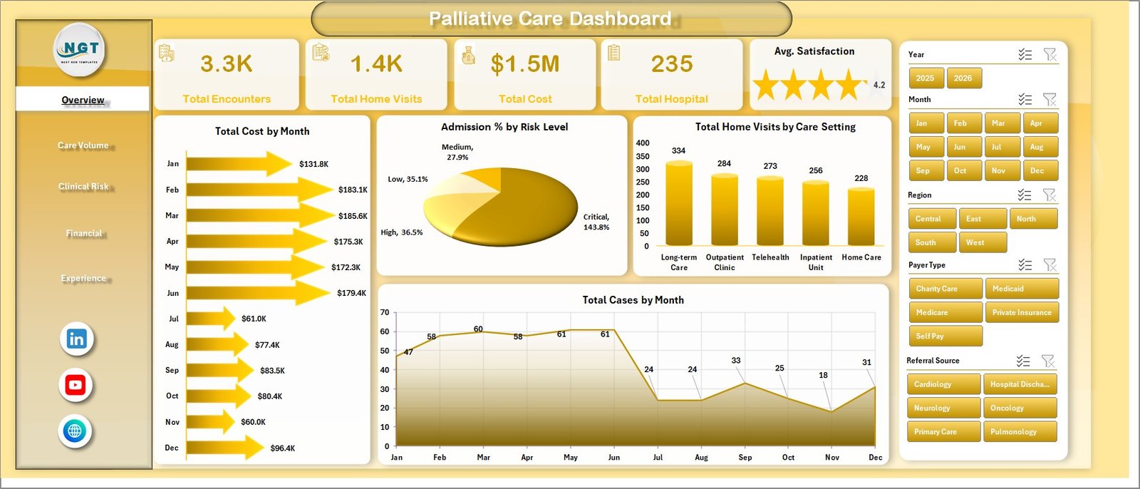
The Overview page is the executive summary for the workbook. The top cards show Total Encounters, Total Home Visits, Total Cost, Total Hospital, and Avg. Satisfaction so leaders can quickly review program volume, patient-touch activity, cost exposure, hospital utilization, and experience quality.
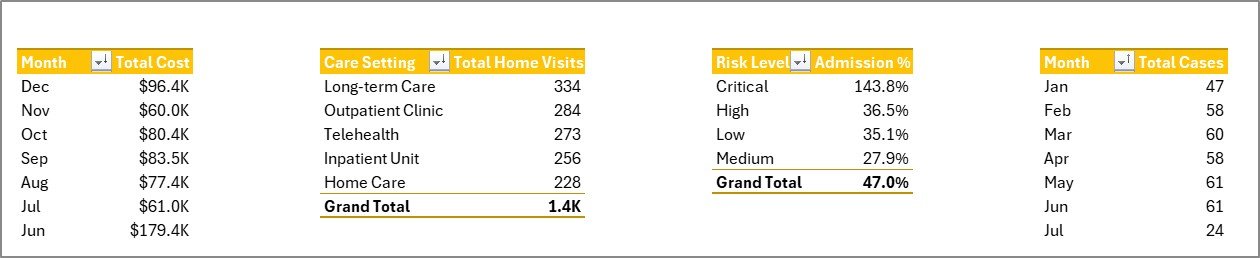
Total Cost by Month: This chart shows monthly cost movement. It helps finance and care operations teams identify cost spikes, seasonal workload, or periods that need deeper review.
Admission % by Risk Level: This chart compares admission percentage across risk levels. It helps teams see whether high-risk groups are driving hospital utilization and where care coordination may need attention.
Total Home Visits by Care Setting: This chart compares home visit volume across care settings. It helps managers understand where visits are concentrated and how care delivery is distributed.
Total Cases by Month: This trend shows case volume month by month. It is useful for capacity planning, staffing review, and identifying demand movement over time.
2 – Care Volume
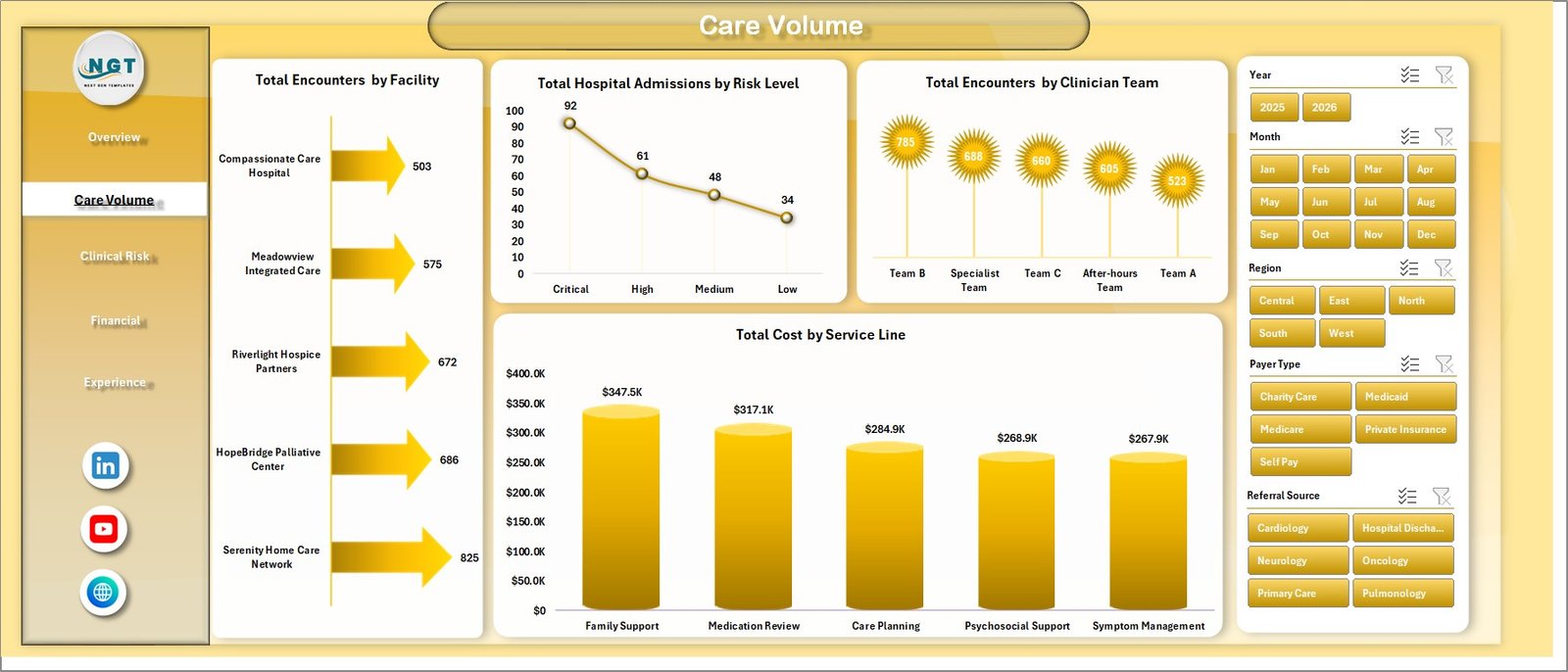
The Care Volume sheet focuses on workload and delivery volume. Total Encounters by Facility compares encounter volume across facilities so leaders can spot high-demand locations. Total Hospital Admissions by Risk Level shows where admissions are concentrated by risk group. Total Encounters by Clinician Team helps managers compare team workload. Total Cost by Service Line highlights which service areas carry higher cost.
3 – Clinical Risk
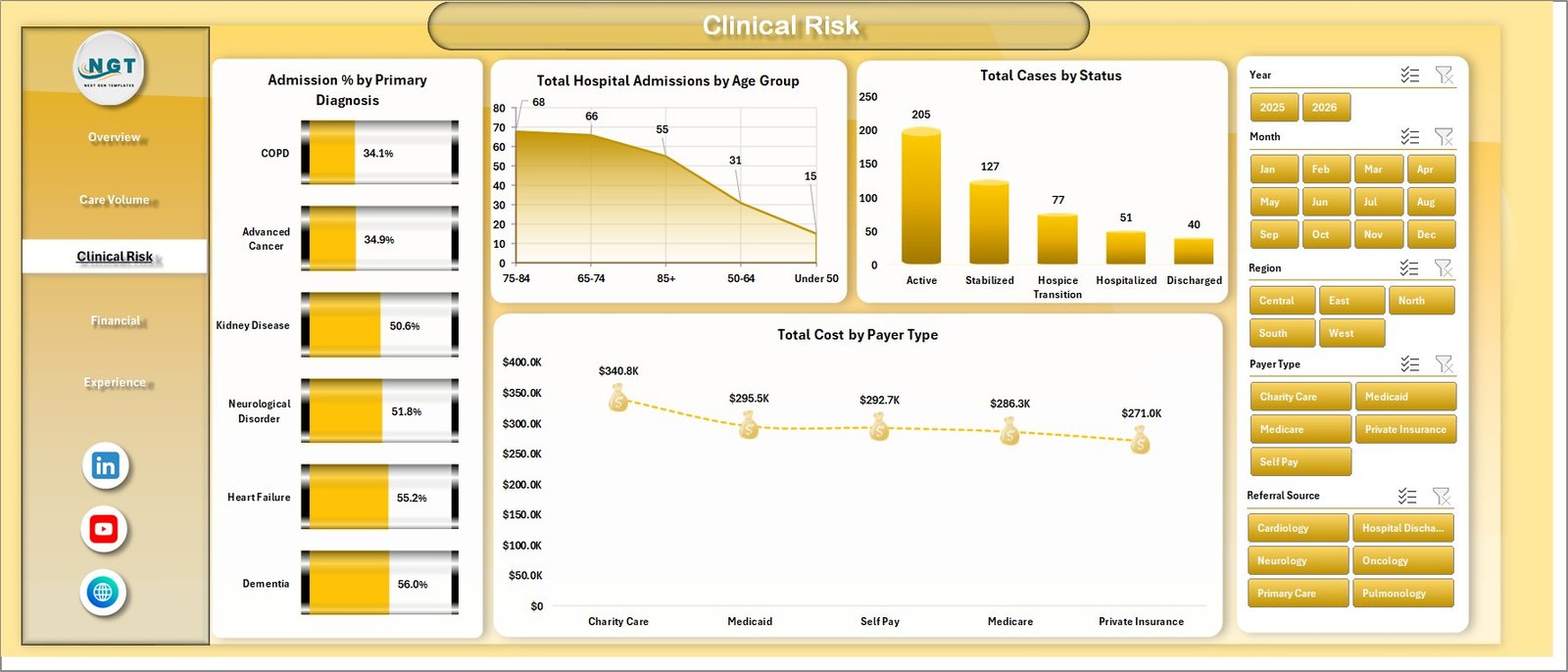
The Clinical Risk page is built for risk, diagnosis, age, status, and payer analysis. Admission % by Primary Diagnosis helps teams compare hospitalization exposure by diagnosis. Total Hospital Admissions by Age Group shows admission volume by patient age group. Total Cases by Status gives a view of active, closed, pending, or other case statuses. Total Cost by Payer Type supports payer-level cost review.
4 – Financial
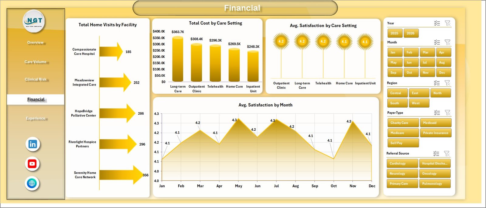
The Financial page connects care delivery with spend and satisfaction. Total Home Visits by Facility compares visit activity by facility. Total Cost by Care Setting shows where spending is highest. Avg. Satisfaction by Care Setting compares experience scores across settings. Avg. Satisfaction by Month tracks whether experience is improving, stable, or declining over time.
5 – Experience
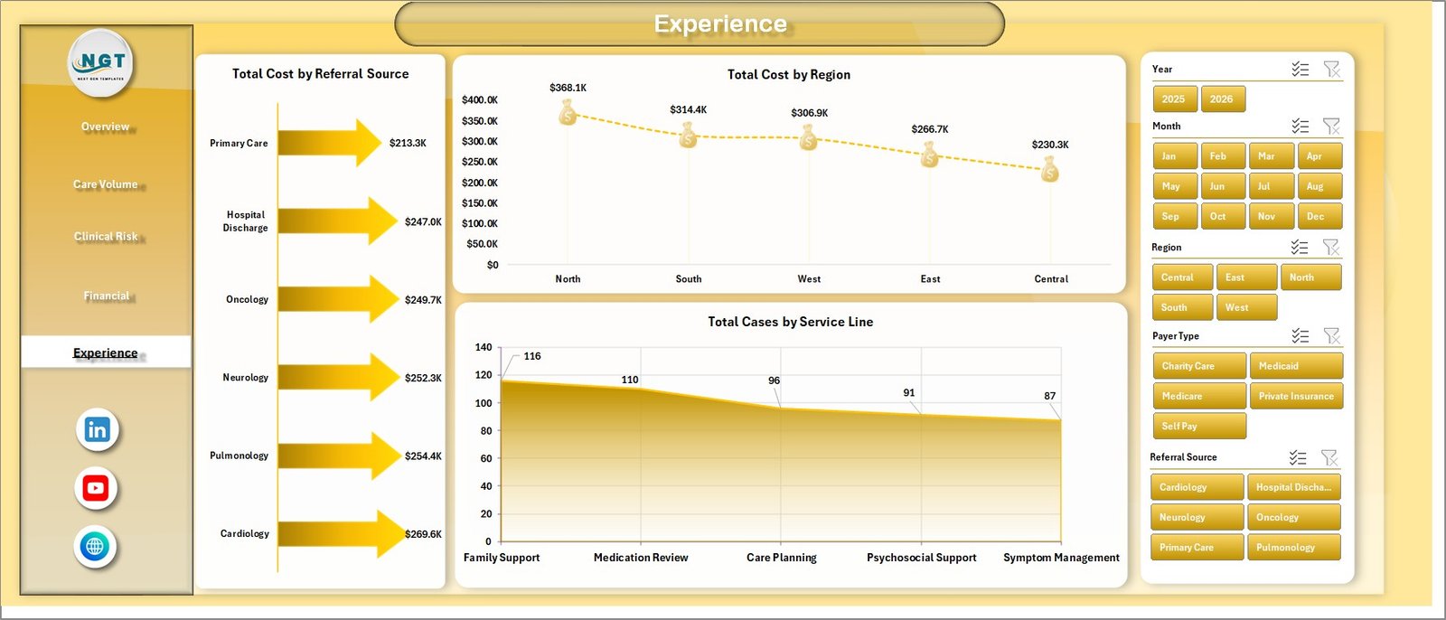
The Experience page gives a focused view of referral, regional, and service-line performance. Total Cost by Referral Source helps teams compare cost by referral path. Total Cost by Region highlights geographic cost concentration. Total Cases by Service Line shows which service lines carry the largest case volume.
6 – Data Sheet Tab
The Data Sheet is the input layer of the workbook. Add your palliative care records in the same format as the sample data so the pivots, slicers, cards, and charts continue to update correctly. Keep date, facility, team, diagnosis, payer, cost, visit, admission, risk, and satisfaction fields clean before refreshing.

7 – Support Sheet
The Support Sheet contains the pivot tables that power the dashboard. After updating the Data Sheet, go to the Data tab in the Excel Ribbon and click Refresh All. Microsoft also documents PivotTable refresh options here: Refresh PivotTable data. You can keep the Support Sheet hidden during normal use.
Palliative Care Dashboard in Excel vs. Google Sheets vs. Paid Healthcare SaaS – Feature Comparison
| Feature | This Excel Dashboard | Google Sheets Alternative | Paid Healthcare SaaS |
|---|---|---|---|
| Cost | One-time template purchase | Low software cost, but may need manual build | Monthly or annual subscription |
| Platform | Microsoft Excel | Browser-based spreadsheet | Vendor cloud platform |
| Setup time | Replace data and refresh | Build or adapt formulas, pivots, slicers, and charts | Implementation and onboarding |
| Real-time team collaboration | Available through OneDrive or SharePoint | Built in | Usually included |
| Mobile access | Possible through Excel mobile or cloud storage | Built in | Usually included |
| Customizable fields | Editable workbook structure | Editable sheet structure | Depends on vendor settings |
| Share with link | Use OneDrive or SharePoint | Built in | Login controlled |
| Year-1 cost at 5 users | Template cost plus existing Excel licensing | Usually low | Often much higher |
| Palliative care reporting | Built around encounters, home visits, cost, admissions, risk, setting, payer, region, referral, service line, and satisfaction | Requires custom setup | Depends on platform exports and report access |
Who Should Use This Template
This dashboard is a good fit for palliative care administrators, hospice managers, care coordination teams, nurse leaders, finance analysts, quality improvement teams, healthcare consultants, and operations managers who already use Excel for recurring reporting. It works best when your source data can be exported or maintained in a structured table.
It is not a replacement for an EHR, claims platform, clinical decision tool, scheduling system, compliance product, care plan system, or patient communication platform. Use it as an analytics workbook after data has been collected and prepared.
Real-World Use Cases
Weekly care operations review: A care operations manager filters by facility, clinician team, care setting, and month to review encounter volume, home visits, and hospital admissions before a staffing meeting.
Monthly finance review: A finance analyst compares cost by payer type, care setting, service line, referral source, region, and month to understand cost concentration and budget movement.
Quality improvement planning: A quality lead reviews admission percentage by diagnosis and risk level, then pairs that with satisfaction by care setting to identify service areas that need attention.
Advantages of Palliative Care Dashboard in Excel
- It keeps volume, risk, finance, and experience analysis in one workbook.
- It uses familiar Excel features, so most teams can update it without a new software rollout.
- It supports quick filtering through slicers for faster review meetings.
- It separates the editable Data Sheet from the Support Sheet that powers the dashboard.
- It gives teams a repeatable structure for monthly or weekly palliative care reporting.
Opportunities for Improvement
The dashboard depends on clean data, consistent headers, and a refresh workflow. It does not connect directly to every EHR, claims platform, or care coordination system. Teams with very large datasets may eventually want Power BI, a database, or a direct reporting pipeline. For Excel-based reporting, however, this workbook gives a practical starting point that can be customized over time.
Best Practices
- Keep the same column headers in the Data Sheet.
- Validate cost, date, encounter, admission, visit, diagnosis, payer, region, and satisfaction fields before refreshing.
- Use consistent names for facilities, clinician teams, care settings, payer types, and service lines.
- Refresh all pivot tables after every data update.
- Hide the Support Sheet after setup to keep the workbook clean for end users.
- Save a backup copy before making major structural changes.
Explore Relevant Templates
- Palliative Care Dashboard in Excel
- Palliative Care KPI Dashboard in Excel
- Organ Donation Networks Dashboard in Excel
- Occupational Therapy Dashboard in Excel
- Browse Excel Dashboard Templates
Frequently Asked Questions
What is included in the Palliative Care Dashboard in Excel?
The workbook includes Overview, Care Volume, Clinical Risk, Financial, Experience, Data Sheet, and Support Sheet tabs, plus KPI cards, slicers, charts, and pivot tables.
Can I use my own data?
Yes. Replace the sample records in the Data Sheet while keeping the same format, then refresh the workbook.
Do I need macros?
No. The workflow uses Excel tables, pivot tables, slicers, charts, and Refresh All.
Can the Support Sheet be hidden?
Yes. The Support Sheet contains pivot tables and can remain hidden after setup.
Is this a clinical decision tool?
No. It is an Excel analytics workbook for reporting and review, not a clinical decision system, care plan system, EHR, or compliance tool.
Can I customize the charts?
Yes. Because it is an Excel workbook, you can edit chart types, labels, colors, formulas, pivots, slicers, and sheet names.
About the Author
Built by PK – Microsoft Certified Professional with 15+ years of Excel, Google Sheets, and Power BI experience. Founder of NextGenTemplates, reaching 300K+ subscribers across YouTube channels. Every template is hand-built and tested before release.
Conclusion
The Palliative Care Dashboard in Excel gives healthcare teams a clear way to review encounters, home visits, cost, hospital admissions, risk, care settings, payer type, service lines, regions, referral sources, and satisfaction from one workbook. Update the Data Sheet, refresh the pivots, and use the dashboard pages to make faster, more consistent decisions.
For more context on the purpose of palliative care, the National Institute on Aging explains that palliative care focuses on improving quality of life for people with serious illnesses and their care partners: What are palliative care and hospice care?
For more Excel tutorials and dashboard ideas, visit PK: An Excel Expert on YouTube.