Part of the free Module 11: Excel Dashboards · Lesson 8 of 10 · Full Excel course
Updated on 5 September 2026 · Works in Excel 365, 2021, 2019 and 2016 unless noted.
An outbound dashboard in Excel is a one-page report for a call centre or telesales team that tracks calls dialled, sales made, sales conversion and average call duration. This free Outbound Dashboard filters the whole page by month, week and date with slicers and shows the results in three hexagon KPI cards, a half-circle conversion gauge, a weekly area chart and a monthly infographic column chart. It is a plain .xlsx with no macros.
What the Outbound Dashboard shows
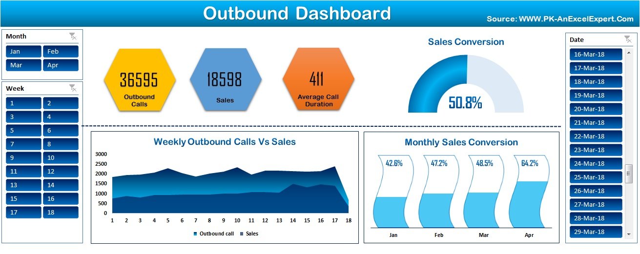
The top row holds three hexagon cards: Outbound Calls (36,595 in the sample), Sales (18,598) and Average Call Duration (411 seconds). To their right a half-circle gauge shows Sales Conversion, sales divided by calls, at 50.8 percent. Below, Weekly Outbound Calls vs Sales is a stacked area chart across weeks 1 to 18, and Monthly Sales Conversion is an infographic column chart where each month’s column fills to its conversion rate (42.6 percent in January rising to 64.2 percent in April). Slicers for Month, Week and Date filter every card and chart at once.
The workbook structure
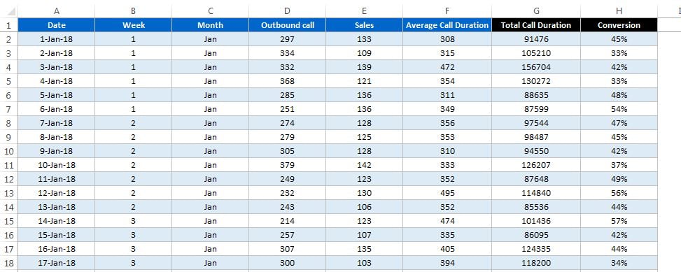
The file has a raw data sheet, a calculation area built from PivotTables, and the Dashboard sheet. The raw data has one row per day with eight columns: Date, Week, Month, Outbound call, Sales, Average Call Duration in seconds, Total Call Duration in seconds and Conversion. Week and Month are helper columns calculated from the date, Total Call Duration is calls multiplied by average duration, and Conversion is sales divided by calls. Total Call Duration matters: the dashboard sums seconds and divides by calls after the slicers are applied instead of averaging daily averages.
How it is built
Because the page is filtered by slicers, the engine is a set of PivotTables on the raw data table rather than a block of formulas. Each visual reads from its own small pivot, and all three slicers are connected to every pivot through Report Connections. The table below maps each element to the technique behind it.
| Element | Technique | Formula or feature |
|---|---|---|
| Week and Month helper columns | Formulas on the Date column | =WEEKNUM(A2) and =TEXT(A2,"mmm") |
| Total Call Duration | Calculated column in seconds | =D2*F2 (calls multiplied by average duration) |
| Daily Conversion | Calculated column | =IFERROR(E2/D2,0) |
| Outbound Calls and Sales cards | Hexagon shapes linked to pivot totals | Select the shape, type =Calc!B4 in the formula bar |
| Average Call Duration card | Weighted average from pivot totals | =Calc!D4/Calc!B4 (total seconds divided by total calls) |
| Sales Conversion gauge | Doughnut chart with a hidden lower half | Series: conversion, 1 minus conversion, 1; first slice angle 270; third slice No fill |
| Weekly Calls vs Sales | Stacked area chart on a pivot by Week | Rows = Week, Values = Sum of Outbound call, Sum of Sales |
| Monthly Sales Conversion | Infographic column chart on a pivot by Month | Two series (conversion and 1 minus conversion) stacked to 100 percent, shape fill set to a picture |
| Month, Week, Date filters | Slicers | PivotTable Analyze > Insert Slicer, then Report Connections to every pivot |
The KPI cards
A PivotTable on the calculation sheet totals Outbound call, Sales and Total Call Duration. The hexagons are shapes from Insert > Shapes; select a shape, click in the formula bar and type =Calc!B4 to link its text to the pivot total. A cell beside the pivot divides total seconds by total calls, =Calc!D4/Calc!B4, and the third hexagon links to that cell, so the weighted average follows every slicer change.
The half-circle conversion gauge
The gauge is the doughnut technique from the speedometer chart lesson without the needle. A three-cell series holds the conversion rate, the remainder to 100 percent and a hidden 100 percent slice. Insert a doughnut chart, set Angle of first slice to 270 degrees, colour the first slice blue, the second pale grey and give the third slice No fill. A text box linked to the conversion cell sits over the gauge and shows 50.8 percent.
The two charts
The area chart reads a pivot with Week in rows and the sums of calls and sales in values, so the horizontal axis runs 1 to 18. The infographic column chart reads a pivot with Month in rows. Its conversion series is stacked with a remainder series so every column reaches 100 percent; the remainder series has a white fill and the conversion series is filled with a picture through Format Data Series > Fill > Picture or texture fill with Stack and Scale. Data labels on the conversion series show the percentage.
Building it without PivotTables
If you prefer formulas, replace each pivot with SUMIFS keyed on a selected month or week in a drop-down cell. With the raw data in a table called Calls and the chosen month in B1:
Calls dialled   =SUMIFS(Calls[Outbound call], Calls[Month], $B$1)
Sales           =SUMIFS(Calls[Sales], Calls[Month], $B$1)
Conversion      =IFERROR(Sales/Calls, 0)
Talk seconds    =SUMIFS(Calls[Total Call Duration], Calls[Month], $B$1)
AHT (seconds)   =IFERROR(Talk seconds/Calls, 0)
Days worked     =COUNTIFS(Calls[Month], $B$1)
AVERAGEIFS(Calls[Average Call Duration], Calls[Month], $B$1) gives an unweighted average that disagrees with the pivot version whenever daily call volumes differ. The SUMIFS approach loses the slicers but works in Excel for the web and needs no refresh.
Worked example
The sample file is summarised by day. Many dialler exports also carry an agent column, and the same arithmetic applies. Suppose one day’s export holds these four agents:
| Agent | Calls | Connected | Sales | Talk time (s) |
|---|---|---|---|---|
| Asha | 120 | 84 | 31 | 39,600 |
| Ben | 95 | 70 | 22 | 29,450 |
| Chloe | 140 | 98 | 41 | 50,400 |
| Dev | 60 | 39 | 9 | 27,000 |
Conversion per agent is sales divided by calls: Asha 25.8 percent, Ben 23.2 percent, Chloe 29.3 percent, Dev 15.0 percent. Average handling time is talk time divided by calls: Asha 330 s, Ben 310 s, Chloe 360 s, Dev 450 s. The team figures are 415 calls, 103 sales, a conversion of =103/415 = 24.8 percent and an AHT of =146450/415 = 353 s. Averaging the four agent AHTs would give 362.5 s, which is wrong because Dev handled far fewer calls. That is exactly why the dashboard stores Total Call Duration and divides after filtering.
How to use it with your own data
- Download the file and open the raw data sheet.
- Paste your dialler export under the same headers, one row per day, with real dates in column A.
- Fill the Week, Month, Total Call Duration and Conversion helper columns down.
- Go to Data > Refresh All so every PivotTable, card and chart updates.
- Clear the slicers, compare the Outbound Calls and Sales cards with your dialler report and save.
Download the free file
Click here to download the Outbound Dashboard Excel file. It is a plain .xlsx with no macros.
Watch the video
Three-part build tutorial:
Tips and common mistakes
- Weight the average. Average call duration must be total seconds divided by total calls, never an average of daily or agent averages.
- Store talk time as a number. Seconds or a real Excel time value can be summed; text such as “4m 30s” cannot.
- Connect every slicer to every pivot. Right-click a slicer, choose Report Connections and tick all the PivotTables, or one chart will ignore the filter.
- Use an Excel Table as the pivot source. New export rows are then included on the next refresh without editing the source range.
- Keep the gauge series in order. Conversion, remainder, hidden slice; if the hidden slice is first, the gauge draws upside down.
- Refresh before you present. PivotTables do not recalculate like formulas; press Ctrl + Alt + F5 after pasting data.
Errors and how to fix them
| Symptom | Cause | Fix |
|---|---|---|
| Cards show old numbers after pasting data | PivotTables not refreshed | Data > Refresh All |
| One chart ignores the slicer | Its pivot is not in the slicer’s Report Connections | Right-click the slicer, Report Connections, tick every pivot |
| Average Call Duration is far too high or low | Card averages the daily averages | Divide the sum of Total Call Duration by the sum of calls |
| #DIV/0! in Conversion | A day with zero calls | Wrap in IFERROR(E2/D2,0) |
| Gauge shows a full circle | Hidden slice still has a fill | Select the third slice and set Fill to No fill |
| Month slicer lists months out of order | Month is text, sorted alphabetically | Sort by a custom list (Jan, Feb, Mar) or use a month number column |
Practice exercise
- Add an Agent column to the raw data, split the sample rows across three agent names and insert an Agent slicer connected to every pivot.
- Add a fourth hexagon card for Connected Calls and a second gauge for connect rate (connected divided by dialled).
- Rebuild the three cards with
SUMIFSkeyed on a month drop-down instead of PivotTables and check they match the slicer version. - Apply a conditional formatting icon set to the daily Conversion column so days below 40 percent show a red marker.
Key takeaways
- An outbound dashboard needs only calls, sales and talk time per period; every KPI is derived from those three.
- Conversion is sales divided by calls, and AHT is total seconds divided by calls, both calculated after filtering.
- PivotTables plus slicers give you month, week and date filters without a single VBA line.
- Shapes linked to cells make KPI cards that update with the slicers.
- The half-circle gauge is a doughnut chart with one hidden slice, and the infographic columns are a stacked chart with a picture fill.
Related lessons
- Excel Dashboards course hub
- Prepare data for an Excel dashboard
- Dynamic charts for Excel dashboards
- C-SAT Dashboard in Excel
- Performance Dashboard in Excel
- PivotTable slicers
- SUMIFS function and AVERAGEIF function
- Microsoft Support: AVERAGEIFS function
Frequently asked questions
What KPIs should an outbound call centre dashboard show?
The core set is calls dialled, calls connected, sales or conversions, conversion rate and average handling time. Add contact rate (connected divided by dialled) and talk time per agent if your dialler exports them. This template tracks calls, sales, conversion and average call duration by month, week and date.
How is the half-circle KPI chart made?
It is a doughnut chart with three values: the conversion rate, its remainder to 100 percent and a hidden 100 percent slice. Set Angle of first slice to 270 degrees and give the hidden slice No fill so only the upper half shows. A linked text box displays the percentage.
How do I calculate average handling time in Excel?
Divide total talk seconds by total calls for the period, for example =SUMIFS(Calls[Total Call Duration], Calls[Month], B1) / SUMIFS(Calls[Outbound call], Calls[Month], B1). Do not use AVERAGE on a column of daily averages, because busy days and quiet days would count equally.
Can I add an agent slicer?
Yes. Add an Agent column to the raw data, refresh, then insert a slicer on the Agent field of any PivotTable and connect it to the others through Report Connections. Every card and chart will then filter by agent as well as by month, week and date.
Does the dashboard work in Excel 2013 and Excel for the web?
It works in Excel 2013 through Microsoft 365 on Windows and Mac because it uses PivotTables, slicers, shapes and standard charts. In Excel for the web the slicers and pivots work, but linked shapes and picture fills may not render, so check the cards there before sharing.
Want the finished version? Ready-made Excel dashboards, trackers and VBA systems are available at NextGenTemplates.com.