Part of the free Module 8: Basic Charts · Lesson 6 of 12 · Full Excel course
Updated on 5 September 2026 · Works in Excel 365, 2021, 2019 and 2016 unless noted.
An area chart in Excel is a line chart with the space between the line and the axis filled with colour, so it shows the trend of a series and the size of the values at the same time. Use it to compare two or three series over an ordered axis such as months, or use a stacked area chart to show how a total is built up from its parts.
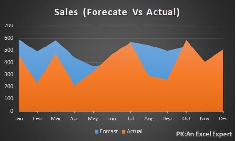
The three area chart types in Excel
Excel 2016 through Microsoft 365 offer the same three flavours, in 2-D and 3-D. Choosing the right one before you draw anything saves most of the formatting work later.
| Chart type | How each series is drawn | The question it answers |
|---|---|---|
| Area (2-D Area) | Every series starts at the zero line, so the shapes overlap | How do these series compare with each other over time? |
| Stacked Area | Each series sits on top of the previous one; the top edge is the total | How is the total made up, and how does the mix change? |
| 100% Stacked Area | Each series is shown as a share of the total, so the plot always fills to 100 | How does the percentage share of each part move over time? |
The plain area chart does not add the series together. That single fact causes most of the confusion beginners have with this chart, because a stacked column chart in the same workbook behaves the opposite way.
Sample data for this lesson
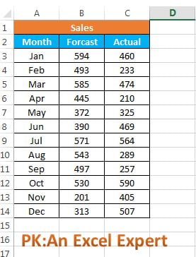
Lay the data out as one column of labels and one column per series. The practice file uses the same layout: month names in the first column, forecast in the second, actual in the third.
| Month | Forecast | Actual |
|---|---|---|
| Jan | 42,000 | 38,500 |
| Feb | 44,000 | 41,200 |
| Mar | 46,000 | 47,800 |
| Apr | 45,000 | 44,100 |
| May | 48,000 | 52,300 |
| Jun | 50,000 | 49,600 |
| Jul | 52,000 | 55,400 |
| Aug | 53,000 | 51,900 |
| Sep | 55,000 | 58,200 |
| Oct | 58,000 | 60,700 |
| Nov | 62,000 | 64,500 |
| Dec | 68,000 | 71,300 |
How to create an area chart in Excel
- Select the month, forecast and actual columns including the header row, so both series are named in the legend and the months become the category axis.
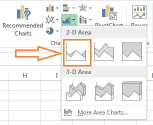
- Go to Insert > Charts > Insert Line or Area Chart. The icon is the small filled hill shape in the Charts group.
- Under 2-D Area, pick Area to overlap the two series, Stacked Area to add them into a total, or 100% Stacked Area to show shares. For a forecast versus actual comparison, choose Area.
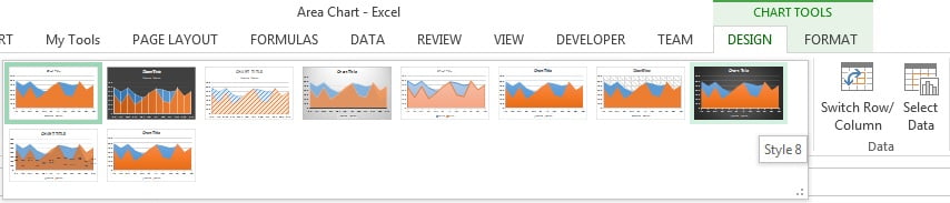
- Click the chart, open the Chart Design tab (called Design under Chart Tools in Excel 2016 and 2019) and pick a preset from Chart Styles.
- Click the chart title and type something specific, such as Forecast vs Actual Sales 2026.
Formatting an area chart so both series stay visible
An unformatted area chart usually hides one series behind another. These five steps fix that and turn the default chart into something you can put in a report.
- Add transparency. Right-click the front series, choose Format Data Series, open Fill & Line, select Solid fill and drag Transparency to about 35 to 50 percent. Both shapes and their overlap now read clearly. Do this on the series that is drawn last, which is the one on top.
- Fix the series order. Go to Chart Design > Data > Select Data, then use the up and down arrows in the Legend Entries list to move the series with the larger values to the back. In a plain area chart the first series in the list is drawn first and ends up behind the others.
- Add a border. In Format Data Series > Fill & Line > Border, set a solid line in a darker shade of the fill colour, width around 1.5 pt. The border restores the trend line that the fill has softened and makes the top edge easy to follow.
- Use data labels sparingly. Select one series and choose Chart Design > Add Chart Element > Data Labels > Above. Labelling every point of a filled chart is unreadable, so label the front series only, or label nothing and keep the value axis.
- Set the axis honestly. Select the value axis, press Ctrl + 1 and keep Minimum at 0, because a filled area implies quantity. On the category axis, set Position Axis to On tick marks so the fill runs edge to edge with no white gap at the sides.
For a 100% Stacked Area chart, also format the value axis as a percentage with no decimals and remove the gridlines. That chart is about share, not about reading exact values.
Worked example: where actual beat forecast
Using the sample table above, build the chart and read it.
- Select A1:C13 and insert a 2-D Area chart.
- In Select Data, move Actual above Forecast so forecast is drawn on top.
- Set the Forecast series fill to 40 percent transparency and give it a 1.5 pt border.
- Add a helper column in D with
=C2-B2and copy it down to see the same story as numbers.
The chart shows forecast running ahead of actual from January to April, the two crossing in March and May, and actual staying above forecast from July onwards. Total actual for the year comes to 635,500 against a forecast of 623,000, which you can confirm with =SUM(C2:C13)-SUM(B2:B13). The area chart gives you that conclusion in one glance; the helper column gives you the number.
When to use an area chart and when not to
Use a plain area chart when you have two or three series on an ordered axis and you want the reader to feel the volume as well as the direction: forecast against actual, budget against spend, planned against delivered, or a cumulative total that grows through the year.
Use a stacked area chart when the series genuinely add up to a meaningful total, such as revenue by product line per quarter or headcount by department per month, and you want to show both the total and the changing mix.
Use a 100% stacked area chart when only the share matters and the total is a distraction, for example channel mix over twenty-four months.
Do not use an area chart when:
- You have four or more series. The fills hide each other and no amount of transparency rescues it. Use a line chart.
- Exact values matter. Readers judge filled shapes badly. Use a line chart with data labels, or a table.
- The categories are not ordered. Regions, products and staff names have no natural sequence, so the filled area implies a continuity that does not exist. Use a bar chart.
- The series cross each other constantly. Overlapping fills that swap places every point become a mess. A line chart handles crossing series cleanly.
- Your values include negatives. Areas below the axis are hard to interpret, especially when stacked.
Errors and how to fix them
| What you see | Cause | Fix |
|---|---|---|
| One series has disappeared | A larger series is drawn in front of a smaller one | Move it back in Select Data, or add 40 percent transparency |
| The area drops to zero mid-chart | Blank cells in the source range | Select Data > Hidden and Empty Cells, choose Gaps, or fill the blanks |
| Legend says Series1 and Series2 | The header row was left out of the selection | Reselect including headers, or rename in Select Data > Edit |
| Months are plotted as a series | Month numbers were read as values | Remove that series and set it as the category axis in Select Data > Edit |
| The values look bigger than they are | The value axis does not start at zero | Set the axis Minimum to 0 in Format Axis |
| Total looks wrong on a plain area chart | Plain area charts overlap, they do not add | Change to Stacked Area from Chart Design > Change Chart Type |
Download the practice file
Download the Area Chart Excel file to practise with the same data, or click the chart below.
Practice exercise
- Build the forecast versus actual area chart from the practice file, then set the front series to 40 percent transparency and a 1.5 pt border.
- Use Chart Design > Change Chart Type to switch the same chart to Stacked Area, and write down in one sentence why the numbers now look wrong for this data.
- Delete the value in one month, then use Select Data > Hidden and Empty Cells to switch between Gaps and Zero and compare the two shapes.
- Rebuild the chart as a line chart and decide which of the two you would put in a monthly report, and why.
Tips and common mistakes
- Keep it to three series. Beyond three, the chart stops being readable no matter how you format it.
- Skip 3-D area charts. The depth effect hides the back series completely and adds nothing.
- Sort your categories in time order. An area chart drawn over unsorted months tells a story that is not there.
- Convert the source range to a Table first. Use Ctrl + T so new months are picked up by the chart automatically.
- Do not mix scales. If one series is ten times the other, the small one becomes invisible; use a combo chart with a secondary axis instead.
Key takeaways
- An area chart is a line chart with the space below the line filled, showing trend and volume together.
- The ribbon path is Insert > Charts > Insert Line or Area Chart, then 2-D Area, Stacked Area or 100% Stacked Area.
- A plain area chart overlaps series; a stacked area chart adds them into a total.
- Transparency plus a sensible series order is what makes an overlapping area chart readable.
- Start the value axis at zero, because a filled area implies quantity.
- With four or more series, or when exact values matter, a line chart is the better choice.
Related lessons
- Line chart in Excel – the chart to switch to when you have too many series.
- Stacked column chart – the discrete alternative to a stacked area chart.
- Combo chart – for series on very different scales.
- How to choose the right chart type.
- Basic Charts course hub – all lessons in this module.
- Excel Dashboard course and the SUM function used in the worked example.
- Available chart types in Office on Microsoft Support.
Frequently asked questions
What is the difference between an area chart and a stacked area chart?
A plain area chart draws every series from the zero line, so the shapes overlap and you compare them against each other. A stacked area chart draws each series on top of the previous one, so the top edge of the plot is the total. Use plain area for comparison, stacked area when the parts genuinely add up.
How do I stop one series hiding the other in an Excel area chart?
Two fixes work together. Open Chart Design > Select Data and move the series with the larger values above the smaller one so it is drawn behind. Then right-click the front series, choose Format Data Series, and set the solid fill transparency to about 40 percent. Adding a solid border to each series makes the edges easier to follow.
When should I use a line chart instead of an area chart?
Use a line chart when you have four or more series, when the series cross each other frequently, when exact values matter more than a sense of volume, or when any value is negative. Area charts earn their place only when the filled magnitude adds meaning, such as forecast against actual or a cumulative total.
Can an area chart show negative values?
It can plot them, and the fill drops below the zero line, but the result is hard to read and worse still when stacked, because negative and positive segments overlap the baseline. For data with negatives, use a line chart or a column chart, where the direction of each bar is obvious at a glance.
How do I make an area chart update automatically when I add new months?
Convert the source range to an Excel Table with Ctrl + T before you insert the chart. Any row you add below the Table is included in the range automatically, so the chart extends without editing Select Data. Named formulas based on OFFSET or INDEX give the same result if a Table is not suitable.
Want the finished version? Ready-made Excel dashboards, trackers and KPI templates are available at NextGenTemplates.com.