Part of the free Module 8: Basic Charts · Lesson 5 of 12 · Full Excel course
Updated on 5 September 2026 · Works in Excel 365, 2021, 2019 and 2016 unless noted.
A line chart in Excel joins data points with a straight or smoothed line so you can read a trend over time at a glance. You build one from Insert > Charts > Insert Line or Area Chart, then add markers, data labels and a trendline. It is the right chart whenever the horizontal axis is days, weeks, months or years.
What a line chart is and when to use it
Every point on a line chart is one period, and the slope between two points shows the direction and the speed of change. Because the eye follows a continuous line without effort, a line chart carries far more periods than a column chart: a week of days, twelve months, or five years of monthly readings all stay readable.
Use a line chart when the categories have a natural order, normally time. If the categories are unordered names such as regions or products, a column or bar chart is the honest choice, because a line drawn between two unrelated categories implies a journey that does not exist. Excel 2016 through Microsoft 365 offer Line, Stacked Line and 100% Stacked Line, each with a markers variant, plus 3-D Line.
Sample data for this lesson
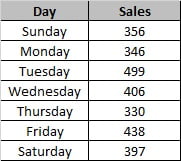
Put this day-wise sales table in a worksheet with the days in column A and the sales in column B. It is the same data used in the screenshots below.
| Day | Sales |
|---|---|
| Monday | 4200 |
| Tuesday | 3850 |
| Wednesday | 5100 |
| Thursday | 4700 |
| Friday | 6300 |
| Saturday | 7150 |
| Sunday | 5600 |
How to create a line chart in Excel
- Select the range including the header row, here
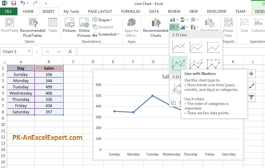
A1:B8. - Go to Insert > Charts > Insert Line or Area Chart. The gallery opens with 2-D Line, 3-D Line and the area types.
- Under 2-D Line pick Line for a plain trend, Line with Markers when you want each period to be visible, or Stacked Line when several series must add up to a total.
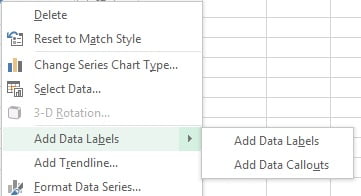
- Right-click the line and choose Add Data Labels so every point shows its value.
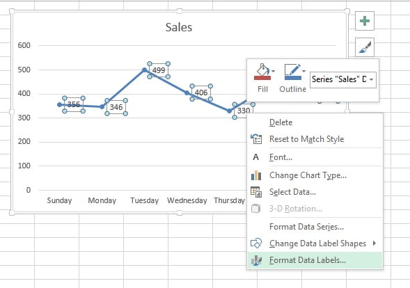
- Right-click any label and choose Format Data Labels to open the formatting pane on the right.
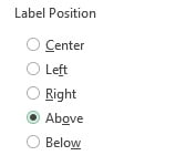
- In Label Options set Label Position to Above so the numbers clear the line. Below, Left, Right and Centre are the other choices.
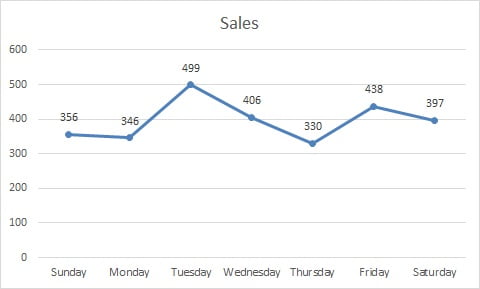
- Click the chart title and type a plain description such as Sales by Day. The finished chart is below.
Download the practice file
Download the Line Chart Excel file and work through the steps with the same data.
Line chart types compared
| Type | What it draws | Use it for |
|---|---|---|
| Line | One plain line per series, no point symbols | Long series of 20 periods or more |
| Line with Markers | A symbol on every data point | Short series where each period matters |
| Stacked Line | Each series is added on top of the one below | Parts that must sum to a total, rarely the best choice |
| 100% Stacked Line | Each period is scaled to 100 per cent | Changing share of a mix over time |
| 3-D Line | Ribbons on a three dimensional floor | Presentation only, it hides values behind ribbons |
Format the line chart
Select the line and press Ctrl + 1 to open Format Data Series. Everything below lives in that pane or in the Chart Design tab.
- Markers. In Format Data Series > Fill & Line > Marker > Marker Options choose Built-in, then set the shape and a size of 5 to 7 points. Choose None to strip markers from a long series.
- Data labels. Use Chart Design > Add Chart Element > Data Labels > Above, or add them from the right-click menu as in the steps above. In Format Data Labels > Number apply a short format such as
#,##0so the labels stay narrow. - Smoothed line. In Format Data Series > Fill & Line > Line tick Smoothed line. It rounds the corners for presentation, but it also draws curves through values that were never measured, so leave it off for reporting.
- Gaps and hidden cells. Blank cells break the line. Click the chart, go to Chart Design > Select Data > Hidden and Empty Cells and choose Gaps, Zero or Connect data points with line. Tick Show data in hidden rows and columns if the chart must survive filtering. Note that
=NA()in a cell always breaks the line, while a truly empty cell obeys this setting. - Axis bounds. Right-click the value axis, choose Format Axis > Axis Options and set Minimum and Maximum by hand. A line chart does not need a zero baseline the way a column chart does, so tightening the minimum makes a small movement visible. Always label the axis when you do this.
- Trendline. Right-click the line and choose Add Trendline, or use Chart Design > Add Chart Element > Trendline. Pick Linear for a steady trend or Moving Average with a period of 3 or 7 to smooth noisy daily data. Tick Display Equation on chart only when the reader needs the maths.
- Axis labels. If date labels overlap, open Format Axis > Axis Options, set Interval between labels to a specified unit, or set the text direction under Size & Properties.
Worked example: actual against target
Add a target column beside the sales figures so the chart carries two lines.
| Day | Actual | Target |
|---|---|---|
| Monday | 4200 | 5000 |
| Tuesday | 3850 | 5000 |
| Wednesday | 5100 | 5000 |
| Thursday | 4700 | 5000 |
| Friday | 6300 | 5000 |
| Saturday | 7150 | 6000 |
| Sunday | 5600 | 6000 |
- Select
A1:C8and insert Insert > Charts > Insert Line or Area Chart > Line with Markers. - Click the Target line, press Ctrl + 1, and under Fill & Line > Line set Dash type to a dashed pattern and the colour to grey. Set Marker > None.
- Leave the Actual line solid and coloured, and add data labels to that series only.
- Add a title such as Sales against Target and delete the gridlines with Chart Design > Add Chart Element > Gridlines > Primary Major Horizontal.
Result: total actual sales are =SUM(B2:B8), which is 36,900 against a target of 37,000, and the chart shows the shortfall sat on Monday and Tuesday while the weekend beat plan. The daily average is =AVERAGE(B2:B8), about 5,271.
When to use a line chart and when not to
Use a line chart when:
- The horizontal axis is time or another ordered sequence, and you want the trend rather than the individual values.
- You have many periods, roughly 8 or more, where columns would become too thin to read.
- You are comparing two to four series over the same periods, for example actual against target or this year against last year.
- The story is the shape: growth, decline, seasonality, a spike, a plateau.
Do not use a line chart when:
- The categories are unordered names such as products, regions or staff. Use a bar or column chart.
- The time steps are uneven, for example readings on 1 March, 4 March and 19 March. A line chart spaces categories evenly and would distort the gaps, so use a scatter chart with a numeric X axis.
- You need to show composition at a single point in time. Use a pie or doughnut chart.
- There are more than about five series. The lines cross into a mess, so use small multiples or highlight one line and grey the rest.
- You only have two or three periods. A column chart reads better and does not imply movement between the points.
Tips and common mistakes
- Do not plot the day column as a series. If a second flat line appears, the first column was read as data. Use Chart Design > Select Data > Horizontal (Category) Axis Labels > Edit to set it as the axis.
- Store dates as real dates, not text. Text dates are treated as plain categories, so missing days are silently skipped and the trend is misleading.
- Turn markers off past about 15 points. A dense line with markers looks like a caterpillar and hides the trend.
- Label instead of legending when you can. With two or three lines, put the series name at the end of each line as a text box; the reader stops moving their eyes to a legend.
- Be honest about a truncated axis. Tightening the minimum is legitimate on a line chart, but say so in the axis title or a footnote.
- Avoid 3-D Line. The ribbons hide each other and the depth axis adds no information.
- Keep the smoothed line out of reports. A curve through monthly totals invents intermediate values.
Errors and how to fix them
| Problem | Cause | Fix |
|---|---|---|
| The line breaks into segments | Blank cells or =NA() in the series |
Chart Design > Select Data > Hidden and Empty Cells > Connect data points with line |
| The line disappears when you filter the table | Excel hides data in hidden rows by default | Tick Show data in hidden rows and columns in the same dialog |
| Points are evenly spaced although the dates are not | The axis is a text axis | Format Axis > Axis Options > Date axis, or switch to a scatter chart |
| The line looks flat | The value axis starts at zero and the range is narrow | Format Axis and set a tighter Minimum and Maximum |
| Labels overlap along the bottom | Too many category labels for the chart width | Format Axis > Interval between labels, or widen the chart |
| New rows do not appear in the chart | The source is a fixed range | Convert the source to a Table with Ctrl + T so the chart grows automatically |
Practice exercise
- Open the practice file and build a Line with Markers chart from the day-wise sales, then add data labels positioned Above.
- Delete the Wednesday value and set Hidden and Empty Cells to Gaps, then to Connect data points with line, and note the difference.
- Add the Target column from the worked example, make the target line dashed grey with no markers, and remove its data labels.
- Add a Moving Average trendline with a period of 3 to the Actual series and describe what it hides and what it reveals.
- Set the value axis Minimum to 3000 and Maximum to 8000, then write one sentence explaining why the chart now looks more dramatic.
Key takeaways
- A line chart shows change over an ordered axis; the slope, not the point, is the message.
- The path is Insert > Charts > Insert Line or Area Chart, then Line, Line with Markers or Stacked Line.
- Markers and data labels help short series and clutter long ones.
- Blank cells break the line unless you change Hidden and Empty Cells.
- A line chart may start above zero, but label the axis when it does.
- Use a scatter chart, not a line chart, when the X values are numeric and unevenly spaced.
Related lessons
- Basic Charts course hub
- Area chart in Excel
- Combo chart in Excel
- Column chart in Excel
- Scatter chart in Excel
- AVERAGE function and FORECAST function
- Excel Dashboard course
- Available chart types in Office (Microsoft Support)
Frequently asked questions
How do I add a second line to an Excel line chart?
Select the extra value column together with the existing data before you insert the chart. If the chart already exists, click it, go to Chart Design > Select Data > Add, give the series a name and point Series values at the new column. The new line uses the same category axis.
Why is my line chart broken into pieces?
Blank cells in the series create gaps. Click the chart, choose Chart Design > Select Data > Hidden and Empty Cells and pick Connect data points with line. Cells holding =NA() always break the line, which is useful when you want a genuine gap shown as missing rather than zero.
What is the difference between a line chart and a scatter chart?
A line chart treats the horizontal axis as evenly spaced categories, so 1 March and 19 March sit one step apart. A scatter chart plots true numeric X values, so uneven dates and measurements are spaced in proportion. Use scatter for irregular readings and for showing the relationship between two numeric variables.
Should a line chart axis start at zero?
Not necessarily. A column chart compares bar lengths, so it needs a zero baseline. A line chart communicates change, so starting the value axis near the data is acceptable and often clearer. Label the axis, keep the scale steady across charts in the same report, and never truncate to exaggerate a small movement.
How do I stop the chart from missing new rows of data?
Convert the source range to a Table with Ctrl + T before you insert the chart. A chart built on a Table extends automatically as rows are appended, so you never edit the series range again. A dynamic named range built with OFFSET or INDEX does the same job on older files.
Want the finished version? Ready-made Excel dashboards, trackers and VBA systems are available at NextGenTemplates.com.