Part of the free Module 11: Excel Dashboards · Lesson 3 of 10 · Full Excel course
Updated on 5 September 2026 · Works in Excel 365, 2021, 2019 and 2016 unless noted.
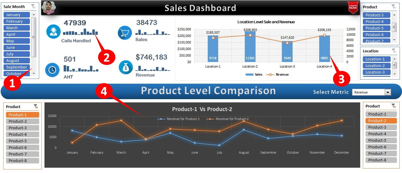
A sales dashboard in Excel puts the numbers a sales manager checks every day on one screen: volume, conversion, handle time and revenue, with trend and comparison views. This Sales Dashboard shows Calls Handled, Sales, AHT and Revenue as KPI cards with twelve-month sparklines, a location-wise sales versus revenue combo chart, and a product comparison chart driven by two slicers and a metric drop-down, all fed by PivotTables on a Support sheet.
What the Sales Dashboard shows
Everything fits on one screen so a manager can read the month at a glance. The four KPIs are Calls Handled, Sales, AHT (average handle time) and Revenue, each with a twelve-month sparkline. Below them a combo chart compares sales and revenue by location, and the product-level comparison lets you pick any metric and see two products side by side month on month. The page has four sections:
- Slicers: filter the whole page by the fields in the raw data.
- Summary cards: the four KPIs with sparklines showing the monthly trend.
- Location wise Sales vs Revenue: a combo chart with sales as columns and revenue as a line on the secondary axis.
- Product level comparison: a metric drop-down plus left and right product slicers feed a two-series line chart.
Why a single-page layout works
A one-page dashboard forces every element to earn its place. The KPI cards answer “how are we doing”, the sparklines answer “is it getting better”, the location chart answers “where”, and the product comparison answers “which product”. Because all four read from the same raw data through PivotTables, the numbers always agree with each other, and the page can be printed or pasted into a slide without losing anything.
The workbook structure
| Element | Technique | Formula or feature |
|---|---|---|
| Raw Data | Excel Table, one row per transaction | Ctrl+T; PivotTables use the Table name as source |
| KPI totals | PivotTable grand totals on Support | =GETPIVOTDATA("Sales",Support!$A$3) or a direct cell link |
| AHT | Calculated field | ='Handle Time'/'Calls Handled' |
| Sparklines | Insert > Sparklines > Line | Data range = month-wise PivotTable row for that KPI |
| Location chart | Combo chart on the location PivotTable | Sales = clustered column, Revenue = line on secondary axis |
| Metric drop-down | Data Validation list or combo box | List: Calls Handled, Sales, AHT, Revenue |
| Product comparison rows | INDEX + MATCH on two product PivotTables | =INDEX(Support!$H$4:$K$15, ROWS($A$1:A1), MATCH($B$20, Support!$H$3:$K$3, 0)) |
| Left and right product slicers | Two slicers, one PivotTable each | Report Connections limited to its own PivotTable |
How it is built
Raw Data sheet
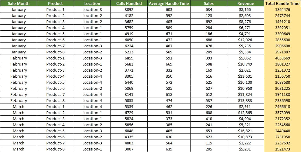
One row per transaction or per agent-day with Month, Location, Product, Calls Handled, Sales, Handle Time and Revenue. Everything else is calculated from this table. Convert it to a Table so the PivotTables grow with it.
Support sheet
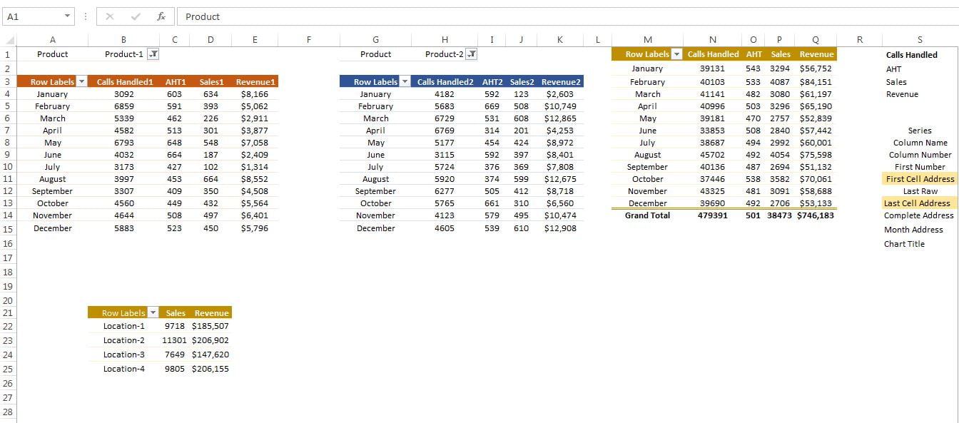
Four PivotTables summarise the raw data: by month (feeds the cards and sparklines), by location (feeds the combo chart), and two by month for the product comparison, each connected to its own product slicer. The KPI cards are shapes linked to the grand-total cells. The sparklines point at the month-wise rows. A small INDEX and MATCH block picks the column for the metric chosen in the drop-down from each product PivotTable, and the comparison line chart plots those two rows.
Building the product comparison
- Insert a PivotTable with Month in Rows and the four metrics in Values. Copy it so you have two identical PivotTables side by side.
- Insert a Product slicer for the first PivotTable and a second Product slicer for the second. In Report Connections make sure each slicer connects to only one PivotTable.
- Create the metric drop-down with Data > Data Validation > List containing the four metric names.
- Beside each PivotTable, write twelve INDEX and MATCH formulas that return the selected metric’s column for each month.
- Insert a line chart on the two INDEX columns, link the chart title to the drop-down cell and format the two series in contrasting colours.
Worked example
Assume this slice of raw data for one location and two products in January.
| Month | Location | Product | Calls Handled | Sales | Handle Time (sec) | Revenue |
|---|---|---|---|---|---|---|
| Jan | Delhi | Broadband | 500 | 60 | 150,000 | 90,000 |
| Jan | Delhi | Mobile | 800 | 120 | 200,000 | 72,000 |
| Jan | Mumbai | Broadband | 400 | 50 | 128,000 | 75,000 |
With no slicer selected the January cards show 1,700 calls, 230 sales, AHT of 478,000 / 1,700 = 281 seconds and revenue of 237,000. The location chart shows Delhi at 180 sales and 162,000 revenue against Mumbai at 50 and 75,000. Choose Revenue in the drop-down, Broadband in the left slicer and Mobile in the right, and the comparison chart plots 165,000 against 72,000 for January.
How to use it with your own data
- Paste your records into the Raw Data sheet under the same headers, keeping the Month column consistent (for example Jan, Feb).
- Go to Data > Refresh All so every PivotTable on the Support sheet updates.
- Check that the slicers list your locations and products; clear any old filter with the slicer’s clear button.
- Pick a metric in the drop-down and two products in the comparison slicers to test the line chart.
- Replace the small images with your own icons if required and save.
Get the finished file
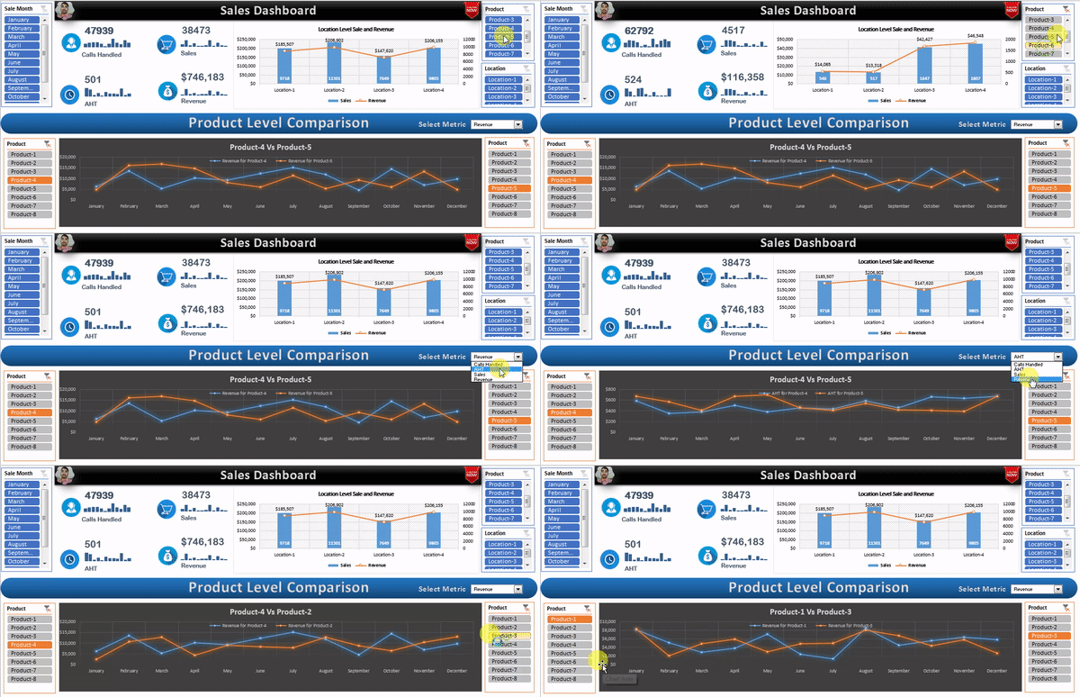
The finished Sales Dashboard workbook is available as a ready-to-use template: Get the Sales Dashboard in Excel. The four videos below show how to build it from a blank workbook.
Watch the video
Visit our YouTube channel for more step-by-step dashboard tutorials.
Tips and common mistakes
- Calculate AHT as a calculated field. Total handle time divided by calls, not an average of an average column.
- Connect the page slicers to every PivotTable through Report Connections, otherwise one section will not filter.
- Keep the two comparison slicers on separate PivotTables so choosing a product on the left does not filter the right chart.
- Use the same sparkline axis across the four cards (Sparkline > Axis > Same for All Sparklines) only when the metrics share a scale; otherwise leave them automatic.
- Convert Raw Data to a Table so new rows are included on refresh.
- Put the secondary axis on Revenue, not Sales, so the columns keep a sensible scale.
Errors and how to fix them
| Symptom | Cause | Fix |
|---|---|---|
| Both comparison lines change together | One slicer is connected to both product PivotTables | Open Report Connections and untick the other PivotTable |
| Comparison chart shows #N/A | Metric name in the drop-down does not match the PivotTable header | Use the exact header text, for example “Sum of Sales” |
| Sparkline is flat | Data range points at a single cell or a total row | Reselect the twelve monthly cells |
| Revenue line is invisible | Revenue on the primary axis with sales columns | Format series, plot on secondary axis |
Practice exercise
- Add a Conversion KPI card (Sales / Calls Handled) with its own sparkline.
- Add an Agent slicer to the page and connect it to the card and location PivotTables only.
- Change the location chart to show revenue per sale as the line instead of total revenue.
- Extend the product comparison to three products with a third PivotTable and slicer.
Key takeaways
- One Raw Data Table and a handful of PivotTables can power every element of a one-page sales dashboard.
- Sparklines inside KPI cards add trend without taking chart space.
- A combo chart with a secondary axis lets counts and currency share one chart.
- Two PivotTables with independent slicers plus INDEX and MATCH give a flexible side-by-side comparison.
- Refresh All is the only maintenance step once the structure is in place.
Related lessons
- Excel Dashboards course hub
- Dynamic charts for Excel dashboards
- Performance Dashboard in Excel
- Process Dashboard in Excel
- INDEX function and MATCH function
- Combo chart in Excel
- Microsoft Support: Analyze trends in data using sparklines
Frequently asked questions
How does the product comparison chart work?
Two PivotTables, each filtered by its own product slicer, return the monthly values for the selected product. INDEX and MATCH pick the column for the metric chosen in the drop-down, and a line chart plots those two twelve-cell ranges as two series.
Can I change the KPIs on the cards?
Yes. Point the card shape at a different PivotTable total by selecting the shape and typing the cell reference in the formula bar, then change the sparkline data range to the matching monthly row on the Support sheet.
How do I add a sparkline inside a KPI card?
Insert the sparkline in the cells behind the card (Insert > Sparklines > Line, data range = the twelve monthly values), then make the card shape’s fill transparent or size the shape so the sparkline cells show through under the number.
Which Excel version do I need?
Excel 2013 or later, including Microsoft 365, on Windows or Mac. Slicers on PivotTables and sparklines have been available since Excel 2010, but the file is saved in the modern format and uses a combo chart layout introduced in 2013.
Can this dashboard use Power Query data instead of a pasted table?
Yes. Load the query to a Table on the Raw Data sheet and keep the PivotTables pointed at that Table. Refresh All will then re-run the query and update every visual in one step.
Want the finished version? Ready-made Excel dashboards, trackers and VBA systems are available at NextGenTemplates.com.