Part of the free Module 8: Basic Charts · Lesson 9 of 9 · Full Excel course
A combo chart in Excel plots two measures on one chart using different chart types, most often columns for a value such as sales and a line for a rate such as conversion percentage on a secondary axis. In this lesson you will build a column and line combo chart of employee-wise sales and sales conversion, first with the built-in Combo Chart command and then with the manual method that works in every version.
What a combo chart is and when to use it
When two measures have very different scales, plotting them on the same axis flattens one of them: a conversion rate of 0.35 disappears next to sales of 120. A combo chart gives the second measure its own secondary axis on the right and a different chart type so the reader never confuses the two. It is the standard visual for volume versus rate, actual versus target, or revenue versus margin. Since Excel 2013 there is a dedicated Insert Combo Chart command; the manual secondary-axis method below also works in Excel 2010 and is useful when you need full control.
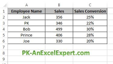
The data and the finished chart

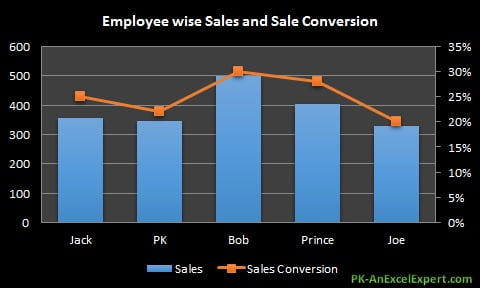
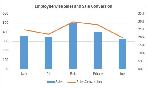
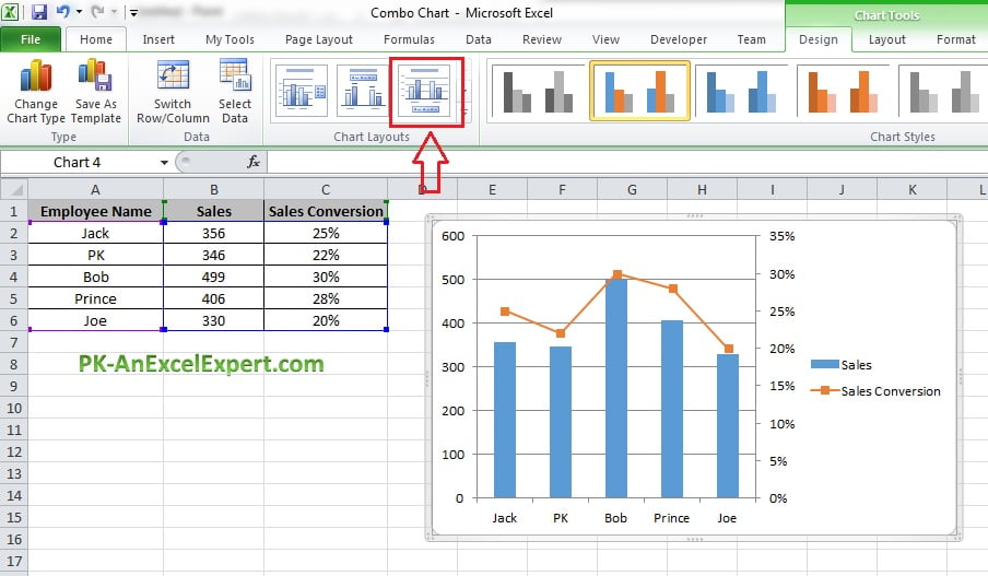
Sales are shown as columns on the primary axis and conversion percentage as a line on the secondary axis.

Method 1: Insert Combo Chart (Excel 2013 to Microsoft 365)
- Select the data range including headers, A1:C6.
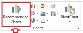
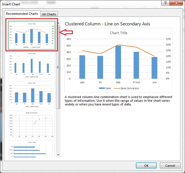
- Go to Insert > Charts > Recommended Charts. Excel usually proposes a clustered column and line on secondary axis as the first suggestion. You can also go straight to Insert Combo Chart > Clustered Column – Line on Secondary Axis.

- In the Insert Chart dialog choose the first recommendation, or open the All Charts tab, pick Combo and set Sales to Clustered Column and Sale Conversion to Line with Secondary Axis ticked. Click OK.

- Click the title and type Employee wise Sales and Sale Conversion. The combo chart is complete.

Method 2: build the combo chart manually (works in Excel 2010 and later)
This method shows what the built-in command does behind the scenes and lets you convert any existing chart into a combo chart.
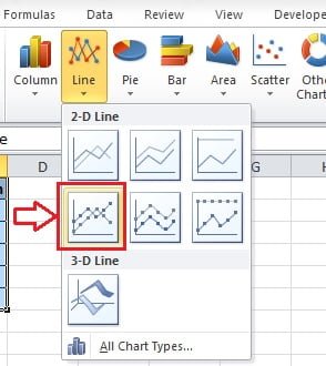
- Select A1:C6 and go to Insert > Charts > Line Chart > Line with Markers. Both series appear as lines, and the conversion line sits flat at the bottom.

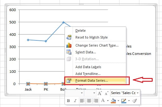
- Right-click the Sale Conversion line and choose Format Data Series.

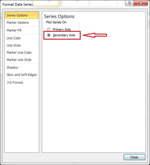
- Under Series Options select Secondary Axis. A percentage axis appears on the right and the line becomes readable.

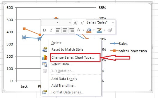
- Right-click the Sales line and choose Change Series Chart Type.

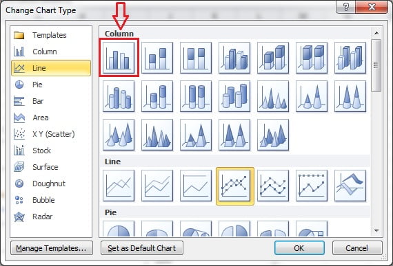
- Choose Clustered Column for the Sales series and click OK.

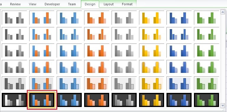
- On the Chart Design tab choose a Quick Layout that includes a legend and data labels (Layout 3 in the example) and a Chart Style you like (Style 42 was used here in Excel 2010; the gallery differs in newer versions).


- Click the title and type Employee wise Sales and Sale Conversion.
Download the practice file
Download the Combo Chart Excel file to practise both methods, or click the chart below.

When to use a combo chart
- Volume and rate together: sales and conversion, calls and abandonment rate, revenue and margin percent.
- Actual as columns with target as a line, so the gap is visible at every point.
- Two measures with different units, such as units sold and average price.
Formatting tips
- Format the secondary axis as percentage with zero decimals and set fixed bounds such as 0 to 100 percent so the line does not exaggerate small changes.
- Use a contrasting colour and markers for the line so it is not confused with the columns.
- Label the axes or add the unit to the legend text; two unlabelled axes are a common source of misreading.
- Keep to one line series on the secondary axis; more than that becomes cluttered.
- Add data labels to the line only, positioned above, to keep the columns clean.
Tips and common mistakes
- If the conversion series is invisible after inserting, it is on the primary axis; move it to the secondary axis first.
- Do not put two column series on different axes; overlapping columns of different scales are unreadable.
- Include headers in the selection so the legend names the series correctly.
- In Excel 2013 and later you can change any series type and axis in one place: right-click the chart and choose Change Chart Type > Combo.
Related lessons
Frequently asked questions
How do I add a secondary axis in Excel?
Right-click the series, choose Format Data Series and select Secondary Axis under Series Options. In Excel 2013 and later you can also tick Secondary Axis in the Change Chart Type > Combo dialog.
Can a combo chart have two lines and columns?
Yes. Any number of series can be assigned a type and axis in the Combo dialog, but more than one line on the secondary axis is usually hard to read.
Why does my line sit flat along the bottom of the chart?
It is plotted on the primary axis where its values are tiny compared with the columns. Move it to the secondary axis.
Want the finished version? Ready-made Excel dashboards and KPI templates are available at NextGenTemplates.com.