Part of the free Module 8: Basic Charts · Lesson 2 of 12 · Full Excel course
Updated on 5 September 2026 · Works in Excel 365, 2021, 2019 and 2016 unless noted.
A stacked column chart in Excel shows each category as one column and divides that column into coloured segments, one per data series. The column height is the total and the segments are the breakdown, so a single chart answers “how much in total” and “made up of what”. You insert it from Insert > Charts > Insert Column or Bar Chart > Stacked Column.
What a stacked column chart shows
A clustered column chart places the series side by side, which makes every value easy to compare but hides the total. A stacked column chart piles the series on top of each other, so the top of the stack is the sum of its parts. That makes it the right choice when the total matters as much as its composition: revenue by region split by product line, headcount by department split by grade, or monthly cost split into rent, salaries and utilities.
Excel offers three stacked versions in the Column gallery. Stacked Column plots actual values. 100% Stacked Column scales every column to the same height so you compare shares only. 3-D Stacked Column adds depth for presentation slides. This lesson builds the 3-D version shown in the screenshots and then explains the 2-D and 100 percent variants, because the steps are identical apart from the gallery button you press.
Sample data for the lesson
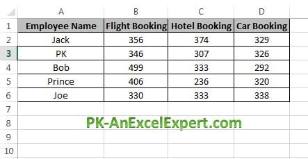
The example uses employee-wise travel bookings with three product series. Type it into a blank sheet with the headers in row 1 so that your cell references match the steps below.
| Employee Name | Flight Booking | Hotel Booking | Car Booking |
|---|---|---|---|
| Jack | 356 | 374 | 329 |
| PK | 346 | 307 | 326 |
| Bob | 499 | 333 | 292 |
| Prince | 406 | 236 | 320 |
| Joe | 330 | 333 | 338 |
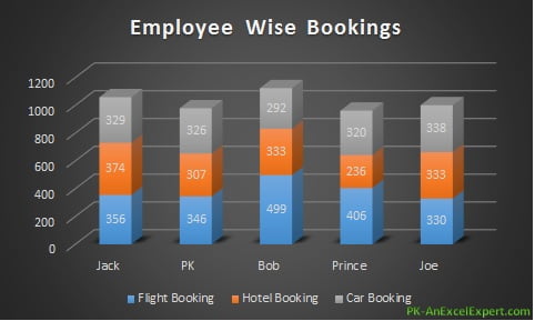
The finished chart looks like this. Each employee gets one column, and the blue, orange and grey segments show flight, hotel and car bookings inside it.
How to create a stacked column chart step by step
- Select the data range including the headers, A1:D6. Do not include a Total column if you have one.
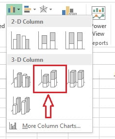
- Go to Insert > Charts > Insert Column or Bar Chart > 3-D Column > 3-D Stacked Column. For a flat chart choose 2-D Column > Stacked Column instead, and for proportions choose 100% Stacked Column.
- Excel inserts the chart with employees on the horizontal axis and one segment per product. If it stacks employees inside product columns instead, click Chart Design > Data > Switch Row/Column.
- With the chart selected, open the Chart Design tab (Design under Chart Tools in Excel 2016 and 2019) and pick a preset from Chart Styles. The screenshots use Style 6, which gives a dark background and white labels.

- Click the chart title and type Employee Wise Bookings.
- Click the plus sign beside the chart (Chart Elements) and tick Data Labels so each segment prints its value.
Formatting a stacked column chart
The default chart is readable, but a few targeted changes turn it into a report-ready visual. Every option below sits in the Format pane, which opens when you double-click a chart element or press Ctrl + 1 with the element selected.
| What to change | Where | Recommended setting |
|---|---|---|
| Data labels | Chart Elements > Data Labels > Center | Centre inside each segment; hide labels on segments under 5 percent of the total |
| Series colour | Right-click a segment > Format Data Series > Fill | One colour family in three shades, darkest at the bottom |
| Gap width | Format Data Series > Series Options | 50 to 80 percent so columns look solid without touching |
| Series order | Chart Design > Select Data > move up or down | Largest or most important series at the bottom |
| Vertical axis | Format Axis > Bounds and Units | Minimum 0, major unit a round number such as 200 |
| 3-D rotation | Format Chart Area > 3-D Rotation | X 15, Y 15, Perspective 0, or switch to 2-D |
Show the total above each column
Excel has no built-in total label for a stacked column, but a hidden series does the job in under a minute.
- Add a Total column in E1:E6 with the formula
=SUM(B2:D2)copied down. - Right-click the chart, choose Select Data > Add, and add the Total series. It stacks on top and doubles the column height for a moment.
- Right-click the new Total segment and choose Change Series Chart Type. Set Total to Line with Markers and leave the others as Stacked Column. In a 3-D chart, first switch the whole chart to 2-D because combo charts are 2-D only.
- Add data labels to the Total series and set their position to Above.
- Format the Total series with No line and Marker type: None, then delete the Total entry from the legend.
The line disappears and only the totals remain, sitting just above each stack.
Worked example
Using the sample data above, the totals per employee are Jack 1,059, PK 979, Bob 1,124, Prince 962 and Joe 1,001. After steps 1 to 6 the chart shows Bob as the tallest column, and the blue segment tells you why: his 499 flight bookings are the largest single value in the table. Joe has the flattest mix, with all three products between 330 and 338, so his segments are almost equal in height. Switching the same chart to 100% Stacked Column via Chart Design > Change Chart Type removes the height difference and shows that flights make up 44 percent of Bob’s bookings but only 33 percent of Joe’s.
If you add the invisible Total series, the labels 1059, 979, 1124, 962 and 1001 appear above the columns and the reader no longer needs to add segments in their head.
When to use and when not to use a stacked column chart
Use it when you have two to five series per category and the sum is meaningful: sales by quarter split by channel, project hours split by phase, or survey responses split by rating. It also works for short time series where composition changes matter, such as twelve months of cost split into three cost types.
Avoid it when you need to compare each series precisely across categories, because only the bottom series has a flat baseline. Use a clustered column chart instead. Avoid it for more than six series (the colours stop being distinguishable), for negative values (they stack below the axis and confuse readers), and for long time series (use a stacked area chart). If the categories have long names, the horizontal stacked bar chart gives the labels room.
Download the practice file
Download the Stacked Column Chart Excel file to practise with the same data, or click the chart below.
Tips and common mistakes
- Put the key series at the bottom. It is the only segment with a flat baseline, so it is the only one readers can compare accurately across columns.
- Keep the legend. Colour is the only way to identify a segment. Move it to the top or right so it does not steal chart height.
- Do not select a Total column. Excel stacks it on top of the parts and every column doubles in height.
- Prefer 2-D for reports. 3-D depth hides small segments and makes values look larger than they are. Keep 3-D for slides.
- Use shades, not rainbows. Three shades of one colour read as one family; six unrelated colours read as noise.
- Turn the source into a Table. Press Ctrl + T before inserting the chart so new rows extend the chart automatically. See the dynamic chart range lesson.
- Check the axis minimum. A vertical axis that starts above zero exaggerates differences between stacks.
Errors and how to fix them
| Problem | Cause | Fix |
|---|---|---|
| Employees appear as segments and products as columns | Excel guessed the wrong orientation | Chart Design > Switch Row/Column |
| Columns are twice as tall as expected | A Total column was included in the selection | Select Data > remove the Total series, or turn it into the invisible line series |
| Segments stack below the axis | Negative values in the data | Use a clustered column chart or plot absolute values with a separate sign column |
| Change Series Chart Type is greyed out | The chart is 3-D; combo charts are 2-D only | Change Chart Type > 2-D Stacked Column, then set the Total series to Line |
| Data labels overlap in thin segments | Small values leave no room for text | Delete individual labels, reduce the font, or show labels for the top series only |
| Chart shows blank gaps for new rows | Source range is fixed | Convert the data to a Table with Ctrl + T or use a dynamic named range |
Practice exercise
- Retype the sample data, insert a 2-D Stacked Column chart and title it “Employee Wise Bookings”.
- Reorder the series so Car Booking sits at the bottom of every stack, then set the gap width to 60 percent.
- Add a Total column with
=SUM(B2:D2)and use the invisible line trick to show the total above each column. - Duplicate the chart with Ctrl + D and change the copy to 100% Stacked Column. Write one sentence on what the second chart shows that the first does not.
- Add a sixth employee to the data and check whether the chart updates. If it does not, convert the range to a Table and try again.
Key takeaways
- A stacked column chart shows totals and their breakdown in one column per category.
- Insert it from Insert > Charts > Insert Column or Bar Chart > Stacked Column; pick 100% Stacked for shares.
- Keep the series count to five or fewer and put the most important series at the bottom.
- Show totals with a hidden line series whose labels are positioned above.
- Never include a Total column in the selected range.
- Use 2-D for reports and 3-D only for slides.
Related lessons
- Basic Charts course hub
- Column chart in Excel
- Stacked bar chart in Excel
- Chart elements and formatting
- SUMIFS function for summarising raw data before charting
- Pivot table course for building the summary table a stacked chart needs
- Microsoft Support: Create a chart from start to finish
Frequently asked questions
How do I make a stacked column chart in Excel?
Select your data with headers, then go to Insert > Charts > Insert Column or Bar Chart and click Stacked Column under 2-D Column. Excel stacks each series inside one column per category. Use Switch Row/Column on the Chart Design tab if the categories and series are the wrong way round, then add a title and data labels.
How do I show the total on top of each stacked column?
Add a Total column to the data and add it to the chart as a new series. Change that series to a line chart with no line and no marker, then add data labels positioned above. The totals float above each stack while the line stays invisible. Delete the Total entry from the legend to finish.
What is the difference between stacked and 100 percent stacked column charts?
A stacked column plots actual values, so column heights differ and show totals. A 100 percent stacked column scales every column to the same height, so you compare shares only and lose the totals. Use stacked when the size matters and 100 percent stacked when only the mix matters.
Why does my stacked column chart show the wrong series in each column?
Excel decides which direction is the series and which is the category from the shape of the range. If it guesses wrong, click the chart and choose Chart Design > Data > Switch Row/Column. The categories move to the horizontal axis and the series become the stacked segments.
Should I use 2-D or 3-D stacked columns?
2-D is easier to read, prints cleanly and supports combo charts, which you need for the total label trick. 3-D depth hides small segments and distorts comparisons. Use 3-D only for presentation slides where visual impact matters more than precise reading of values.
Want the finished version? Ready-made Excel charts, dashboards and KPI templates are available at NextGenTemplates.com.