Part of the free Module 8: Basic Charts · Lesson 4 of 12 · Full Excel course
Updated on 5 September 2026 · Works in Excel 365, 2021, 2019 and 2016 unless noted.
A stacked bar chart in Excel draws one horizontal bar per category and splits that bar into coloured segments, one segment per data series. The length of the whole bar is the total and each segment is a part of it, so the reader sees the total and its composition at the same time. You insert it from Insert > Charts > Insert Column or Bar Chart > Stacked Bar.
What a stacked bar chart shows
The stacked bar is the horizontal twin of the stacked column chart. Categories run down the vertical axis and values run along the horizontal axis, which is why it handles long labels such as email addresses, product names or supplier names far better than a column chart does. Because the segments sit end to end, only the first segment shares a common baseline. That first series is therefore the only one your reader can compare precisely across bars, and it should be the series that matters most.
Excel gives you three flavours of the chart in the same gallery. Pick the one that answers the question you are actually asking.
| Chart type | What the bar length means | Best used for |
|---|---|---|
| Stacked Bar (2-D) | The sum of the series values | Totals plus breakdown, printed reports and dashboards |
| 100% Stacked Bar | Always 100 percent of the row | Share of mix, where the split matters and the total does not |
| 3-D Stacked Bar | The sum, drawn with depth | Slides and covers only, never for precise reading |
Sample data for this lesson
The example is email-ID-wise booking data with three products in columns B, C and D. Headings sit in row 1 and the categories sit in column A, which is the layout Excel expects.
| Email Id | Flight Booking | Hotel Booking | Car Booking |
|---|---|---|---|
| Jack@sometexthere.com | 356 | 374 | 329 |
| PK@sometexthere.com | 346 | 307 | 326 |
| Bob@sometexthere.com | 499 | 333 | 292 |
| Prince@sometexthere.com | 406 | 236 | 320 |
| Joe@sometexthere.com | 330 | 333 | 338 |
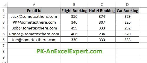
Notice that there is no Total column in the range. Excel adds the segments up for you, so a Total column would be stacked on as a fourth segment and double the length of every bar.
Create a stacked bar chart step by step
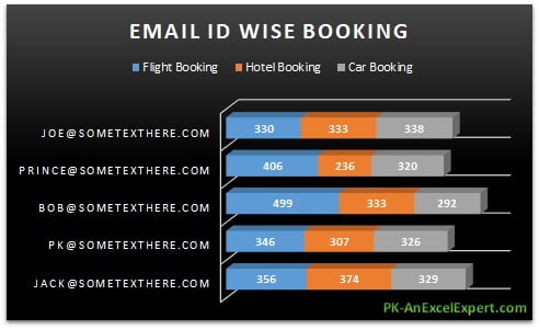
This is the finished chart you are building, a 3-D stacked bar with a dark background.
- Select the data range including the headings, A1:D6. Click any single cell inside the block if you prefer and Excel will expand the selection for you.
- Go to Insert > Charts > Insert Column or Bar Chart. The gallery drops down with a 2-D Bar row and a 3-D Bar row.
- For a flat chart choose 2-D Bar > Stacked Bar. For the version in the screenshots choose 3-D Bar > 3-D Stacked Bar. For proportions choose 2-D Bar > 100% Stacked Bar or 3-D Bar > 3-D 100% Stacked Bar. Hover over any thumbnail to see a live preview on the sheet.
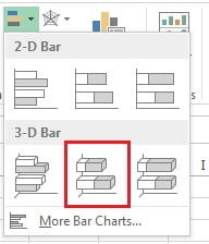
- Click the chart, open the Chart Design tab (called Design under Chart Tools in Excel 2016 and 2019) and pick Style 3 in the Chart Styles gallery.

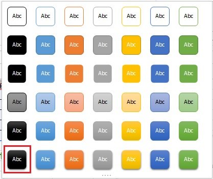
- With the chart still selected, open the Format tab and in Shape Styles choose Intense Effect – Black, Dark 1 to give the plot a dark background.
- Click the chart title and type Email Id Wise Bookings. Press Esc to leave the title.
If the email IDs end up in the legend and the products end up on the axis, click Chart Design > Data > Switch Row/Column.
Format the chart so it can be read
A default stacked bar is rarely finished. Four settings do most of the work.
- Data labels. Select the chart and choose Chart Design > Add Chart Element > Data Labels > Center. On a 2-D stacked bar you can also right-click a series, choose Format Data Labels and pick Inside End or Inside Base. A 3-D stacked bar only offers Center, which is one reason to build the flat version when numbers matter.
- Gap width. Right-click any bar, choose Format Data Series and set Gap Width to about 40 to 60 percent. The default 150 percent leaves thin bars and a lot of empty space. On a 3-D chart set Gap Depth to 0 as well so segments stop hiding each other.
- Category order. Excel plots the first row of your table at the bottom. Right-click the category axis, choose Format Axis and tick Categories in reverse order to put the first row at the top. Then set Horizontal axis crosses to At maximum category so the labels stay on the left.
- Number format. With the labels selected, set the number format in the Format Data Labels pane, for example
#,##0, so the segment values match the sheet.
Change the series order and the colours
Stacking order is the whole design of this chart. The series listed first is drawn against the baseline on the left, so put your anchor series there.
- Click the chart and choose Chart Design > Data > Select Data.
- In Legend Entries (Series), select a series and use the Move Up and Move Down arrows. Moving a series up moves it closer to the baseline.
- Click OK. The legend follows the same order, so it stays in step with the segments.
For colour, use Chart Design > Change Colours to apply a whole palette, or click a segment once to select the series and a second time to select that single segment, then use Format > Shape Fill. Keep one hue family and vary the shade from dark at the baseline to light at the end. That reads as a sequence and stops the chart looking like confetti.
Show the total at the end of each bar
Excel has no built-in total label for stacked charts. Use a helper series on a 2-D stacked bar.
- In column E add a heading of Total and in
E2enter=SUM(B2:D2), then fill it down toE6. - Right-click the chart, choose Select Data > Add and point Series values at
E2:E6. The Total is stacked on as a fourth segment. - Right-click that new segment, choose Format Data Series > Fill > No fill. The bar length now looks unchanged.
- Right-click the invisible series again, choose Add Data Labels, then Format Data Labels and set the label position to Inside Base. Each total now sits just past the last visible segment.
- Remove the Total entry from the legend: click the legend, click the Total item once to select it alone and press Delete.
Worked example
Using the table above, the totals are Jack 1,059, PK 979, Bob 1,124, Prince 962 and Joe 1,001. Select A1:D6, insert a 2-D Stacked Bar, set Gap Width to 50 percent, add centre data labels and tick Categories in reverse order. Add the helper Total series from E2:E6 with no fill and Inside Base labels.
The finished chart says two things at once. Bob has the longest bar at 1,124 bookings, driven almost entirely by 499 flight bookings, while Joe sits mid-table at 1,001 with the most even split of the five. Because Flight Booking is the first series it sits on the baseline, so that 499 against Prince’s 406 and Joe’s 330 is the comparison the eye makes first. Swap Flight Booking out of first position and that insight disappears, which is exactly why series order is a design decision rather than an accident.
When to use a stacked bar chart, and when not to
Use it when all of the following are true:
- The parts genuinely add up to a meaningful whole, such as bookings by product adding up to total bookings.
- The total matters as much as the split. If only the split matters, use a 100% stacked bar.
- Category names are long or numerous. Horizontal bars give the labels room; a column chart would tilt them.
- You have two to five series. Beyond five, the middle segments become slivers.
Avoid it when:
- You need to compare a middle or last series across categories. Nothing but the first segment shares a baseline, so those comparisons are guesswork. Use a clustered bar chart instead.
- Values can be negative. Negative segments run the opposite way and the stack stops meaning a total.
- The categories are a time series. Time belongs on a horizontal axis, so use a stacked column chart or an area chart.
- The segments are not parts of the same whole. Stacking unrelated measures invents a total that means nothing.
Download the practice file
Download the Stacked Bar Chart Excel file to practise with exactly this data, or click the chart below.
Tips and common mistakes
- Leave the Total column out of the source range. Selecting it stacks the total as an extra segment and doubles every bar. Add it later as a deliberate no-fill helper series.
- Put the anchor series first. Only the baseline series can be compared accurately, so it should be the number your reader cares about most.
- Sort the source table before charting. Sort descending by total and tick Categories in reverse order, and the longest bar lands at the top where the eye starts.
- Do not exceed five series. Thin segments and near-identical colours defeat the purpose. Group the small ones into an Other series.
- Reserve 3-D for slides. Depth distorts length, hides short segments and limits data label positions to Centre.
- Keep label contrast high. On the dark Shape Style used here, set the data label font to white or a very light grey or the numbers vanish.
- Base the chart on an Excel Table. Format the range with Ctrl+T first and new rows are picked up by the chart automatically.
Errors and how to fix them
| Symptom | Cause | Fix |
|---|---|---|
| Every bar is roughly twice as long as it should be | A Total column was inside the selected range | Chart Design > Select Data and remove the Total series, or reselect A1:D6 |
| Products are on the axis and email IDs are in the legend | Excel guessed the orientation from the shape of the range | Chart Design > Data > Switch Row/Column |
| The first row of the table appears at the bottom | Default category axis direction | Format Axis > tick Categories in reverse order, then set Horizontal axis crosses to At maximum category |
| Some segments are missing from the stack | Blank cells or text such as NA in the value range | Replace blanks with 0, or use =IFERROR(value,0) in a helper column |
| Bars are thin with wide gaps | Gap Width is still at the 150 percent default | Format Data Series > set Gap Width to 40 to 60 percent |
| Data labels overlap or are unreadable | Segments too small for the label | Enlarge the chart, shorten the number format, or move small series into an Other series |
Practice exercise
- Open the practice file and build a 2-D stacked bar from A1:D6 with centre data labels and Gap Width at 50 percent.
- Reorder the series so Hotel Booking sits on the baseline, then say in one sentence which insight changed.
- Add a Total column with
=SUM(B2:D2), plot it as a no-fill helper series and label it Inside Base. - Copy the chart, change it to a 100% Stacked Bar with Chart Design > Change Chart Type and compare what each version tells you.
- Sort the table by total descending, tick Categories in reverse order and confirm the longest bar is now at the top.
Key takeaways
- A stacked bar chart shows a total and its composition in one horizontal bar, and it is the right choice when category names are long.
- The ribbon path is Insert > Charts > Insert Column or Bar Chart, then Stacked Bar, 100% Stacked Bar or their 3-D equivalents.
- Only the first series shares a common baseline, so series order decides which comparison your reader can actually make.
- Gap Width, data labels, reversed category order and a sorted source table turn a default chart into a readable one.
- Totals need a no-fill helper series with Inside Base labels, because Excel has no built-in total for stacked charts.
- Use 100% Stacked Bar for share of mix and a clustered bar when every series must be compared precisely.
Related lessons
- Basic Charts course hub
- Bar chart in Excel
- Stacked column chart in Excel
- Column chart in Excel
- SUM function and SUMIFS function for building the totals behind the chart
- Advanced Charts and Infographics and Excel Dashboards
- Available chart types in Office on Microsoft Support
Frequently asked questions
How do I add a total at the end of each stacked bar?
Add a Total column with =SUM(B2:D2), plot it as an extra series on a 2-D stacked bar, set its fill to No fill and add data labels positioned Inside Base. The total then appears just past the last visible segment. Delete the Total item from the legend so the chart stays tidy.
Why are my bars in the reverse order to my table?
Excel plots the first row of the source range at the bottom of a bar chart. Right-click the category axis, choose Format Axis and tick Categories in reverse order. Then set Horizontal axis crosses to At maximum category, otherwise the category labels jump to the right side of the plot.
Can a stacked bar chart show percentages instead of values?
Yes. Change the chart to a 100% Stacked Bar with Chart Design and Change Chart Type, and every bar becomes the same length with segments sized by share. If you need the real totals as well, keep the plain stacked bar and add labels from a helper range of percentages using the Value From Cells option.
What is the difference between a stacked bar and a stacked column chart?
Only the orientation. A stacked bar runs horizontally with categories down the left, which suits long labels and long lists. A stacked column runs vertically, which suits time on the axis such as months or quarters. The maths, the stacking order rules and the formatting options are identical in both.
How many series can a stacked bar chart handle?
Excel allows far more, but two to five series is the practical limit for a chart people can read. Beyond five, the middle segments become slivers and the colours blur together. Combine the smallest series into a single Other category, or switch to a clustered bar or a small multiples layout instead.
Want the finished version? Ready-made Excel dashboards, trackers and KPI templates are available at NextGenTemplates.com.