Bar Chart is like a horizontal column chart, It is used when category names are big.
For example if we want to create an email-id wise sales chart. we can showcase email id wise number of sales as given below is the snapshot of a Bar chart.
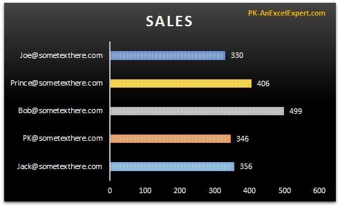
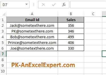
Below is the email is wise sales data for above chart.
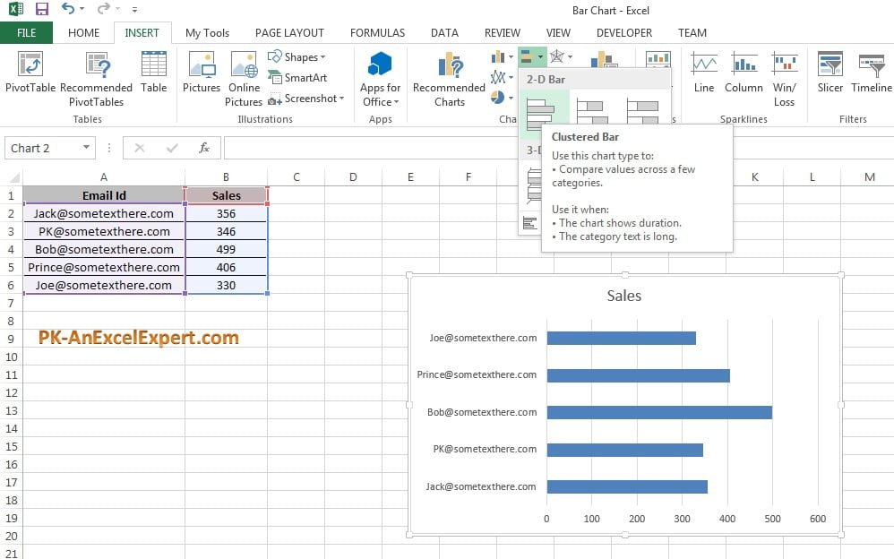
To create this Bar Chart below step to be followed –
Select the data range like “A1:B6”.
Go to Insert>>Charts>>Bar Chart >> 2D Bar>>Clustered Bar
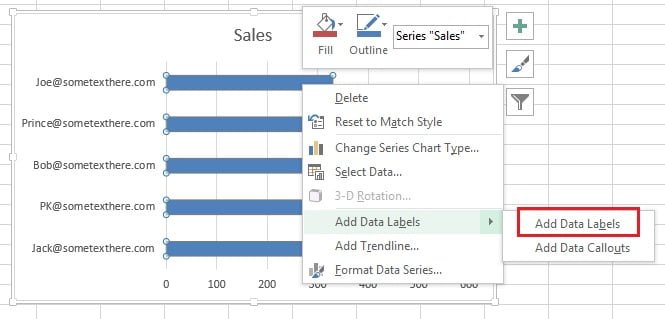
To add the data labels right click on bars and click on Add Data Labels.
Once data labels are added we can give different the columns color for each email id. To do so right click on bar and click on Format Data Series option.
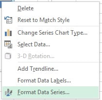
Under format data series option go to fill option. and there is an option available “Very colors by points”, check this option.
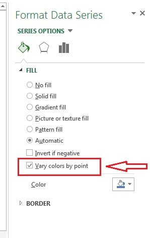
After check very colors by point option Bars color for each email id will be changed. Now we change the style of the chart.
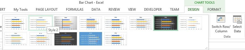
To change the chart style-
Click on the charts, “Design” Tab will be visible under “Chart Tools”. We can choose any of the design. I have taken Style 2 from the chart style for this chart.
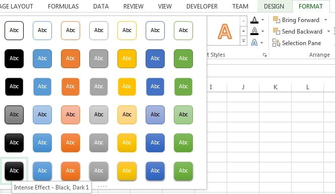
Now we will change chart background color.
- Select the chart and go to “Format” tab under “Chart Tools” .
- Go to shape styles and click on “Intense Effect – Black, Dark 1 (First column in last row)
Now our Bar chart is ready. Please download this excel file for practice.