Part of the free Module 8: Basic Charts · Lesson 7 of 12 · Full Excel course
Updated on 5 September 2026 · Works in Excel 365, 2021, 2019 and 2016 unless noted.
A pie chart in Excel turns one series of positive numbers into slices of a circle, where each slice angle is proportional to that category’s share of the total. Use it to answer a single question: what proportion of the whole does each category hold? Insert one from Insert > Charts > Insert Pie or Doughnut Chart, then label the slices with the category name and percentage.
What a pie chart shows
The full circle represents 100 percent of one series. Excel measures each slice by angle, and readers judge angles poorly, so a pie chart is only reliable when the differences are large and the number of slices is small. It also requires that the parts genuinely add up to a meaningful whole: revenue by employee adds up to total revenue, but revenue in 2024 and 2025 does not belong in the same pie.
Excel offers five variants in the same gallery: 2-D Pie, 3-D Pie, Pie of Pie, Bar of Pie and Doughnut. For published reports, 2-D Pie is the only one of the first four you should reach for by default.
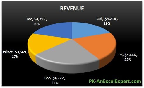
Each label carries three pieces of information: the employee name, the revenue value and that employee’s percentage of total revenue.
Sample data used in this lesson
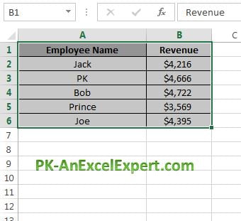
The workbook holds five employees and their revenue for the year in A1:B6. Type it into a blank sheet if you want to follow along without downloading anything.
| Cell | Employee Name | Revenue |
|---|---|---|
| Row 2 | Jack | 4,216 |
| Row 3 | PK | 4,666 |
| Row 4 | Bob | 4,722 |
| Row 5 | Prince | 3,569 |
| Row 6 | Joe | 4,395 |
The total is 21,568. Put =SUM(B2:B6) in B7 so you can check the percentages Excel prints on the slices.
How to insert a pie chart in Excel
- Sort the data largest to smallest first. Click any cell in column B and choose Data > Sort & Filter > Sort Largest to Smallest. Slices then run clockwise in size order, which is far easier to read.
- Select the whole range including the headers, A1:B6. A pie chart plots one series, so select exactly one label column and one value column.
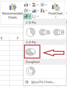
- Go to Insert > Charts > Insert Pie or Doughnut Chart and pick 2-D Pie from the gallery. The same gallery holds 3-D Pie, Pie of Pie and Bar of Pie. The screenshots in this lesson use 3-D Pie because that is what the original workbook built; 2-D Pie is the better choice for anything you publish.
- Drag the chart clear of the data and resize it so the labels have room.
Format the pie chart
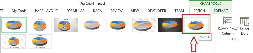
- Click the chart, open the Chart Design tab (called Design under Chart Tools in Excel 2016 and 2019) and choose a style from Chart Styles. The sample uses Style 8.
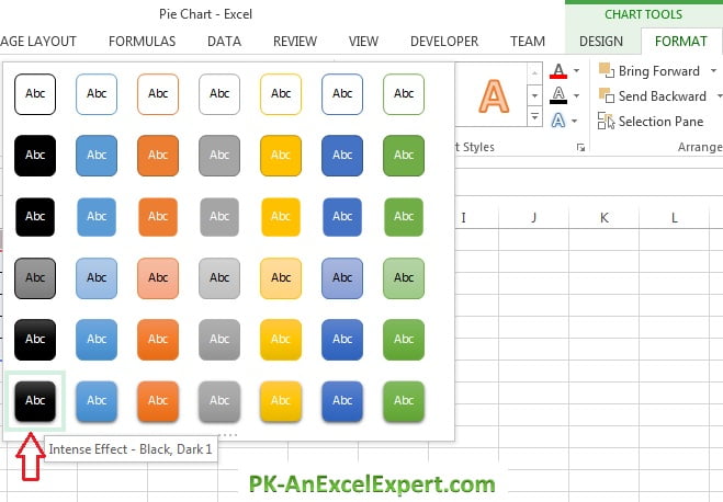
- With the chart area selected, open the Format tab and pick a preset from Shape Styles if you want a dark background. Keep the slice colours clearly different from one another.
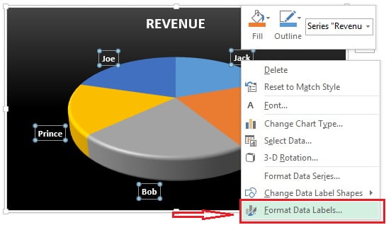
- Add labels with the plus sign beside the chart (Chart Elements > Data Labels), then right-click a label and choose Format Data Labels.
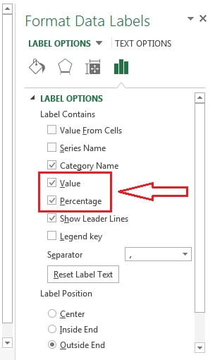
- Under Label Options tick Category Name and Percentage, add Value if the amounts matter, and set Separator to New Line. Under Label Position choose Best Fit so Excel places each label inside its slice where it fits, or Outside End and tick Show Leader Lines when thin slices push their labels away.
- Delete the legend once the labels carry the category names. Select it and press Delete.
Explode a slice and set the first slice angle
- To pull out one slice, click the pie once to select the series, then click the slice again to select only that point. Drag it outwards, or right-click and use Format Data Point > Series Options > Point Explosion and set a value such as 10 percent. Explode one slice only; exploding them all just shrinks the chart.
- To rotate the pie, right-click the series, choose Format Data Series and change Angle of first slice. Zero degrees starts the first slice at twelve o’clock, which is where readers expect the largest slice to begin.
- To recolour one slice, select the point and use Format > Shape Fill. Grey out the slices you are not talking about and give the key slice the accent colour.
Pie of Pie for small slices
When several tiny categories crowd the edge of the pie, insert Pie of Pie or Bar of Pie instead. Excel moves the last few values into a secondary plot joined by connector lines. Right-click the series, open Format Data Series and set Split Series By to Position, Value, Percentage Value or Custom, then set Values in second plot to the number of categories you want moved. Sort ascending before you split by Position, because Excel takes the last rows.
Pie variants compared
| Chart type | Best for | Watch out for |
|---|---|---|
| 2-D Pie | Two to six categories that form a real whole | Unreadable once slices are similar in size |
| 3-D Pie | Nothing in a business report | Perspective enlarges the front slices, so it misleads |
| Pie of Pie | One big pie plus a few small categories broken out | The secondary plot is not to scale with the main pie |
| Bar of Pie | Same as Pie of Pie, with a stacked bar for the small values | Readers often miss that the bar is only part of one slice |
| Doughnut | Share of a whole with a KPI number in the hole | Angles are even harder to judge than in a pie |
| Bar chart | Comparing category sizes accurately | Loses the sense of a single whole unless you add percentages |
Worked example: employee-wise revenue share
Using the sample data above, select A1:B6, insert a 2-D Pie and tick Category Name and Percentage in Format Data Labels. Excel divides each value by the total of 21,568 and prints these shares:
| Employee | Revenue | Share of total |
|---|---|---|
| Bob | 4,722 | 21.9% |
| PK | 4,666 | 21.6% |
| Joe | 4,395 | 20.4% |
| Jack | 4,216 | 19.5% |
| Prince | 3,569 | 16.5% |
The result is honest about this data set and about pie charts. Five slices between 16.5 and 21.9 percent look almost identical on a circle, and only the labels tell you that Bob is ahead of Prince by about five points. That is the classic sign that a bar chart would serve the reader better. Keep the pie when the message is one dominant share, such as a single product at 62 percent; switch to bars when the ranking is the message. The printed percentages may add up to 99.9 or 100.1 because each one is rounded on its own.
When to use a pie chart and when not to
Use a pie chart when all four of these are true.
- One series only. Extra value columns are ignored by the chart type.
- Five or six categories at most. Beyond that the small slices cannot be labelled cleanly. Group the tail into Other, or use Pie of Pie.
- Values are positive and add to a meaningful whole. Negative numbers become mirrored slices and zeros vanish.
- The differences are big. One slice dominating, or a rough 60/30/10 split, reads instantly.
Choose something else when any of these apply.
- You are comparing similar values. A bar chart puts the bars on a common baseline, so the eye compares lengths instead of angles and reads a two-point gap accurately.
- You are showing change over time. Use a line chart.
- You are comparing two totals. Two pies side by side cannot be compared reliably; use a clustered or stacked column chart.
- The audience needs the numbers. A sorted table with a percentage column beats a pie every time.
Never use 3-D Pie in a report you send to someone else. The tilt makes front slices look bigger than back slices of the same value, and there is no analytical benefit to trade against that.
Download the practice file
Download the Pie Chart Excel file to practise with the same data, or click the chart below.
Tips and common mistakes
- Sort before you chart. Excel draws slices in worksheet order, so unsorted data produces a scattered, hard to read circle.
- Show one decimal at most. Select the labels, open Number in the Format Data Labels pane and set 0 or 1 decimal place. More precision than that is noise.
- Do not add a second series. If you need two measures, use a doughnut with two rings or a clustered bar chart.
- Drop the legend when labels name the slices. Two sets of category names waste space and split the reader’s attention.
- Keep the colours distinct and consistent. If the same categories appear elsewhere in the report, give each one the same colour on every chart.
- Watch hidden and filtered rows. By default Excel excludes them, so the total behind the percentages can change without warning.
- Do not chart a total row. Including a Total cell makes it half the pie and every other slice meaningless.
Problems and how to fix them
| Problem | Cause | Fix |
|---|---|---|
| All slices are the same size | The values are text, not numbers | Check for leading spaces or apostrophes, then use Data > Text to Columns > Finish to convert |
| Only one slice appears | A total row or one huge outlier is in the range | Remove the total from the chart range, or split the outlier out |
| Percentages do not add to 100 | Each label is rounded independently | Show one decimal place, or state that figures are rounded |
| A category is missing | Its row is hidden or filtered out | Right-click the chart, choose Select Data > Hidden and Empty Cells and tick Show data in hidden rows and columns |
| Labels overlap on thin slices | Too many small categories | Set position to Outside End with leader lines, or switch to Pie of Pie |
| Slices look wrong for the numbers | The chart is a 3-D Pie | Use Chart Design > Change Chart Type and pick 2-D Pie |
Practice exercise
- Open the practice file, sort the revenue largest to smallest and insert a 2-D Pie from A1:B6.
- Label the slices with category name and percentage on separate lines, set the position to Best Fit and delete the legend.
- Explode Bob’s slice by 10 percent and set the angle of first slice so that Bob starts at twelve o’clock.
- Add three more employees with revenue under 500, then rebuild the chart as Pie of Pie with three values in the second plot.
- Copy the data to a new sheet, chart it as a bar chart and decide in one sentence which of the two reads better.
Key takeaways
- A pie chart shows one series as shares of a single whole, and nothing else.
- The ribbon path is Insert > Charts > Insert Pie or Doughnut Chart, then 2-D Pie, 3-D Pie, Pie of Pie or Bar of Pie.
- Sort largest to smallest, label with category name and percentage, and remove the legend.
- Best Fit or Outside End with leader lines keeps labels readable; Point Explosion and Angle of first slice highlight one slice.
- Use Pie of Pie when several categories are too small to label.
- Five or six slices is the practical limit, and a bar chart is usually the better answer.
Related lessons
- Basic Charts course hub
- Doughnut chart in Excel
- Bar chart in Excel
- Chart elements: titles, labels and legends
- How to choose the right chart type
- SUM function for the total behind the percentages
- Excel Dashboard course
- Available chart types in Office and Add or remove data labels in a chart on Microsoft Support
Frequently asked questions
How do I show percentages on an Excel pie chart?
Select the chart, click the plus sign and tick Data Labels. Right-click any label, choose Format Data Labels, then tick Percentage under Label Options. Excel divides each value by the series total, so you do not need a helper column. Add Category Name as well and set the separator to New Line, then delete the legend.
How do I pull one slice out of a pie chart?
Click the pie once to select the whole series, then click the slice again so only that point is selected. Drag it away from the centre, or right-click and set Point Explosion under Format Data Point to a value such as 10 percent. Explode a single slice only, because exploding every slice shrinks the chart without adding meaning.
How many slices should a pie chart have?
Five or six at most. Past that the small slices cannot be labelled without overlapping, and readers cannot judge the angles anyway. Group the tail into a single Other category, use Pie of Pie to break the small values into a secondary plot, or switch to a sorted bar chart, which stays readable with twenty categories.
Why should I avoid 3-D pie charts?
A 3-D pie is drawn in perspective, so slices near the front cover more area on screen than slices of the same value at the back. The reader then overstates whatever happens to sit at the front. There is no analytical gain to offset that distortion, so use 2-D Pie for anything you share.
Can a pie chart show more than one series?
No. Excel plots only the first series in a pie chart and ignores the rest. To compare two measures, use a doughnut chart with two rings, a clustered bar chart, or two separate pies clearly labelled. If you need part to whole across several periods, a 100 percent stacked column chart is the usual answer.
Want the finished version? Ready-made Excel dashboards, trackers and VBA systems are available at NextGenTemplates.com.