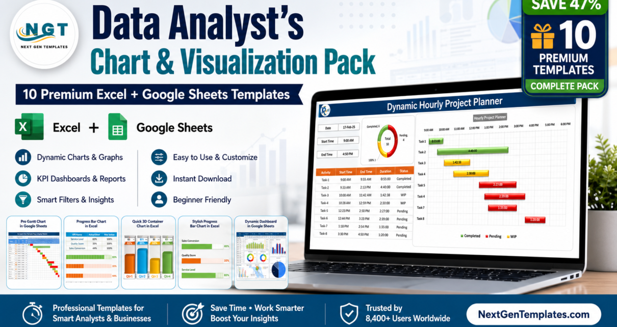
Every analyst hits the same wall. The numbers are clean, the pivot is correct, the story is clear — and then you spend two hours fighting Excel’s chart engine trying to make a Gantt bar start on the right date, or a gauge needle point where it should. The Data Analyst’s Chart & Visualization Pack exists to delete that two hours from your week. It bundles ten premium chart templates — seven for Microsoft Excel and three for Google Sheets — into a single download, so the visual you need is already built, already tested, and waiting for your data.
Bought one at a time, these ten templates cost $56.90. As a bundle the price is $29.99, a saving of $26.91 or 47%. That works out to roughly $3.00 per template, and like everything on NextGenTemplates it is a one-time purchase — no subscription, no seat limits, no upsell required to unlock features.
🎯 Data Analyst’s Chart & Visualization Pack
Individual total $56.90 → Bundle price $29.99
Save $26.91 — 47% off — 10 templates, one download
Why a Chart Pack Beats Building Charts From Scratch
Chart techniques are not evenly distributed knowledge. Anyone can make a column chart. Very few people can make a horizontal milestone timeline out of an XY scatter series, or a gauge needle that rotates correctly across a 180-degree arc, or a Gantt bar that respects an hourly grid. These are solved problems — but the solutions live in scattered forum threads and half-finished tutorials, and reverse-engineering them takes far longer than the chart is worth.
The templates in this pack are those solutions, packaged. Each file is a working example with the hard part already done: the helper columns, the axis scaling, the series ordering, the conditional formatting rules. You replace the sample data and the chart redraws. If you want to understand the technique, the formulas are visible and unlocked — so each template doubles as a reference you can borrow from for years.
Key Features of the Data Analyst’s Chart & Visualization Pack
Four Gantt chart variants across two platforms. Project reporting rarely fits one time grain. This pack covers hourly (for shift plans, maintenance windows and event schedules), daily (the standard task plan), and weekly (for programmes running six months or longer where a daily grid becomes unreadable). One of them is a Pro Excel build with a VBA data entry form, so team members add tasks through a dialog instead of typing over your formulas.
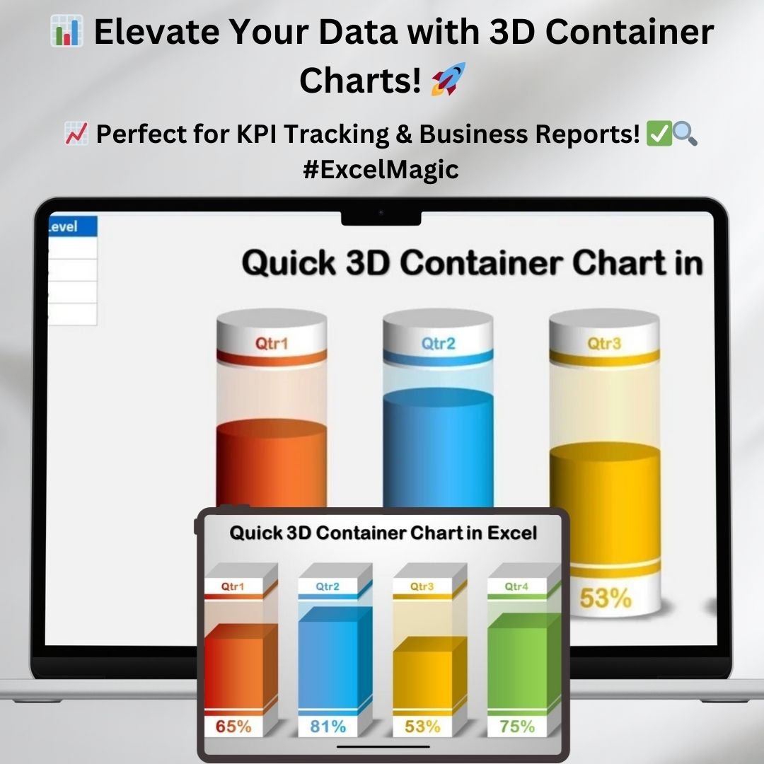
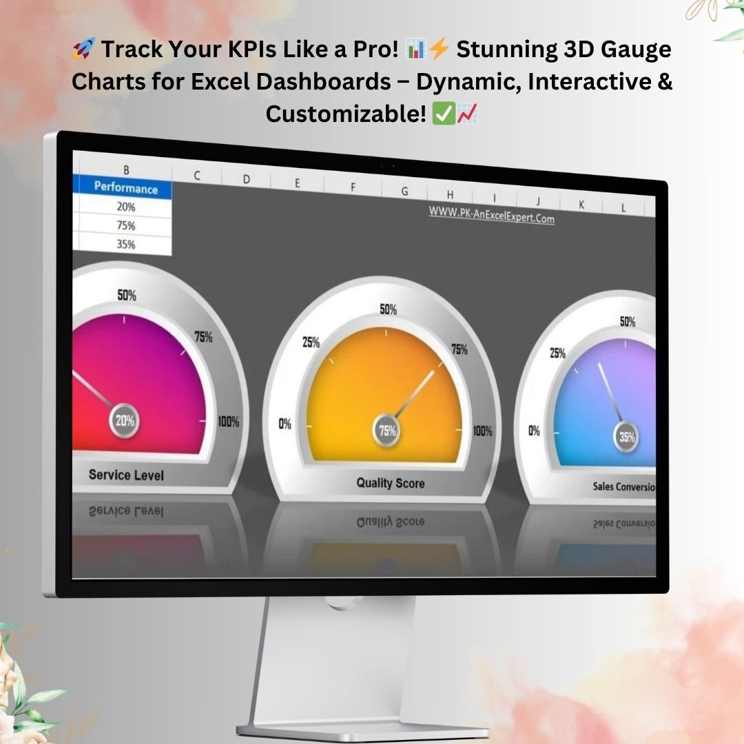
KPI visuals that survive a board deck. The 3D Gauge Chart and Quick 3D Container Chart are the two templates people ask about most. Both are built entirely from native Excel chart types and shapes — no add-ins, no plugins, nothing that breaks when the file lands on a colleague’s locked-down laptop. Drop in a percentage and you get a headline visual for OEE, SLA attainment, budget consumption or quota progress.
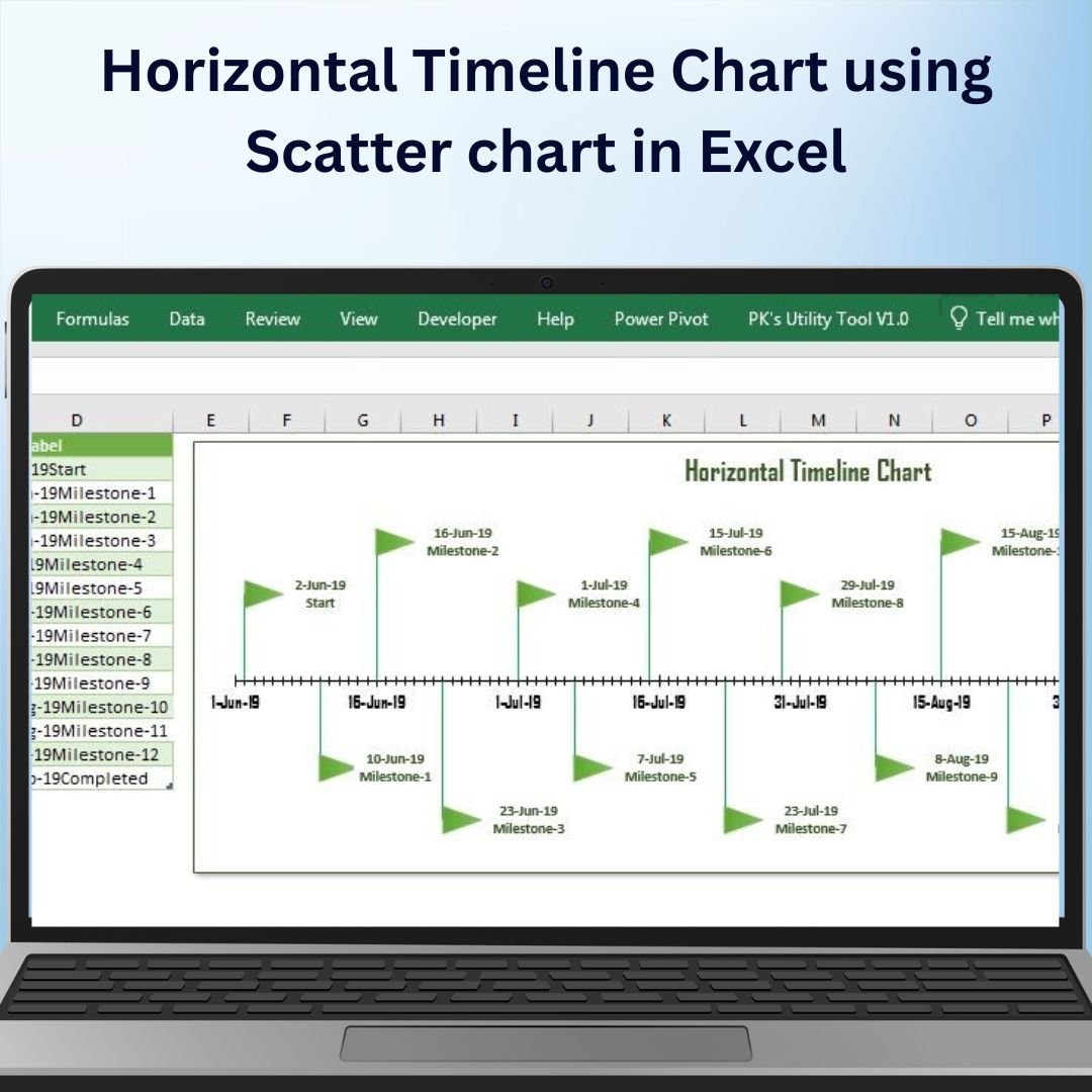
A scatter-based horizontal timeline. This is the technique most analysts never find. Excel has no native timeline chart type, but an XY scatter series with custom error bars and data labels produces roadmap-quality milestone timelines. The template hands you the working mechanics.
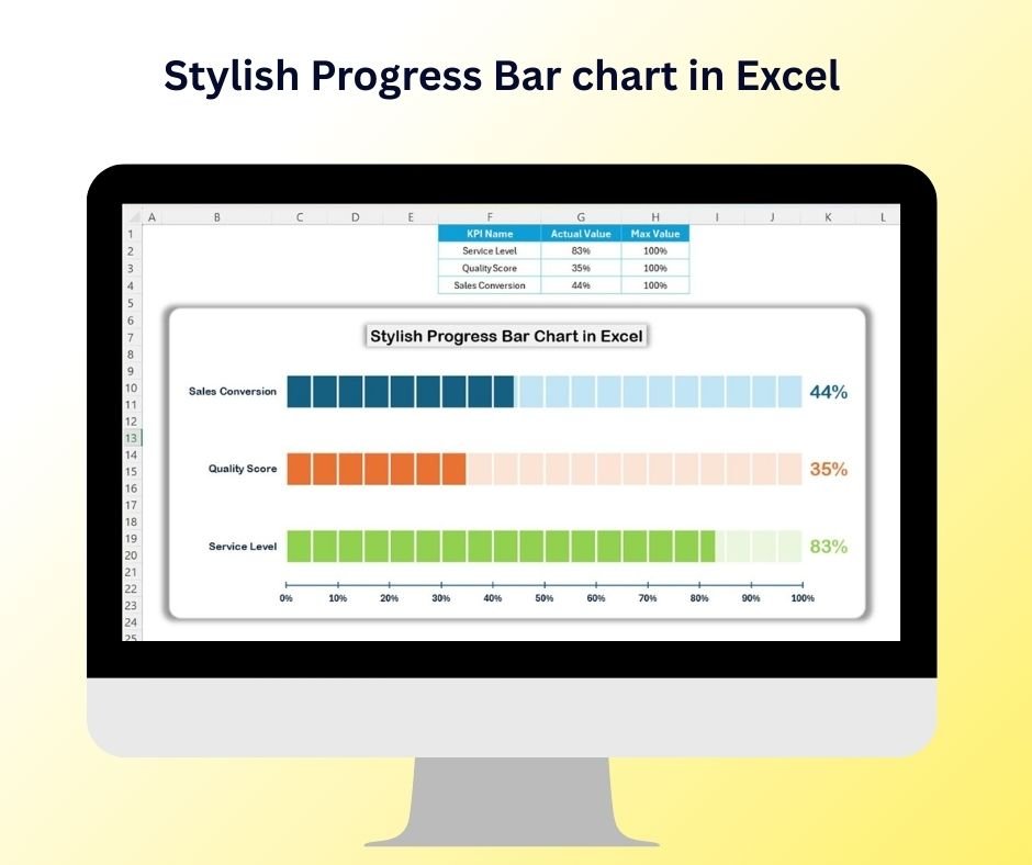
Progress bars that look designed, not default. The Stylish Progress Bar Chart turns a single percentage column into clean, rounded completion bars — the kind of visual that belongs on slide one of a status review rather than buried in an appendix.
Excel and Google Sheets side by side. Seven Excel files for your heavy desktop reporting, three Google Sheets templates for anything the team needs to edit together. No format conversion, no broken formulas from a bad import.
Everything editable. No locked sheets, no hidden password-protected ranges. Colours, fonts, gridlines, axis formats and label positions are all yours to change so the output matches your organisation’s reporting standards.
What’s Included in the Bundle
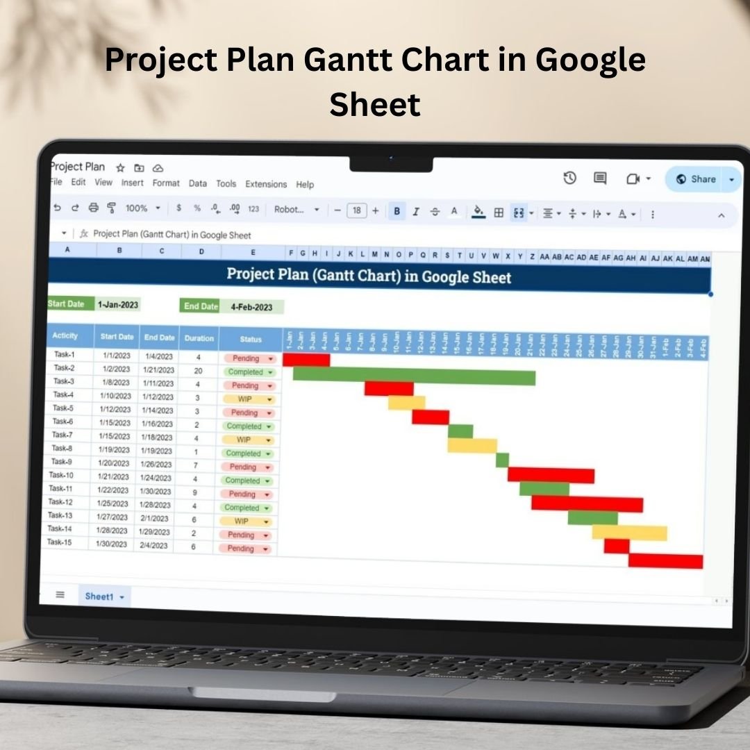
1. Project Plan Gantt Chart in Google Sheet
A collaborative Gantt planner covering task breakdown, owners, start and end dates, dependency tracking and live progress updates. Because it runs in Google Sheets, the whole team edits the same file and everyone sees status changes immediately.
2. Pro Gantt Chart Project Planner in Google Sheets
The advanced Sheets planner. It adds resource allocation and a richer timeline view on top of standard Gantt tracking, making it the better choice when you need to see who is over-committed as well as what is late.

3. Dynamic Hourly Gantt Chart for Projects
An hour-by-hour Excel Gantt for work that a daily grid cannot represent — shift handovers, planned maintenance windows, event run sheets, installation schedules and production changeovers.

4. Stylish Progress Bar chart in Excel
Modern rounded completion bars driven by a single percentage column. Useful anywhere you need to communicate “how far along are we” without a paragraph of explanation — project status, training completion, collection rates, onboarding progress.
5. Pro Gantt Chart in Excel with data entry form
The flagship Excel Gantt in this pack. A VBA-powered form handles adding, editing and deleting tasks, which keeps the underlying formulas intact no matter who is updating the plan. This is the template to hand to a team rather than keep to yourself.

6. Quick 3D Container chart in Excel
A fill-level container visual for capacity, stock levels, budget consumption or target attainment. Built with native shapes and chart series only, so it renders identically on any machine that can open the file.
7. Weekly Project Plan (Gantt Chart) in Google Sheets
A week-bucketed Gantt for longer programmes. Once a plan runs past a couple of months, a daily grid becomes a horizontal scroll nobody reads — weekly buckets keep the whole timeline on one screen.

8. 3D Gauge Chart in Excel
A speedometer-style KPI dial with a 3D finish. Give it a value and a target and it produces the single headline visual that a leadership audience will actually read — ideal for OEE, SLA compliance, utilisation or revenue against plan.
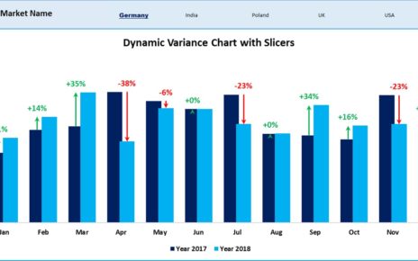
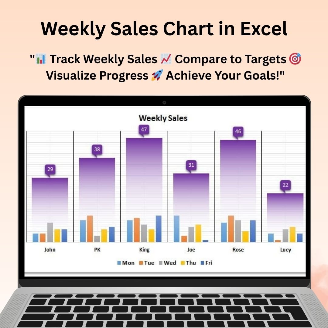
9. Weekly Sales Chart in Excel
A week-over-week sales comparison chart with clean labelling and sensible axis formatting. Drop in a new week of figures and the visual is ready for Monday’s review pack.
10. Horizontal Timeline Chart using Scatter chart in Excel
Milestone timelines built from an XY scatter chart. Roadmaps, release schedules, project phases and company history charts — all without leaving Excel or buying a diagramming tool.
Smart Comparison — Buying Individually vs the Bundle
| # | Template | Platform | Individual Price |
|---|---|---|---|
| 1 | Project Plan Gantt Chart in Google Sheet | Google Sheets | $4.99 |
| 2 | Pro Gantt Chart Project Planner in Google Sheets | Google Sheets | $4.99 |
| 3 | Dynamic Hourly Gantt Chart for Projects | MS Excel | $4.99 |
| 4 | Stylish Progress Bar chart in Excel | MS Excel | $4.99 |
| 5 | Pro Gantt Chart in Excel with data entry form | MS Excel | $9.99 |
| 6 | Quick 3D Container chart in Excel | MS Excel | $4.99 |
| 7 | Weekly Project Plan (Gantt Chart) in Google Sheets | Google Sheets | $6.99 |
| 8 | 3D Gauge Chart in Excel | MS Excel | $4.99 |
| 9 | Weekly Sales Chart in Excel | MS Excel | $4.99 |
| 10 | Horizontal Timeline Chart using Scatter chart in Excel | MS Excel | $4.99 |
| — | Individual Total | 7 Excel + 3 Sheets | $56.90 |
| ★ | Bundle Price | All 10 included | $29.99 — save $26.91 (47%) |
Put differently: the bundle costs less than buying the Pro Gantt Chart, the 3D Gauge Chart, the Weekly Project Plan and the Horizontal Timeline separately — and you get the other six templates at no additional cost.
Advantages of Taking the Bundle
You get the templates you did not know you needed. Most people arrive looking for one specific chart. Six months later they need a gauge, or a timeline, or an hourly Gantt — and by then they have forgotten where they bought the first one. Owning the full pack means the next request is already answered.
Consistency across your reporting. Charts assembled from ten different sources look like ten different sources. Building from one coherent pack means shared colour logic, shared label conventions and a report suite that reads as deliberate rather than improvised.
One checkout, one file, one licence. Ten separate purchases means ten confirmation emails, ten downloads and ten files to keep track of. The bundle is a single transaction and a single ZIP.
Platform flexibility built in. Teams rarely standardise cleanly on Excel or Google Sheets. Having both covered means you are not stuck converting a file for the one colleague who works differently.
A technique library, not just artwork. Because nothing is locked, each template teaches a method. Analysts who work through these files come away able to build the charts themselves — which is worth considerably more than the download.
Best Practices for Deploying the Pack
Keep one master copy untouched. Before you edit anything, save a pristine copy of each template to a reference folder. When a formula eventually gets broken — and it will — you want a clean original to copy from rather than a support request.
Set your brand palette once. Pick your organisation’s colours, apply them to all ten templates in a single sitting, and save that set as your working baseline. Doing it per-report is how visual consistency quietly disappears.
Match the chart to the time grain, not to preference. Hourly Gantt for anything under two days. Daily for typical project plans. Weekly for programmes over roughly three months. Using the wrong grain is the most common reason a Gantt chart becomes unreadable.
Use gauges sparingly. A gauge chart is powerful precisely because it shows one number. Three gauges on a page is a dashboard; eight is noise. Reserve them for genuine headline metrics.
Point charts at named ranges or tables. Before you paste a chart into a live dashboard, convert its source to an Excel Table or named range. The chart then expands automatically as data arrives instead of silently truncating.
Give the Pro Gantt’s form to the team. The VBA data entry form exists to stop people editing cells directly. If you distribute the plan, distribute it with the form as the intended entry point.
Explore More Templates
If this pack is useful, these adjacent collections are worth a look:
- Excel Charts and Visualization — the full library of individual chart templates
- Project Management Templates — trackers, planners and PMO reporting tools
- Project Management for Google Sheets — the cloud-native equivalents
- Template Bundles — every bundle currently available, by department and industry
- Excel Dashboards — complete dashboards if you need the whole report rather than the chart
Frequently Asked Questions
Which Excel versions do these templates work with?
The Excel templates are built on standard chart types, formulas and conditional formatting supported by Excel 2016 and later, including Microsoft 365. The Pro Gantt Chart with data entry form contains VBA, so it needs a desktop version of Excel on Windows or macOS with macros enabled — it will not run in Excel for the web.
Do I need any add-ins or plugins?
No. Every visual in the pack is built from native functionality. The 3D gauge and 3D container charts in particular are often assumed to need a third-party tool, and they do not — that is part of why they are in this collection.
How do the Google Sheets templates get delivered?
Each Google Sheets template arrives as a PDF containing a copy link. Open the PDF, click the link, and the sheet is added to your own Google Drive as an editable copy that belongs entirely to you.
Can I use these in client work?
Yes. You can edit, rebrand and use the templates in reports you deliver to clients or employers. What you cannot do is resell or redistribute the template files themselves as a product.
Is this a subscription?
No. It is a one-time purchase with lifetime access to the files you download. NextGenTemplates does not run subscriptions on template products.
What if I already own some of these templates?
The bundle is priced so that it is usually still cheaper than buying the remainder individually — at $29.99 for ten templates, the break-even point is roughly six templates. If you already own more than that, buying the outstanding ones separately may work out better.
Are the files editable and unlocked?
Yes. There are no password-protected sheets or hidden ranges. All formulas, helper columns and chart settings are visible so you can adapt them or learn from them.
Conclusion
Analysts are judged on clarity, and clarity is mostly a function of the visual. A correct number in a bad chart gets ignored; the same number in a well-built gauge or timeline drives a decision. The Data Analyst’s Chart & Visualization Pack gives you ten of those well-built visuals — four Gantt variants, a 3D gauge, a 3D container chart, styled progress bars, a weekly sales chart and a scatter-based timeline — across Excel and Google Sheets, for less than the price of three of them bought alone.
📊 Ten Premium Chart Templates — One Simple Price
Excel + Google Sheets | One-time purchase | Instant download
$56.90 $29.99 save $26.91 (47%)
Visit our YouTube channel to learn step-by-step video tutorials