Greenhouse farming teams often manage hundreds of crop batches across farm sites, greenhouse zones, crop types, growing methods, harvest cycles, climate strategies, and irrigation systems. Without a clear analytics layer, revenue, operating cost, quality score, waste rate, and profit are difficult to review together. The Greenhouse Farming Dashboard in Power BI turns those greenhouse records into a five-page interactive report for fast farm performance analysis.
This Power BI dashboard is built for greenhouse owners, farm managers, controlled-environment agriculture teams, agribusiness analysts, and consultants who want a ready-made reporting template instead of building visuals from scratch. You can open the .pbix file in Power BI Desktop, connect your own data source, refresh the report, and review performance by page.
Click here to view the Greenhouse Farming Dashboard in Power BI
Greenhouse Farming Dashboard in Power BI
Key Features of Greenhouse Farming Dashboard in Power BI
- Five Power BI report pages for Overview, Crop Insights, Farm Operations, Quality Review, and Cost Analysis.
- Executive KPI cards for Total Revenue, Total Operating Cost, Total Crop Batches, Harvested Batches, and Net Farm Profit.
- Interactive slicers so users can filter quickly by available farm, crop, site, status, month, and operations fields.
- Crop and batch analytics covering growing method, farm site, harvest cycle, status, and crop type.
- Operations visibility for climate strategy, irrigation system, greenhouse zone, and at-risk batches.
- Quality and waste review through waste rate, quality score, status, crop type, and monthly profit visuals.
- Editable .pbix report for teams that want to adapt measures, fields, pages, and visuals.
Dashboard Pages Explanation
1. Overview Page
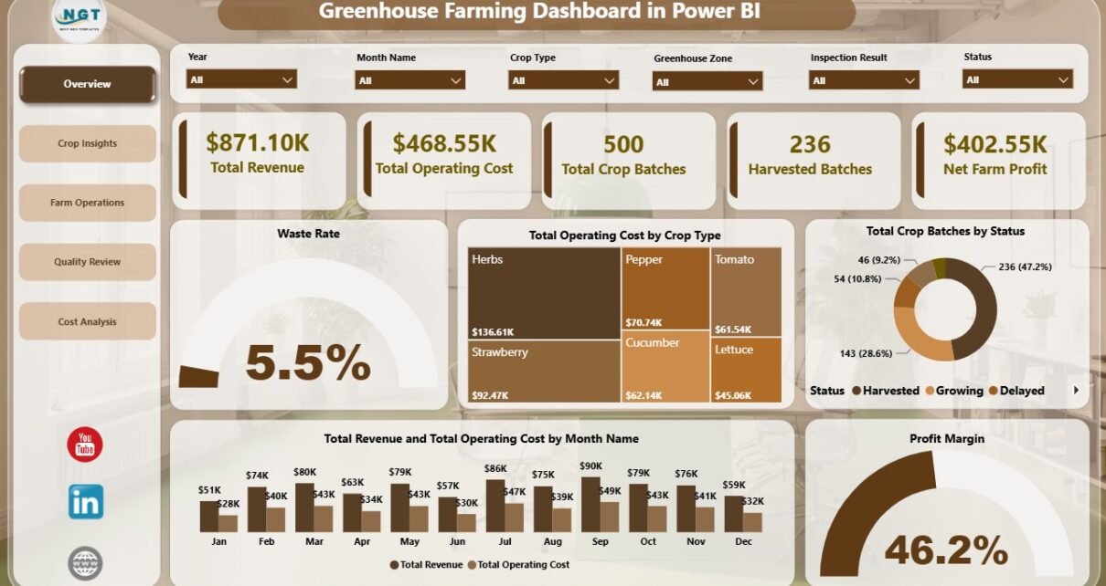
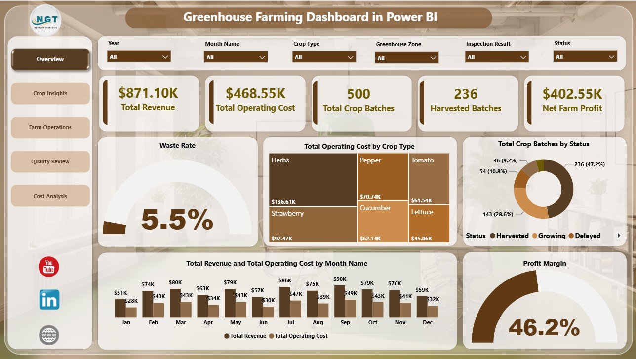
The Overview page gives a leadership-level snapshot of greenhouse performance. The top cards show Total Revenue, Total Operating Cost, Total Crop Batches, Harvested Batches, and Net Farm Profit, making it easier to compare financial health, batch workload, and harvest output in one view.
Waste Rate by Overall Farm Performance: This chart shows how waste rate changes across performance groups. It helps managers connect overall operational health with crop loss and quality issues.
Total Operating Cost by Crop Type: This visual shows which crops consume the highest operating cost. It supports crop planning, input review, and resource allocation decisions.
Total Crop Batches by Status: This chart summarizes crop batches by status. It helps teams quickly understand active, harvested, delayed, completed, or at-risk batch distribution.
Total Revenue and Total Operating Cost by Month Name: This chart compares monthly revenue against monthly cost. It helps identify periods where costs rise faster than revenue or margins improve.
Profit Margin by Overall Farm Performance: This visual shows whether stronger farm performance also produces better margin. It helps leaders connect operational quality with profitability.
Overview Page
2. Crop Insights
The Crop Insights page studies crop performance from quality, cost, site, and harvest-cycle angles. Average Quality Score by Growing Method compares quality outcomes across cultivation methods. Total Revenue and Total Operating Cost by Farm Site shows how each site performs financially. Harvested Batches by Harvest Cycle helps users understand completion volume across harvest cycles.
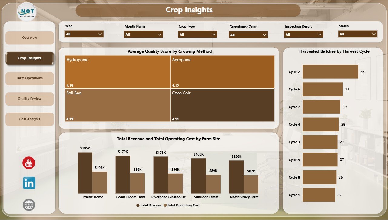
Crop Insights
3. Farm Operations
The Farm Operations page is useful for operations managers who need to monitor execution risks. At Risk Batches by Climate Strategy highlights where climate management may need attention. Average Quality Score by Irrigation System helps compare irrigation approaches, and Net Farm Profit by Greenhouse Zone shows which zones are producing stronger financial results.

Farm Operations
4. Quality Review
The Quality Review page brings together crop quality, waste, status, and profit movement. Waste Rate by Status helps identify where waste appears in the batch lifecycle. Average Quality Score by Crop Type compares quality across crops, and Net Farm Profit by Month Name tracks profitability over time.
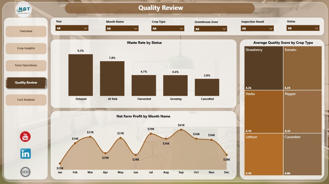
Quality Review
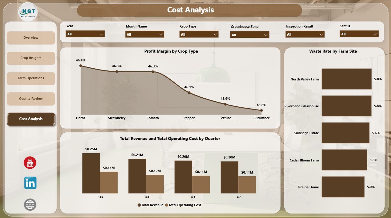
5. Cost Analysis
The Cost Analysis page gives a dedicated financial review. Profit Margin by Crop Type shows which crops are more profitable after operating cost. Waste Rate by Farm Site highlights sites with loss issues, and Total Revenue and Total Operating Cost by Quarter supports seasonal review of revenue and expense patterns.
Cost Analysis
Greenhouse Farming Dashboard in Power BI vs. Tableau vs. Paid Farm SaaS – Feature Comparison
| Feature | This Power BI Dashboard | Tableau Alternative | Paid Farm SaaS |
|---|---|---|---|
| Cost | $17.99 one-time | License plus dashboard build time | Monthly or annual subscription |
| Platform | Power BI Desktop and Power BI Service | Tableau Desktop or Cloud | Vendor cloud platform |
| Setup time | Open .pbix, connect data, refresh | Build model and visuals manually | Onboarding and configuration |
| Real-time team collaboration | Available through Power BI Service licensing | Available through Tableau publishing | Usually included by user seat |
| Mobile access | Available after publishing | Available after publishing | Usually included |
| Customizable fields | Editable report pages, visuals, measures, and filters | Editable if you build the workbook | Limited by vendor settings |
| Share with link | Possible through Power BI sharing options | Possible through Tableau sharing | Usually login controlled |
| Year-1 cost at 5 users | $17.99 plus Microsoft licensing you already use | Software licensing plus development time | Often hundreds or thousands |
| Greenhouse-ready pages | Included across five pages | Requires custom design | Depends on the farm software plan |
Who Should Use This Template
This template is useful for greenhouse owners, farm managers, controlled-environment agriculture teams, crop quality reviewers, farm operations analysts, agribusiness consultants, and Power BI users who need a ready dashboard for greenhouse revenue, cost, batch, quality, waste, and profit reporting.
It is not designed for live climate control, IoT sensor automation, ERP integration, pesticide compliance, inventory purchasing, payroll, or full farm management workflows. It is best used as an analytics report when the source data is already available.
Real-World Use Cases
Aarav, greenhouse owner: Aarav checks Total Revenue, Total Operating Cost, Harvested Batches, and Net Farm Profit every week before crop planning meetings.
Meera, operations manager: Meera reviews Farm Operations to see at-risk batches by climate strategy and compare quality score by irrigation system.
Daniel, agriculture consultant: Daniel uses Quality Review and Cost Analysis pages to explain waste, margin, crop quality, site performance, and quarterly cost patterns to clients.
Advantages of Greenhouse Farming Dashboard in Power BI
- It saves time compared with designing a greenhouse Power BI report from a blank canvas.
- It keeps financial, crop, operations, quality, and cost analysis in one report.
- It gives leadership a high-level view while still allowing page-level drilldown.
- It supports faster review through slicers, cards, and ready-made visuals.
- It avoids recurring dashboard software fees for teams that already use Microsoft Power BI.
Opportunities for Improvement
Larger greenhouse operators may extend the dashboard with Power Query connections, SQL databases, ERP exports, sensor summaries, crop variety details, labor tracking, inventory usage, or planned vs actual harvest schedules. Teams with automated data pipelines can also publish the report to Power BI Service and configure scheduled refresh where licensing supports it.
Best Practices
- Keep crop type, farm site, greenhouse zone, status, and month names consistent in the source data.
- Validate Total Revenue, Total Operating Cost, Harvested Batches, and Net Farm Profit after every refresh.
- Review waste rate and quality score together so yield gains do not hide quality issues.
- Use slicers during review meetings instead of creating duplicate report pages.
- Document any custom measures or fields added to the Power BI model.
For official Microsoft guidance, see What is Power BI Desktop?.
Explore Relevant Templates
- Greenhouse Farming Dashboard in Power BI
- Agriculture and Farm Dashboard in Power BI
- Greenhouse Farming Dashboard in Excel
- Greenhouse Farming KPI Dashboard in Excel
Frequently Asked Questions
What is the Greenhouse Farming Dashboard in Power BI?
It is a downloadable Power BI dashboard template for tracking greenhouse revenue, operating cost, crop batches, harvested batches, quality, waste, and profit.
Do I need Power BI Desktop?
Yes. Open the .pbix file in Power BI Desktop, replace or connect the source data, and refresh the report.
Can I customize this dashboard?
Yes. You can edit visuals, slicers, cards, fields, page names, colors, and measures based on your reporting needs.
How many pages are included?
The report includes five pages: Overview, Crop Insights, Farm Operations, Quality Review, and Cost Analysis.
Is this a full greenhouse management system?
No. It is an analytics dashboard, not climate control, ERP, inventory, compliance, or farm automation software.
About the Author
Built by PK – Microsoft Certified Professional with 15+ years of Excel, Google Sheets, and Power BI experience. Founder of NextGenTemplates, reaching 300K+ subscribers across YouTube channels. Every template is hand-built and tested before release.
Conclusion
The Greenhouse Farming Dashboard in Power BI gives greenhouse teams a practical way to review revenue, operating cost, crop batches, harvested batches, quality, waste, and profit from one report. With five dashboard pages, KPI cards, slicers, and ready-made visuals, it helps users move from scattered records to clearer farm performance analysis.
Click to Purchase Greenhouse Farming Dashboard in Power BI
Visit our YouTube channel to learn step-by-step Excel, Power BI, and dashboard tutorials.