Meal kit delivery businesses operate on thin operational margins. Revenue, gross profit, ingredient cost, delivery cost, box size, delivery status, and customer segment can all change quickly from one month to the next. Without a clear reporting system, teams may know total sales but still miss the real drivers behind profit, delivery success, and customer demand.
The Meal Kit Delivery Dashboard in Excel gives food delivery and subscription meal teams a ready-to-use Excel reporting workbook for tracking performance across orders, customers, menus, and delivery operations. It includes 7 worksheet tabs, 4 executive KPI cards, 5 dashboard analysis pages, a data input sheet, and a support sheet with pivot tables.
Click here to purchase the Meal Kit Delivery Dashboard in Excel
Meal Kit Delivery Dashboard in Excel
Key Features of Meal Kit Delivery Dashboard in Excel
This Excel dashboard is designed for practical meal kit reporting, not generic business charts. It focuses on the numbers a food subscription team reviews again and again: revenue, orders, meals, cost, margin, customer mix, menu performance, and delivery reliability.
- 4 high-level KPI cards: Total Revenue, Net Gross Profit, Total Meals Ordered, and Total Orders.
- 5 dashboard pages: Overview, Order Trend, Customer Mix, Menu Insights, and Delivery Ops.
- 20+ analytical chart views: covering region, month, subscription plan, order status, customer segment, meal preference, cuisine type, delivery partner, and city.
- Interactive slicers: filter the dashboard quickly and review a specific region, plan, customer group, time period, or delivery partner.
- Editable Data sheet: paste your own meal kit records in the same format.
- Support sheet with pivots: refresh all pivot tables and charts after changing the data.
- Excel-native workflow: no monthly subscription and no locked SaaS environment.
Dashboard Pages Explanation
1 – Overview Page
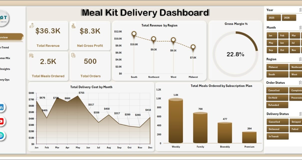
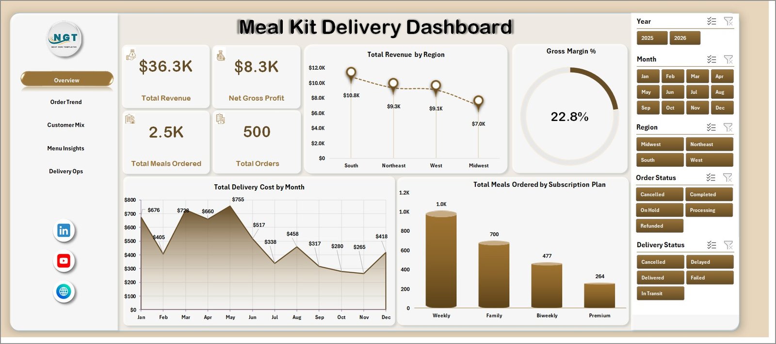
The Overview page is the main executive summary. At the top, the dashboard displays KPI cards for Total Revenue, Net Gross Profit, Total Meals Ordered, and Total Orders. These cards give decision-makers a quick read on sales, margin, volume, and order activity before they review the supporting charts.
The page also includes multiple slicers so users can filter the dashboard quickly. For example, a manager can narrow the view by period, region, plan, customer type, or other available dimensions depending on the data structure.
Total Revenue by Region helps compare sales across delivery markets and identify which regions are generating the most demand. This is useful for campaign planning, delivery partner allocation, and geographic expansion decisions.
Gross Margin % by Overall Performance shows whether revenue is turning into healthy profit after ingredient and delivery costs. If revenue grows but gross margin falls, this chart helps trigger a cost or pricing review.
Total Delivery Cost by Month tracks logistics spending over time. Meal kit companies can use this to identify months where fuel, partner fees, failed deliveries, or volume spikes increased fulfillment cost.
Total Meals Ordered by Subscription Plan reveals which plans drive the most meal volume. This helps teams compare weekly, monthly, family, and premium plans from a demand perspective.
Overview Page
2 – Order Trend
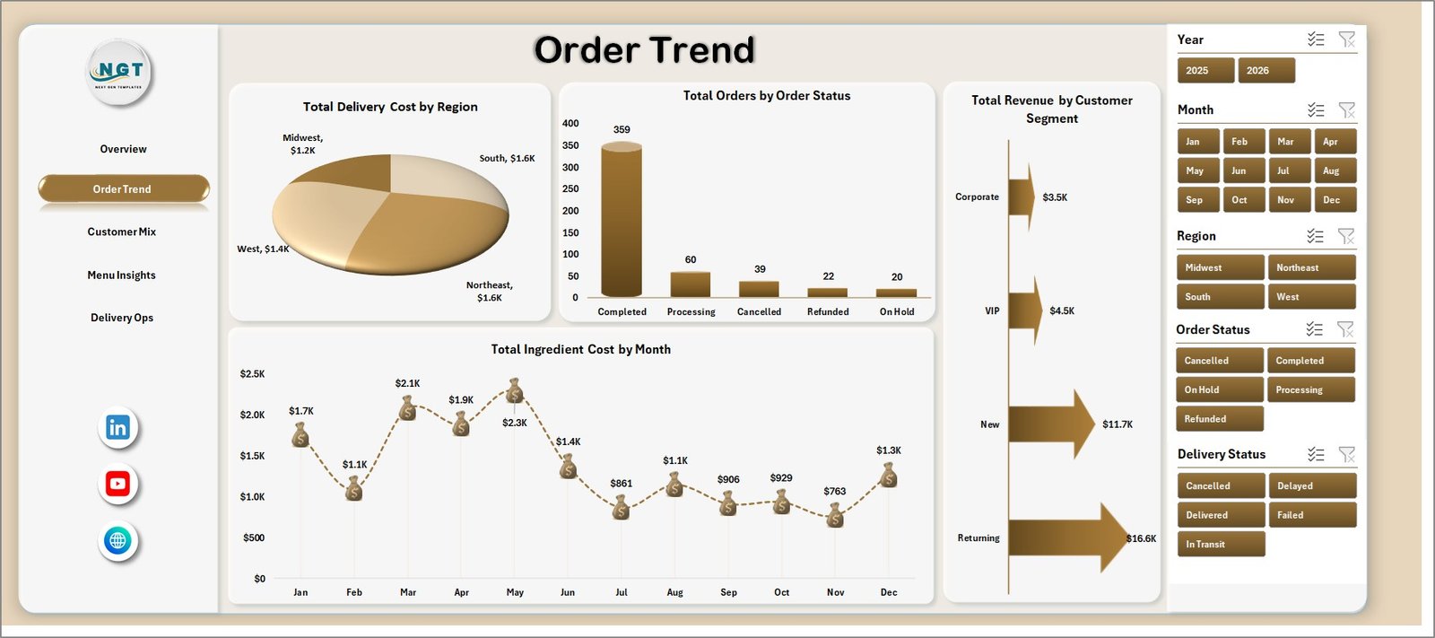
The Order Trend sheet focuses on how meal kit orders and costs move across major operating dimensions. It helps teams understand not only how many orders they received, but also how delivery and ingredient costs behave across regions, statuses, customers, and months.
Total Delivery Cost by Region compares logistics expense across markets. High-cost regions may need delivery route review, partner renegotiation, or minimum-order rules.
Total Orders by Order Status shows how orders are distributed across statuses such as completed, pending, delayed, or cancelled. This is one of the quickest ways to find operational friction.
Total Revenue by Customer Segment identifies which customer groups are producing the highest sales. A meal kit company can use this insight to focus offers on high-value segments.
Total Ingredient Cost by Month tracks food cost trends. Procurement and finance teams can use it to monitor supplier price changes, seasonal ingredients, or menu-cost movement.
Order Trend
3 – Customer Mix
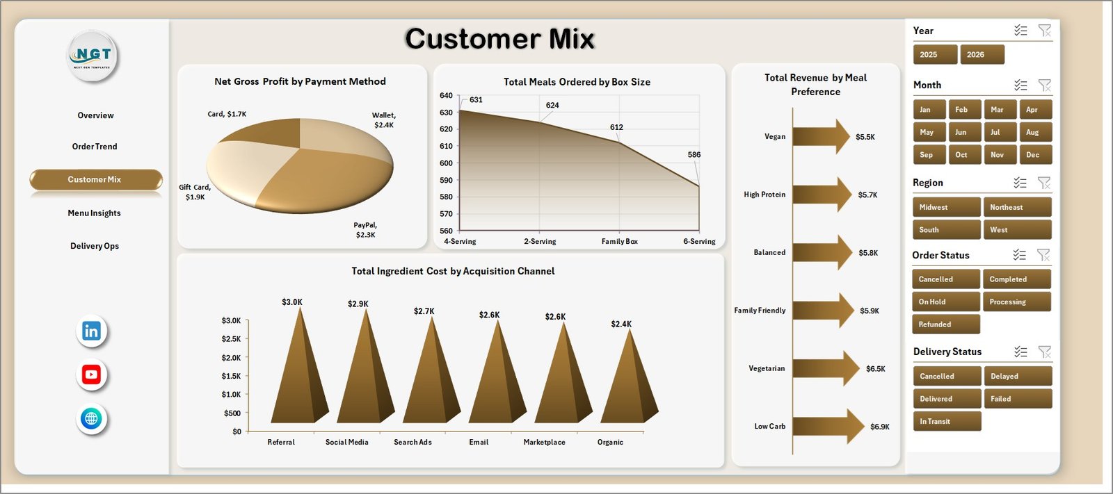
The Customer Mix page explains how different customer choices affect revenue, cost, and profit. Meal kit businesses often sell to multiple customer segments, box sizes, dietary preferences, and acquisition channels. This page helps connect those choices to performance.
Net Gross Profit by Payment Method helps reveal whether some payment methods are associated with stronger or weaker profitability. This can be useful when settlement fees, discounts, or refund behavior differ by payment type.
Total Meals Ordered by Box Size shows demand by serving size. If larger boxes are growing, the operations team may need to plan packaging, ingredients, and delivery capacity differently.
Total Revenue by Meal Preference compares revenue across preferences such as vegetarian, vegan, high-protein, family meals, or other categories captured in the data.
Total Ingredient Cost by Acquisition Channel connects marketing source with ingredient cost. This is useful when certain channels attract customers who choose higher-cost menus.
Customer Mix
4 – Menu Insights
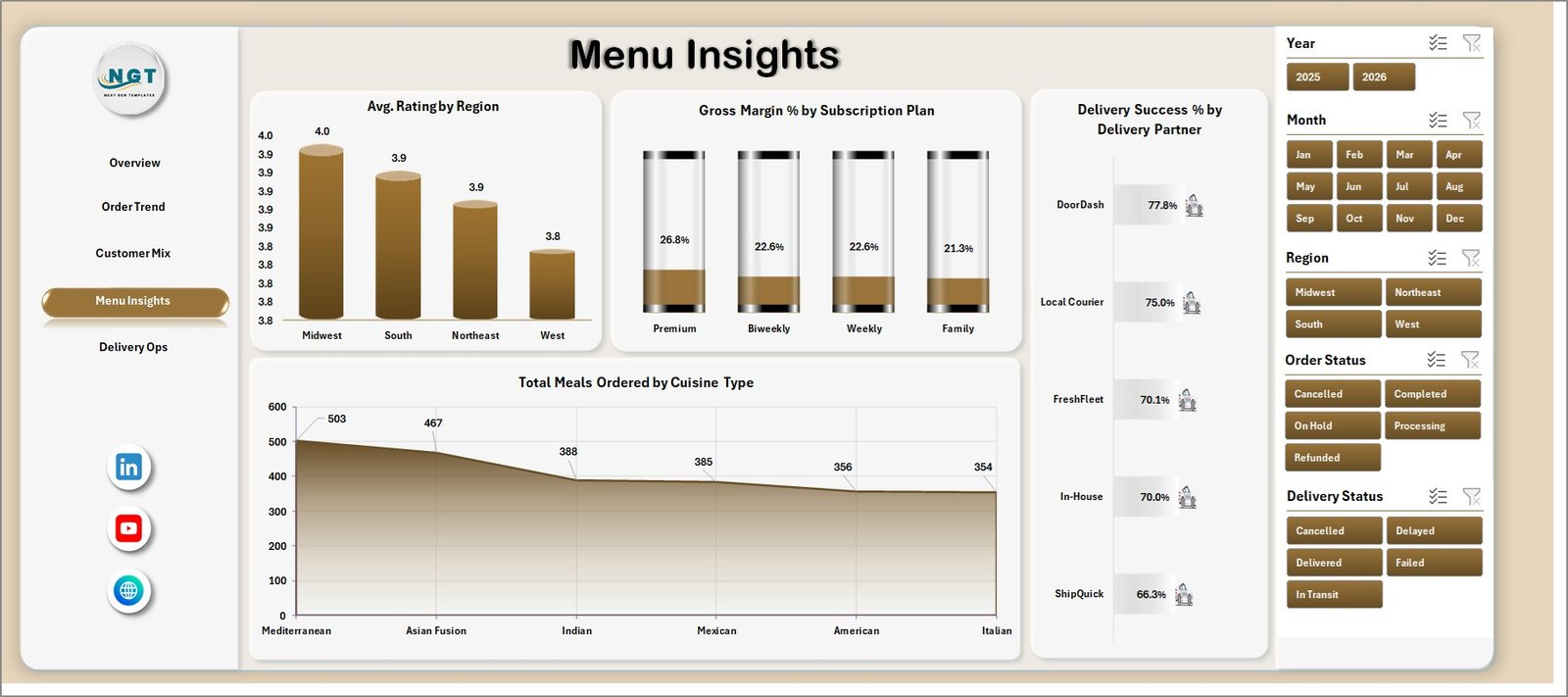
The Menu Insights sheet is helpful for product, culinary, and customer experience teams. It connects ratings, margins, delivery performance, and cuisine demand so the team can improve menu planning with data.
Avg. Rating by Region shows whether customer satisfaction differs by market. A lower rating in one region may point to delivery time, packaging, freshness, or menu fit.
Gross Margin % by Subscription Plan compares profitability across plans. This helps teams decide whether a plan should be repriced, promoted, revised, or discontinued.
Delivery Success % by Delivery Partner measures carrier reliability. It supports partner scorecards and makes delivery discussions more data-backed.
Total Meals Ordered by Cuisine Type shows which cuisine categories customers order most. Menu teams can use this for recipe planning, campaign calendars, and procurement forecasting.
Menu Insights
5 – Delivery Ops
The Delivery Ops page brings fulfillment and profitability together. It is especially useful for operations managers who need to understand where deliveries are helping or hurting business results.
Gross Margin % by Region compares margin quality across delivery areas. It helps identify markets that may look strong in revenue but weak in profitability.
Net Gross Profit by Delivery Status shows how order outcomes affect profit. Failed, delayed, or returned orders often carry hidden cost, and this chart makes that easier to see.
Total Revenue by Month gives a clean monthly sales trend for management reporting. It can be used to compare promotions, seasonality, and growth.
Total Ingredient Cost by City helps pinpoint city-level cost pressure. If one city has unusually high ingredient cost, the team can review supplier sourcing, menu mix, or data quality.
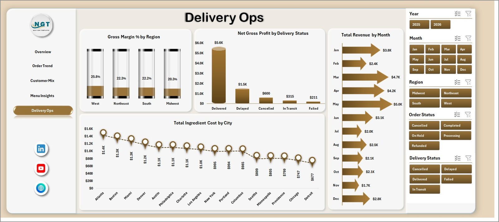
Delivery Ops
6 – Data Sheet Tab
The Data sheet is where users enter or paste their meal kit delivery records. The most important rule is to keep the same format. Once new data is added, the dashboard can be refreshed to update the charts and cards.

Data Sheet tab
7 – Support Sheet
The Support sheet contains the pivot tables used to build the dashboard dynamically. After updating the Data sheet, go to the Data tab in the Excel Ribbon and click Refresh All. All pivot tables and charts refresh together. This sheet can be hidden after setup so day-to-day users only see the dashboard pages.

Support sheet tab
Meal Kit Delivery Dashboard in Excel vs. Google Sheets vs. Paid CRM/SaaS – Feature Comparison
| Feature | Meal Kit Delivery Dashboard in Excel | Google Sheets dashboard | Paid food delivery SaaS |
|---|---|---|---|
| Cost | $17.99 one-time | Low one-time or custom build | $50-$300+ per month |
| Platform | Microsoft Excel | Google Sheets | Vendor-hosted cloud platform |
| Setup time | 10-30 minutes | 30-60 minutes | Days or weeks |
| Real-time team collaboration | Limited unless shared through OneDrive | Strong | Strong |
| Mobile access | Limited | Good | Good |
| Customizable fields | High | High | Depends on plan |
| Share with link | Possible through OneDrive | Yes | Yes |
| Year-1 cost at 5 users | $17.99 plus Excel access | One-time template cost | $600-$3,600+ |
| Best use | Fast internal reporting | Collaborative reporting | Full ordering, billing, and route operations |
Who Should Use This Template
This template is ideal for meal kit startups, subscription food brands, meal prep services, delivery operations teams, finance analysts, marketing analysts, and consultants who need a structured reporting workbook. It is especially useful when the team already exports order data from another system and wants a clean Excel dashboard for review meetings.
Real-World Use Cases
Asha, founder of a regional meal kit brand, uses the Overview page before her weekly leadership meeting. She checks revenue, gross profit, order count, and meal volume, then filters by region to see where growth is strongest.
Daniel, delivery operations manager, uses Delivery Ops and Menu Insights to compare delivery success by partner and gross margin by region. This helps him prepare partner scorecards and find cost problems before they damage customer experience.
Maya, finance analyst for a subscription meal company, reviews ingredient cost by month and city to explain margin changes. Instead of preparing a manual report every month, she refreshes the workbook and exports key charts.
Advantages of Meal Kit Delivery Dashboard in Excel
- It saves setup time because the workbook already includes dashboard pages, slicers, cards, charts, and pivots.
- It keeps reporting familiar because most teams already know Microsoft Excel.
- It avoids monthly software cost for companies that only need reporting and analysis.
- It gives teams a repeatable structure for monthly operations reviews.
- It helps combine finance, menu, customer, and delivery metrics in one place.
Opportunities for Improvement
Like any Excel dashboard, this template works best when the input data is accurate and consistently formatted. Teams can improve the workbook further by connecting exports through Power Query, adding more custom KPIs, protecting input formulas, or creating a separate executive PDF report from the dashboard views.
For larger operations, this dashboard may become part of a broader analytics process. If the business needs live routing, order management, payment capture, or warehouse inventory, a dedicated operating system may still be required. Microsoft also provides guidance for Excel data import and transformation through Power Query in Excel.
Best Practices
- Keep the Data sheet structure consistent before refreshing the dashboard.
- Validate date, region, order status, subscription plan, and delivery partner values before analysis.
- Refresh all pivots after every data update.
- Review margin and delivery charts together, not separately.
- Use slicers during management meetings so leaders can drill into the exact segment being discussed.
- Keep a backup copy before making structural changes to formulas or pivot tables.
Explore Relevant Templates
If you work with food, retail, or operations reporting, these templates may also help:
- Food and Beverage Report in Excel
- Meal Prep Business KPI Dashboard in Excel
- General Store POS Web App
Frequently Asked Questions
What is the Meal Kit Delivery Dashboard in Excel?
It is an Excel dashboard template for tracking meal kit delivery revenue, gross profit, orders, meals ordered, ingredient cost, delivery cost, customer mix, menu performance, and delivery operations.
Can I use my own data?
Yes. Replace the sample records in the Data sheet while keeping the same format, then refresh the workbook.
Does this dashboard require macros?
No. The dashboard is built around Excel charts, slicers, pivot tables, and structured worksheets.
Can I customize the charts?
Yes. Since this is an Excel workbook, you can edit chart titles, formulas, pivot tables, fields, colors, and layout as required.
Who is this dashboard best for?
It is best for meal kit companies, meal prep services, subscription food brands, delivery operations managers, and finance analysts.
Can the Support sheet be hidden?
Yes. The Support sheet contains pivot tables used by the dashboard and can be hidden after the workbook is configured.
About the Author
Built by PK – Microsoft Certified Professional with 15+ years of Excel, Google Sheets, and Power BI experience. Founder of NextGenTemplates, reaching 300K+ subscribers across YouTube channels. Every template is hand-built and tested before release.
Conclusion
The Meal Kit Delivery Dashboard in Excel gives food subscription teams a practical way to track revenue, profit, order trends, customer behavior, menu performance, and delivery operations inside one editable workbook. It is not a replacement for a full ordering or delivery management system, but it is a strong reporting layer for teams that need fast, clear, and repeatable meal kit performance analysis.
Download the Meal Kit Delivery Dashboard in Excel from NextGenTemplates
Visit our YouTube channel for Excel, dashboard, and reporting tutorials.