The SaaS Customer Success Dashboard in Power BI helps subscription businesses track customer health, MRR, contract value, tickets, CSM performance, renewals, and at-risk accounts in one interactive report. Many SaaS teams still run customer success reviews from separate CRM exports, billing spreadsheets, support reports, and product-usage files. That creates reporting delays and makes it harder to identify which accounts need attention before renewal conversations begin.
This Power BI dashboard gives customer success leaders a ready-made structure with five report pages, five executive KPI cards, slicers, and visuals built around the metrics SaaS teams review most often. If you are new to the platform, Microsoft provides the official Power BI Desktop download and setup guide.
Key Features of SaaS Customer Success Dashboard in Power BI
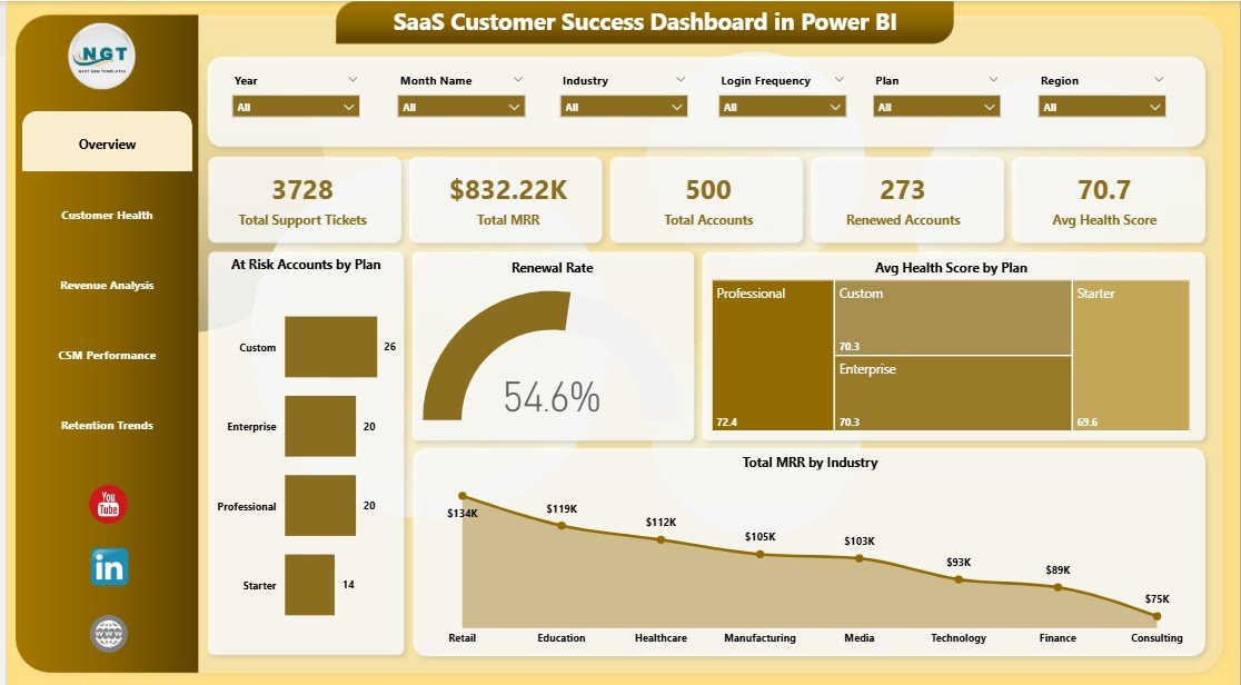
The dashboard starts with five headline cards: Total MRR, Total Contract Value, Total Records, Total Tickets, and Avg. Health Score. These cards help leaders understand revenue scale, account volume, support pressure, and overall customer health before going deeper into the report pages.
Multiple slicers allow quick filtering by plan, industry, region, CSM, renewal status, login frequency, onboarding status, and month. This is useful during live meetings because managers can isolate a segment without rebuilding visuals.
The dashboard includes visuals for at-risk accounts, health score, MRR, contract value, renewals, CSM workload, and onboarding status. It is designed for repeat reporting: update the source data, refresh the PBIX file, and review the updated dashboard.
Dashboard Pages Explanation
Overview Page
The Overview page shows Total MRR, Total Contract Value, Total Records, Total Tickets, and Avg. Health Score at the top. Total At Risk by Plan identifies which subscription tiers carry the most risk, while Avg. Health Score by Plan compares customer quality across plan levels. Total MRR by Month shows revenue movement, and Total MRR by Industry highlights which segments contribute the strongest recurring revenue.
SaaS Customer Success Dashboard in Power BI
Customer Health
The Customer Health page focuses on account quality and renewal risk. Total Records vs Total At Risk by Industry helps reveal where risk is concentrated. Total Records by Renewal Status shows the renewal pipeline. Total Contract Value by Plan connects financial exposure to pricing tiers. Avg. Health Score by Login Frequency shows whether customer engagement is linked to stronger account health.
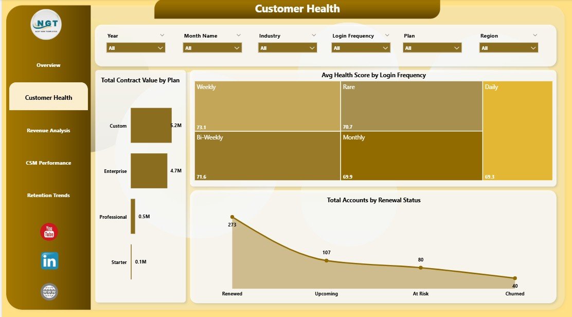
Customer Health
Revenue Analysis
The Revenue Analysis page helps leadership understand where revenue and contract value sit across the customer base. Total MRR by Region compares geographic revenue distribution. Total Contract Value by Industry highlights high-value segments. Total Records by CSM Name shows account ownership, and Total Contract Value by Month gives a time-based view of customer value.
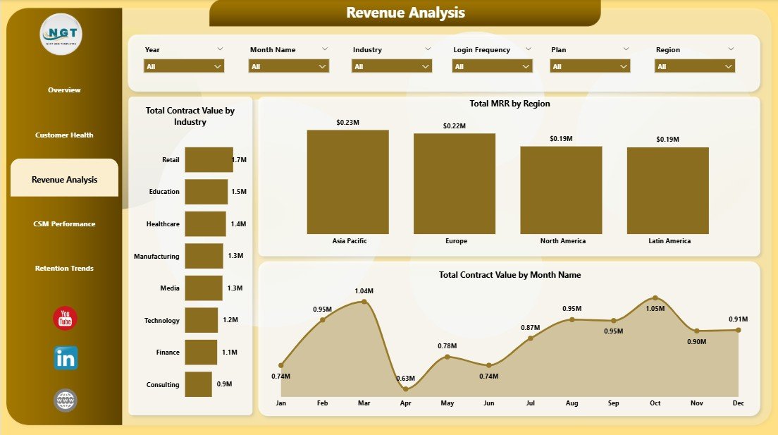
Revenue Analysis
CSM Performance
The CSM Performance page is built for coaching and workload review. Total MRR by CSM Name compares book value. Total Tickets by CSM Name shows support pressure by owner. Total Records by Month tracks account volume over time. Avg. Health Score by CSM Name gives managers an account-quality view across the team.
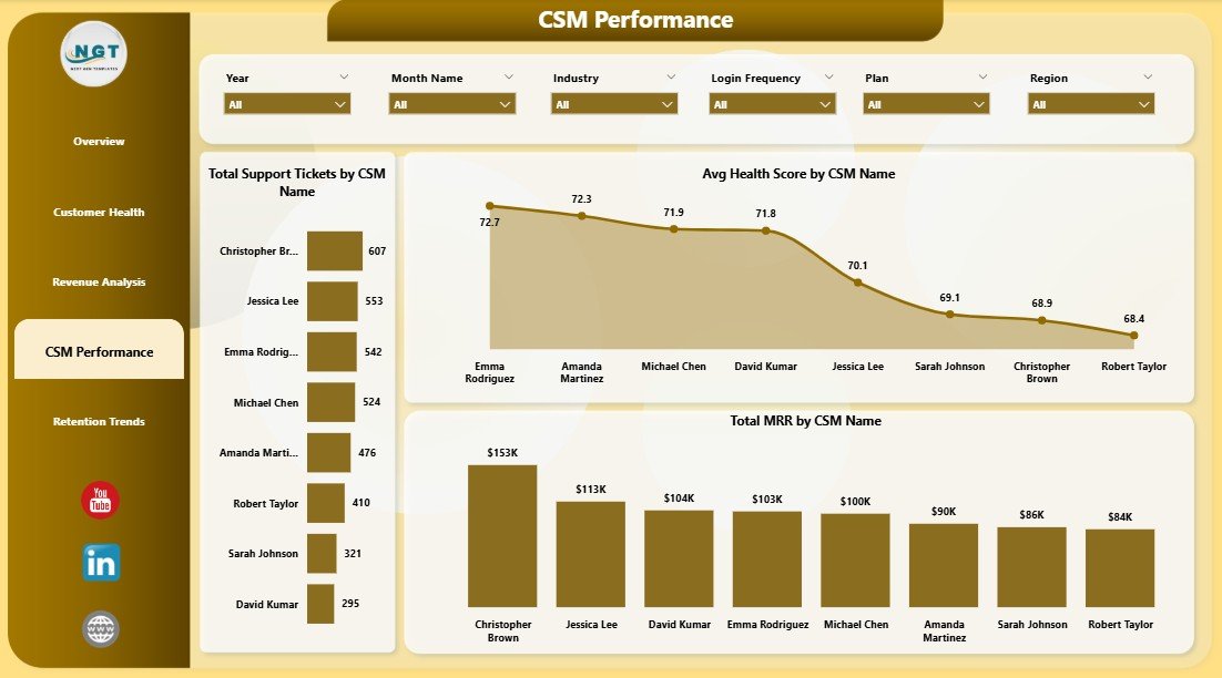
CSM Performance
Retention Trends
The Retention Trends page focuses on renewal and customer-base movement. Total Renewed by Month shows renewal progress over time. Total Records by Region explains where the account base is concentrated. Total Records by Onboarding Status connects retention reporting with activation progress.
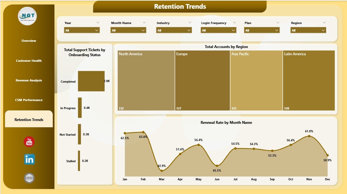
Retention Trends
Data Sheet Tab
The Data Sheet is where users add or replace customer success records in the same format as the sample data. Keep the column structure consistent before refreshing the Power BI report.
Support Sheet Tab
The Support Sheet contains helper structures used to power the dashboard workflow. After updating the data source, refresh the Power BI report and keep the support sheet hidden when sharing the report with stakeholders.
SaaS Customer Success Dashboard in Power BI vs. Tableau vs. Paid CRM/SaaS – Feature Comparison
| Feature | SaaS Customer Success Dashboard in Power BI | Tableau or Qlik Alternative | Paid Customer Success SaaS |
|---|---|---|---|
| Cost | $17.99 one-time | Recurring license cost | Often $2,500 to $10,000+ per year |
| Platform | Power BI Desktop | Tableau or Qlik | Hosted SaaS platform |
| Setup time | Under 15 minutes with clean data | Data modeling and dashboard setup required | Weeks of onboarding and configuration |
| Customizable fields | Editable PBIX and source data | Editable, but must be built manually | Depends on vendor permissions |
| MRR and health reporting | Built in | Custom build required | Built in |
| Year-1 cost at 5 users | $17.99 total | Often hundreds to thousands | Often thousands per year |
Who Should Use This Template
This dashboard is a good fit for SaaS founders, Heads of Customer Success, RevOps analysts, Customer Success Managers, account managers, and consultants who need a repeatable customer health reporting layer. It is especially useful for teams that already export customer records from CRM, billing, support, or product analytics systems.
It is not meant to replace a full customer success automation platform. If your team needs live Salesforce sync, automated playbooks, role-based permissions, customer emails, or in-app workflows, a platform such as Gainsight, ChurnZero, HubSpot, Totango, or Salesforce may be a better fit.
Real-World Use Cases
Anita leads Customer Success at a 90-person SaaS company. She uses the Overview and Customer Health pages every Monday to filter at-risk accounts by plan and renewal status. The Total Contract Value by Plan chart helps her prioritize high-value save motions.
Marco runs RevOps for a subscription software business. He uses Revenue Analysis to prepare monthly leadership updates. Total MRR by Region and Total Contract Value by Industry help him explain revenue concentration.
Priya is a fractional CS consultant. She creates one copy of the report for each client and uses CSM Performance to compare portfolio value, ticket load, and average health score by owner.
Advantages of SaaS Customer Success Dashboard in Power BI
The biggest advantage is speed. You do not need to design the data story from scratch. The report is already organized around common customer success questions: risk by plan, health by engagement, revenue by segment, workload by CSM, and renewals over time.
The second advantage is ownership. Your reporting file stays editable, and you can adjust visuals, fields, slicers, and measures directly in Power BI Desktop. That gives smaller teams more flexibility than a locked SaaS reporting page.
The third advantage is cost. A one-time $17.99 template is easier to justify when your immediate need is structured reporting, not a full automation suite.
Opportunities for Improvement
The dashboard depends on clean data. If your exports use inconsistent account names, plan names, or dates, clean the data source before refreshing the PBIX file. The template is also a reporting layer, so it does not send customer emails, create playbooks, or update CRM records automatically.
Advanced teams may want to extend the model with ARR, expansion revenue, NPS, product usage score, customer segment, churn reason, or risk reason. Because the PBIX is editable, those additions are possible, but they require some Power BI modeling knowledge.
Best Practices
- Keep the data source headers consistent before each refresh.
- Refresh the dashboard before every customer success meeting.
- Use slicers before making decisions so you are reviewing the correct plan, region, CSM, renewal status, or month.
- Save a monthly snapshot so you can compare retention performance over time.
- Document any custom fields you add so future users understand the model.
Explore Relevant Templates
For a spreadsheet-based version, see the SaaS Customer Success Dashboard in Excel. For product adoption analytics, explore the SaaS Product Usage Dashboard in Excel. For service operations, pair it with the IT Help Desk Dashboard in Power BI.
You can purchase the Power BI version here: SaaS Customer Success Dashboard in Power BI.
Frequently Asked Questions
What does the SaaS Customer Success Dashboard in Power BI track?
It tracks Total MRR, Total Contract Value, Total Records, Total Tickets, Avg. Health Score, at-risk accounts, renewal status, revenue by region, contract value by industry, CSM performance, and onboarding status.
How do I update the dashboard?
Replace the sample customer success data with your own records, keep the same structure, then open the PBIX file in Power BI Desktop and click Refresh.
Do I need Power BI Pro?
No. Power BI Desktop is enough for opening, editing, refreshing, and exporting the report. Power BI Pro is only needed for publishing and sharing through the Power BI Service.
Can I customize the dashboard?
Yes. You can edit visuals, colors, slicers, measures, and report pages directly in Power BI Desktop.
Is this better than a customer success platform?
It is better for low-cost reporting and quick account review. A customer success platform is better for live integrations, automation, playbooks, permissions, and workflow management.
Can I use this outside SaaS?
Yes, any subscription or recurring-revenue business can adapt the fields, but the included pages and labels are optimized for SaaS customer success reporting.
About the Author
Built by PK – Microsoft Certified Professional with 15+ years of Excel, Google Sheets, and Power BI experience. Founder of NextGenTemplates, reaching 300K+ subscribers across YouTube channels. Every template is hand-built and tested before release.
Conclusion
The SaaS Customer Success Dashboard in Power BI gives SaaS teams a practical way to monitor MRR, contract value, tickets, health score, risk, renewals, CSM workload, and retention trends without building a report from scratch. It sits between raw spreadsheets and expensive customer success software: structured enough for leadership reporting, flexible enough for your own data, and affordable as a one-time purchase.
Click here to purchase the SaaS Customer Success Dashboard in Power BI
Instant download. One-time payment. No subscription. Lifetime access.
Visit our YouTube channel for step-by-step Power BI tutorials: YouTube.com/@PK-AnExcelExpert
Last updated: May 2026