A career counseling centre generates a surprising amount of data and almost never has anywhere good to put it. Session dates, counselor names, service types, delivery modes, referral sources, fees, costs, case statuses, satisfaction scores – most centres keep all of it in one long spreadsheet, then spend the first week of every month turning that spreadsheet into a report by hand. The Career Counseling Centers Dashboard in Excel is the reporting layer that sits on top of that sheet. Five linked pages, 25 pivot-driven charts and KPI cards, four synced slicers, and 27 columns already wired up. You paste your records into one table, press Refresh All, and the whole pack updates. Career Counseling Centers Dashboard in Excel
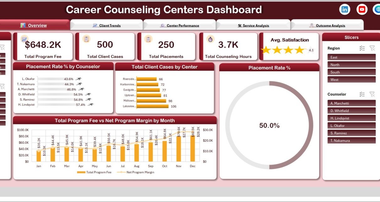
One thing to be clear about before anything else: this is a reporting template for data you enter yourself. It counts and charts what your centre has recorded. It does not give counselling, career or employment advice, it does not predict or influence what happens to a client, and it makes no claim about accreditation, professional counselling standards, or how you must handle student or client records. Every figure in the screenshots below – 648.2K in program fee, 500 client cases, 250 placements, the six centre names, the six counselor names – is demo data shipped with the file so you can see the layout working before you replace it.
Key Features of the Career Counseling Centers Dashboard in Excel
- Five report pages from one table. Overview, Client Trends, Center Performance, Service Analysis and Outcome Analysis all read the same Data sheet, so there is exactly one version of any number.
- 25 pivot tables and pivot charts, all parked on a Support sheet so the report pages stay clean while the arithmetic stays inspectable.
- Four synced slicers – Month, Center, Region and Counselor – in fixed panels on the left and right of every page.
- 27 prepared columns: Case ID, Session Date, Center, Region, Counselor, Client Segment, Service Type, Delivery Mode, Referral Source, Case Status, Sessions Planned, Sessions Attended, Counseling Hours, Program Fee, Counselor Cost, Operating Cost, Satisfaction Score, plus derived Month, Year, Quarter and case-status counters.
- Three calculated fields – Net Margin (program fee less counselor and operating cost), Placement Rate and Attendance Rate – defined once and recalculated as the data grows.
- Tab-style page navigation across the top of every sheet.
- No macros. It is a plain .xlsx, so there is no security prompt, nothing to enable and nothing to install. Excel 2016 or later, Windows or Mac.
- 500 demo rows and a user-manual PDF in the download.
Dashboard Pages Explanation
Seven worksheets in total: five dashboard pages, the Data table you type into, and the Support sheet holding every pivot. Here is what each page actually shows.
Overview
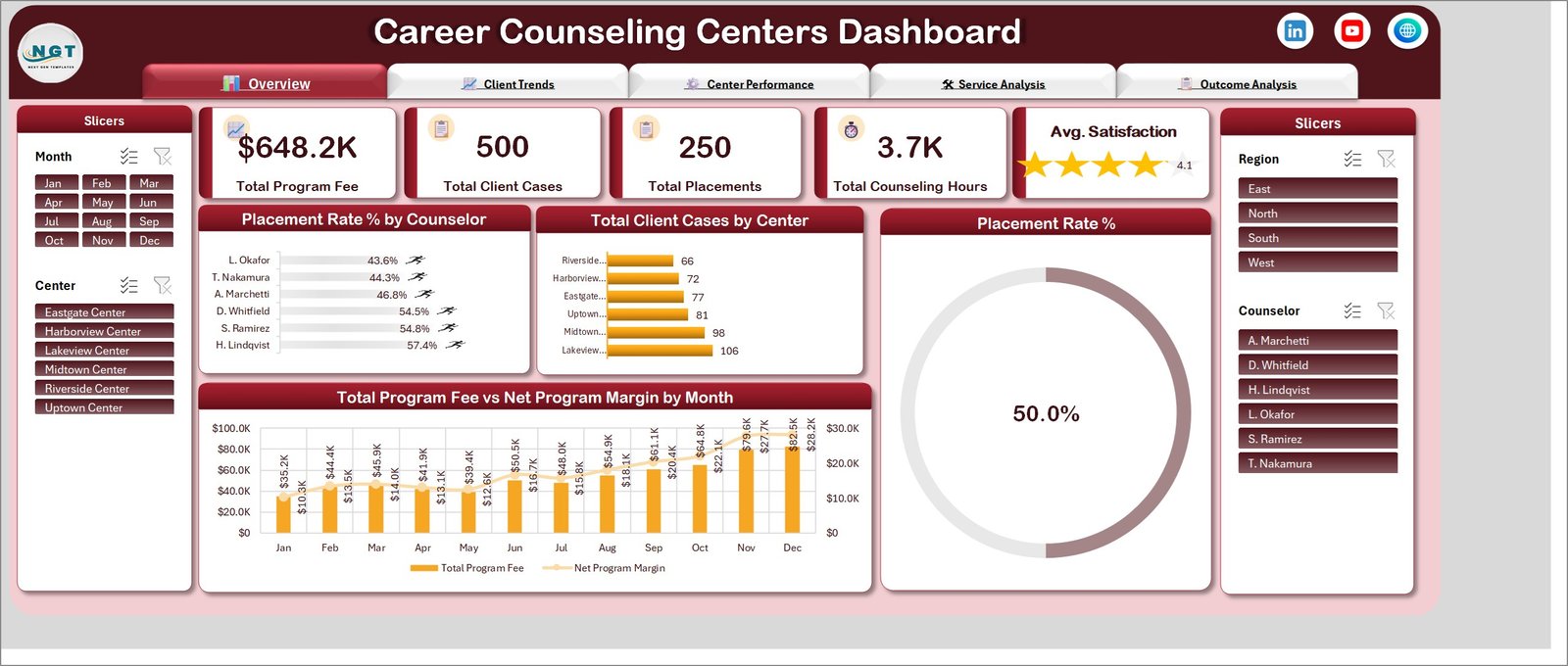
The summary screen. Five KPI cards run across the top – Total Program Fee, Total Client Cases, Total Placements, Total Counseling Hours and an Avg. Satisfaction star rating. Below them sit Placement Rate % by Counselor, Total Client Cases by Center, a large Placement Rate % doughnut gauge, and a combination chart of Total Program Fee vs Net Program Margin by Month that puts fee as columns and margin as a line on a secondary axis. In the demo data the fee climbs from 35.2K in January to 82.5K in December while margin tracks it from 10.3K to 28.2K – the shape you want to check first, because a fee line rising faster than margin is the thing a centre manager needs to notice.
Client Trends
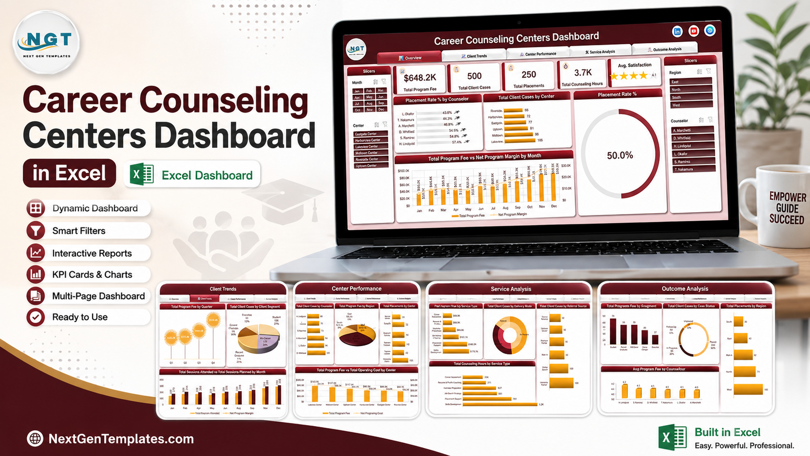
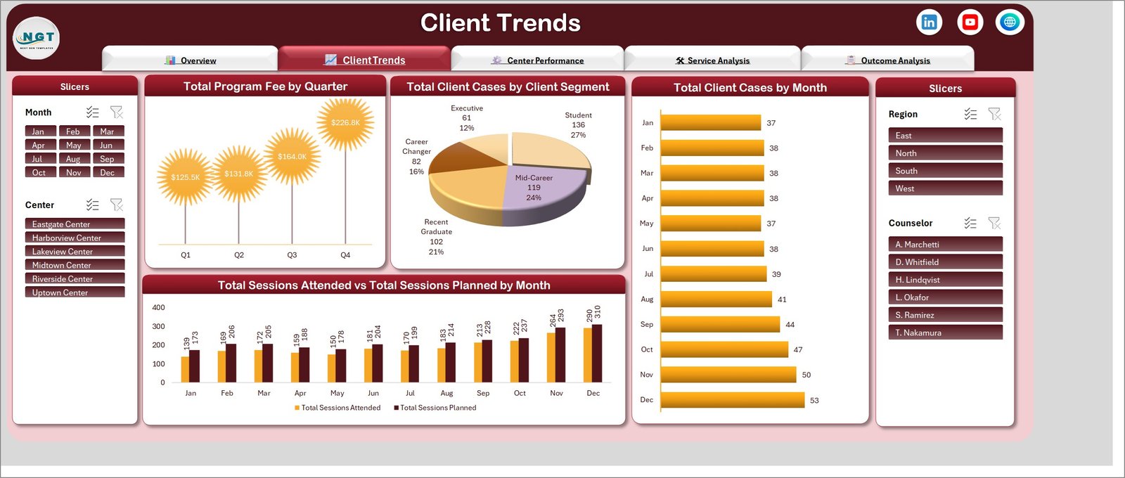
Demand, by time and by who is asking. Total Program Fee by Quarter steps from 125.5K in Q1 to 226.8K in Q4 in the sample. Total Client Cases by Client Segment splits the caseload across Student, Mid-Career, Recent Graduate, Career Changer and Executive. Total Client Cases by Month gives the same volume as a horizontal bar. The most useful chart on the page is Total Sessions Attended vs Total Sessions Planned by Month – two columns side by side, month after month, showing exactly where booked appointments are not being kept. In the demo data the gap runs 30 to 40 sessions a month, which is the kind of number that changes how you schedule. Career Counseling Centers Dashboard in Excel
Center Performance
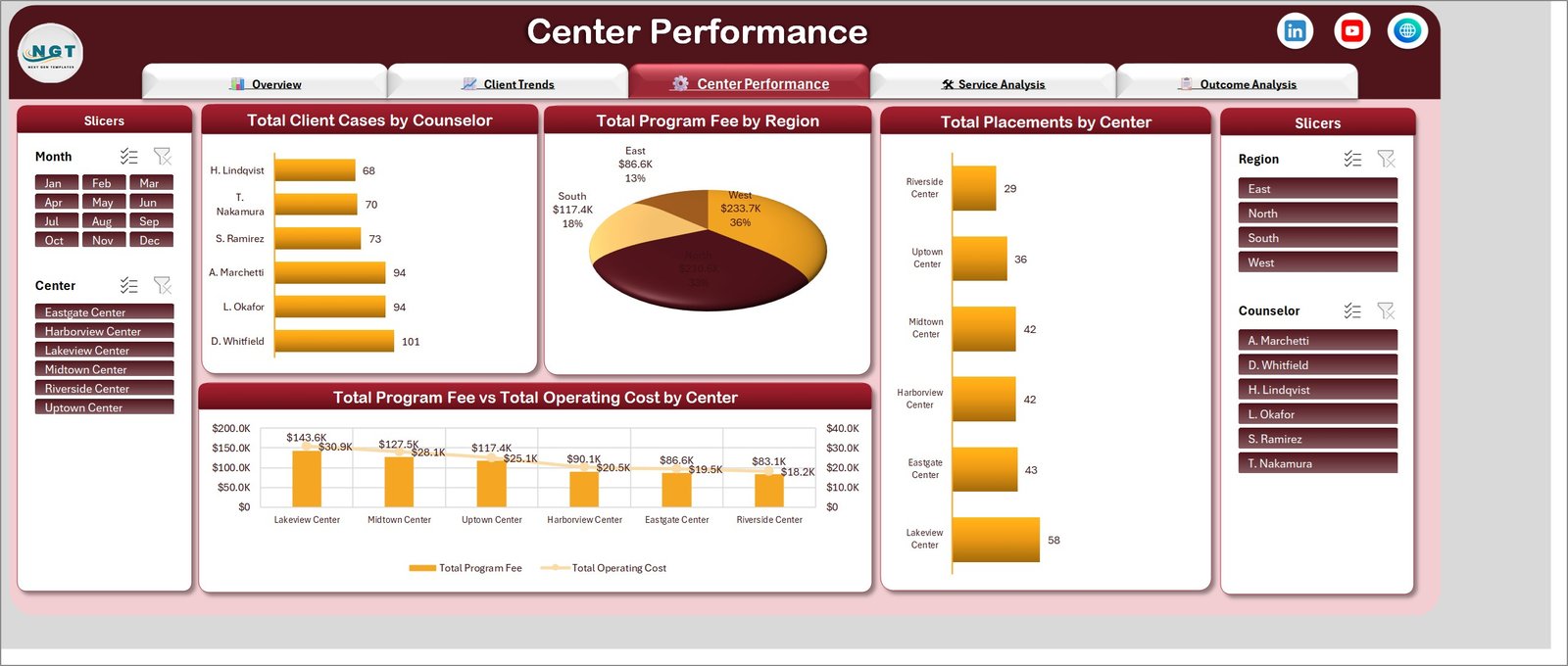
Where the work happens. Total Client Cases by Counselor ranks the team by caseload, Total Program Fee by Region splits revenue across East, North, South and West, and Total Placements by Center ranks the sites. The anchor chart is Total Program Fee vs Total Operating Cost by Center: six centres ordered from highest fee to lowest, with operating cost drawn as a line over the top. Reading the demo data, Lakeview at 143.6K fee against 30.9K cost and Riverside at 83.1K against 18.2K have broadly similar cost ratios – which is the comparison the chart exists to make easy, rather than eyeballing two separate lists.
Service Analysis
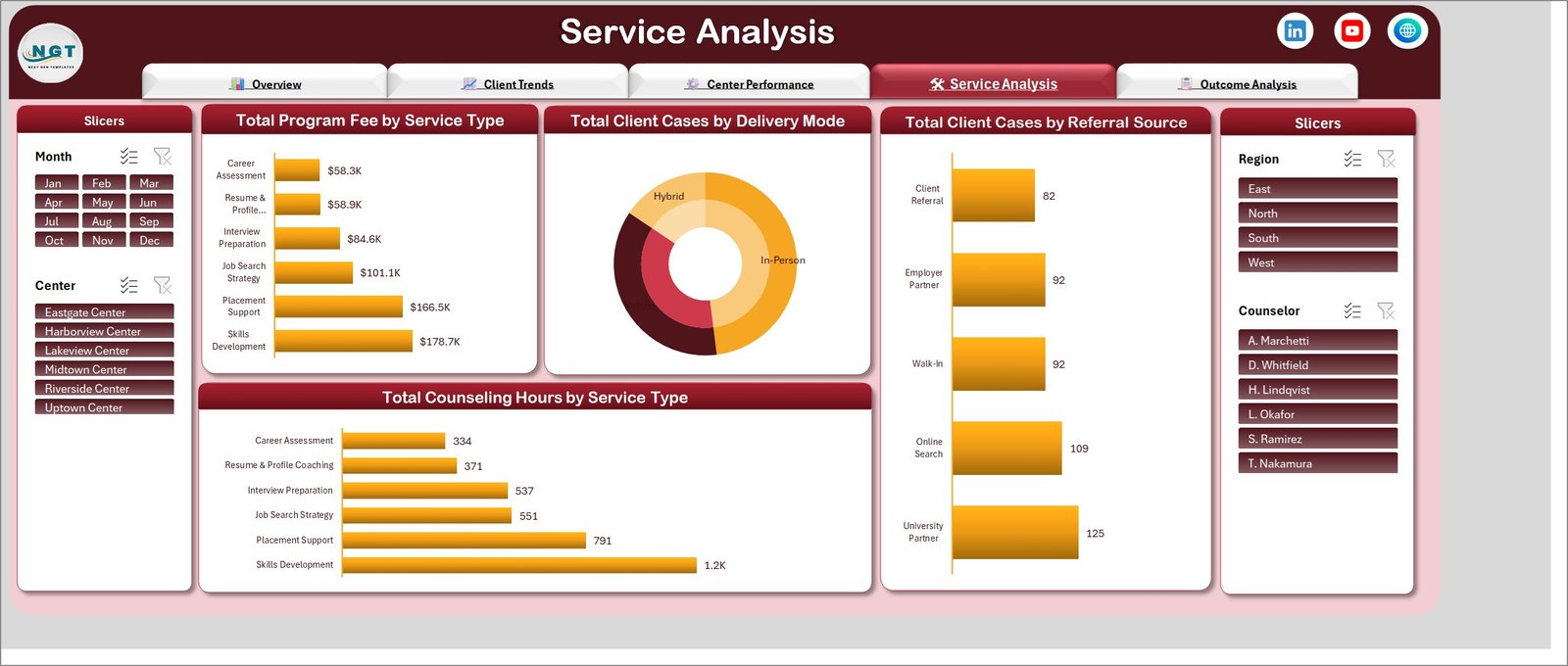
What you actually deliver, and how. Total Program Fee by Service Type and Total Counseling Hours by Service Type cover the same six services – Career Assessment, Resume & Profile Coaching, Interview Preparation, Job Search Strategy, Placement Support and Skills Development – once by money and once by time. Putting them on one page is deliberate: in the demo data Skills Development takes 1.2K hours for 178.7K of fee while Career Assessment takes 334 hours for 58.3K, and the fee-per-hour comparison only becomes obvious when both charts are in view. Alongside them, Total Client Cases by Delivery Mode (In-Person, Virtual, Hybrid) and Total Client Cases by Referral Source (Client Referral, Employer Partner, Walk-In, Online Search, University Partner) tell you how the work reached you. Career Counseling Centers Dashboard in Excel
Outcome Analysis
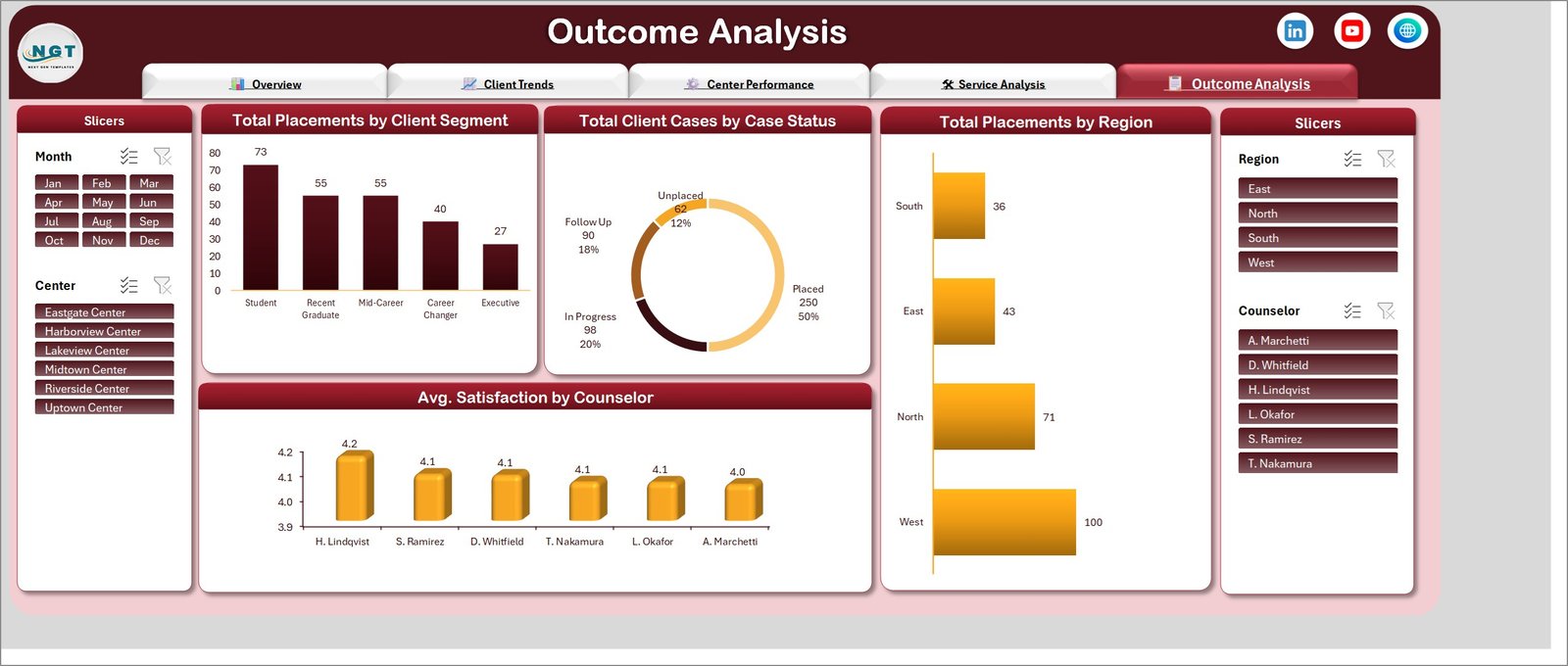
How the recorded cases closed. Total Placements by Client Segment, Total Client Cases by Case Status as a doughnut across Placed, In Progress, Follow Up and Unplaced, Total Placements by Region, and Avg. Satisfaction by Counselor. Worth repeating here, because this is the page people over-read: these are counts of what was logged in your file. A high Placed count means a lot of cases were marked Placed. It is not a measure of counselling quality, and the satisfaction column is whatever score your own feedback process produced.
Career Counseling Centers Dashboard in Excel vs. Google Sheets vs. Paid Case-Management SaaS – Feature Comparison
| This Excel template | Google Sheets equivalent | Paid case-management SaaS | |
|---|---|---|---|
| Cost | One payment, under 20 | Free tool, you still build the template | Typically 30-90 per user per month |
| Platform | Excel 2016+, Microsoft 365, Windows or Mac | Any browser | Browser, vendor-hosted |
| Setup time | Paste and refresh – under an hour | Hours of pivot and chart building | Days to weeks of onboarding |
| Real-time team collaboration | OneDrive or SharePoint co-authoring | Yes, native | Yes, native |
| Mobile access | Excel mobile app | Yes | Yes |
| Customizable fields | Every column, chart and label | Yes, if you build it | Only what the vendor exposes |
| Share with link | Yes, via OneDrive or SharePoint | Yes | Yes |
| Works offline | Yes – it is a local file | Limited | No |
| Where the data lives | Your file, your storage | Google account | Vendor servers |
| Year-1 cost at 5 users | Under 20 total | 0, plus your build time | Roughly 1,800-5,400 |
SaaS figures are typical published list prices for small-team case-management products and are given for scale only. Check current vendor pricing before you make a decision on them.
Who Should Use This Template
It fits a centre manager running one site or a small network who already keeps session records in a spreadsheet and needs a monthly or quarterly pack for a board, a funder or a university partner. It fits a university career services lead who wants segment-level reporting without asking IT for a new system. It fits an independent coach with one or two counselors who needs fee, hours and referral-source visibility on a single screen. Career Counseling Centers Dashboard in Excel.
It does not fit anyone who needs a live client-management system – appointment booking, secure case notes, consent tracking, role-based access, an audit trail. None of that is here, and a spreadsheet is the wrong place for it. It also will not connect to a student information system on its own, and it is not a compliance, accreditation or professional-standards product of any kind. Career Counseling Centers Dashboard in Excel
Real-World Use Cases
The monthly board pack. A centre manager exports the month’s sessions, pastes them onto the Data sheet, refreshes, then filters the Center slicer to each site in turn and saves a PDF per site. What was a three-hour copy-paste job becomes ten minutes, and the Center Performance page answers most of what the board asks.
The funder report. A programme funded per segment needs case volume and placement counts broken out by Student and Recent Graduate. The Outcome Analysis page gives both, and the Month slicer scopes it to the reporting period without touching a formula.
The scheduling review. The Sessions Attended vs Planned chart on Client Trends is the fastest way to find the months where booked appointments were missed. Combine it with the Counselor slicer and you can see whether the pattern is centre-wide or sits with particular caseloads.
Advantages of the Career Counseling Centers Dashboard in Excel
- One source of truth. Everything derives from the Data table, so fixing a mis-keyed fee fixes it on all five pages at once.
- Nothing to learn. Pivot tables, pivot charts and slicers are standard Excel features – Microsoft’s own guide to slicers covers the only control most users will touch.
- Fully editable. Centre names, counselor names, service types, delivery modes, referral sources and case statuses are plain text values, not hard-coded lists.
- Your data stays yours. No cloud account, no vendor, no export step. It is one file on your own storage.
- Print-ready. Each page is laid out to a single landscape screen, so Save as PDF produces a usable report pack with no re-formatting.
Opportunities for Improvement
Honest limits, so nothing surprises you after purchase. The workbook has no data entry form – you paste or type into the table directly, and there is no validation stopping a typo in a centre name from creating a new category in every chart. There is no automatic refresh; adding rows does not update the pages until you press Refresh All. Charts are static in layout, so adding a seventh service type works fine but adding a whole new page means building it yourself. There is no user access control, which is exactly why identifiable client information belongs in your existing case system rather than in this file. And the demo data is not a benchmark – do not read the 50 percent placement rate in the sample as any kind of industry figure, because it is generated numbers.
Best Practices
- Keep one row per case, not per session, if you want the case counts to mean what the labels say – or adjust the captions to match how you actually record.
- Use consistent spellings. “Lakeview Center” and “Lakeview Centre” become two separate categories in every chart.
- Do not put client names or identifying detail in the file. Case IDs are enough for reporting, and they keep the workbook out of scope for the sensitive-records question entirely.
- Refresh before you screenshot. Half the “the numbers are wrong” reports come from reading a page that has not been refreshed since the last paste.
- Keep a clean copy of the original file before you start editing charts, so you always have the shipped layout to fall back to.
- Add your own columns to the right of the table – they become pivot fields after a refresh, and nothing existing breaks. Career Counseling Centers Dashboard in Excel
Explore Relevant Templates
- Career Counseling Centers Dashboard in Power BI – the same five-page report rebuilt for Power BI Desktop.
- Career Mentorship Platforms Dashboard in Power BI – mentor matching, session volume and programme cost.
- Alumni Associations Dashboard in Excel – the natural next step once placed clients become alumni.
- Temp Staffing Dashboard in Excel – the employer-side view of the same placement pipeline.
- Digital Curriculum Startups Dashboard in Excel – for the training and skills side of the same sector. Career Counseling Centers Dashboard in Excel
Frequently Asked Questions
Will this dashboard improve our placement rate?
No. It reports what you record and nothing more. It does not offer counselling, career or employment advice, and it has no effect on client outcomes.
Are the numbers in the screenshots real centre data?
No. All 500 rows are demo data generated for the template, including the centre and counselor names. Delete them and paste your own.
Can I store client case notes in it?
Not advisable. There is no access control, encryption or audit trail. Keep identifiable client information in whatever system your organisation already uses, and follow your own policies on what may be exported to a spreadsheet.
Which versions of Excel does it work in?
Excel 2016 and later, including Microsoft 365, on Windows and Mac. It uses pivot tables, pivot charts and slicers only – no macros, no add-ins.
How do I change the colours?
The workbook uses a deep-maroon and amber theme. Change it from Page Layout, Themes, or re-colour individual charts from the Chart Design tab like any other Excel chart.
How many rows can it handle?
It ships with 500 and handles tens of thousands comfortably. Large datasets simply take longer to refresh.
Is there a Power BI version?
Yes, sold separately as the Career Counseling Centers Dashboard in Power BI.
About the Author
Built by PK – Microsoft Certified Professional with 15+ years of Excel, Google Sheets, and Power BI experience. Founder of NextGenTemplates, reaching 300K+ subscribers across YouTube channels. Every template is hand-built and tested before release.
Conclusion
Most career counseling centres do not need software. They need the spreadsheet they already keep to stop being a dead end. The Career Counseling Centers Dashboard in Excel does that in one file: 27 columns you paste into, 25 pivot-driven visuals across five pages, four slicers that move together, and a report pack you can export to PDF the same afternoon. It reports your data honestly and claims nothing about outcomes – which is exactly what a reporting tool should do.
Get the Career Counseling Centers Dashboard in Excel, or take the Power BI version if that is where your reporting lives. For step-by-step Excel dashboard tutorials, subscribe to youtube.com/@PKAnExcelExpert.