Most alumni offices are not short of data. They are short of a way to look at it. The export lands, somebody rebuilds the same four pivot tables, screenshots them into a deck, and next quarter it happens again. The Alumni Associations Dashboard in Excel is the alternative: five linked report pages that read one data sheet and recalculate the instant you click a slicer.
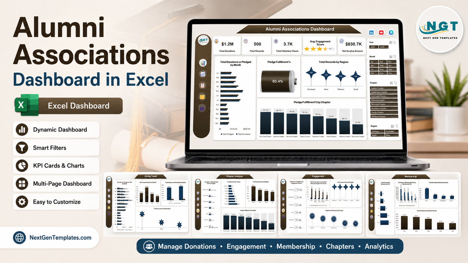
On the 500 sample records shipped with the workbook it reports $1.2M in total donations, 3.7K volunteer hours, an average engagement score of 3.7 out of 5, a 93.4% pledge fulfilment rate and a net surplus of $830.7K. Those are sample figures, generated for demonstration. The point of quoting them here is that every one of them is a live calculation – replace the sample rows with your own export, refresh, and each number redraws. This post walks through what is on each page, what it does well, where it stops, and how to get your own data into it.
Key Features of the Alumni Associations Dashboard in Excel
- Five report pages – Overview, Giving Trend, Chapter Analysis, Engagement and Membership – reached from a fixed navigation rail down the left edge.
- Four slicers wired to every page: Year, Month, Chapter and Region. Selecting Northeast filters all five pages at once, so you never compare a filtered chart against an unfiltered one.
- Five KPI cards on the overview, including an engagement score rendered as a five-star meter rather than a bare decimal.
- A pledge fulfilment gauge reading donations received against donations pledged.
- Eight chapters and four regions broken out consistently across pages, so a chapter conversation and a regional conversation use the same underlying totals.
- Six outreach channels measured on response rate, event attendance and volunteer hours.
- Membership tier and status views, plus giving split by graduation decade.
- Plain .xlsx, no macros – pivot tables, slicers and standard Excel charts. Nothing to enable, nothing to trust.
Dashboard Pages Explanation
Page 1 – Alumni Associations Dashboard
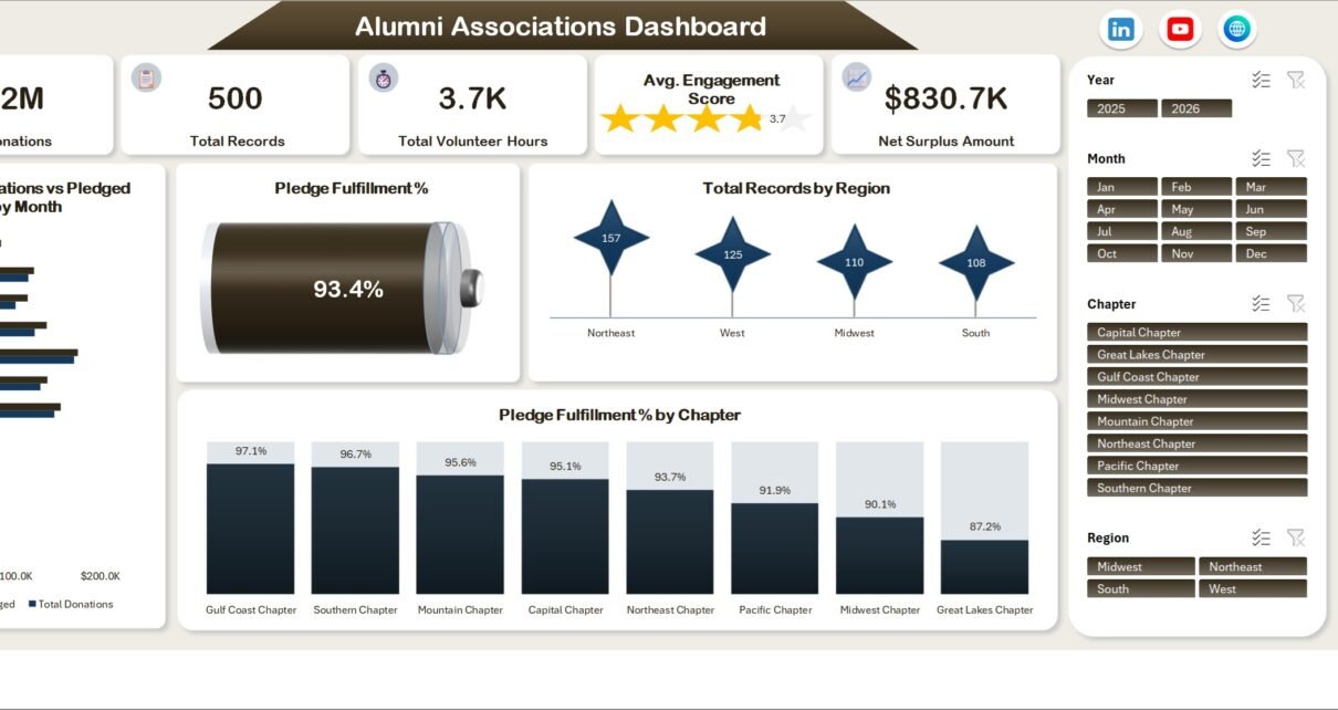
The landing page carries the five headline cards – Total Donations, Total Records, Total Volunteer Hours, Avg. Engagement Score and Net Surplus Amount – then four visuals underneath.
Total Donations vs Pledged by Month is a paired horizontal bar chart, so the gap between what was promised and what arrived is visible per month rather than buried in an annual average. Pledge Fulfillment % is a single gauge; on the sample data it reads 93.4%. Total Records by Region plots four markers – Northeast 157, West 125, Midwest 110, South 108. Pledge Fulfillment % by Chapter ranks all eight chapters, from Gulf Coast Chapter at 97.1% down to Great Lakes Chapter at 87.2%.
That last chart is the one that earns its place. A single association-wide fulfilment number tells you almost nothing; a ten-point spread across chapters tells you where to look.

Page 2 – Giving Trend
Time and cost. Donations vs Program Cost by Month puts the two side by side for all twelve months, which is the only honest way to talk about a fundraising programme. Net Surplus Amount by Quarter shows the sample year running $218.8K in Q1, peaking at $310.4K in Q2, then falling to $173.0K and $128.5K. Total Donations vs Total Membership Fees by Year separates the two income streams across 2025 and 2026. Total Records by Donation Band splits the file into Low (304 records), Medium (128) and High (68).
The donation-band chart is a useful reality check. Two-thirds of the file sits in the low band on the sample data, which is what most alumni files actually look like.

Page 3 – Chapter Analysis
Everything chapter-shaped in one place. Donations vs Membership Fees by Chapter ranks all eight on both income lines – on the sample data Northeast Chapter leads at $242.8K in donations against $20.7K in fees, Great Lakes trails at $70.7K and $4.8K. Total Records by Chapter gives the membership size behind those totals (Northeast 107 records, Great Lakes 34), which stops you praising a chapter that is simply larger. Net Surplus Amount by Region rolls the eight chapters into four regions, and the chapter fulfilment ranking is repeated here for context.

Page 4 – Engagement
How alumni respond, by channel and by programme. Outreach Response % by Engagement Channel ranks six channels: Alumni Events 71.8%, Phone Outreach 67.2%, Alumni Portal 55.1%, Email 46.8%, Social Media 38.5%, Direct Mail 36.1%. Event Attendances vs Volunteer Hours by Engagement Channel sits beside it, and the two together are more informative than either alone – email produces the largest raw volunteer-hour figure in the sample while sitting fourth on response rate.
Avg. Engagement Score by Program covers six programmes (Networking Events, Scholarship Fund, Annual Giving, Career Services, Reunions, Mentorship), clustered tightly between 3.7 and 3.8 on the sample data. Total Event Attendances by Faculty closes the page: Business 176, Engineering 140, Arts & Sciences 137, Education 58, Medicine 56, Law 45.

Page 5 – Membership
The base itself. Total Records by Membership Tier runs Bronze 169, Silver 137, Gold 99, Platinum 61, Life 34 – the classic pyramid. Donations vs Membership Fees by Membership Tier shows why the pyramid matters: Platinum contributes $387.9K in donations from 61 records against Bronze’s $70.4K from 169. Total Records by Membership Status counts Active 279, Lapsed 106, Pending Renewal 71, Cancelled 44 – the pending-renewal figure being the one worth acting on. Total Donations by Graduation Decade puts the 2010s cohort at $316.0K, the 2000s at $280.2K, the 1990s at $263.5K, the 2020s at $154.1K and the 1980s at $142.4K.

The sheets behind the pages
A Data sheet holds the 500 sample records. A Support sheet holds every pivot table feeding the visuals. The slicers connect to those pivots. You edit the Data sheet and nothing else. If you want to understand how the plumbing works, Microsoft’s own primer on using slicers to filter data covers the connection model this workbook relies on.
Alumni Associations Dashboard in Excel vs. Google Sheets vs. Paid Alumni CRM – Feature Comparison
| This Excel dashboard | Google Sheets equivalent | Paid alumni CRM | |
|---|---|---|---|
| Cost | $17.99 one-off | $9.99-$18.99 one-off | $3,000-$15,000+ per year |
| Platform | Excel 2016+ / Microsoft 365 | Browser, any device | Vendor-hosted web app |
| Setup time | 15-30 minutes | 15-30 minutes | 4-12 weeks |
| Real-time team collaboration | Via OneDrive co-authoring | Native | Native, with roles |
| Mobile access | Excel mobile app | Full browser access | Dedicated apps |
| Customisable fields | Unlimited | Unlimited | Within vendor limits |
| Share with link | Once uploaded to the cloud | Yes, built in | Yes, per licence |
| Year-1 cost at 5 users | $17.99 | $18.99 | $3,000+ |
| Chapter and region reporting | Two dedicated pages | Built in | Built in, plus territory rules |
| Donor records, receipting, workflows | No – reporting only | No | Core function |
The distinction that matters: a CRM manages alumni records. This workbook reports on them. They are not competitors so much as different stages – most associations that buy this one already have their records somewhere and just want the quarterly view without a second licence.
Who Should Use This Template
It fits an alumni relations officer who assembles a quarterly board pack by hand, a chapter coordinator consolidating eight spreadsheets from eight volunteers, a development office analyst testing whether a channel pays for itself, or a small association with a few thousand members and no CRM budget. The common thread is that the data already exists and the reporting is the bottleneck.
It does not fit if you need a system of record for individual alumni, automated acknowledgements or receipts, payment processing, or a live two-way sync with a donor database. It also is not the right shape past roughly 50,000 rows – Excel will hold them, but refresh times start to bite.
Real-World Use Cases
The quarterly board pack
An alumni relations manager pastes the quarter’s export over the sample rows, sets the Year and Month slicers, and copies the overview page straight into the deck. Five KPI cards and the pledge-fulfilment gauge answer the three questions that always come up before anyone asks them.
The chapter conversation
A national coordinator consolidates eight chapter files into one Data sheet. The Chapter Analysis page shows a ten-point spread in pledge fulfilment, and the record-count chart beside it shows the leading chapter is also the largest – so the praise goes to the chapter converting well at half the size, not the one with the biggest headline total.
The channel cost question
A development analyst is asked whether phone outreach is worth keeping. The Engagement page puts it at 67.2% response against email at 46.8%; the Giving Trend page puts programme cost against donations month by month. The memo writes itself in an afternoon rather than a week.
Advantages of the Alumni Associations Dashboard in Excel
- One filter set, five pages. Cross-page slicer sync removes the most common dashboard error – comparing a filtered chart with an unfiltered one.
- Membership size sits next to money. Record counts appear alongside donation totals on both the chapter and membership pages, which keeps per-capita reality in the frame.
- Cost is on the page, not implied. Programme cost is charted against donations rather than left to a footnote, so net surplus is derivable, not asserted.
- No macros. A plain .xlsx opens on locked-down university machines where macro-enabled files get blocked.
- Yours to edit. Every pivot, chart and slicer is a standard Excel object – add a page, delete a chart, restyle it to your institution’s colours.
Opportunities for Improvement
Being straight about what it does not do:
- No year-on-year variance column. The workbook charts two years side by side but does not compute a percentage change – you read the gap off the chart.
- Engagement scores cluster tightly. On the sample data five of six programmes land at 3.7. With real data that spread may widen, but the chart type does not help you see small differences.
- Refresh is manual. There is no query connection to an external source; you paste and hit Refresh All.
- Desktop-first. Slicers work in the Excel mobile app but are cramped. This is a laptop artefact.
- No record-level drill-through. Click a chapter bar and you get a filter, not a list of the underlying alumni.
Best Practices
- Keep the header row untouched. The pivot tables reference those exact names; renaming a column breaks the chart that reads it.
- Load a full period, not a partial one. A half-loaded month makes the monthly charts read like a collapse.
- Standardise your chapter and tier spellings before pasting. “Northeast” and “North East” become two slicer buttons.
- Refresh All once, then check one KPI against a known total. Thirty seconds of verification catches a mis-aligned paste.
- Strip personal identifiers you do not need. The dashboard works from chapter, tier, status, amount and channel – names, addresses and contact details add nothing to the charts and everything to your handling obligations.
- Save a filtered copy for each chapter rather than emailing the whole workbook, if chapter volunteers should only see their own numbers.
Explore Relevant Templates
- Alumni Associations Dashboard in Excel – the template this post walks through.
- Alumni Associations Dashboard in Power BI – the same five pages rebuilt as a Power BI report.
- Alumni Engagement KPI Dashboard in Excel – a tighter scorecard view of engagement alone.
- Colleges & Universities Dashboard in Excel – institution-wide rather than alumni-only reporting.
- Donation Register Data Entry System in Excel – the entry form that produces a file like this one.
- Nonprofit Organizations Dashboard in Google Sheets – the browser-based equivalent for wider nonprofit work.
- Education & School Management Bundle – eight education templates in one purchase.
- Airline Loyalty Programs Dashboard in Excel and Carpooling Platforms Dashboard in Excel – the same five-page build applied to membership and usage data in other sectors.
Frequently Asked Questions
Which Excel versions does the Alumni Associations Dashboard in Excel support?
Excel 2016, 2019, 2021 and Microsoft 365 on Windows or Mac. It uses pivot tables, slicers and standard chart types only – no macros, no Power Pivot licence, no add-ins.
Are the donation and engagement figures shown real?
No. Every figure in the screenshots and in the shipped workbook is sample data generated for demonstration purposes. Replace it with your own export before showing it to anyone.
Can I add my own chapters, regions, tiers or programmes?
Yes. The slicers and pivots read whatever values appear in the Data sheet, so a ninth chapter or a new membership tier only needs typing into your data and a refresh.
Does it handle donor receipting or compliance reporting?
No. It is a reporting workbook working from aggregated fields. It does not issue receipts, manage individual records, or address any tax or regulatory requirement – you remain responsible for how any personal or donation data you paste in is stored and shared.
How many records can it handle?
The sample is 500. It runs comfortably into the tens of thousands. Beyond roughly 50,000 rows, refresh times grow and a database-backed tool is the better answer.
Is there a Power BI version?
Yes – the Alumni Associations Dashboard in Power BI covers the same five pages from the same data model.
What is in the download?
A ZIP containing the .xlsx workbook with all five pages, the 500 sample records and every pivot table, plus an Excel Dashboard User Manual PDF.
About the Author
Built by PK – Microsoft Certified Professional with 15+ years of Excel, Google Sheets, and Power BI experience. Founder of NextGenTemplates, reaching 300K+ subscribers across YouTube channels. Every template is hand-built and tested before release.
Conclusion
The Alumni Associations Dashboard in Excel does one job properly: it turns an alumni export into five report pages that stay in sync with each other. It will not manage your donor records, issue a receipt or replace a CRM, and it does not pretend to. What it removes is the recurring afternoon of rebuilding pivot tables before every board meeting – and it does that for the price of a takeaway, in a file format that opens on any managed university laptop.
Get it here: Alumni Associations Dashboard in Excel. For step-by-step Excel dashboard tutorials, subscribe to youtube.com/@PKAnExcelExpert.
Last updated: 14 August 2026. All figures quoted in this article are sample data included with the template.