
A loyalty programme is two businesses in one. There is the marketing business that hands out miles, and there is the balance-sheet business that owes them. Most airline teams report the first and guess at the second, because the numbers live in different exports. The Airline Loyalty Programs Dashboard in Power BI puts both on the same six pages: miles earned against miles redeemed, what is left outstanding, what quietly expired, what the programme actually cost, and how many members are still active at the end of it.
This is a finished .pbix, not a tutorial. It carries a star-schema semantic model, 95 DAX measures, six report pages, five synced slicers per page, a hidden Details drillthrough page wired to nine fields, and two tooltip pages. It opens with 500 sample member records spanning 18 months, eight airlines, six regions, five membership tiers and six earn partners. Every figure shown in the screenshots below is that sample data – it is there so the visuals work before you connect anything, and no real airline or member information is included.
Key Features of the Airline Loyalty Programs Dashboard in Power BI
- A proper semantic model. A single 21-column fact table named Data joins a Power Query-generated Date table on one active relationship. Every month-over-month measure and every month axis depends on that one join, which is why the model is worth understanding before you edit it.
- 95 DAX measures, already written. Totals (Total Miles Earned, Total Miles Redeemed, Total Miles Expired, Total Ticket Revenue, Total Ancillary Revenue, Total Loyalty Cost), derived ratios (Redemption Rate %, Breakage Rate %, Program Margin %, Engagement Rate %, Churn Rate %, Retention Rate %, Elite Member %), per-member rates (Avg Miles Per Member, Avg Revenue Per Member, Cost Per Mile Redeemed) and a matching MoM % variant for every headline number.
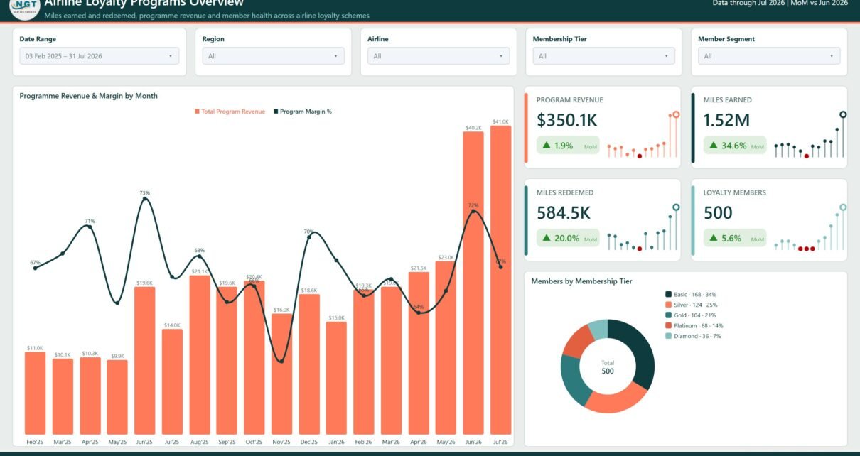
- KPI cards drawn as SVG. Each card shows the value, a coloured month-over-month delta and a lollipop sparkline, so a KPI never appears without its recent history behind it.
- Synced slicers. Date Range, Region, Airline and Membership Tier follow you between pages; the fifth slicer is page-specific – Member Segment, Earn Partner, Cabin Class, Route Type and Member Status respectively.
- Drillthrough and tooltip pages. Right-click almost any category and the hidden Details page opens filtered to it. Hovering a bar or a line point opens Trend Detail or Category Detail – small report pages rendered as tooltips rather than a plain value.
- One theme file. The deep-teal and coral palette comes from a JSON theme, so rebranding is a theme swap, not a tour of every visual.
Dashboard Pages Explanation
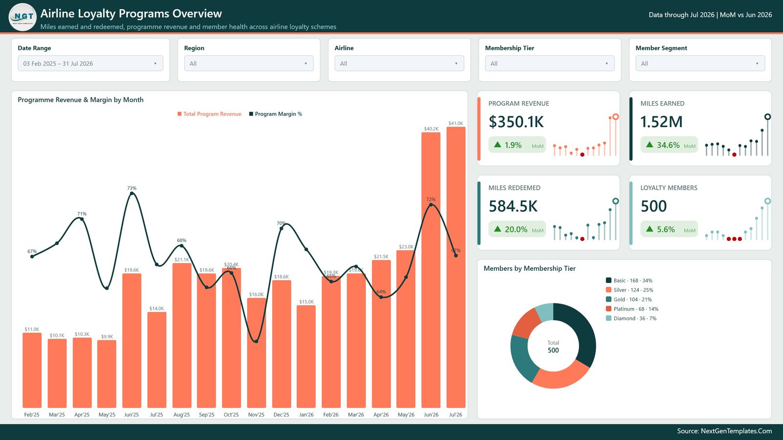
Page 1 – Airline Loyalty Programs Overview
The entry page answers whether the programme pays for itself. Four KPI cards carry Program Revenue, Miles Earned, Miles Redeemed and Loyalty Members with their MoM deltas. A combo chart plots Total Program Revenue as columns against Program Margin % as a line across the months, so a revenue spike that came at the cost of margin is visible in one glance. A donut splits the member base across Basic, Silver, Gold, Platinum and Diamond.
Page 2 – Miles Activity
Titled Miles & Redemption on the banner, this is the earn-and-burn page. Five cards run Miles Earned, Miles Redeemed, Outstanding Miles, Redemption Rate and Breakage Rate. Below them, Miles Earned vs Redemption Rate by Month shows whether members are burning at the pace they are earning; Miles Earned by Earn Partner separates Flight, Co-Brand Card, Hotel, Car Rental, Dining and Retail; Miles Redeemed by Cabin Class shows where the miles are actually spent; and Miles Expired by Month tracks the ones nobody used.

Page 3 – Tier Analysis
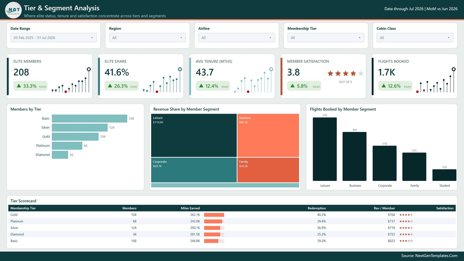
Elite Members, Elite Share, Avg Tenure (Mths), Member Satisfaction and Flights Booked head the page. A Members by Tier bar chart, a Revenue Share by Member Segment treemap (Leisure, Business, Corporate, Family) and Flights Booked by Member Segment sit underneath, and a Tier Scorecard table closes it with members, miles earned, redemption rate, revenue per member and a star rating per tier. This is the page that tells you whether elite status is buying loyalty or just discounting it.
Page 4 – Revenue Insights
Program Revenue is broken into Ticket Revenue and Ancillary Revenue and set against Loyalty Cost and Program Margin. Revenue & Margin by Cabin Class shows that the biggest revenue bar is not always the best margin. A Revenue vs Margin by Airline scatter sizes each bubble by members. The Airline P&L table lists revenue, loyalty cost, net contribution and margin per carrier, and Revenue by Region closes the page.

Page 5 – Member Retention
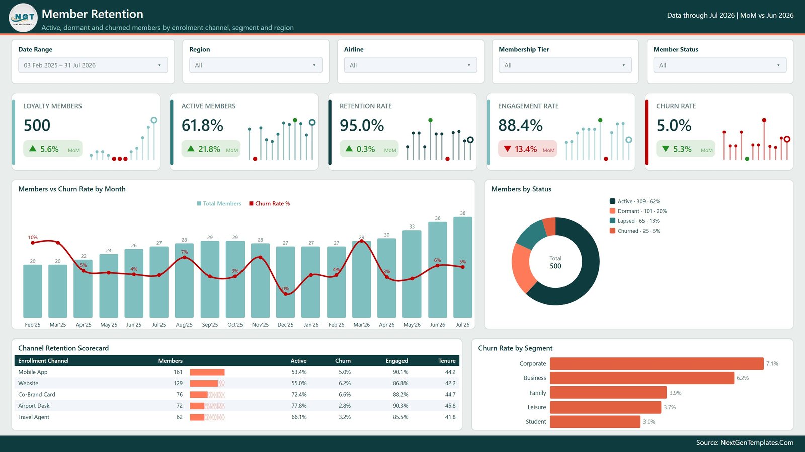
Loyalty Members, Active Members, Retention Rate, Engagement Rate and Churn Rate lead. Members vs Churn Rate by Month pairs growth with attrition on one axis pair; a Members by Status donut splits Active, Dormant, Lapsed and Churned; the Channel Retention Scorecard compares Mobile App, Website, Co-Brand Card, Airport Desk and Travel Agent on members, active share, churn, engagement and tenure; and Churn Rate by Segment ranks where members leave fastest.
Page 6 – Get More Dashboards
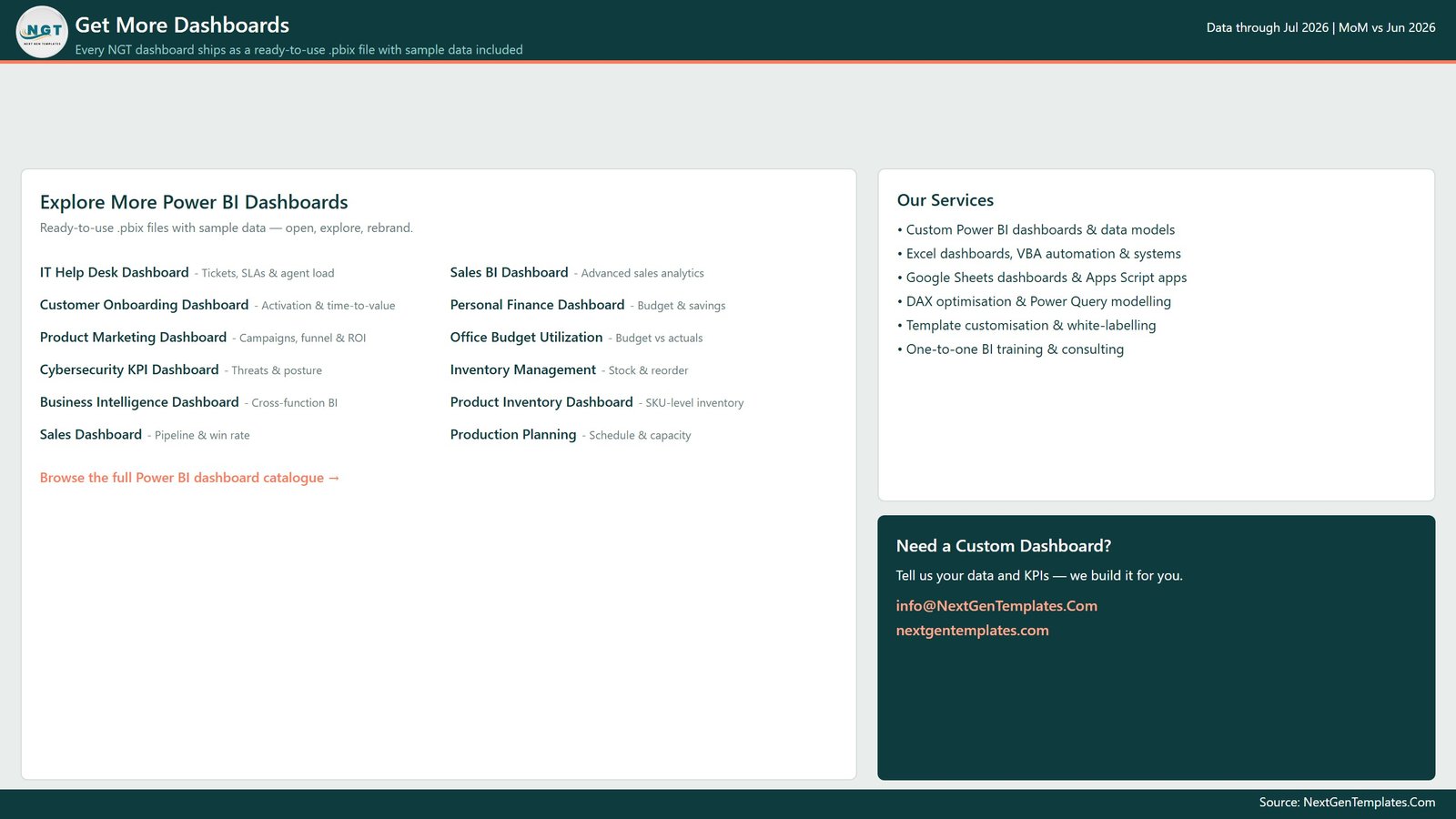
A navigation page pointing at other NextGenTemplates Power BI reports and at custom build enquiries. Delete it before you publish the report inside your own workspace.
The three pages that do not appear in the tab strip
Details is the drillthrough target. It is bound to Airline, Region, Membership Tier, Member Segment, Enrollment Channel, Cabin Class, Route Type, Earn Partner and Member Status, so a right-click on nearly any visual element lands there with the right filter already applied. Trend Detail and Category Detail are 280×360 pages configured as report page tooltips. All three are hidden in view mode but fully editable in Power BI Desktop – the mechanics are documented in Microsoft’s drillthrough guidance if you want to add your own.
Airline Loyalty Programs Dashboard in Power BI vs. Tableau vs. Paid Loyalty SaaS – Feature Comparison
| This Power BI template | Tableau / Qlik build | Paid loyalty analytics SaaS | |
|---|---|---|---|
| Cost | One-off template price | Tableau Creator from ~70 per user per month | Typically 500+ per month on contract |
| Platform | Power BI Desktop, free from Microsoft | Licensed desktop client | Vendor cloud only |
| Setup time | Open, repoint the source, refresh | Days of modelling and layout | Weeks of onboarding |
| Measures included | 95 DAX measures ready to use | Written from scratch | Vendor-defined |
| Real-time team collaboration | Via Power BI Service workspaces | Via Tableau Server or Cloud | Built in |
| Mobile access | Power BI mobile app | Vendor mobile app | Built in |
| Customisable fields | Full – the model is yours | Full | Limited to vendor schema |
| Share with a link | Publish to the Service | Publish to the server | Built in |
| Year-1 cost at 5 users | Template price only | ~4,200 in licences | 6,000+ |
| Outstanding miles and breakage view | Included | Build it | Usually included |
Who Should Use This Template
Loyalty programme managers who assemble a monthly pack by hand. Airline revenue and commercial analysts who need programme margin per carrier without exporting to a spreadsheet first. CRM and retention leads who track churn by enrolment channel. BI developers and consultants who want a credible starting model rather than a blank canvas. And anyone learning DAX who would rather read 95 working measures than another isolated example – the naming is plain and the patterns repeat, which makes the file a decent reference on its own.
It assumes you already have member-level data with dates, miles, revenue and status. If your loyalty platform reports on itself and finance is happy with those numbers, you do not need this.
Real-World Use Cases
The monthly programme review. Refresh on the first working day, screenshot Overview and Revenue Insights, and put the commentary where the arithmetic used to go. The Report Context line in the header names the latest month and the comparison month, so the deck is never accidentally a month behind.
The margin investigation. Margin dips. Filter Route Type on Revenue Insights, find the carrier whose net contribution moved in the Airline P&L table, right-click it into the Details page, and read the underlying rows without leaving the report.
The re-engagement campaign. On Member Retention, compare Churn Rate by Segment against the Channel Retention Scorecard. Members recruited through one channel usually behave differently from another; targeting the weak channel beats a blanket email to the whole base.
The breakage conversation. Outstanding Miles and Breakage Rate on the Miles Activity page give the commercial team a monitoring view of the mile balance and how much of it expires, ahead of the formal accounting exercise.
Advantages of the Airline Loyalty Programs Dashboard in Power BI
- Earn, burn, expiry, cost and retention are modelled together, so the miles you granted and the money they cost sit in the same file.
- Nothing is locked. Measures, visuals, theme, pages and the Power Query source are all editable.
- Drillthrough on nine fields means most “why is that number like that” questions are answered by right-clicking rather than by a new report request.
- Power BI Desktop is free, so the cost of a second or third analyst opening the file is zero.
- Sample data ships with it, so the report is explorable before your own extract is ready.
Opportunities for Improvement
Honest limits, so you can judge it before buying. Breakage Rate % here is expired miles over earned miles – a monitoring ratio, not the deferred-revenue liability your finance team files under IFRS 15; if you need the accounting figure, this is a companion to it and not a replacement. Refresh is scheduled, not streaming, so it will not act as an operational console. Award-seat inventory, fare-class optimisation and partner settlement are outside its scope. And the model expects the 21 documented column names – a different schema means a rename step in Power Query before the first refresh works.
Best Practices
- Open the file and click through all six pages with the sample data before touching anything. It is much easier to spot what broke afterwards.
- Repoint the source in Power Query rather than pasting data into the model, so refresh stays one click.
- Keep the Data-to-Date relationship intact. Every MoM measure and every month axis depends on it.
- Add measures rather than editing the shipped ones, at least until you are certain nothing else references them.
- Rebrand through the theme JSON instead of restyling visuals one at a time.
- Delete the Get More Dashboards page before publishing to your workspace.
- Keep sample data and live data in separate files while you are testing, so a half-mapped refresh never reaches the board pack.
Explore Relevant Templates
- Airline Loyalty Programs Dashboard in Excel – the same analysis built on pivot tables and slicers.
- Airports Dashboard in Power BI – passenger traffic, turnaround and airport revenue.
- Airline Catering Dashboard in Power BI – onboard meal cost and service quality.
- Aviation Maintenance Dashboard in Power BI – fleet reliability and maintenance cost.
- Business Travel Services Dashboard in Power BI – corporate travel spend and supplier performance.
- Alumni Associations Dashboard in Power BI – membership, engagement and giving for a very similar member-lifecycle model.
Frequently Asked Questions
Do I need a paid Power BI licence?
No. Power BI Desktop is free and will open, refresh and edit the file. A Pro or Premium licence is only needed to publish to the Power BI Service and share with colleagues.
Is the data in the screenshots real?
No. Everything shown is generated sample data – 500 member records over 18 months – included so the report works out of the box. Replace it with your own export.
What columns does my data need?
Record ID, Date, Airline, Region, Membership Tier, Member Segment, Enrollment Channel, Cabin Class, Route Type, Earn Partner, Miles Earned, Miles Redeemed, Miles Expired, Ticket Revenue, Ancillary Revenue, Redemption Cost, Program Cost, Flights Booked, Tenure Months, Satisfaction Score and Member Status. Rename yours to match in Power Query and everything downstream keeps working.
Can I report on several airlines at once?
Yes. Airline is a synced slicer and a drillthrough field, and the Revenue Insights page carries an Airline P&L table, so a group can see each carrier and the total.
Can I add pages or measures?
Yes. Nothing in the file is protected. The hidden Details and tooltip pages are visible in Desktop and can be copied as a pattern for your own.
How is this different from the Excel version?
The Excel build uses pivot tables, pivot charts and slicers on a workbook. This one uses a semantic model with DAX measures, page-level drillthrough and tooltip pages – more analytical depth, at the cost of learning Power BI. Teams often buy both and let each group work where it is comfortable.
About the Author
Built by PK – Microsoft Certified Professional with 15+ years of Excel, Google Sheets, and Power BI experience. Founder of NextGenTemplates, reaching 300K+ subscribers across YouTube channels. Every template is hand-built and tested before release.
Conclusion
Loyalty reporting fails in a predictable way: the miles report and the money report are produced by different people from different exports, and nobody sees the two together until the year-end review. The Airline Loyalty Programs Dashboard in Power BI collapses that gap into one file – six pages, 95 measures, drillthrough to the underlying rows, and a model you can point at your own data in an afternoon.
Get the Airline Loyalty Programs Dashboard in Power BI on NextGenTemplates, or take the Excel version if your team lives in workbooks.
For Power BI and Excel walkthroughs, subscribe on YouTube at youtube.com/@PKAnExcelExpert.