Accounting firms and CPA practices spend hours each week compiling engagement data into manual reports — copying figures into spreadsheets, reconciling billing vs cost numbers, and preparing partner summaries by hand. According to Microsoft’s productivity research, knowledge workers spend up to 20% of their week on data gathering that could be automated. The Accountancy Practice Dashboard in Excel eliminates that overhead: 20 pre-built pivot charts across 5 dashboard pages, 5 KPI cards, and multi-slicer filtering that updates everything in under 10 minutes with a single Refresh All click.
This guide walks through every page of the dashboard, explains the charts and KPIs in detail, and shows you how to replace the sample data with your firm’s real engagement records.
What Is the Accountancy Practice Dashboard in Excel?
The Accountancy Practice Dashboard in Excel is a multi-page analytics template built entirely on native Excel pivot tables and slicers. It contains 7 sheet tabs: five dashboard pages, one Data sheet, and one Support sheet with all the underlying pivot tables. No VBA macros, no add-ins, no subscriptions — just standard Excel 2016 or later.
The five dashboard pages each focus on a different dimension of practice performance: overall KPIs, service economics, partner benchmarking, industry profitability, and monthly trends. Together they replace the need for a paid practice management SaaS tool for firms that primarily need analytics visibility rather than workflow automation.
Dashboard Pages Explanation
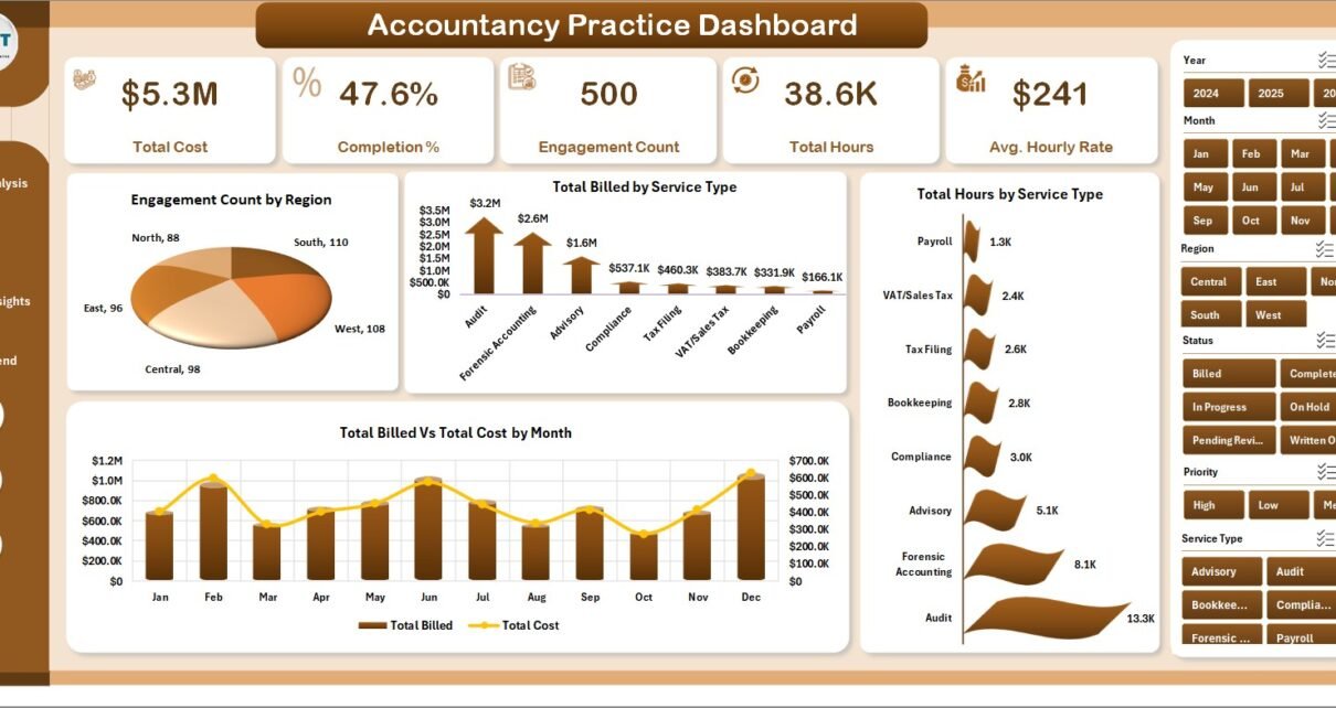
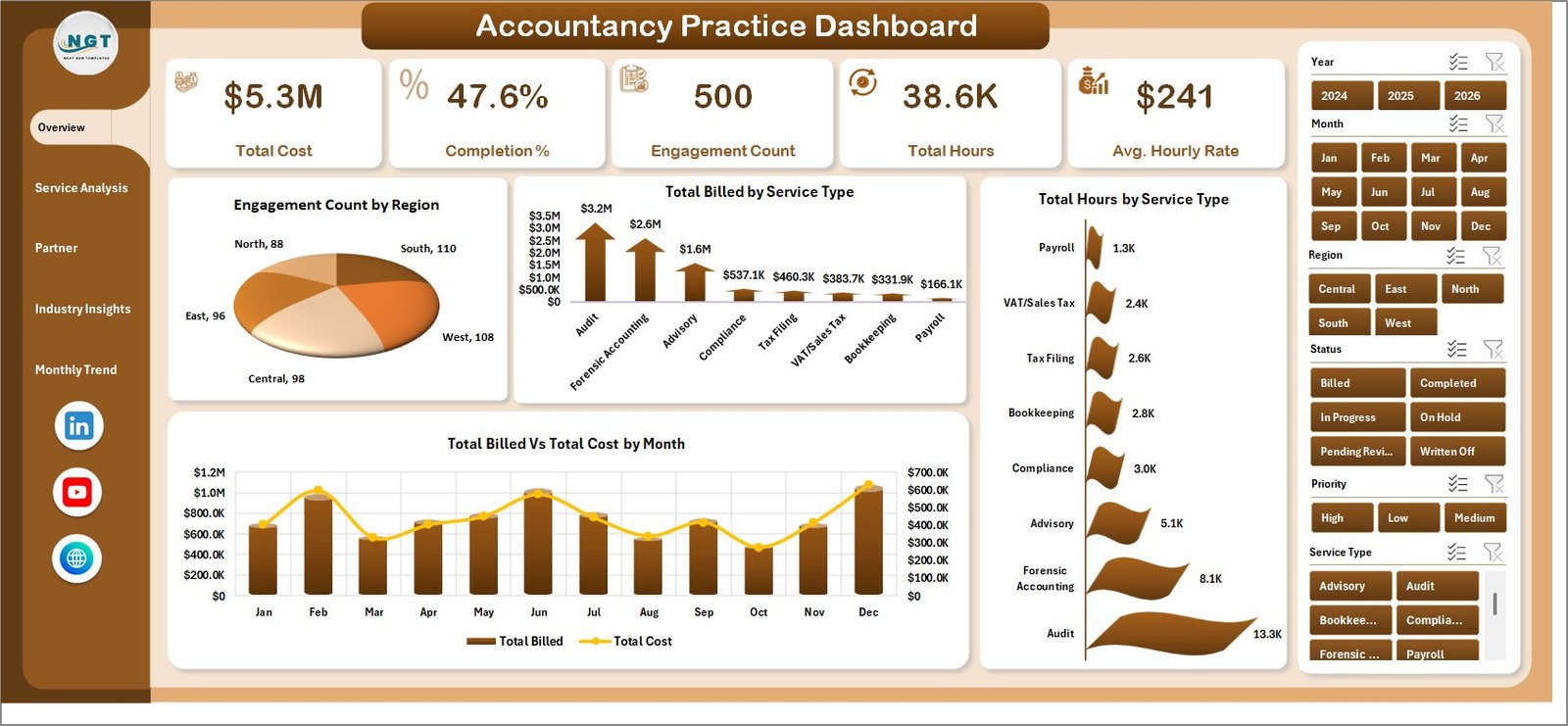
1. Overview Page
Accountancy Practice Dashboard — Overview Page
The Overview page is the command centre. Five KPI cards across the top display the highest-priority metrics at a glance:
- Total Cost — aggregate cost across all engagements in the selected period
- Completion % — proportion of engagements completed vs total initiated
- Engagement Count — total number of active and closed engagements
- Total Hours — hours billed or logged across all service types
- Avg. Hourly Rate — blended rate across all partners and services
Below the cards, four pivot charts provide analytical context:
- Engagement Count by Region — shows the geographic distribution of your client base, useful for identifying growth markets or resource gaps by region
- Total Billed by Service Type — breaks down revenue contribution across service lines such as audit, tax, advisory, and compliance
- Total Hours by Service Type — reveals capacity consumption per service, helping you compare billing efficiency across lines
- Total Billed vs Total Cost by Month — a dual-bar or line chart that exposes profitability timing, showing months where cost ran ahead of billings
Slicers on this page let you filter all four charts simultaneously by region, service type, partner, or any other defined dimension — without touching a single formula.
2. Service Analysis
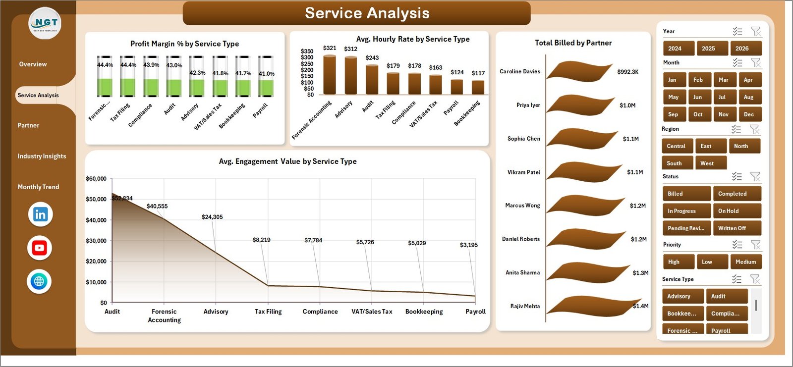
Service Analysis
The Service Analysis page examines the economics of each service line. Four charts drive this view:
- Profit Margin % by Service Type — the single most important chart for strategic planning; shows which services actually generate margin and which are margin-dilutive
- Avg. Hourly Rate by Service Type — benchmarks the effective rate per service, highlighting where pricing may need adjusting
- Total Billed by Partner — reveals each partner’s revenue contribution, useful for compensation review and workload balancing
- Avg. Engagement Value by Service Type — shows the typical deal size per service, helping forecast revenue from new mandates
3. Partner Performance
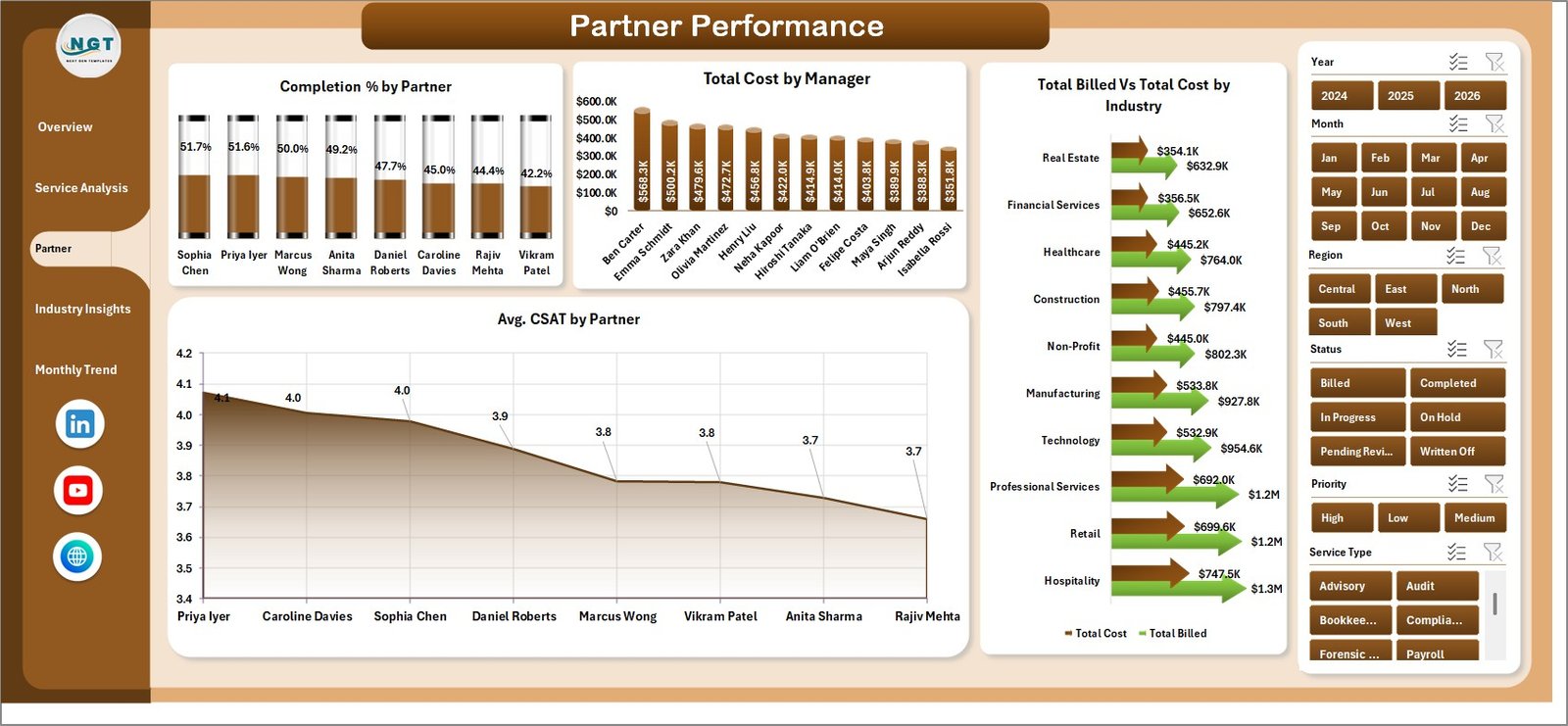
Partner Performance
The Partner Performance page benchmarks each partner against the practice’s overall metrics:
- Completion % by Partner — flags partners or managers with a backlog of incomplete engagements relative to their peers
- Total Cost by Manager — shows cost allocation by manager, useful for identifying overheads concentrated in specific leadership roles
- Total Billed vs Total Cost by Industry — a cross-cut view that shows which client industries generate surplus and which run at near-zero margin
- Avg. CSAT by Partner — surfaces client satisfaction scores by partner, an early warning indicator for retention risk
4. Industry Insights
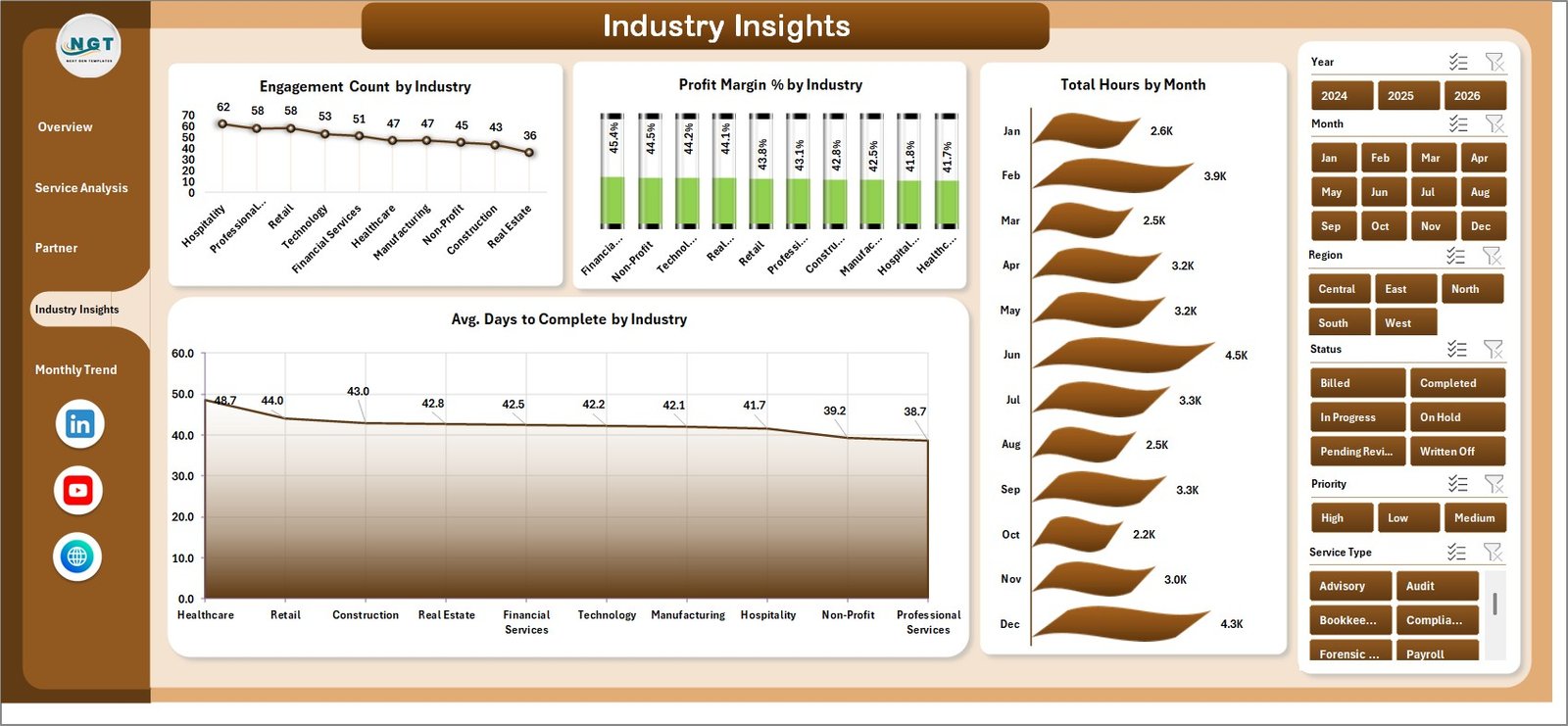
Industry Insights
The Industry Insights page helps practices decide where to allocate business development resources:
- Engagement Count by Industry — shows client concentration across sectors such as retail, manufacturing, healthcare, and financial services
- Profit Margin % by Industry — identifies which sectors generate healthy margins vs which are technically complex but margin-thin
- Total Hours by Month — a cross-industry time series showing whether capacity is growing, shrinking, or seasonal
- Avg. Days to Complete by Industry — highlights industries with longer engagement cycles that tie up partner capacity and cash flow
5. Monthly Trend
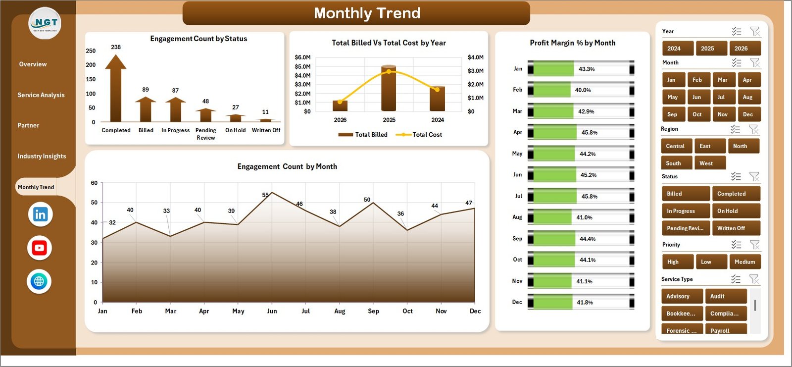
Monthly Trend
The Monthly Trend page is designed for management reporting and board-level reviews:
- Engagement Count by Status — shows the distribution between active, completed, on-hold, and cancelled engagements over time
- Total Billed vs Total Cost by Year — year-on-year comparison of top-line billings against total cost, the clearest indicator of practice-wide profitability trajectory
- Profit Margin % by Month — a monthly view of margin fluctuation, revealing seasonality and one-off cost events
- Engagement Count by Month — tracks volume trends that often precede revenue changes by 30–90 days
6. Data Sheet
Data Sheet Tab
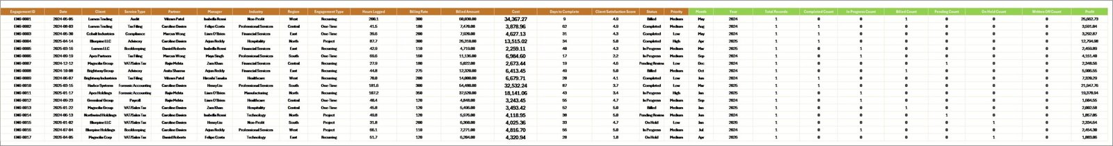
The Data sheet is the single source of truth for the entire dashboard. Enter one row per engagement using the same column headers provided in the sample data: engagement ID, client name, service type, partner, manager, region, industry, start date, completion date, billed amount, cost, hours, CSAT score, and status. All dashboard pages draw from this sheet via pivot tables.
7. Support Sheet
Support Sheet Tab
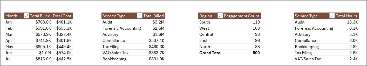
The Support sheet contains all pivot tables that feed the 20 charts across the five dashboard pages. You do not need to edit this sheet. After updating your Data sheet, go to the Excel Ribbon → Data → Refresh All, and every pivot will regenerate automatically. Hide this sheet from regular users once the dashboard is deployed.
Accountancy Practice Dashboard in Excel vs. Google Sheets vs. Paid Practice Management SaaS — Feature Comparison
| Feature | Accountancy Practice Dashboard in Excel | Google Sheets Dashboard | Karbon / Xero Practice Manager |
|---|---|---|---|
| Cost | $17.99 one-time | $0–15 one-time | $59–$99/user/month |
| Platform | Microsoft Excel (offline + cloud) | Browser-based | Cloud SaaS only |
| Setup time | <10 minutes | <15 minutes | 2–6 weeks + onboarding |
| Real-time collaboration | Via OneDrive / SharePoint | ✅ Native | ✅ Native |
| Mobile access | Via Excel Mobile | ✅ Full | ✅ Full |
| Customisable fields | ✅ Full control | ✅ Full control | Limited |
| Partner-level CSAT tracking | ✅ Built-in | Manual setup | ✅ Built-in |
| Year-1 cost at 5 users | $17.99 total | $0–15 total | $3,540–$5,940 |
For accounting practices that want partner-level analytics without per-seat SaaS fees, the Accountancy Practice Dashboard in Excel sits in the sweet spot.
Who Should Use This Template
Perfect for:
- CPA firms and chartered accounting practices monitoring billing and cost by service and partner
- Practice managers preparing monthly board packs and partner review reports
- Finance directors at mid-size firms (5–200 staff) replacing manual reporting workflows
- Solo accountants tracking engagement profitability without investing in practice management software
Not a fit if:
- You need real-time multi-user CRM with automated workflow triggers (consider Karbon or CCH Axcess)
- Your team has no access to Microsoft Excel 2016 or later
- You require automated invoicing directly from the dashboard
Real-World Use Cases
James manages a 40-person regional CPA firm. Each month he pastes updated engagement records into the Data sheet, clicks Refresh All, and sends the Partner Performance page to managing partners. A process that used to take 3 hours now takes under 10 minutes. He uses the Avg. CSAT by Partner chart to spot client satisfaction dips before they become retention problems.
Priya is a finance controller at a multi-industry accounting practice. She pulls the Industry Insights page every quarter to compare Profit Margin % across retail, manufacturing, and healthcare clients. The analysis directly informs which sectors get prioritised in the firm’s business development plan.
A boutique accountancy with 3 partners uses the Monthly Trend page to present Total Billed vs Total Cost by Year at their AGM. It replaces a manually compiled PowerPoint with a live Excel dashboard that’s updated on the morning of the meeting.
Advantages of Accountancy Practice Dashboard in Excel
The biggest advantage is cost: a one-time $17.99 purchase covers the entire firm with no per-user fees and no renewal risk. Practice management SaaS tools like Karbon and Xero Practice Manager charge $59–$99/user/month, making them uneconomical for small and mid-size practices that primarily need analytics rather than workflow automation.
The second advantage is familiarity. Every accountant already knows Excel. There is no learning curve, no vendor-specific UI to master, and no risk of data being locked in a SaaS platform that could be discontinued or repriced. The pivot table and slicer architecture means any Excel-literate user can maintain, extend, and customise the dashboard independently.
Third, it works entirely offline. The dashboard runs without an internet connection, which matters for firms handling sensitive client data under strict confidentiality requirements.
Opportunities for Improvement
The dashboard does not include automated data import — engagement records must be entered manually or pasted from a CSV export. Firms with large volumes of monthly engagements may find this time-consuming without a pre-built import macro. Additionally, as a pivot-based template, real-time multi-user editing is not supported without a shared OneDrive or SharePoint environment; simultaneous edits by multiple users can cause conflicts. Teams requiring live collaboration should consider the Google Sheets equivalent or a cloud-first SaaS tool.
Best Practices
- Keep the Data sheet column headers unchanged — pivot tables reference named columns and renaming them will break the charts.
- Use a consistent date format across all rows to ensure monthly trend charts group correctly.
- Add new engagements at the bottom of the Data sheet rather than inserting rows in the middle, to keep the pivot table’s data range intact.
- After any data update, always click Refresh All before reviewing the dashboards.
- Set a recurring monthly reminder to update the Data sheet and distribute the refreshed dashboard to partners.
Explore Relevant Templates
If you are building out your firm’s analytics toolkit, these related templates complement the Accountancy Practice Dashboard in Excel:
- Accounting Firms Dashboard in Excel — a broader analytics dashboard for accounting firm operations and client profitability.
- Accounting Firms KPI Dashboard in Excel — a scorecard-style KPI view with trend indicators for chartered accountancy practices.
- Accounting Firms Dashboard in Power BI — for practices already invested in the Microsoft Power Platform.
- Financial Tech Startups KPI Dashboard in Excel — track fintech KPIs including MRR, CAC, and churn in a similar multi-page Excel format.
Frequently Asked Questions
What KPIs does the Accountancy Practice Dashboard in Excel track?
The Accountancy Practice Dashboard in Excel tracks 5 KPI cards — Total Cost, Completion %, Engagement Count, Total Hours, and Avg. Hourly Rate — plus 20 charts covering service-level economics, partner performance, industry profitability, and monthly trends across 5 dashboard pages.
Does this template work without internet access?
Yes. The Accountancy Practice Dashboard in Excel runs entirely in Microsoft Excel with no internet connection required. All data, pivot tables, and charts are self-contained within the .xlsx file. An internet connection is only needed if you choose to save the file to OneDrive for team sharing.
How long does setup take?
Initial setup takes under 10 minutes. Open the file, delete the sample rows from the Data sheet, paste your engagement records in the same column format, and click Refresh All. All five dashboard pages update instantly with your real data.
How does this compare to Karbon or Xero Practice Manager?
Karbon and Xero Practice Manager are cloud SaaS tools at $59–$99/user/month with client workflow automation and team CRM features. The Accountancy Practice Dashboard in Excel is a one-time $17.99 analytics-focused download with no subscription, no per-user fees, and full Excel customisability. It covers the reporting and KPI visibility layer; it does not replace workflow automation.
Can I customise the service types, partners, and industries?
Yes. Simply enter your firm’s actual service types, partner names, and client industry categories in the Data sheet. The pivot tables pick them up automatically on the next Refresh All. No formula editing or chart reconfiguration is needed.
Is there a Google Sheets version available?
Not for this specific template, but NextGenTemplates offers a range of Google Sheets Dashboard Templates covering finance, HR, operations, and more.
About the Author
Built by PK — Microsoft Certified Professional with 15+ years of Excel, Google Sheets, and Power BI experience. Founder of NextGenTemplates, reaching 300K+ subscribers across YouTube channels. Every template is hand-built, tested with real-world data scenarios, and released only when it meets the standard PK would use in client engagements. Follow on YouTube.com/@PK-AnExcelExpert for step-by-step tutorial videos.
Conclusion
The Accountancy Practice Dashboard in Excel gives accounting firms and CPA practices a clear, structured view of their engagement portfolio — without the cost or complexity of a SaaS subscription. Five dashboard pages, 20 pre-built pivot charts, 5 KPI cards, and multi-slicer filtering combine into a reporting tool that most practices can set up and customise in a single morning.
👉 Click here to Purchase the Accountancy Practice Dashboard in Excel
✅ Instant download · One-time payment · No subscription
📅 Last updated: May 2026