
Accounting firms and CPA practices typically spend hours each week assembling engagement data into manual reports — extracting billing figures from time-tracking systems, reconciling costs against billed amounts, and preparing partner summary slides by hand. According to Microsoft’s Power BI documentation, interactive dashboards can reduce manual reporting cycles by up to 70%. The Accountancy Practice Dashboard in Power BI eliminates that overhead: 5 headline KPIs, 15+ pre-built visuals across 5 report pages, and multi-dimensional slicers that filter the entire report in a single click — all in a .pbix file that sets up in under 15 minutes.
This guide walks through every page of the dashboard, explains the visuals and KPIs in detail, and shows you how to connect your own engagement data so the dashboard reflects your firm’s real numbers.
What Is the Accountancy Practice Dashboard in Power BI?
The Accountancy Practice Dashboard in Power BI is a fully pre-built .pbix report file covering five analytical dimensions of accounting practice performance: overall KPIs, service-line economics, partner benchmarking, industry-sector profitability, and monthly trends. It uses Power Query for data connectivity and Power BI’s native visual engine for all charts — no custom visuals from AppSource required, no DAX complexity beyond what ships with the template.
The five report pages each address a specific management question. Together they replace the need for a paid practice management SaaS tool for firms that primarily need analytics visibility rather than workflow automation. The same dashboard is also available as the Accountancy Practice Dashboard in Excel for teams on Microsoft Excel.
Dashboard Pages Explanation
1. Overview Page
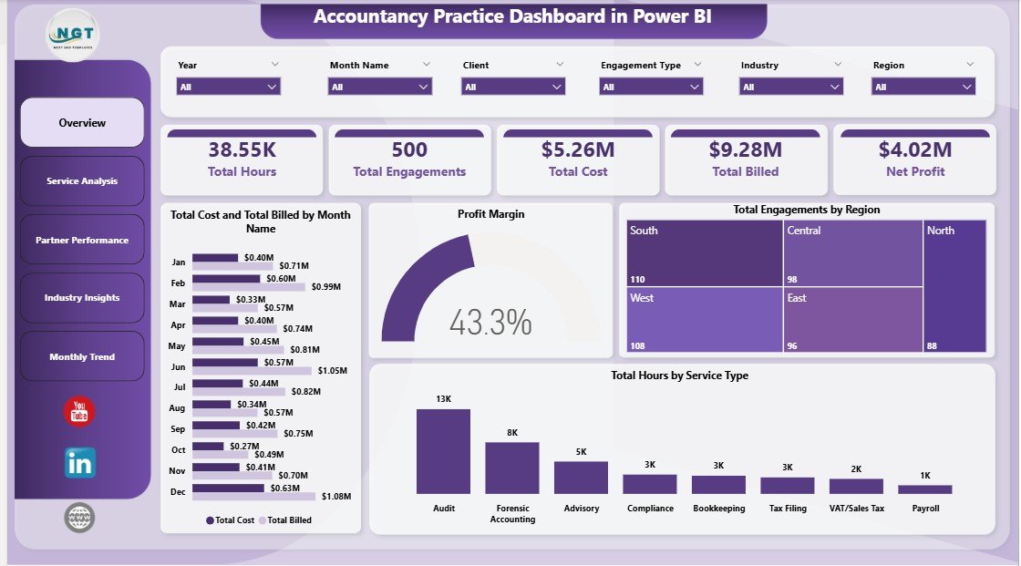
Accountancy Practice Dashboard in Power BI — Overview Page
The Overview page is the command centre for firm-wide performance. Five KPI cards across the top surface the highest-priority metrics at a glance:
- Total Hours — aggregate hours billed or logged across all service types and partners
- Total Engagements — total number of active and closed engagements in the selected period
- Total Cost — aggregate cost across all engagements, including staff time and overhead allocation
- Total Billed — total billed amount across all engagements and service lines
- Net Profit — the difference between Total Billed and Total Cost, the single most important practice health metric
Below the cards, four visuals provide analytical context. Total Cost and Total Billed by Month Name exposes profitability timing — showing months where cost ran ahead of billings. Profit Margin provides a firm-wide margin gauge. Total Engagements by Region shows geographic client distribution, useful for identifying growth markets or resource gaps. Total Hours by Service Type reveals capacity consumption across audit, tax, advisory, and compliance, helping compare billing efficiency across service lines.
Slicers above the canvas filter all four visuals simultaneously by service type, partner, region, or date range — with no DAX changes needed.
2. Service Analysis
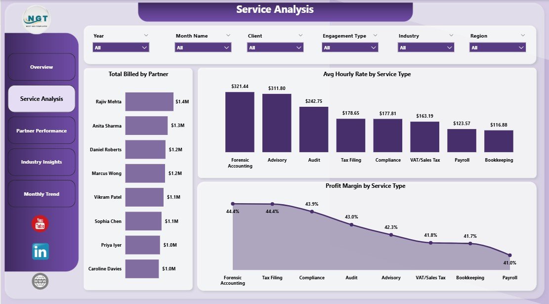
Service Analysis
The Service Analysis page examines the economics of each service line. Three visuals drive this view:
- Total Billed by Partner — shows each partner’s revenue contribution, useful for compensation review and workload balancing across the practice
- Avg Hourly Rate by Service Type — benchmarks the effective rate per service, highlighting where pricing may need adjusting relative to market rates
- Profit Margin by Service Type — the single most strategically important visual; shows which services generate healthy margin and which are technically demanding but margin-dilutive
Practices using this page typically discover that 2–3 service lines account for the majority of their profitability, while others consume significant partner time without proportional return. That insight directly informs pricing strategy and service-mix decisions.
3. Partner Performance
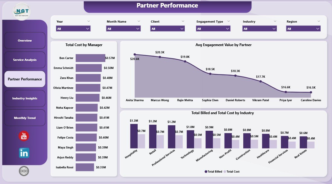
Partner Performance
The Partner Performance page benchmarks each partner and manager against practice-wide metrics:
- Total Cost by Manager — shows cost allocation by manager, useful for identifying overheads concentrated in specific leadership roles
- Avg Engagement Value by Partner — highlights which partners are handling the highest-value mandates vs those managing high-volume but lower-value engagements
- Total Billed and Total Cost by Industry — a cross-cut view showing which client industries generate billing surplus and which run at near-zero margin, informing industry specialisation decisions
4. Industry Insights
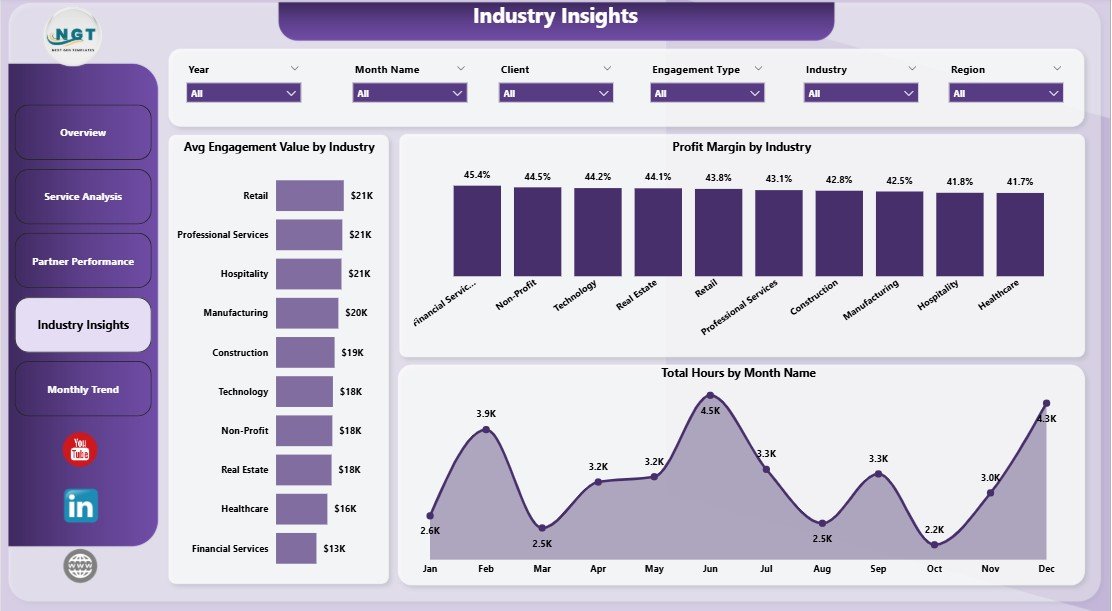
Industry Insights
The Industry Insights page helps practices decide where to focus business development resources:
- Avg Engagement Value by Industry — identifies which sectors command the highest engagement fees, showing where to prioritise pitch activity
- Profit Margin by Industry — reveals sectors that are technically demanding but margin-thin vs those that are fast-moving and profitable
- Total Hours by Month Name — a cross-industry time series showing whether capacity is growing, shrinking, or seasonal across the practice as a whole
5. Monthly Trend
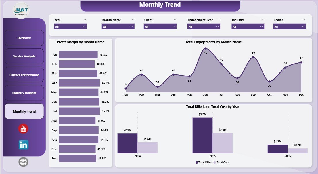
Monthly Trend
The Monthly Trend page is designed for management reporting and board-level reviews:
- Profit Margin by Month Name — a monthly view of margin fluctuation, revealing seasonality patterns and the impact of one-off cost events
- Total Engagements by Month Name — tracks engagement volume trends that often precede revenue changes by 30–90 days
- Total Billed and Total Cost by Year — year-on-year comparison of top-line billings against total cost, the clearest indicator of practice-wide profitability trajectory over multiple years
Accountancy Practice Dashboard in Power BI vs. Tableau / Qlik vs. Paid Practice Management SaaS — Feature Comparison
| Feature | Accountancy Practice Dashboard in Power BI | Tableau / Qlik Build | Karbon / Xero Practice Manager |
|---|---|---|---|
| Cost | $17.99 one-time | $70+ / user / month + build cost | $59–$99 / user / month |
| Platform | Power BI Desktop (free) + optional Service | Tableau Desktop / Qlik Sense | Cloud SaaS only |
| Setup time | Under 15 minutes | 3–6 weeks build cycle | 2–6 weeks + onboarding fees |
| Mobile access | Free Power BI mobile app | Tableau / Qlik mobile | ✅ Full mobile app |
| Customisable KPIs | ✅ Unlimited — you own the .pbix | Unlimited | Limited to vendor’s model |
| Partner-level billing analysis | ✅ Built-in Service Analysis page | Custom build required | ✅ Available |
| Industry profitability by sector | ✅ Built-in Industry Insights page | Custom build required | Limited |
| Year-1 cost at 5 users | $17.99 total | $4,200+ in licenses | $3,540–$5,940 |
For accounting practices that need partner-level analytics without per-seat SaaS fees or a custom Tableau build, the Accountancy Practice Dashboard in Power BI sits in the sweet spot.
Who Should Use This Template
Perfect for:
- CPA firms and chartered accounting practices with Power BI Desktop installed wanting monthly partner and service-line reports
- Practice managers preparing quarterly board packs with billing vs cost and profit margin analysis
- Finance directors at mid-size firms (5–200 staff) replacing manual Excel reporting workflows with Power BI
- Power BI-literate analysts at accounting networks who want a deployment-ready .pbix instead of building from scratch
Not a fit if:
- You need integrated client workflow automation, automated invoicing, or a built-in CRM (consider Karbon or CCH Axcess)
- Your team doesn’t have Power BI Desktop and isn’t willing to install the free Microsoft client
- You require row-level security across 100+ partners with complex permission hierarchies at enterprise scale
Real-World Use Cases
James manages a 40-person regional CPA firm. Each month he pastes updated engagement records into the source Excel file, clicks Refresh in Power BI Desktop, and publishes the updated report to Power BI Service so managing partners can view it on their phones before the monthly review meeting. He uses the Avg Engagement Value by Partner visual to spot which partners are handling below-average mandates, saving roughly 3 hours of manual report preparation per cycle.
Priya is a finance controller at a multi-industry accounting practice with clients across retail, manufacturing, and healthcare. She uses the Industry Insights page every quarter to compare Profit Margin and Avg Engagement Value by Industry, feeding the analysis directly into the firm’s business development plan. The data showed her that healthcare engagements generated the highest average value but retail consumed disproportionate partner hours, leading to a deliberate shift in pitching strategy.
A boutique accountancy with 4 partners replaced a manually compiled PowerPoint deck with this Power BI dashboard for their annual general meeting. The Monthly Trend page’s Total Billed and Total Cost by Year visual presents a clean year-on-year profitability trajectory that used to take half a day to compile. They chose the Power BI version over the Excel version specifically for the browser-based sharing capability via Power BI Service.
Advantages of the Accountancy Practice Dashboard in Power BI
The biggest advantage is cost. A one-time $17.99 purchase covers the entire firm with no per-user fees and no renewal risk. Karbon and Xero Practice Manager charge $59–$99/user/month, making them uneconomical for practices that primarily need analytics visibility rather than workflow automation.
The second advantage is Power BI’s publish-to-web capability. Unlike the Excel version, the .pbix file can be published to Power BI Service so partners, managers, and stakeholders can view the live report in any browser or on the Power BI mobile app without downloading a file or opening a desktop application. This makes it dramatically easier to distribute management reporting across a distributed team.
Third, the data model is clean and extensible. Power BI users who want to add custom DAX measures, change the colour theme, or bring in additional data sources can do so without rebuilding the existing visuals. You own the .pbix file outright — no cloud lock-in, no vendor dependency.
Opportunities for Improvement
The dashboard does not include automated data import — engagement records must be entered manually into the source Excel or CSV file, or the Power Query source step must be pointed at an existing data export from your time-tracking or billing system. Practices with complex data sources may need a Power BI-literate analyst to set up the query path. Additionally, the template uses a single flat data source rather than a multi-table star schema, which means very large datasets (50,000+ rows) may experience slower refresh times in Power BI Desktop.
Best Practices
- Keep the source data column headers unchanged — Power Query references named columns and renaming them will break the refresh step.
- Use a consistent date format across all rows to ensure the monthly trend visuals group correctly.
- After any data update, always click Refresh on the Home ribbon before reviewing the dashboard pages.
- Schedule an automatic refresh in Power BI Service by connecting the published report to a cloud data source such as OneDrive or SharePoint — this keeps the dashboard current without manual intervention.
- Set up row-level security in Power BI Desktop if you plan to share the service report with partners who should only see their own billing data.
Explore Relevant Templates
If you are building out your firm’s analytics toolkit, these templates complement the Accountancy Practice Dashboard in Power BI:
- Accountancy Practice Dashboard in Excel — the same 5 pages and KPI set built on native Excel pivot tables for teams not yet on Power BI.
- Accounting Firms Dashboard in Power BI — a broader analytics dashboard covering accounting firm operations and multi-client profitability.
- Accounting Firms KPI Dashboard in Excel — a scorecard-style KPI view with trend indicators for chartered accountancy practices.
Frequently Asked Questions
What KPIs does the Accountancy Practice Dashboard in Power BI track?
The Accountancy Practice Dashboard in Power BI tracks 5 KPI cards on the Overview page — Total Hours, Total Engagements, Total Cost, Total Billed, and Net Profit — plus 15+ deeper analysis visuals across Service Analysis, Partner Performance, Industry Insights, and Monthly Trend pages covering billing, margin, hourly rates, and engagement volume by partner and industry.
How long does setup take?
Setup of the Accountancy Practice Dashboard in Power BI takes under 15 minutes. Install the free Power BI Desktop application from Microsoft, open the .pbix file, point the Power Query source step at your own engagement Excel or CSV file using the same column structure, and click Refresh. Every KPI card and visual across all 5 pages updates automatically.
How does this compare to Karbon or Xero Practice Manager?
Karbon and Xero Practice Manager are cloud SaaS platforms at $59–$99/user/month with client workflow automation, billing integration, and team CRM. The Accountancy Practice Dashboard in Power BI is a one-time $17.99 analytics template focused on KPI visibility and management reporting. For practices that already manage workflows elsewhere and only need the analytics layer, the Power BI dashboard saves $3,500–$5,900 per year at 5 users.
Can I publish the dashboard to Power BI Service for my team?
Yes. Once you have refreshed the Accountancy Practice Dashboard in Power BI against your data in Power BI Desktop, use the Publish button on the Home ribbon to upload it to your Power BI workspace. Partners and managers can then view the live report in any browser or on the free Power BI mobile app for iOS and Android without needing Power BI Desktop themselves.
Can I customise the service types, partners, and industries?
Yes. The Accountancy Practice Dashboard in Power BI is fully editable in Power BI Desktop. Replace the sample data with your firm’s actual service types, partner names, and client industry categories — the visuals pick them up automatically on the next Refresh. You can also add new DAX measures, change the report theme, or add additional pages without affecting the existing visuals.
Is there an Excel version of this dashboard?
Yes. The Accountancy Practice Dashboard in Excel covers the same 5 analytical pages — Overview, Service Analysis, Partner Performance, Industry Insights, and Monthly Trend — built on native Excel pivot tables and slicers for teams not yet using Power BI Desktop.
About the Author
Built by PK — Microsoft Certified Professional with 15+ years of Excel, Google Sheets, and Power BI experience. Founder of NextGenTemplates, reaching 300K+ subscribers across YouTube channels. Every template is hand-built, tested with real-world data scenarios, and released only when it meets the standard PK would use in client engagements. Follow on YouTube.com/@PK-AnExcelExpert for step-by-step tutorial videos.
Conclusion
The Accountancy Practice Dashboard in Power BI gives accounting firms and CPA practices a clear, structured view of their engagement portfolio in a format that can be published to browsers and mobile devices — without the cost or complexity of a SaaS subscription. Five report pages, 15+ pre-built visuals, 5 KPI cards, and multi-dimensional slicers combine into a management reporting tool that most practices can set up, refresh, and distribute in a single morning.
👉 Click here to Purchase the Accountancy Practice Dashboard in Power BI
✅ Instant download · One-time payment · No subscription
📅 Last updated: May 2026
👉 Youtube.com/@PK-AnExcelExpert