The Telehealth Dashboard in Power BI is a ready-to-use .pbix template that turns raw appointment, doctor, and revenue data into a 5-page interactive analytics report. It tracks 4 executive KPI cards and 14 supporting visuals across Overview, Specialty Analysis, Doctor Performance, Channel Insights, and Patient Trends — and it sets up in under 10 minutes.
If you run a telemedicine practice, a hospital virtual care unit, or a digital-first clinic, this dashboard replaces hours of monthly spreadsheet work with a single click of Refresh. Below is a complete walkthrough of every page, every KPI, and a comparison against alternatives like Microsoft Power BI‘s out-of-the-box features and paid SaaS analytics modules.
Key Features of Telehealth Dashboard in Power BI
The dashboard is engineered around five operational questions every telehealth leader asks every month — and answers each with a dedicated page. Here are the standout features:
- Five purpose-built report pages — Overview, Specialty Analysis, Doctor Performance, Channel Insights, Patient Trends. Each page maps to a different decision-maker.
- Four executive KPI cards on the Overview page — Total Revenue, Total Appointments, Total Cost, and Avg Satisfaction. These four numbers anchor weekly leadership reviews.
- 14 pre-built visuals across the five pages — completion rate, monthly revenue trend, specialty profitability, doctor scorecards, channel mix, device split, age group distribution, and insurance mix.
- Slicers on every page — filter by date range, specialty, doctor, channel, patient type, and device. Every visual on the page re-renders instantly.
- Doctor performance scorecard — revenue, resolution rate, and average consultation duration per doctor on a single page.
- Patient segmentation — appointments by patient type, revenue by insurance type, appointments by age group.
- Works in free Power BI Desktop — no Pro license required to use locally; only needed if you publish to the cloud.
- Fully unlocked .pbix file — change theme, KPIs, slicers, DAX, and branding however you need.
Dashboard Pages Explanation
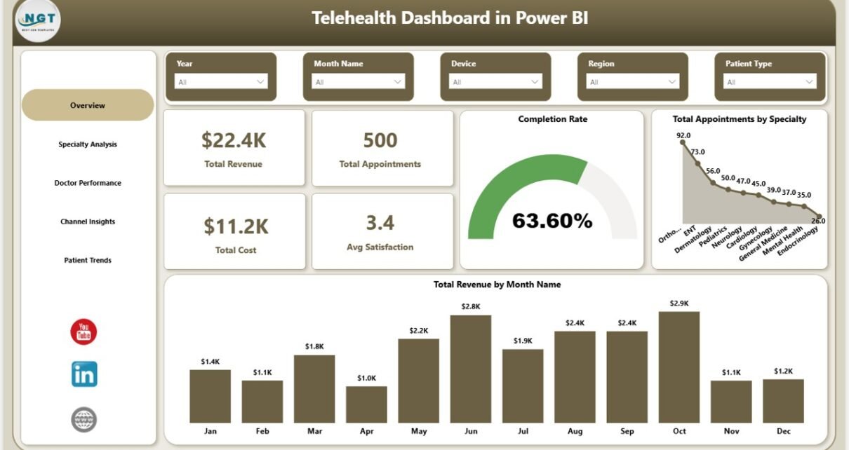
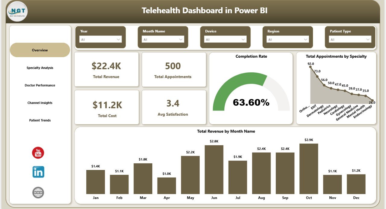
1 — Overview Page
The Overview page is the C-suite view. The top row shows four KPI cards summarizing the entire telehealth operation: Total Revenue, Total Appointments, Total Cost, and Avg Satisfaction. Below those, the Completion Rate visual shows the percentage of booked appointments that actually completed — a direct indicator of operational health. Total Appointments by Specialty reveals which specialties carry the most volume, and Total Revenue by Month Name surfaces seasonal patterns and month-over-month growth. Multiple slicers at the top let you filter every visual on the page at once.
Telehealth Dashboard in Power BI — Overview
2 — Specialty Analysis
This page focuses on per-specialty operational and financial performance. Avg Consultation Duration by Specialty shows where appointments run longer than expected — a sign of either case complexity or scheduling problems. Resolution Rate by Specialty highlights clinical effectiveness by showing what percentage of consultations ended with a resolved case versus needing follow-up. Total Revenue and Total Cost by Specialty overlays revenue against cost on the same chart so you can spot specialties that are profitable versus subsidized.
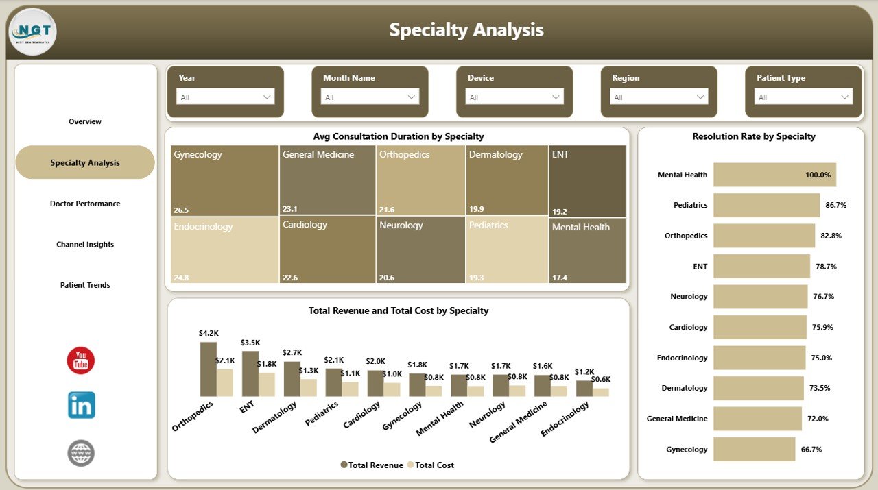
Specialty Analysis
3 — Doctor Performance
The clinical-leadership page. Total Revenue by Doctor Name ranks clinicians by revenue contribution. Resolution Rate by Doctor Name shows quality of outcomes — critical so a high-revenue doctor with a low resolution rate is flagged for coaching. Avg Consultation Duration by Doctor Name reveals capacity — a doctor with very long durations is either taking complex cases or running inefficient consultations. Together these three give a balanced scorecard rather than a single revenue ranking.
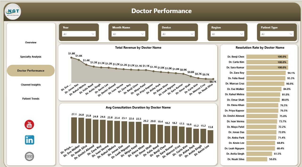
Doctor Performance
4 — Channel Insights
The marketing and product page. Total Appointments by Channel shows which acquisition source — website, app, partner, referral — actually books consultations, not just clicks. Total Appointments by Device reveals the mobile vs desktop vs tablet split, telling you where to invest in UX. Total Revenue by Consultation Type compares revenue across video, audio, and chat consultations, which directly informs pricing strategy.
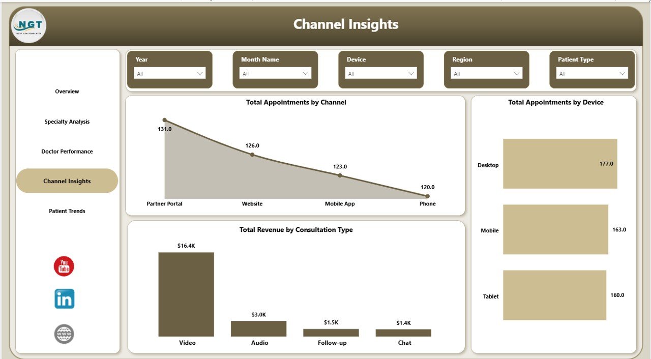
Channel Insights
5 — Patient Trends
The demographics and behaviour page. Total Appointments by Patient Type separates new patients from returning ones — a critical lifecycle metric for retention. Total Revenue by Insurance Type shows how revenue mixes across insurance categories and self-pay, which feeds directly into payer contract negotiations. Total Appointments by Age Group reveals which demographic segments are actually using telehealth — useful for product and marketing teams making targeting decisions.
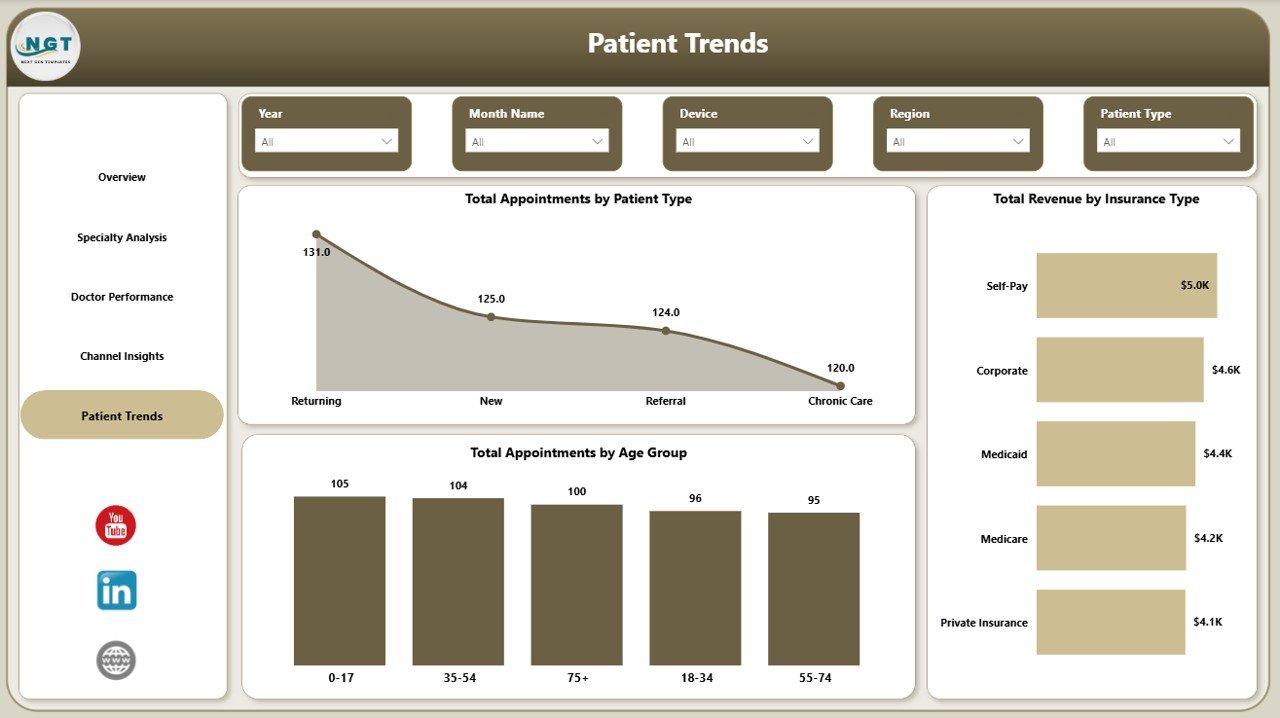
Patient Trends
Telehealth Dashboard in Power BI vs. Tableau vs. Athenahealth — Feature Comparison
| Feature | Telehealth Dashboard in Power BI | Tableau / Qlik Healthcare Dashboard | Athenahealth / Kareo Analytics |
|---|---|---|---|
| Cost | $17.99 one-time | $70 / user / month | $140-400 / provider / month |
| Platform | Power BI Desktop (free) | Tableau / Qlik | Cloud SaaS (vendor-locked) |
| Setup time | Under 10 minutes | 2-6 weeks | 30-90 day implementation |
| Pre-built telehealth KPIs | ✅ 4 cards + 14 visuals | ❌ Build from scratch | ✅ Locked to vendor schema |
| Doctor performance view | ✅ Included | ❌ Custom build | ✅ Limited to in-platform data |
| Customizable | ✅ Full Power BI flexibility | ✅ Full | ❌ Vendor-controlled |
| Year-1 cost at 5 users | $17.99 | $4,200 | $8,400-24,000 |
| Works with any data source | ✅ Excel, SQL, CSV, APIs | ✅ Yes | ❌ Only Athena data |
For telehealth operators that want fast, executive-grade analytics without paying $8,000+ per year for healthcare SaaS, the Telehealth Dashboard in Power BI sits in the sweet spot.
Who Should Use This Template
Perfect for:
- Telehealth practice managers and operations leads at clinics with 5-100 doctors
- Hospital virtual care units who need a unified view of remote consultation performance
- Telemedicine startups outgrowing spreadsheets but not ready for $8K+ per year SaaS
- Healthcare consultants delivering performance reviews to multi-specialty clinics
- Power BI analysts who need a head-start template for a clinical client demo
Not a fit if:
- You’re a solo practitioner doing fewer than 50 consultations per month
- You need HIPAA-audited cloud BI with row-level security across thousands of users
- You don’t have access to Power BI Desktop — try the Telehealth Dashboard in Excel instead
- You need a patient-facing portal — this is an internal management dashboard
Real-World Use Cases
Dr. Mehta runs operations at a 12-doctor multi-specialty telemedicine clinic. Every Monday morning, she opens the Telehealth Dashboard in Power BI, applies the previous-week date slicer, and walks her clinical team through the four KPI cards. She drills into Doctor Performance to flag any clinician whose resolution rate dropped below 85%. What used to be a 3-hour Excel exercise is now a 20-minute review.
Lara leads marketing at a Series A telehealth startup. She uses the Channel Insights page to prove which paid channels are actually generating booked appointments — not just clicks. Last quarter, the dashboard revealed organic referrals were converting 3x better than paid social, and she reallocated $40K in ad spend based on a single slicer-driven view.
Priya is a healthcare consultant. She bought the Telehealth Dashboard in Power BI as a delivery accelerator. She drops in client data, rebrands the visual theme, and presents specialty profitability findings within the first week of every engagement — closing engagements faster and increasing her effective hourly rate.
Advantages of Telehealth Dashboard in Power BI
- One-time $17.99 vs $4,000+ per year for Tableau equivalents — at 5 users, you save more than 99% in year-1 costs.
- Setup measured in minutes, not weeks — replace sample data, hit Refresh, done.
- Decision-ready visuals — every chart maps to a real management question.
- Vendor-independent — works with any data source, no lock-in to a healthcare SaaS schema.
- Full editability — the .pbix file is unlocked so analysts can extend or rebrand freely.
Opportunities for Improvement
Honest limitations — knowing them helps you decide if this template is right for your context:
- Not HIPAA-certified out of the box — if you publish to Power BI Service, your tenant must have its own compliance posture configured.
- No row-level security templates — you would need to add RLS roles yourself for multi-tenant deployments.
- No real-time streaming dataset — refreshes are pull-based; for sub-minute live ops you would need to extend with DirectQuery.
- No mobile-optimized layout out of the box — Power BI mobile renders the desktop layout; you can add a phone-specific layout in Power BI Desktop.
Best Practices
- Keep your raw data in a single appointments table with one row per consultation — denormalize doctor and patient attributes into that table for simpler DAX.
- Refresh daily via Power BI Service if your team works across time zones — schedule overnight refresh to keep morning reviews accurate.
- Use the slicers on a single page rather than across the report — Power BI sync-slicers are cleaner with page-scoped filtering.
- Set up bookmarks for “weekly review” and “monthly board view” — leadership clicks one bookmark to land on the right filtered view.
- Pair this dashboard with a row-level data quality check — bad data in any column propagates silently into all 14 visuals.
Explore Relevant Templates
- Telehealth Dashboard in Excel — same metrics, native Excel build for spreadsheet-first teams.
- Telemedicine Platforms KPI Dashboard in Power BI — broader telemedicine KPI view with platform-level metrics.
- Medical Practice Dashboard in Google Sheets — in-clinic visit-tracking dashboard.
- Home Health Care KPI Scorecard in Excel — visit-based home care performance.
- Mental Health Services Report in Excel — behavioural-health-specific reporting.
Browse all Power BI Dashboard Templates on NextGenTemplates.
Frequently Asked Questions
What KPIs does the Telehealth Dashboard in Power BI track?
The Telehealth Dashboard in Power BI tracks 4 executive KPIs (Total Revenue, Total Appointments, Total Cost, Avg Satisfaction) plus 14 supporting visuals across specialty performance, doctor scorecards, channel mix, device split, consultation types, patient segmentation, insurance mix, and age group analysis.
Do I need a Power BI Pro license to use this dashboard?
No — the Telehealth Dashboard in Power BI runs entirely in Power BI Desktop, which is free from Microsoft. You only need a paid Power BI Pro or Premium licence if you want to publish the report to the Power BI Service cloud and share it across your organisation.
How long does setup take?
Setup typically takes under 10 minutes. Open the .pbix file, replace the sample data with your own appointment records keeping column names identical, then click Refresh. All 5 pages, slicers, KPI cards, and visuals update automatically with your real data.
How does this compare to Athenahealth or Kareo analytics?
Athenahealth and Kareo cost $140-400 per provider per month and only analyze data inside their own platforms. The Telehealth Dashboard in Power BI is a $17.99 one-time purchase that works with any data source — Excel, CSV, SQL, or API — giving you full control over your metrics without vendor lock-in.
Can I customize the visuals, colors, and KPIs?
Yes — every visual is editable in Power BI Desktop. You can change the colour theme, add or remove KPI cards, rebuild slicers, write your own DAX measures, and rebrand the dashboard with your clinic’s logo. The .pbix file is fully unlocked, with no protected sheets.
Does the template include sample data?
Yes, the Telehealth Dashboard in Power BI ships with realistic sample appointment, doctor, specialty, and revenue data so you can see exactly how every visual behaves before plugging in your own data. You replace the sample via the Power Query editor.
About the Author
Built by PK — Microsoft Certified Professional with 15+ years of Excel, Google Sheets, and Power BI experience. Founder of NextGenTemplates, reaching 300K+ subscribers across YouTube channels. Every template is hand-built and tested before release.
Conclusion
The Telehealth Dashboard in Power BI gives you executive-grade analytics for your virtual care operation in under 10 minutes — at less than 0.5% of the cost of comparable Tableau or Athenahealth deployments. Five pages, four KPI cards, fourteen visuals, complete slicer control, and a fully unlocked .pbix file you can rebrand and extend.
👉 Click here to Purchase Telehealth Dashboard in Power BI
✅ Instant download · One-time payment · No subscription · Lifetime access
For more Excel, Power BI, and dashboard tutorials, visit Youtube.com/@PK-AnExcelExpert.
📅 Last updated: May 2026