Alumni offices sit on more data than they can read. A single membership export carries giving history, chapter, graduating cohort, faculty, tier, renewal status, event attendance and volunteer hours – and most of it gets reduced to one number in a board pack. The Alumni Associations Dashboard in Power BI takes that same export and turns it into five linked report pages: giving, chapters, engagement and membership health, plus a catalogue page.
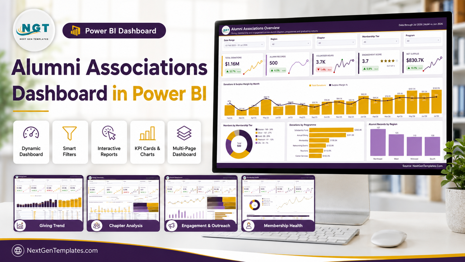
The shipped file is a .pbix with a working sample model: 500 alumni records, 18 months of monthly history (February 2025 to July 2026), 8 regional chapters, 5 membership tiers, 6 giving programmes and 6 outreach channels, driving 25 KPI cards across the five pages. Every figure you see in the screenshots below is fictional sample data – it exists so the visuals render the moment you open the file, not because it describes any real institution.
Key Features of the Alumni Associations Dashboard in Power BI
- An open semantic model. A Power Query import table for the alumni fact rows plus a date table generated in M. Both are visible and editable in Transform Data – there is no black box to work around.
- Explicit DAX measures. Total Donations, Total Pledged, Pledge Fulfillment %, Avg Gift Size, Major Donors, Net Surplus, Surplus Margin %, Income / Member, Engagement Rate, Outreach Response, Volunteer Rate, Elite Share, Active Members and Churn Rate are all written as named measures, each with a month-over-month companion.
- SVG KPI cards. Every card renders its own delta chip and a lollipop sparkline of the trailing series, green when the metric improved on the prior month and red when it fell.
- Synced slicers. Date Range, Region, Chapter and Membership Tier are shared across pages; each page adds one slicer of its own – Program, Graduation Decade, Faculty, Engagement Channel or Membership Status.
- A hidden Details drillthrough page. Right-click a chapter bar, a cohort or a tier row and drill through to the underlying records with the filter context intact.
- Two custom tooltip pages, so hovering a visual returns a small formatted report rather than a bare value.
- A theme JSON holding the palette, fonts and visual defaults – edit it once and every page follows.
Dashboard Pages Explanation
Page 1 – Alumni Associations Overview
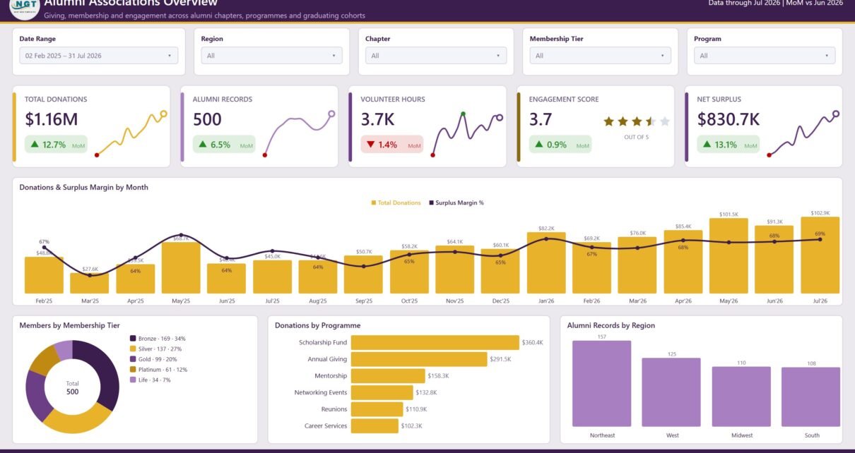
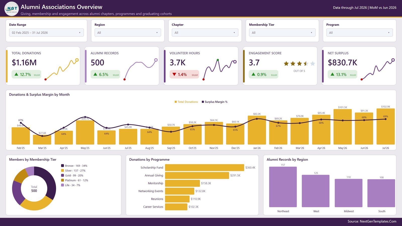
The landing page carries five cards: Total Donations, Alumni Records, Volunteer Hours, Engagement Score (out of 5, shown as a star rating) and Net Surplus. Below them, Donations & Surplus Margin by Month puts monthly giving on columns and surplus margin on a line across the same 18 months, so a strong donation month with a thin margin is immediately visible. The bottom row holds a donut of Members by Membership Tier, a horizontal bar chart of Donations by Programme (Scholarship Fund, Annual Giving, Mentorship, Networking Events, Reunions, Career Services) and a column chart of Alumni Records by Region.
Page 2 – Giving Trend
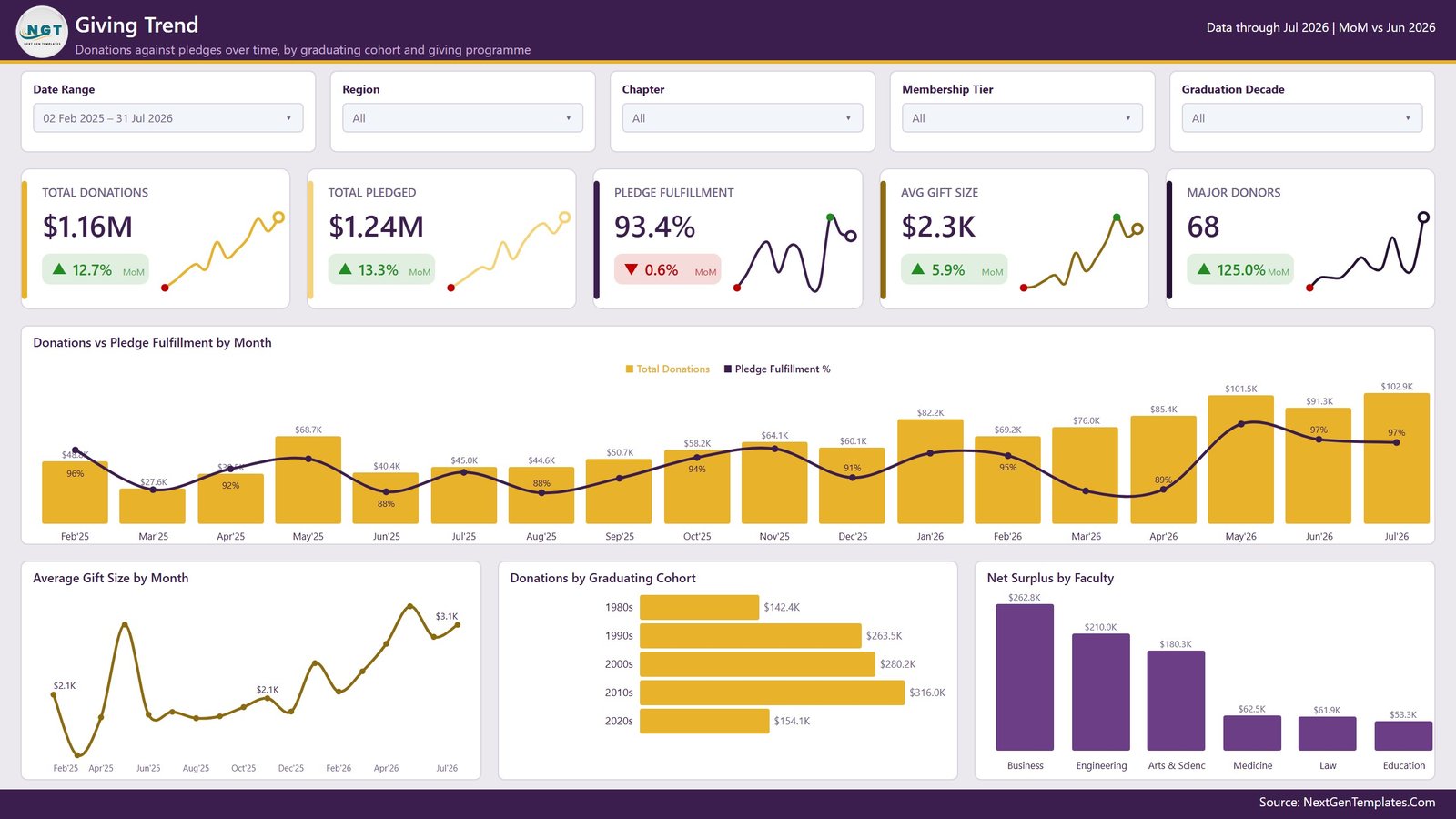
This page answers one question: are pledges turning into money? Total Donations and Total Pledged sit next to Pledge Fulfillment %, Avg Gift Size and Major Donors. Donations vs Pledge Fulfillment by Month overlays the fulfilment line on the donation columns, and a separate Average Gift Size by Month line chart shows whether growth came from more gifts or bigger ones. Donations by Graduating Cohort splits giving across the 1980s through the 2020s, and Net Surplus by Faculty breaks the result down by academic school. The Graduation Decade slicer only appears here.
Page 3 – Chapter Analysis
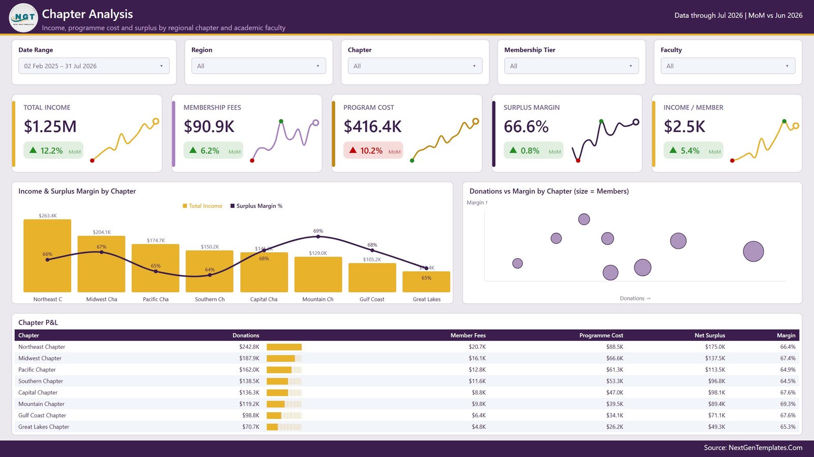
The financial page. Total Income, Membership Fees, Program Cost, Surplus Margin and Income / Member head the layout. Income & Surplus Margin by Chapter ranks the eight chapters by income with margin on a line – and it is where the interesting tension shows up, because the chapter with the largest income is rarely the one with the best margin. Beside it, a scatter chart plots Donations vs Margin by Chapter with bubble size set to member count. Underneath sits a full Chapter P&L matrix: donations, member fees, programme cost, net surplus and margin per chapter, with in-cell data bars on the donations column.
Page 4 – Engagement & Outreach
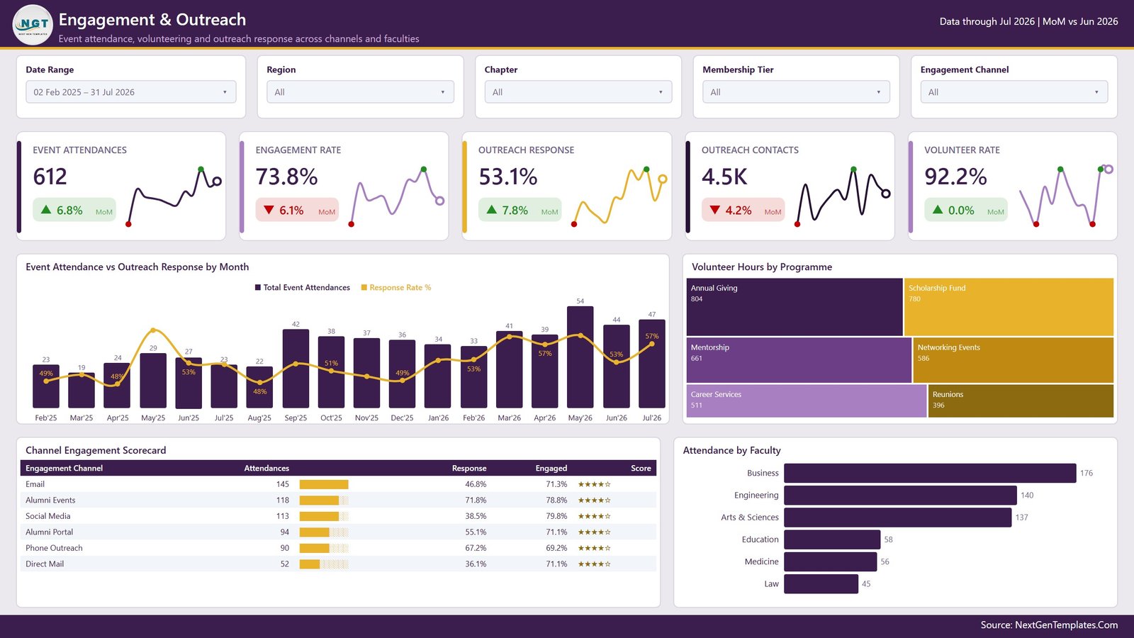
Event attendance, volunteering and outreach response. Cards cover Event Attendances, Engagement Rate, Outreach Response, Outreach Contacts and Volunteer Rate. Event Attendance vs Outreach Response by Month pairs attendance columns with a response-rate line. A treemap of Volunteer Hours by Programme sizes each programme by hours contributed. The Channel Engagement Scorecard matrix ranks Email, Alumni Events, Social Media, Alumni Portal, Phone Outreach and Direct Mail on attendances, response, engaged share and a star score – a quick way to see that the channel with the most contacts is not always the one with the best response. Attendance by Faculty closes the page.
Page 5 – Membership Health
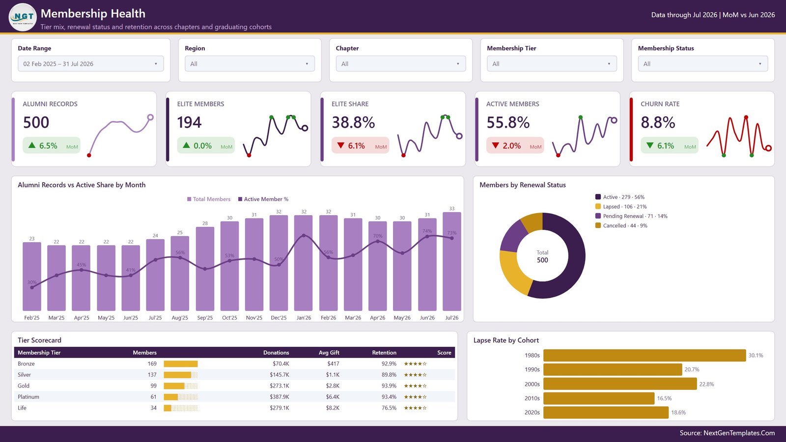
Retention. Alumni Records, Elite Members, Elite Share, Active Members and Churn Rate sit above Alumni Records vs Active Share by Month. A donut breaks members into Active, Lapsed, Pending Renewal and Cancelled. The Tier Scorecard matrix lists members, donations, average gift and retention for Bronze through Life, and Lapse Rate by Cohort shows which graduating decades drift away fastest. In the sample data the oldest cohort lapses most and gives most – the kind of contradiction this page is built to surface.
Page 6 – Get More Dashboards
A catalogue page inside the report, linking to other NextGenTemplates Power BI builds and to the customisation service. Delete it before circulating the file internally if you would rather not ship a shop window.
Alumni Associations Dashboard in Power BI vs. Excel vs. a Paid Alumni CRM – Feature Comparison
| What matters | This Power BI dashboard | Excel dashboard | Paid alumni CRM / SaaS |
|---|---|---|---|
| Cost | One-time purchase | One-time purchase | Annual subscription, usually per constituent record |
| Platform | Power BI Desktop (free) or the Power BI Service | Microsoft Excel | Vendor-hosted web app |
| Setup time | About 20 minutes to repoint the query and refresh | About 15 minutes to paste data | Weeks – migration plus onboarding |
| Real-time team collaboration | Yes, once published to a workspace | Via OneDrive co-authoring | Yes, built in |
| Mobile access | Yes, Power BI mobile app | Limited | Yes |
| Customisable fields and measures | Full – edit the M query, the DAX and the theme | Full – edit formulas and pivots | Only what the vendor exposes |
| Share with a link | Yes, through the Power BI Service | File sharing only | Yes |
| Year-1 cost at 5 users | The one-time template price | The one-time template price | Quoted annually by the vendor |
| Drillthrough to record level | Yes, hidden Details page carrying filter context | Manual – filter the data sheet | Yes |
| Where the data lives | Your machine or your tenant | Your machine | The vendor’s platform |
Who Should Use This Template
It suits an alumni relations officer who pulls a member export each month and needs the same five views every time; a development or advancement analyst who has to defend chapter-level surplus to a board; a small university foundation without the budget for BI consultants; a regional chapter president reporting upward; and a Power BI learner who wants a finished, readable model to take apart – the DAX and the M are both plain enough to follow.
It is not the right tool if you need write-back into a CRM, automated acknowledgement workflows, payment or receipting functions, or a hosted portal your alumni sign into. Keep receipting and any regulatory or tax reporting in your finance and constituent systems; this file is a reporting layer and nothing more.
Real-World Use Cases
Monthly membership review. Refresh on the first working day, open Membership Health, read Churn Rate and the renewal donut, then drill through the Lapsed segment to produce a call list before lunch.
Chapter funding decisions. Before the annual grant round, sort the Chapter P&L matrix by margin. Chapters that cover their own programme cost argue for themselves; the ones that do not become a conversation rather than a surprise.
Campaign channel planning. Set the Chapter slicer to a single chapter and read the Channel Engagement Scorecard. If Direct Mail carries the lowest attendance and the lowest response for that chapter, the next mailing budget writes itself.
Cohort-based appeals. Use Donations by Graduating Cohort with the Graduation Decade slicer to see which decades respond to which programme, then shape the appeal accordingly.
Advantages of the Alumni Associations Dashboard in Power BI
- One refresh updates everything. Repoint the query once; every card, chart, matrix and slicer follows.
- Measures are readable. Because the KPIs are explicit DAX measures rather than visual-level aggregations, you can audit any number and reuse it in a new visual.
- Record-level answers stay one click away. The drillthrough page means the dashboard never dead-ends at a total.
- Consistent MoM framing. Every card compares to the prior month in the same way, so the pages read as one report rather than five.
- Rebranding is a theme swap, not a visual-by-visual edit.
- Free to run. Power BI Desktop costs nothing; a licence is only needed to publish and share online.
Opportunities for Improvement
Being honest about the edges: the model imports from a file, so there is no live CRM connection out of the box – if your platform offers a Power BI connector you will need to swap the source yourself. The date table is generated in M over a fixed range, so a longer history needs the start and end parameters adjusted. The sample model is a single flat fact table rather than a star schema; that keeps it easy to read but you may want to split dimensions out before scaling past a few hundred thousand rows. Row-level security is not configured – if chapter presidents should only see their own chapter, that is a role you add. And the Get More Dashboards page is marketing; delete it for internal circulation.
Best Practices
- Keep the column headers. The DAX references them by name; rename a column and measures break.
- Refresh on a fixed day so month-over-month deltas compare like with like.
- Clean the export before import – blank tiers and stray date formats are the usual cause of a hollow-looking card.
- Add measures, do not overwrite them. Write a new measure alongside the shipped one so you can compare before switching a visual over.
- Publish to a workspace if more than one person reads it, and set a scheduled refresh rather than emailing files around.
- Treat personal detail carefully. Alumni records and giving history are personal data – share the report with the smallest group that needs it, and use the aggregate pages for wider circulation.
Microsoft’s own documentation on setting up drillthrough in Power BI is worth reading before you extend the Details page.
Explore Relevant Templates
- Alumni Associations Dashboard in Power BI – the template covered in this post.
- Alumni Associations Dashboard in Excel – the same five pages built with pivot tables and slicers.
- Nonprofit Fundraising Dashboard in Power BI – campaign-level giving instead of membership.
- Disability Support NGOs Dashboard in Power BI – programme delivery and beneficiary reporting.
- Airline Loyalty Programs Dashboard in Power BI – another tier-and-retention model.
- Carpooling Platforms Dashboard in Power BI – membership and usage analytics in a mobility setting.
Frequently Asked Questions
Do I need a paid Power BI licence to use this dashboard?
No. Power BI Desktop is free from Microsoft and opens the file completely. A Pro or Premium licence is only needed to publish the report to a workspace and share it online.
Are the alumni figures in the screenshots real?
No. Every record, donation amount, chapter and percentage in the sample model is fictional, generated so the visuals populate on first open.
Can I connect it to my alumni CRM?
Not out of the box – it reads a flat export. If your CRM exposes a supported Power BI connector you can change the source step in Power Query, but the shipped configuration expects a file.
Can I add my own KPIs?
Yes. The model is unlocked. Add columns in Power Query, write new DAX measures and drop them on any page.
What exactly is in the download?
A ZIP containing the .pbix report file. Unzip before opening.
Can I use it for donor receipting or compliance reporting?
No. Treat it strictly as a tracking and reporting layer; receipting, acknowledgement and any regulatory or tax obligations belong in your finance and CRM systems.
How many chapters and tiers does it support?
The sample carries 8 chapters and 5 tiers, but nothing is hard-coded – the visuals and slicers expand to whatever your data contains.
About the Author
Built by PK – Microsoft Certified Professional with 15+ years of Excel, Google Sheets, and Power BI experience. Founder of NextGenTemplates, reaching 300K+ subscribers across YouTube channels. Every template is hand-built and tested before release.
Conclusion
Most alumni reporting fails not because the data is missing but because it never gets assembled in one place. The Alumni Associations Dashboard in Power BI assembles it: giving against pledges, chapter surplus, channel response and membership retention, all filtered by the same four slicers and all traceable back to the records behind them. Point the query at your own export, refresh, and you have a monthly reporting routine instead of a monthly rebuild.
Get the Alumni Associations Dashboard in Power BI – instant download, lifetime access and free minor updates. For step-by-step Power BI and Excel walkthroughs, subscribe at youtube.com/@PKAnExcelExpert.