Tracking public safety incidents — fires, vehicle accidents, patrol responses, equipment damage, vandalism — with three separate spreadsheets and a Friday-afternoon scramble to compile the council report is exhausting. In this article I’ll walk you through a Public Safety Report in Excel that handles all of it in one workbook: 5 KPIs, 5 charts, two slicers, and an Information Table that prints to PDF in two clicks.
You can read this as a tutorial — every screenshot below comes from the actual file — or you can skip to the bottom and download the ready-to-use template. Either way, by the end you’ll know exactly how a four-sheet reporting workbook for public safety is structured and how to adapt it for your own agency.
What is a public safety report?
A public safety report is the periodic (weekly, monthly, quarterly) document that operations, finance, and political leadership use to answer four questions:
- How many incidents did we handle in the period?
- How many are resolved vs. still in progress?
- What did each incident type cost — by department, by region, by month?
- Where are the trends going?
Most municipal agencies and campus safety departments need this report to walk into a council meeting, file a grant application, or sign off a quarterly compliance review. Software vendors sell records management systems (RMS) that produce these reports — but a lean Excel reporting workbook does the same job at $0/month, with no vendor lock-in.
The four sheets at a glance
Sheet 1 is the Summary Page — five KPI cards, five charts, and a right-side slicer. It’s the page you screenshot for the council packet.
Sheet 2 is the Report Page — a left-side slicer and an Information Table. It’s the page you filter and print when the Chief asks for “every incident in District 3 last month.”
Sheet 3 is the Data sheet — the raw record of every incident, one row per event.
Sheet 4 is the Support sheet — pivot tables and lookup logic that drive Sheets 1 and 2. You’ll rarely open it.
Let’s walk through each one.
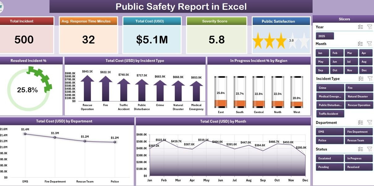
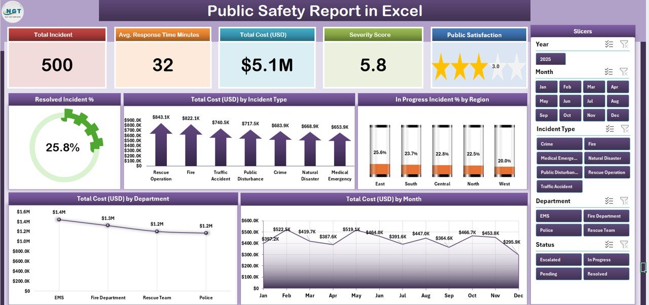
Sheet 1 — Summary Page
The top of the Summary Page shows five KPI cards:
- Total Incidents — count of all rows in the Data sheet (filtered by slicer)
- Resolved % — incidents marked Status = “Resolved” / total incidents
- In Progress % — incidents marked Status = “In Progress” / total incidents
- Total Cost USD — sum of the Cost USD column
- Avg Response — average resolution time in hours
Below the cards, five charts give the visual breakdown:
- Resolved Incident % — donut showing resolved share
- Total Cost by Incident Type — bar chart ranking incident categories by cost
- In Progress Incident % by Region — bar chart highlighting regions with backlog
- Total Cost USD by Department — bar chart for departmental cost ownership
- Total Cost by Month — line chart for trend analysis
The right-side slicer is connected to all five charts and all five KPI cards via a shared pivot cache. Click “Region = North,” and every visual on the page recalculates instantly. (If you’re new to slicers, Microsoft has a clean walkthrough.)
Sheet 2 — Report Page
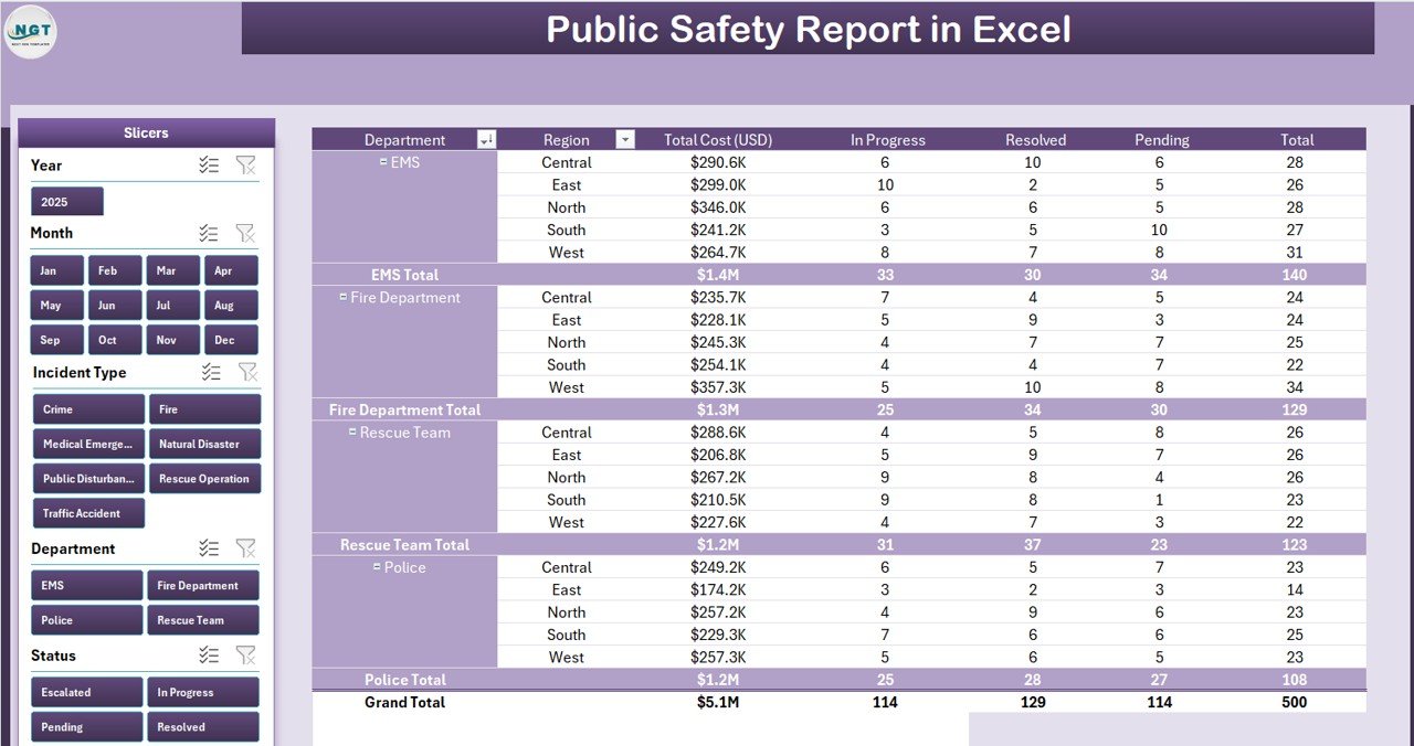
The Report Page is the operational view. It has:
- A left-side slicer with the same fields as the Summary slicer (Region, Department, Incident Type, Month).
- A long Information Table with one row per incident: Incident ID, Date, Type, Region, Department, Cost USD, Status, Resolution Time, and Notes.
The table is set up as an Excel Table (Insert → Table) with banded rows, total row enabled, and structured references. It’s slicer-connected too — so clicking “Department = Fire-Rescue” on the slicer instantly filters the table.
Two clicks to print: File → Print → Active Sheet. Or File → Save As → PDF if you need to email it.
Sheet 3 — Data sheet
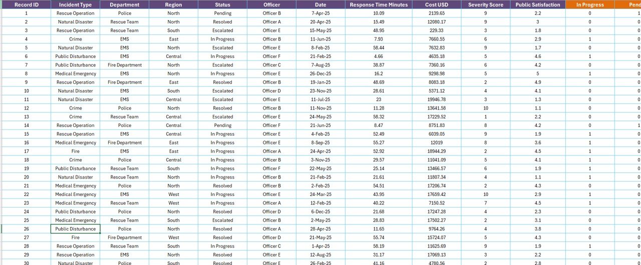
This is where every incident lives. Columns include:
- Incident ID — unique key (e.g., INC-2026-00482)
- Date — date of incident
- Type — vehicle accident, fire, vandalism, medical, etc.
- Region — North, South, East, West (or your district codes)
- Department — police, fire-rescue, EMS, public works, etc.
- Cost USD — total response and recovery cost
- Status — Resolved or In Progress
- Resolution Time (hours) — for closed incidents
- Notes — free-text context
Add new rows at the bottom — every chart, KPI, and slicer downstream is set up with structured references, so they pick up the new rows automatically. (You’ll still need to click Refresh All on the Support sheet’s pivot tables to pick them up. More on that below.)
Sheet 4 — Support sheet
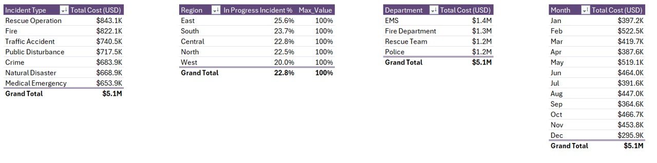
The Support sheet hosts:
- A pivot table for the Resolved % donut
- A pivot table for the Cost by Incident Type bar chart
- A pivot table for In Progress % by Region
- A pivot table for Cost by Department
- A pivot table for Cost by Month line chart
All pivots share the same source range: the Data sheet’s Excel Table. That’s important — it means a single Refresh All updates every visual on the workbook in one click.
How to use the workbook (5 steps)
- Open the file in Microsoft Excel desktop (2016 or newer; Microsoft 365 recommended).
- Paste your incident records into the Data sheet — one row per incident, matching the column order.
- Refresh the pivots. Go to the Data ribbon and click Refresh All. This rebuilds every pivot cache.
- Open the Summary page. Confirm KPI cards and all five charts are showing your numbers.
- Filter with slicers. Use the right-side slicer on the Summary page or the left-side slicer on the Report page. Slicers can multi-select with Ctrl+click.
That’s it. From a blank workbook to a printable summary in under five minutes once your data is ready.
Customising the template for your agency
Three customisations are common:
Add a custom column to the Data sheet. The Data sheet is an Excel Table — adding a column to the right is automatic. Right-click the Support sheet’s pivot caches and choose Refresh so the new field shows up in pivot field lists.
Change the slicer fields. Right-click any slicer → Slicer Settings → and rename, hide, or sort options. To add a brand-new slicer field (e.g., Officer Name), drag the field into the pivot’s Filters area and Insert Slicer.
Update the colour palette. The KPI cards and charts use Excel’s theme colours. Page Layout → Colors → choose any built-in palette or create a custom one. Every visual repaints in two seconds.
When Excel is the right tool — and when it isn’t
Excel is the right tool when you need:
- Reporting and presentation, not real-time dispatch
- A workbook a single analyst can own end-to-end
- A file that opens on every laptop in the building, online or offline
- Fast iteration — a column change is a minute, not a vendor ticket
Excel is the wrong tool when you need:
- A live CAD (Computer-Aided Dispatch) system feeding real-time location data
- 50+ field officers editing the same record simultaneously
- Federally-mandated chain-of-custody on individual evidence records
In those cases, an RMS like Mark43 or Tyler is appropriate — and you can still run this Excel report on top of the RMS export to get a board-ready summary.
Frequently asked questions
Does this template work in Excel for Mac?
Yes. The workbook opens identically in Excel for Mac (Microsoft 365). Slicers and pivot tables behave the same way. The desktop app is recommended over Excel for the web for slicer responsiveness on this file.
How many incidents can I track?
The workbook is tested up to 50,000 incident rows on a standard laptop. For most municipal and campus reporting cycles, you will not approach that limit.
Can I add my own incident categories?
Yes. Just type new category names into the Type column on the Data sheet. After Refresh All, your new categories appear in slicer options and chart legends automatically.
Is the file editable?
Fully editable. No locked sheets, no hidden formulas, no password. Adapt every column, formula, and chart to your agency’s needs.
Do I need VBA or macros?
No. The workbook uses native Excel features only — pivot tables, slicers, and structured references. No VBA, no macros, no add-ins. It opens cleanly under any macro security setting.
Can I share it with my whole team?
Yes. Save it on a shared drive, OneDrive, or SharePoint. Multiple users can open it; for true real-time co-authoring, save to OneDrive and use Excel for the web (slicers will work with reduced animation).
Built by a Microsoft Certified Excel professional
Hi, I’m PK — Microsoft Certified Professional and creator of the @PK-AnExcelExpert YouTube channel (~297K subscribers). I’ve built and shipped Excel, Power BI, and Google Sheets reporting templates for 15+ years. Every workbook on NextGenTemplates.com is reviewed for formula integrity, accessibility, and reporting clarity before it ships.
Download the ready-made template
Building this workbook from scratch — sourcing pivot caches, designing KPI cards, wiring the slicers, formatting the charts — takes a focused day or two. The finished version is ready in 5 minutes and costs less than a coffee.
Click here to Purchase the Public Safety Report in Excel
You’ll receive the .xlsx file instantly, with lifetime use across your agency.
Related tutorials on PK An Excel Expert
- Crisis Response KPI Dashboard in Power BI
- Incident Management KPI Dashboard in Power BI
- Smart Cities Contract Dashboard in Excel
- Street Lighting Services KPI Dashboard in Excel
Visit our YouTube channel to learn step-by-step video tutorials