The Incident Management KPI Dashboard in Power BI tracks IT incident performance across 3 interactive pages, comparing MTD and YTD actuals against targets and prior-year benchmarks. Setup takes under 10 minutes — fill 3 Excel tabs (Input_Actual, Input_Target, KPI Definition) and the entire .pbix file refreshes automatically.
For IT and service operations leaders who want a clean, one-screen view of incident KPIs without paying $45-180 per agent per month for ServiceNow ITSM or building a custom Tableau workbook, this Incident Management KPI Dashboard in Power BI offers a $11.99 one-time-purchase reporting layer that sits on top of any ITSM tool’s monthly export.
Introduction to the Incident Management KPI Dashboard
Incident management is the heartbeat of any IT or service operations function. Whether you run a 30-person fintech service desk or a 1,000-person managed services consultancy, the same questions come up at every monthly review: What’s our MTTR by priority? Are we hitting SLA? How does this month compare to last year? Which incident groups are getting worse?
The Incident Management KPI Dashboard in Power BI answers all of these in one place. The .pbix file pulls from a simple Excel data source — three sheets you fill in by hand or by export — and produces a 3-page Power BI deck with a Summary KPI table, a KPI Trend page with combo charts, and a hidden drill-through KPI Definition page.
If you’ve used our Customer Support SLA KPI Dashboard or the Crisis Response KPI Dashboard, the structure here will feel familiar — same 3-page layout, same MTD/YTD/PY framework, but tuned for incident KPIs like MTTR, SLA Compliance %, and Reopened Incident Rate.
Key Features of the Incident Management KPI Dashboard
- 3-page Power BI structure – Summary page, KPI Trend page, and hidden drill-through KPI Definition page.
- MTD and YTD comparison – every KPI displays Actual CY MTD vs Target CY MTD and Actual CY YTD vs Target CY YTD, plus same period of previous year.
- Visual ▲▼ status icons – red/green indicators auto-apply per LTB (Lower the Better) or UTB (Upper the Better) logic.
- Two interactive slicers – Month and KPI Group on the Summary page; KPI-name slicer on the Trend page.
- 3 KPI summary cards – Total KPIs, MTD Target Met, MTD Target Missed.
- Excel-driven data source – fill 3 worksheets (Input_Actual, Input_Target, KPI Definition) and refresh.
- Drill-through KPI Definition – right-click any KPI row to see formula and definition; back button returns you to Summary.
- No DAX coding required – the .pbix file ships with all measures pre-built.
Dashboard Pages Explanation
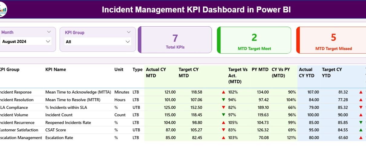
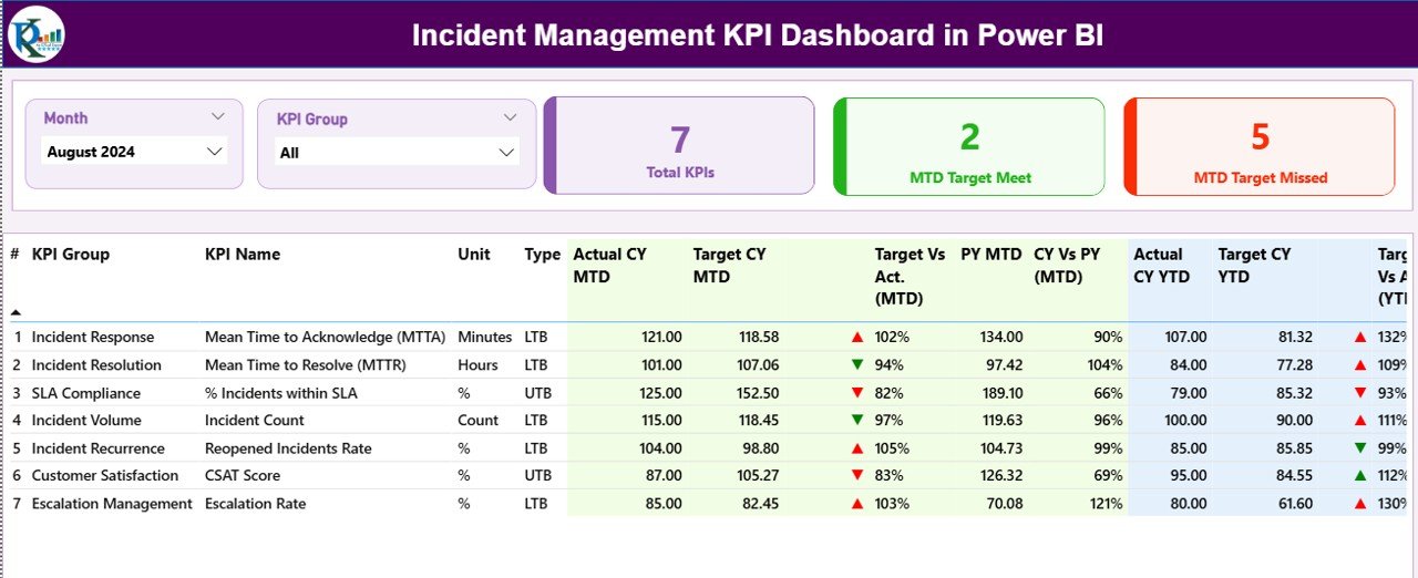
Page 1 — Summary Page
The Summary Page is the main view. Two slicers sit at the top — Month and KPI Group — for one-click filtering. Three header cards display the Total KPIs count, MTD Target Met count, and MTD Target Missed count, so leaders see incident posture in 5 seconds.
Below the cards, a detailed KPI table shows 16 columns: KPI Number, KPI Group, KPI Name, Unit, Type (LTB/UTB), Actual CY MTD, Target CY MTD, MTD Icon, Target Vs Act. (MTD) %, PY MTD, CY Vs PY (MTD) %, Actual CY YTD, Target CY YTD, YTD Icon, Target Vs Act. (YTD) %, PY YTD, and CY Vs PY (YTD) %. The MTD Icon and YTD Icon columns use ▼ red and ▲ green markers based on whether the KPI is hitting its target.
Page 2 — KPI Trend Page
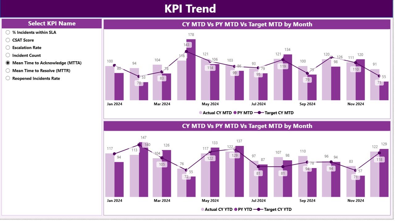
The KPI Trend Page features two side-by-side combo charts. The left chart shows MTD Actual CY, MTD Actual PY, and MTD Target across all 12 months. The right chart shows the same three series for YTD numbers. A KPI-name slicer on the left filters both charts simultaneously, so you can isolate one incident KPI and study its 12-month behavior end-to-end.
Page 3 — KPI Definition Page (drill-through, hidden)
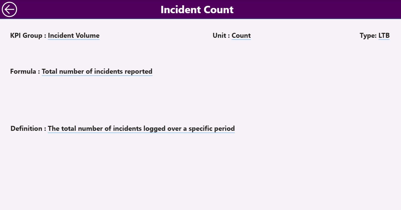
The KPI Definition Page is hidden by default. From the Summary page, right-click any KPI row and select “Drill through > KPI Definition” to land here. The page shows that KPI’s formula and definition, helping new team members or stakeholders self-explain what each metric measures. A back button in the top-left corner returns you to the Summary view.
Excel Data Source — 3 Sheets
The dashboard reads from an Excel file with three worksheets:
- Input_Actual – fill KPI Name, Month (first date of the month), MTD number, and YTD number per row.
- Input_Target – same structure, but with target values per KPI Name and Month.
- KPI Definition – fill KPI Number, KPI Group, KPI Name, Unit, Formula, Definition, and Type (LTB or UTB).
That’s it. Once the three sheets are filled, click Refresh in Power BI Desktop and the entire dashboard updates. No DAX, no queries, no Power Query M code to maintain. Microsoft’s official Power BI Excel data connector documentation covers the underlying connection method if you want to dig deeper.
Incident Management KPI Dashboard vs. Tableau / Qlik vs. ServiceNow / Jira Service Management — Feature Comparison
| Feature | Incident Management KPI Dashboard (Power BI) | Tableau / Qlik dashboard | ServiceNow ITSM / Jira Service Mgmt |
|---|---|---|---|
| Cost | $11.99 one-time | $15-75 / user / month | $45-180 / agent / month |
| Platform | Power BI Desktop (free) | Tableau Cloud / Qlik Sense | SaaS (browser-based) |
| Setup time | Under 10 minutes | 2-4 weeks | 4-12 weeks |
| MTD vs YTD vs PY built in | ✅ | Custom build required | Custom report build |
| LTB / UTB logic per KPI | ✅ | Manual config | Manual config |
| Drill-through KPI definition | ✅ | ✅ | Limited |
| Editable for non-IT users | ✅ (Excel-driven) | Requires Tableau skills | Requires admin role |
| Year-1 cost at 5 users | $11.99 | $900-4,500 | $2,700-10,800 |
| Vendor lock-in | None — files are yours | Subscription only | Subscription only |
For IT teams that want incident KPI tracking without paying ServiceNow or burning Tableau license clock, the Incident Management KPI Dashboard sits in the sweet spot.
Who Should Use This Template
Perfect for:
- IT Service Managers and Service Desk leads at 20-1,000 person companies tracking monthly incident posture.
- NOC and Operations Managers who report MTTR, SLA compliance, and reopened-incident rate to leadership.
- ITSM consultants who need a quick reusable reporting layer on top of ServiceNow, Jira, or Freshservice exports.
- Power BI users who want a working KPI-table layout to copy into other domains.
Not a fit if:
- You need real-time alerting or paging — this is a monthly KPI review dashboard, not an SRE incident response tool.
- You need direct API integration into ServiceNow, Jira, or BMC Helix without an Excel intermediate file.
- You don’t have Power BI Desktop installed (free download required).
Real-World Use Cases
Priya is the IT Service Desk Manager at a 250-person fintech company. Every month-end she pulls MTTR by priority, SLA compliance %, P1 incident count, and reopened-incident rate from ServiceNow into the Excel data file. Twenty minutes later she has a polished 3-page Power BI deck for the CTO. She replaced a $9,000/year Tableau seat with this template.
Arjun runs a 12-person managed services consulting firm. He uses the Incident Management KPI Dashboard as a deliverable layer for his clients — each client gets a copy with their own incident data. The drill-through KPI Definition page lets clients self-explain their own formulas without him on the call. He charges $400 per client per month for the reporting service.
Sara is an ITSM consultant on a ServiceNow migration. She uses the Power BI template to validate that the new ServiceNow workflows produce the same numbers as the old Remedy system. Side-by-side MTD CY vs MTD PY makes the migration audit trivially easy.
Advantages of the Incident Management KPI Dashboard
- Cost – one $11.99 payment vs. recurring $900-10,800/year subscriptions for Tableau or ServiceNow.
- Speed – under 10 minutes from download to working dashboard.
- Ownership – the .pbix file is yours forever; no vendor lock-in, no licensing renewals.
- Flexibility – the KPI Definition sheet lets you add, rename, or remove any incident KPI without touching DAX.
- Reusable structure – once you understand the 3-page layout you can apply it to HR, Finance, Manufacturing, or any other domain.
- Native Power BI – publishes to Power BI Service like any other .pbix, integrates with row-level security, scheduled refresh, and Microsoft Teams embeds.
Opportunities for Improvement
Honest constraints to know before buying:
- Not real-time – this is a monthly KPI review dashboard fed by Excel. If you need live incident dashboards with 5-minute refresh from ServiceNow’s API, you’ll need a custom build.
- Excel intermediate file – data has to land in the Input_Actual / Input_Target sheets. Teams that want direct connector to ServiceNow can extend the .pbix with their own Power Query, but the template ships Excel-first.
- Single-currency – there’s no built-in multi-currency or multi-region grouping. Add a column to the KPI Definition sheet if you need it.
- No row-level security out of the box – if you publish to Power BI Service and want different teams to see different KPIs, you’ll configure RLS yourself.
Best Practices
- Pick 8-15 KPIs, not 30. Dashboards with too many KPIs cause leadership to skim and miss the signal. Start lean, add when there’s a real use case.
- Always enter Month as the first date of the month. The dashboard’s MTD/YTD logic depends on consistent date keys.
- Get LTB / UTB right per KPI. MTTR, Reopened Rate, and Backlog Age are LTB. SLA Compliance %, First Call Resolution, and Customer Satisfaction are UTB. Wrong type means wrong red/green icon.
- Fill the KPI Definition fields once and stop. When stakeholders forget what “MTTR” means, drill-through saves the meeting.
- Refresh after every data update. Power BI caches; click Refresh in Desktop or schedule it in the Service.
Explore Relevant Templates
- Customer Support SLA KPI Dashboard in Power BI – same 3-page structure for customer support SLAs.
- Crisis Response KPI Dashboard in Power BI – same MTD/YTD framework for crisis response.
- Office IT Helpdesk Dashboard in Power BI – broader IT helpdesk dashboard covering ticket lifecycle.
- Helpdesk Efficiency KPI Dashboard in Google Sheets – Google Sheets equivalent for non-Power BI teams.
- Customer Service Dashboard in HTML – browser-based dashboard option.
Browse the full KPI Dashboard in Power BI collection for 686+ ready-to-use Power BI templates across every department.
Frequently Asked Questions
What KPIs does the Incident Management KPI Dashboard track?
The Incident Management KPI Dashboard tracks any incident KPIs you define in the KPI Definition sheet — typical examples include MTTR (Mean Time to Resolution), Mean Time to Acknowledge, First Call Resolution Rate, SLA Compliance %, Reopened Incident Rate, P1 and P2 Incident Count, and Backlog Age. The template is KPI-agnostic; you control the list.
How long does setup take?
Under 10 minutes if you already have your incident KPI data in a spreadsheet. Open the .pbix file in Power BI Desktop, point it to your filled Excel file, click Refresh, and every visual updates. No DAX coding, no Power BI experience required beyond opening Desktop.
Do I need a Power BI subscription to use this?
No. Power BI Desktop is free from Microsoft and runs the .pbix file fully on your computer. You only need a Power BI Pro license if you want to publish the Incident Management KPI Dashboard to the Power BI Service for online sharing with your team.
How does this compare to ServiceNow’s built-in dashboards?
ServiceNow ITSM costs $45-180 per agent per month and gives you native dashboards. The Incident Management KPI Dashboard is a $11.99 one-time-purchase reporting layer that sits on top of any ITSM tool’s exports — useful when you want a shareable monthly KPI deck without giving every viewer a ServiceNow license.
Can I customize the KPI list and add my own metrics?
Yes. The KPI Definition sheet drives the entire dashboard. Add a new row with KPI Number, KPI Group, KPI Name, Unit, Formula, Definition, and Type (LTB or UTB), then add matching rows in Input_Actual and Input_Target. Refresh — the new KPI appears automatically across all 3 pages.
What’s the difference between LTB and UTB?
LTB stands for Lower the Better (used for KPIs like MTTR, Reopened Rate, Backlog Age). UTB stands for Upper the Better (used for KPIs like SLA Compliance %, First Call Resolution Rate). The Incident Management KPI Dashboard automatically applies the right green/red ▲▼ icon based on each KPI’s Type.
Does it work with ServiceNow, Jira, or Freshservice data?
Yes. Export your monthly incident KPI numbers from ServiceNow, Jira Service Management, Freshservice, BMC Helix, or any ITSM tool into the Input_Actual and Input_Target Excel sheets. The Incident Management KPI Dashboard doesn’t care about the data source — it cares about the structure of the numbers.
About the Author
Built by PK — Microsoft Certified Professional with 15+ years of Excel, Google Sheets, and Power BI experience. Founder of NextGenTemplates, reaching 300K+ subscribers across YouTube channels (@PK-AnExcelExpert, @NextGenTemplates, @NeoTechNavigators). Every template is hand-built and tested before release.
Conclusion
The Incident Management KPI Dashboard in Power BI gives IT and service operations teams a clean, polished monthly KPI deck for $11.99 — replacing recurring Tableau or ServiceNow seats that cost $900-10,800 per year. Three Excel sheets, three Power BI pages, MTD/YTD/PY comparisons, and visual ▲▼ icons. That’s the whole template.
👉 Click here to Purchase the Incident Management KPI Dashboard in Power BI
✅ Instant download · One-time payment · No subscription
🎥 Visit Youtube.com/@PK-AnExcelExpert for step-by-step Power BI tutorials.
Last updated: April 2026