Title: Rural Development Dashboard in Power BI Slug: rural-development-dashboard-in-power-bi Status: draft Categories: Power BI (237), Templates (12) Focus keywords: Rural Development Dashboard in Power BI, Power BI rural development dashboard, rural development dashboard template, public sector Power BI dashboard, government program dashboard Meta description: Track rural development transactions, hours saved, costs, regions, funding, and service quality with this editable Power BI dashboard.
Rural Development Dashboard in Power BI helps public-sector teams, NGOs, CSR teams, and development program managers turn operational records into clear reporting. Instead of reviewing scattered spreadsheets, monthly summaries, and separate funding reports, this dashboard brings 5 Power BI pages, 5 executive cards, 25 chart views, and multiple slicers into one editable PBIX file. Teams can monitor transactions processed, manual hours saved, total program cost, success rate, satisfaction score, regional performance, funding efficiency, and service quality in a structured reporting experience.
Power BI is especially useful for recurring program review because it can connect data sources, refresh reports, and publish interactive views through Microsoft Power BI Service. You can learn more about the platform from Microsoft Power BI documentation.

Key Features of Rural Development Dashboard in Power BI
- 5 Power BI report pages: Overview, Program Impact, Regional View, Funding Analysis, and Service Quality.
- Executive KPI cards: Track Transactions Processed, Manual Hours Saved, Total Program Cost, Success Rate, and Satisfaction Score.
- 25 analysis views: Review transactions, hours saved, region, department, platform, priority, process, spend, efficiency, and quality.
- Fast slicer filtering: Use report filters to move from national or program-level reporting to more focused views.
- Editable Power BI structure: Customize visuals, fields, colors, measures, and data connections in Power BI Desktop.
- One-time download: Use the dashboard template without a recurring SaaS reporting subscription.
Dashboard Pages Explanation
1. Overview Page
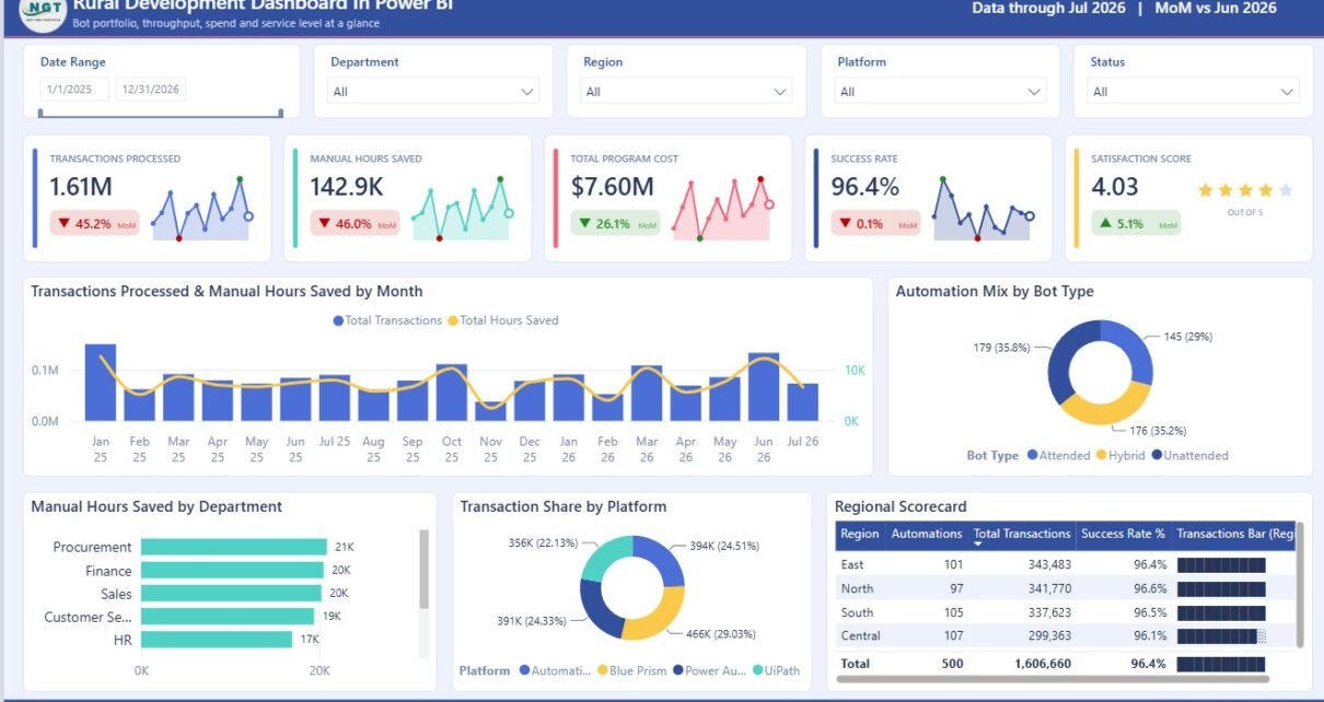
The Overview page is designed for leadership review. It starts with high-level cards for Transactions Processed, Manual Hours Saved, Total Program Cost, Success Rate, and Satisfaction Score, so decision-makers can understand the program position quickly.
Transactions Processed and Manual Hours Saved by Month: This chart compares monthly transaction volume with saved manual effort. It helps show whether operational scale is also producing time savings.
Automation Mix by Bot Type: This chart explains which bot types or automation categories support the program. It helps users understand the technology mix behind rural service operations.
Manual Hours Saved by Department: This view ranks departments by saved effort. It highlights which teams are benefiting most from process improvement.
Transaction Share by Platform: This chart shows where transaction workload is concentrated across platforms. It is useful for reviewing system dependency and platform adoption.
Regional Scorecard by Region: This scorecard compares region-level results side by side. It helps identify strong regions and areas needing attention.
2. Program Impact
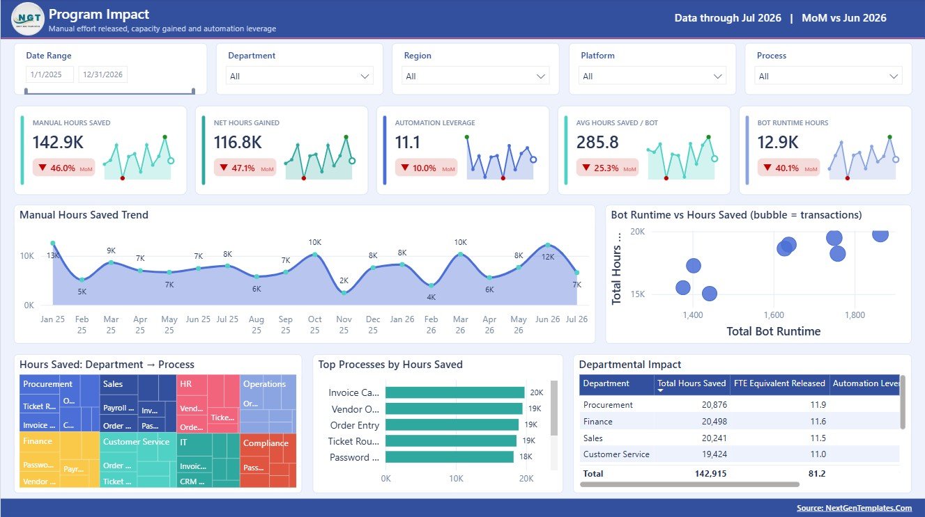
The Program Impact page focuses on practical delivery value. It helps users explain how much effort is being saved, which processes create the largest benefit, and which departments are seeing measurable impact.
Manual Hours Saved by Month: This chart tracks time savings over time. It helps confirm whether program benefits are growing, flat, or declining.
Bot Runtime vs Hours Saved: This view compares automation runtime with saved work hours. It helps evaluate whether the automation effort is producing useful productivity value.
Hours Saved by Department and Process: This chart breaks savings into department and process detail. It helps teams find the combinations creating the best return.
Top Processes by Hours Saved: This ranking highlights the processes with the largest savings. It supports prioritization for scale-up and standardization.
Departmental Impact by Department: This chart compares overall impact by department. It helps leaders understand where adoption and benefit are strongest.
3. Regional View
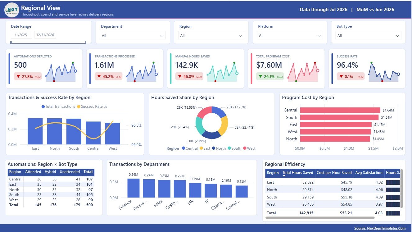
The Regional View page is built for geographic comparison. Rural development programs often vary by district, zone, or region, so this page helps compare workload, cost, success rate, bot type, department activity, and efficiency.
Transactions and Success Rate by Region: This chart compares workload and quality together. A high-volume region with a lower success rate becomes easy to detect.
Hours Saved Share by Region: This view shows each region’s contribution to total saved time. It helps identify where process gains are concentrated.
Program Cost by Region: This chart compares spending across regions. It supports budget monitoring and regional funding review.
Automations by Region and Bot Type: This visual shows technology usage by location. It helps compare maturity and automation mix across regions.
Transactions by Department: This chart shows which departments handle the highest transaction load. It helps surface pressure points and resourcing needs.
Regional Efficiency by Region: This view compares overall efficiency. It supports follow-up investigation into cost, process, and service quality differences.
4. Funding Analysis
The Funding Analysis page connects program spend with operational efficiency. It is useful for budget reviews, donor reporting, grant monitoring, and internal cost control.
Program Spend and Cost per Hour Saved by Month: This chart compares spend with cost efficiency across time. It helps show whether spending is translating into saved effort.
Development Spend by Platform: This visual compares spend across platforms. It helps technology and program teams review where development investment is going.
Spend by Department: This chart shows department-level spend. It supports financial review and internal accountability.
Cost per Hour Saved by Department: This chart compares efficiency by department. It helps identify departments where saved effort is expensive or cost-effective.
Spend by Department and Priority: This visual combines spending with priority level. It helps verify whether critical work is receiving suitable funding.

5. Service Quality
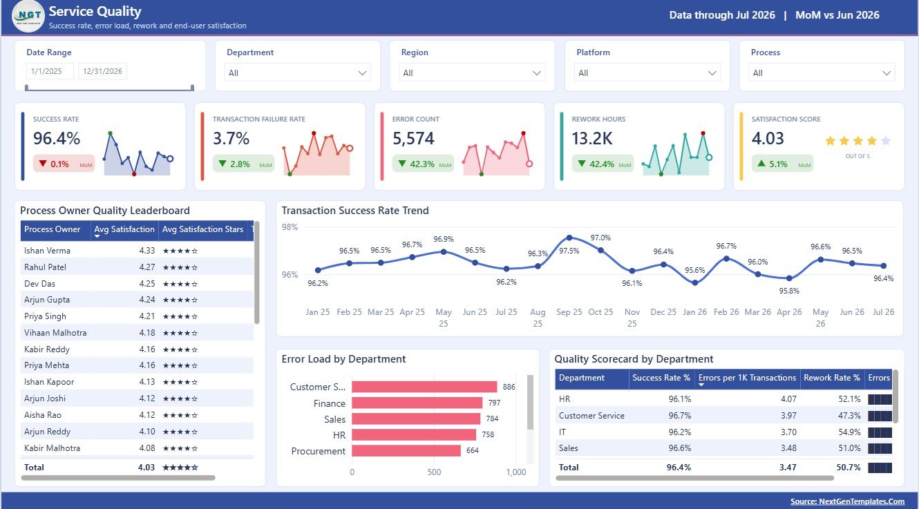
The Service Quality page is focused on reliability and accountability. It helps teams review process owners, monthly success rate, error load, and department-level quality scorecards.
Process Owner Quality Leaderboard by Process Owner: This chart ranks owners by quality performance. It helps recognize strong ownership and identify where coaching may be needed.
Transaction Success Rate by Month: This trend shows whether reliability is improving or slipping over time. It is useful for service quality reviews.
Error Load by Department: This chart shows where errors are concentrated. It helps prioritize fixes, training, and process redesign.
Quality Scorecard by Department: This scorecard summarizes quality by department. It gives leaders a quick view of service health.
Rural Development Dashboard in Power BI vs. Tableau vs. Paid CRM/SaaS – Feature Comparison
| Feature | This Power BI dashboard | Tableau alternative | Paid SaaS alternative |
|---|---|---|---|
| Cost | $17.99 one-time template price | Requires Tableau access and build time | Recurring license or implementation cost |
| Platform | Power BI Desktop and Power BI Service | Tableau Desktop or Cloud | Vendor-hosted system |
| Setup time | Replace data source and refresh | Build calculations and visuals | Onboarding and configuration |
| Real-time team collaboration | Available through Power BI Service | Available through Tableau Cloud | Usually included by role |
| Mobile access | Available through Power BI apps after publishing | Available through Tableau mobile options | Usually vendor controlled |
| Customizable fields | Editable model, visuals, and measures | Editable with Tableau skills | Limited by vendor setup |
| Share with link | Available after Power BI publishing | Available after Tableau publishing | Often login restricted |
| Year-1 cost at 5 users | $17.99 plus Power BI access | Software plus build effort | Often much higher |
| Rural development reporting | Built around operations, funding, regions, and quality | Requires custom build | Depends on product fit |
Who Should Use This Template
This template is suitable for rural development departments, government analysts, NGOs, CSR implementation teams, grant managers, donor reporting teams, public-sector consultants, and program directors who need a reusable Power BI reporting layer. It is especially helpful when teams already have transaction, department, process, regional, cost, and quality data available in Excel, CSV, database, or another source.
Real-World Use Cases
Anika, rural program director: uses the Overview and Regional View pages before monthly review meetings to compare transactions, cost, satisfaction, and regional efficiency.
Rohit, public-sector analyst: uses Program Impact to identify which processes save the most manual hours and which departments are seeing the best results.
Meera, NGO funding manager: uses Funding Analysis to compare spend, cost per hour saved, and priority allocation for internal reports and donor updates.
Advantages of Rural Development Dashboard in Power BI
The dashboard keeps operational, financial, regional, and quality views in one report. It reduces repetitive report-building work, gives leaders quick filter-based analysis, and helps program teams explain outcomes using visuals instead of long manual summaries. Because it is a PBIX file, users can adapt the report structure as their program fields, funding logic, or region hierarchy changes.
Opportunities for Improvement
This template is a reporting dashboard, not a live rural management information system. Teams that need mobile field forms, automated approvals, beneficiary registration, case workflows, or live transaction processing may need a separate app or system. The best use is to connect clean source data to Power BI and use this report for review, monitoring, and presentation.
Best Practices
- Keep source column names consistent before refreshing the report.
- Validate transaction, cost, department, process, and region fields before publishing.
- Review success rate and error-load definitions with process owners.
- Use slicers during review meetings to move from summary to detail.
- Keep a backup copy before editing measures or relationships.
Explore Relevant Templates
- Rural Development Dashboard in Power BI
- Rural Development Dashboard in Excel
- Rural Development KPI Dashboard in Power BI
- Power BI dashboard templates
Frequently Asked Questions
What is included in the Rural Development Dashboard in Power BI?
The report includes Overview, Program Impact, Regional View, Funding Analysis, and Service Quality pages with KPI cards, charts, slicers, and editable visuals.
Can I use my own rural development data?
Yes. You can replace or connect your own data source in Power BI Desktop and refresh the dashboard.
Do I need Power BI Desktop?
Yes. Open and edit the PBIX file in Power BI Desktop. You can publish it to Power BI Service if you have the required account and permissions.
Is this dashboard only for government teams?
No. NGOs, donor-funded projects, CSR teams, and public-sector consultants can also use it for rural development monitoring.
Can I customize the charts?
Yes. You can edit visuals, colors, fields, measures, slicers, and report pages if you are comfortable with Power BI.
Does this replace a full MIS?
No. It is a reporting dashboard, not a beneficiary registry, mobile collection tool, approval workflow, or live transaction system.
About the Author
Built by PK – Microsoft Certified Professional with 15+ years of Excel, Google Sheets, and Power BI experience. Founder of NextGenTemplates, reaching 300K+ subscribers across YouTube channels. Every template is hand-built and tested before release.
Conclusion
Rural Development Dashboard in Power BI is built for teams that need clearer reporting across operations, regional delivery, funding, efficiency, and service quality. With 5 pages and structured analysis views, it gives decision-makers a faster way to review progress and ask better follow-up questions. For more tutorials, visit PK An Excel Expert on YouTube.