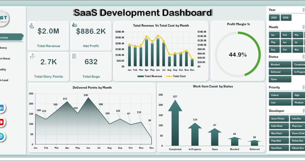
SaaS Development Dashboard in Excel helps SaaS founders, product managers, engineering leads, QA teams, and delivery managers review revenue, cost, story points, bugs, product areas, quality, team load, and satisfaction from one refreshable workbook. For a SaaS business, even small changes in delivery speed, bug volume, customer satisfaction, and margin can create a real operating impact over a quarter. This Excel dashboard brings 7 worksheet tabs, 4 KPI cards, 20 chart views, multiple slicers, a structured data sheet, and a pivot-based support sheet into one editable reporting file.
Key Features of SaaS Development Dashboard in Excel
This template is designed for recurring SaaS delivery reporting rather than one-time analysis. You can replace the sample data, refresh the pivot tables, and use slicers to review the dashboard from different angles.
- 7 worksheet tabs: Overview, Delivery, Product Areas, Quality, Team Load, Data Sheet, and Support Sheet.
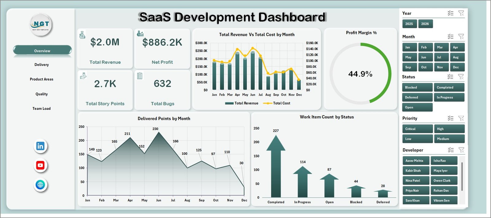
- 4 headline KPI cards: Total Revenue, Net Profit, Total Story Points, and Total Bugs.
- 20 analysis charts: Review revenue, cost, story points, bugs, status, priority, modules, customer segments, teams, developers, and satisfaction.
- Multiple slicers: Filter the dashboard quickly without rebuilding charts manually.
- Refreshable pivot model: Update the Data Sheet and use Refresh All from the Excel Data ribbon.
- Editable Excel file: Adjust labels, columns, charts, slicers, and pivots to match your SaaS reporting process.
Dashboard Pages Explanation
1. Overview Page
The Overview page gives a high-level executive view of SaaS performance. The cards show Total Revenue, Net Profit, Total Story Points, and Total Bugs so leaders can compare commercial performance with delivery output and quality.
Total Revenue Vs Total Cost by Month: This chart compares monthly revenue against delivery cost. It helps identify months where cost movement is reducing the benefit of higher revenue.
Profit Margin % by Overall Performance: This chart connects margin with overall performance. It helps leaders see whether delivery outcomes are supporting healthy profitability.
Delivered Points by Month: This chart tracks story point delivery over time. It helps teams review throughput, capacity changes, and sprint delivery patterns.
Work Item Count by Status: This chart separates work items by status. It helps managers quickly see open, completed, blocked, delayed, or in-progress workload.
2. Delivery
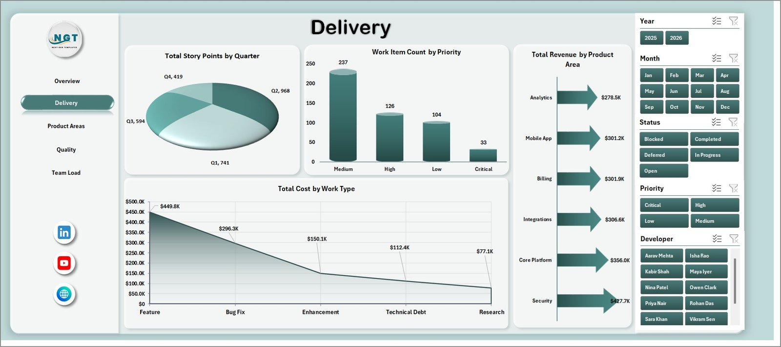
The Delivery sheet focuses on story points, backlog priority, revenue by product area, and cost by work type. It is useful for sprint reviews, delivery governance, and roadmap discussion.
Total Story Points by Quarter: This chart shows delivery output across quarters. It helps teams evaluate whether capacity is increasing, stable, or falling.
Work Item Count by Priority: This chart groups work items by priority. It helps identify whether urgent work is dominating the backlog.
Total Revenue by Product Area: This chart compares revenue contribution across product areas. It helps product managers see which areas are creating the most commercial value.
Total Cost by Work Type: This chart separates cost by development, testing, support, bug fixing, research, or other work types used in the data.
3. Product Areas
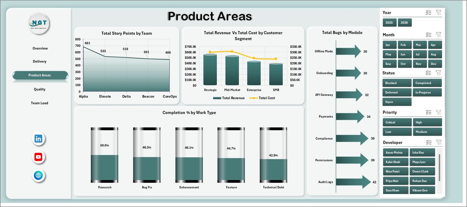
The Product Areas sheet helps users understand value, cost, completion, modules, teams, and customer segments. This page is useful when product owners need to decide where to invest next.
Total Story Points by Team: This chart compares story point delivery across teams. It helps managers review workload distribution and delivery contribution.
Total Revenue Vs Total Cost by Customer Segment: This chart compares commercial value and cost by segment. It helps identify profitable, costly, or high-potential customer groups.
Total Bugs by Module: This chart shows bug volume by module. It helps QA and product teams find modules with higher defect concentration.
Completion % by Work Type: This chart compares completion percentage across work categories. It helps reveal where progress is strong and where work is lagging.
4. Quality
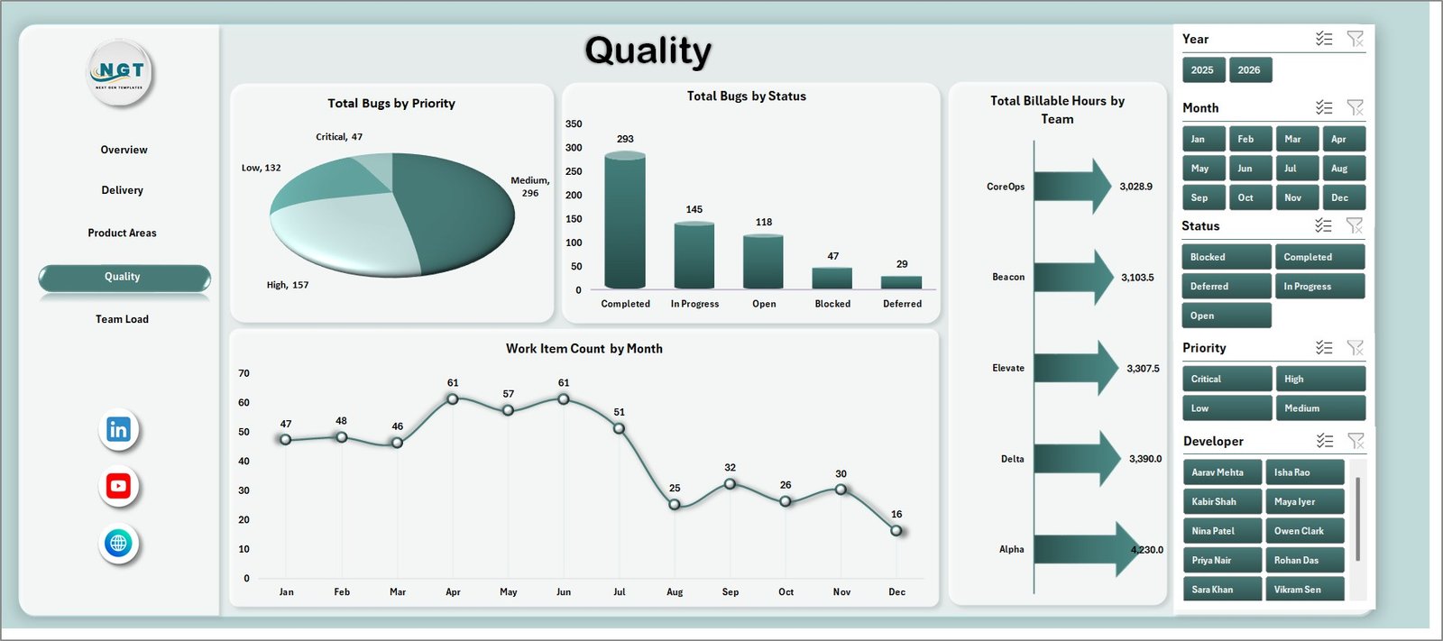
The Quality sheet focuses on bug priority, bug status, billable hours, and work item count. It helps engineering and QA leaders balance delivery speed with reliability.
Total Bugs by Priority: This chart groups bugs by priority. It helps teams focus first on high-impact issues.
Total Bugs by Status: This chart shows bug status distribution. It helps identify whether issues are open, fixed, in testing, reopened, or pending action.
Total Billable Hours by Team: This chart compares team effort. It helps review workload allocation and project billing patterns.
Work Item Count by Month: This chart tracks monthly work item volume. It helps identify demand spikes and workload seasonality.
5. Team Load
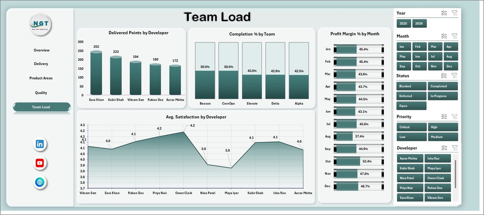
The Team Load sheet gives a people-focused view of developer output, team completion, margin trend, and satisfaction. It supports capacity planning and delivery balance reviews.
Delivered Points by Developer: This chart compares delivered story points by developer. It helps leads understand individual contribution and workload spread.
Completion % by Team: This chart compares completion percentage by team. It helps identify teams that are progressing well and teams that may need support.
Profit Margin % by Month: This chart tracks monthly margin. It helps connect delivery operations with business profitability.
Avg. Satisfaction by Developer: This chart compares satisfaction scores by developer. It helps review stakeholder feedback, service quality, or experience patterns.
6. Data Sheet Tab
The Data Sheet is where you add SaaS development records in the same format as the sample file. Keep the same structure so slicers, charts, cards, and pivots refresh correctly.

7. Support Sheet
The Support Sheet contains pivot tables used to build the dashboard dynamically. After updating the Data Sheet, go to the Excel Data tab and click Refresh All. You can keep this sheet hidden after setup.

SaaS Development Dashboard in Excel vs. Google Sheets vs. Paid CRM/SaaS – Feature Comparison
| Feature | This Excel dashboard | Google Sheets alternative | Paid SaaS alternative |
|---|---|---|---|
| Cost | One-time template purchase | Low software cost but more manual setup | Monthly or annual subscription |
| Platform | Microsoft Excel | Google Sheets | Vendor-hosted product analytics or PM tool |
| Setup time | Replace data and refresh | Build formulas, charts, and filters manually | Account setup, integrations, and onboarding |
| Real-time team collaboration | Best through Microsoft 365 sharing | Strong browser collaboration | Usually included by paid seat |
| Mobile access | Limited for serious dashboard editing | Good for light review | Usually available |
| Customizable fields | Editable workbook, pivots, charts, and source table | Editable but easier to break | Limited by vendor settings |
| Share with link | Available through Microsoft 365 sharing | Native Google Drive sharing | Usually account based |
| Year-1 cost at 5 users | Template cost plus Excel access | Workspace access plus build time | Often hundreds or thousands of dollars |
| SaaS delivery reporting | Strong for refreshable monthly reporting | Good for shared lightweight tracking | Best for live workflow and app integrations |
Who Should Use This Template
This dashboard is useful for SaaS founders, product managers, engineering managers, delivery leads, scrum masters, QA managers, startup finance analysts, and consultants. It is especially helpful when a team exports delivery data from tools like Jira, Azure DevOps, Linear, GitHub Projects, or internal trackers and wants a clean Excel-based reporting layer.
It is not a replacement for a live issue tracking tool, billing system, product analytics platform, or customer success platform. Use it when you need recurring management reporting and your data can be entered or exported into Excel.
Real-World Use Cases
Anika, SaaS founder: reviews revenue, cost, profit margin, story points, and bugs before leadership updates and investor reporting.
Rohit, delivery lead: compares work item priority, story point delivery, completion percentage, and customer segment cost before sprint planning.
Meera, QA manager: reviews bugs by module, priority, and status to decide where testing and bug-fix resources should go next.
Advantages of SaaS Development Dashboard in Excel
The biggest advantage is speed. Instead of building a reporting workbook from scratch, users can start with prepared pages, pivot tables, charts, slicers, and source data columns. The workbook also gives managers a familiar Excel environment, which is helpful for teams that already use spreadsheets for reporting.
Another advantage is ownership. You can edit the workbook, adjust labels, add fields, change charts, and keep the file inside your own reporting process. There is no vendor lock-in and no recurring dashboard subscription just to review monthly development performance.
Opportunities for Improvement
This dashboard depends on clean source data. If work item status, developer names, module labels, cost fields, or dates are inconsistent, the charts will reflect those inconsistencies. Teams should define a simple data entry standard before using the file for live reporting.
The dashboard is also not connected directly to project management tools by default. If you want automated live syncing from Jira, Azure DevOps, Linear, or GitHub, you may need an export process, Power Query setup, or custom integration.
Best Practices
Use consistent names for teams, developers, product areas, modules, work types, statuses, and priorities. Keep one row per work item or reporting record. Before refreshing, check that dates, revenue, cost, story points, bug counts, and satisfaction fields are entered in the expected format.
Microsoft also provides helpful guidance for Excel tables and data structure in its official documentation. You can review Excel table basics here: Microsoft Support: Overview of Excel tables.
Explore Relevant Templates
- SaaS Development Dashboard in Excel
- SaaS Development KPI Dashboard in Excel
- SaaS Development KPI Dashboard in Power BI
- Robotics Process Automation Dashboard in Excel
- Excel Dashboard Templates
Frequently Asked Questions
What is included in the SaaS Development Dashboard in Excel?
The workbook includes Overview, Delivery, Product Areas, Quality, Team Load, Data Sheet, and Support Sheet tabs with KPI cards, slicers, charts, source data, and pivot tables.
Can I use my own SaaS development data?
Yes. Replace the sample rows in the Data Sheet with your own records in the same format, then refresh the workbook.
Does this dashboard require macros?
No. It is designed around Excel tables, pivot tables, slicers, cards, and charts.
Can I customize the charts and fields?
Yes. You can edit labels, chart formats, source columns, slicers, and pivot tables if you are comfortable with Excel.
Is this a replacement for Jira or Azure DevOps?
No. It is a reporting dashboard after data is entered or exported. It does not replace Jira, Azure DevOps, Linear, GitHub Projects, or similar tools.
Which Excel version should I use?
Use a modern desktop version of Microsoft Excel for the best pivot refresh and slicer experience.
About the Author
Built by PK – Microsoft Certified Professional with 15+ years of Excel, Google Sheets, and Power BI experience. Founder of NextGenTemplates, reaching 300K+ subscribers across YouTube channels. Every template is hand-built and tested before release.
Conclusion
The SaaS Development Dashboard in Excel gives product and engineering teams a practical way to review delivery, revenue, cost, bugs, quality, product areas, and team load from one workbook. It is best for recurring reporting, management meetings, sprint reviews, and business performance reviews where Excel is still the most convenient format.
Visit PK An Excel Expert on YouTube for step-by-step Excel, dashboard, and automation tutorials.