SaaS Development Dashboard in Power BI is a ready-to-use PBIX report for SaaS founders, product managers, engineering leaders, and BI analysts who want to connect revenue, delivery, quality, and team capacity in one view. The dashboard includes 5 Power BI pages, 5 executive KPI cards, 20 chart views, and multiple slicers for quick filtering. Instead of reviewing revenue in one tool, sprint status in another, and quality metrics in a third place, this template brings the main SaaS development indicators into a single Power BI reporting experience.
Teams often lose time during monthly reviews because delivery data, product area economics, bugs, story points, and capacity numbers sit in different exports. This Power BI dashboard gives you a faster starting point. You can open the file in Power BI Desktop, replace the sample data source, refresh the model, and customize the visuals for your own product, module, team, sprint, or customer segment structure. For Power BI setup and publishing guidance, you can also refer to Microsoft Power BI documentation.
Key Features of SaaS Development Dashboard in Power BI
- 5 report pages: Overview, Delivery Performance, Product Area Economics, Quality and Reliability, and Team Load and Capacity.
- 5 top-level cards: Total Revenue, Work Items, Story Points, Completion Rate, and Avg Satisfaction.
- 20 analysis charts: Review revenue, delivery velocity, sprint backlog, product modules, customer segments, defects, billable hours, and delivery cost.
- Power BI slicers: Filter the report quickly using available dimensions such as month, product area, team, module, work type, sprint, and status.
- Editable PBIX format: Modify visuals, model fields, DAX measures, colors, slicers, and source connections in Power BI Desktop.
- Built for SaaS operations: Combine product, engineering, quality, and revenue reporting without starting from a blank Power BI canvas.
Dashboard Pages Explanation
1. Overview Page
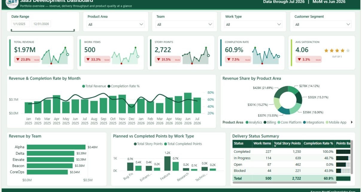
The Overview page gives leaders a quick summary of SaaS development performance. The top cards show Total Revenue, Work Items, Story Points, Completion Rate, and Avg Satisfaction, so the first view combines commercial performance, delivery volume, progress, and customer sentiment.
Revenue and Completion Rate by Month: This chart compares monthly revenue with completion performance. It helps show whether growth is supported by reliable execution or whether delivery completion is falling behind commercial momentum.
Revenue Share by Product Area: This visual breaks revenue into product-area contribution. It helps product leaders identify which areas of the SaaS platform are driving the highest share of business value.
Revenue by Team: This chart compares team-level revenue contribution. It is useful for ownership reviews, roadmap planning, and understanding how team focus connects to measurable business outcomes.
Planned and Completed Points by Work Type: This chart compares planned effort with completed effort across work types. It helps teams understand whether features, bugs, enhancements, and maintenance items are being completed as expected.
Delivery Status Summary by Status: This visual summarizes work items by delivery status. It gives a clean view of completed, active, backlog, delayed, or blocked work for operating reviews.

SaaS Development Dashboard in Power BI
2. Delivery Performance
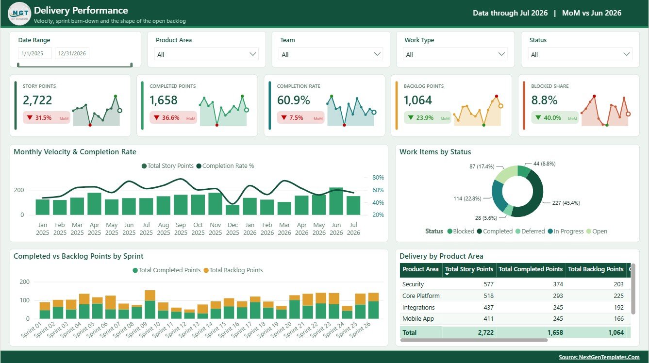
The Delivery Performance page is focused on execution health. It helps engineering managers and delivery leads review velocity, status, sprint output, backlog movement, and product-area delivery metrics in one page.
Monthly Velocity and Completion Rate by Month: This chart shows how delivery velocity and completion percentage move across months. It helps separate real throughput from work that keeps rolling forward unfinished.
Work Items by Status: This visual counts work items by status. It helps highlight whether too much work is sitting in backlog, active development, review, blocked, or incomplete states.
Completed and Backlog Points by Sprint: This chart compares completed points with backlog points by sprint. It supports sprint retrospectives, capacity discussions, and planning conversations.
Delivery Metrics by Product Area: This view compares delivery metrics across product areas. It helps product and engineering teams find areas with stronger execution and areas that may need planning attention.
Delivery Performance
3. Product Area Economics
The Product Area Economics page connects SaaS revenue with product structure. It is useful for roadmap prioritization, executive portfolio reviews, and commercial discussions around product modules and customer segments.
Revenue by Module: This chart ranks modules by revenue. It helps teams identify which modules are most important commercially and where future investment may create the greatest return.
Revenue Composition by Product Area and Module: This visual breaks revenue into product-area and module combinations. It helps leadership understand the mix behind total revenue instead of relying only on headline totals.
Revenue by Customer Segment: This chart compares revenue across customer segments. It helps SaaS teams see whether enterprise, SMB, mid-market, or other segments are driving the business.
Product Area Metrics by Product Area: This table-style view summarizes key metrics by product area. It helps compare commercial contribution, delivery activity, and product ownership in one place.
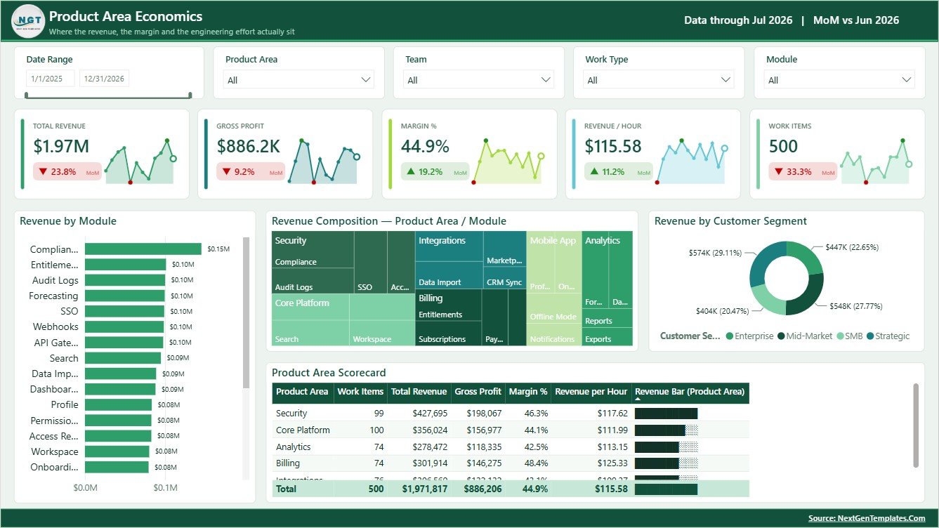
Product Area Economics
4. Quality and Reliability
The Quality and Reliability page helps teams connect defects, satisfaction, priority, effort, modules, and work type. It is especially useful for spotting where customer sentiment may be affected by delivery quality.
Bugs Raised and Satisfaction by Month: This chart compares bug volume with satisfaction over time. It helps leaders see whether defects are rising during periods where customer satisfaction is under pressure.
Work Items by Priority: This visual shows work distribution by priority. It supports escalation review and helps teams understand whether high-priority work is dominating delivery capacity.
Bugs by Product Area: This chart ranks product areas by bug count. It helps prioritize stabilization work, technical debt, QA attention, and test coverage.
Effort and Defects by Module: This chart compares delivery effort with defect volume by module. It helps identify modules that require high effort or create reliability concerns.
Quality Metrics by Work Type: This view summarizes quality results by work type. It helps compare features, bugs, enhancements, and maintenance items from a reliability perspective.
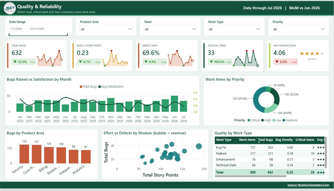
Quality and Reliability
5. Team Load and Capacity
The Team Load and Capacity page helps managers review developer hours, delivery cost, and team-level metrics. It is useful for capacity planning, utilization review, and cost-to-delivery discussions.
Billable Hours by Developer: This chart compares billable hours across developers. It helps managers identify workload imbalance, underutilization, or possible capacity pressure.
Billable Hours and Delivery Cost by Month: This chart compares monthly effort with delivery cost. It helps leadership understand whether cost growth is matched by useful delivery output.
Team Metrics by Team: This view summarizes team-level performance. It supports sprint planning, team reviews, and operating rhythm discussions.
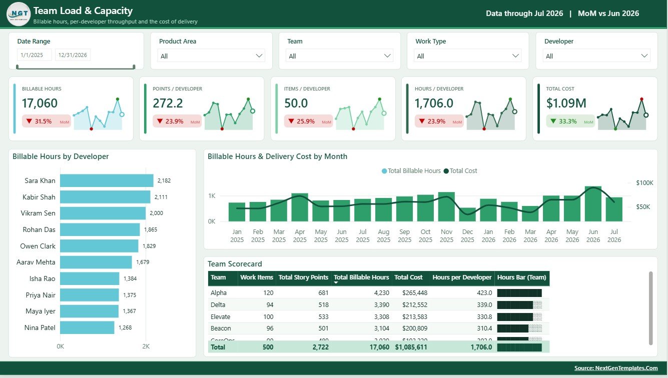
Team Load and Capacity
SaaS Development Dashboard in Power BI vs. Tableau vs. Paid CRM/SaaS – Feature Comparison
| Area | This Power BI dashboard | Tableau alternative | Paid SaaS alternative |
|---|---|---|---|
| Cost | One-time template purchase | Requires Tableau access and build time | Recurring license or implementation fee |
| Platform | Power BI Desktop and Power BI Service | Tableau Desktop or Tableau Cloud | Vendor cloud system |
| Setup time | Replace data source and refresh | Build model and visuals manually | Configure account, fields, workflows, and users |
| Customizable fields | Edit model, visuals, measures, and slicers | Editable with Tableau skills | Limited by vendor configuration |
| Year-1 cost at 5 users | Template price plus Power BI access | Licenses plus development effort | Often much higher due to subscriptions |
| Best fit | SaaS reporting, delivery review, quality tracking, and capacity analysis | Teams already standardized on Tableau | Live project, CRM, ticketing, or workflow operations |
Who Should Use This Template
This template is a good fit for SaaS founders, product managers, engineering managers, delivery leads, scrum masters, revenue operations teams, quality managers, and Power BI developers. It works best when your team already has development, sprint, work item, bug, revenue, or capacity data that can be exported or connected to Power BI.
Real-World Use Cases
Founder operating review: A SaaS founder can review revenue, completion rate, satisfaction, work items, and story points before an investor or leadership update.
Product roadmap planning: A product operations lead can compare product areas, modules, revenue contribution, and delivery performance to decide where roadmap attention should go next.
Engineering capacity review: An engineering manager can review velocity, backlog points, bugs, defects, billable hours, and delivery cost during sprint planning and retrospectives.
Advantages of SaaS Development Dashboard in Power BI
The main advantage is speed. You do not need to design a complete Power BI report from a blank canvas. The pages, cards, chart structure, and analysis flow are already prepared. The dashboard also connects business and technical views, which makes it more useful for cross-functional reviews than a delivery-only report.
Opportunities for Improvement
This template is a reporting file, not a live engineering platform. It does not replace Jira, Azure DevOps, Linear, HubSpot, Stripe, or a customer success platform. For best results, connect clean data exports and validate definitions such as revenue, completion rate, story points, bug count, and billable hours before using the dashboard for decision-making.
Best Practices
- Define each metric before replacing the sample data.
- Keep product area, module, team, sprint, work type, and status names consistent.
- Refresh the report after each data update and check slicers before presenting.
- Use the Overview page for executive review and the other pages for deeper diagnosis.
- Publish through Power BI Service only after confirming permissions and data privacy rules.
Explore Relevant Templates
You can download the product from SaaS Development Dashboard in Power BI. You may also explore Power BI templates and Power BI dashboard templates on NextGenTemplates.
Frequently Asked Questions
What is the SaaS Development Dashboard in Power BI?
It is a ready-to-use Power BI dashboard template for SaaS revenue, delivery performance, product area economics, quality, reliability, team load, and capacity reporting.
Can I use my own data?
Yes. Open the PBIX file in Power BI Desktop, replace or connect your own source, refresh the model, and validate the visuals.
Does this replace Jira or Azure DevOps?
No. It is a reporting dashboard. You can use exported or connected data from project tools, but the template itself is not a workflow system.
Can I customize charts and measures?
Yes. You can edit visuals, measures, fields, slicers, colors, and source connections in Power BI Desktop.
Is Power BI Desktop required?
Yes. The PBIX file should be opened and edited in Power BI Desktop.
Can I share the dashboard with my team?
Yes, if you have the required Power BI account and permissions, you can publish and share it through Power BI Service.
About the Author
Built by PK – Microsoft Certified Professional with 15+ years of Excel, Google Sheets, and Power BI experience. Founder of NextGenTemplates, reaching 300K+ subscribers across YouTube channels. Every template is hand-built and tested before release.
Conclusion
The SaaS Development Dashboard in Power BI gives software teams a clear way to review revenue, work items, story points, delivery status, product area economics, quality, reliability, team load, and capacity from one report. It is especially useful when leaders need a repeatable monthly or sprint-level view without building every page from scratch.
For more Excel, Power BI, and dashboard tutorials, visit PK: An Excel Expert on YouTube.