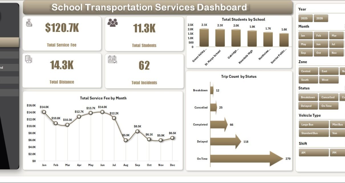
School transportation teams manage a moving mix of students, schools, routes, shifts, vehicle types, service fees, driver costs, incidents, and safety ratings. The School Transportation Services Dashboard in Excel turns that operational data into 7 structured workbook tabs, 4 high-level KPI cards, and 18 analysis charts so administrators can review service performance without building reports from scratch.
This dashboard is designed for schools, transport coordinators, fleet supervisors, route managers, and finance officers who want an editable Excel reporting file. Add your data in the same format, refresh the pivot tables, and use the slicers to analyze the dashboard by the available fields in the workbook. For Microsoft guidance on refreshing workbook data and PivotTables, see Microsoft Support on refreshing data in Excel.

Key Features of School Transportation Services Dashboard in Excel
- 4 executive KPI cards: Total Service Fee, Total Students, Total Distance, and Total Incidents.
- 7 workbook tabs: Overview, Route Ops, School Demand, Fleet Costs, Safety, Data Sheet, and Support Sheet.
- 18 analysis charts: review schools, months, trip status, shifts, zones, routes, vehicle types, costs, and safety performance.
- Interactive slicers: filter dashboard views quickly without editing formulas.
- Pivot table support: update the Data Sheet and refresh all pivot-driven visuals from Excel.
- One-time Excel workflow: no monthly subscription, no custom BI build, and no live software dependency.
Dashboard Pages Explanation
1 – Overview Page
The Overview Page gives leadership the fastest read on school transportation performance. The KPI cards summarize Total Service Fee, Total Students, Total Distance, and Total Incidents, while slicers help filter the dashboard by the available fields in the workbook.
Total Students by School: This chart shows student volume by school so transport coordinators can see which campuses create the highest demand. It supports vehicle capacity planning and route coverage reviews.
Total Service Fee by Month: This chart shows how transportation service fee changes across months. Finance teams can use it for monthly reporting, fee trend checks, and seasonality review.
Trip Count by Status: This chart groups trips by their operating status. It helps route managers identify completed, delayed, cancelled, pending, or custom status groups based on the data entered.
2 – Route Ops
The Route Ops page is built for operational review of shifts, routes, zones, and service types.
Trip Count by Shift: Shows how trips are distributed across shifts. It helps balance driver assignments and vehicle availability.
Total Distance by Zone: Compares route distance across service zones. It helps identify zones that may need route redesign or cost review.
Total Students by Route: Shows student load by route. Use it to find overloaded, balanced, or underused routes.
Total Service Fee by Service Type: Compares fees by service type. It helps teams understand which transportation services contribute most to revenue.

3 – School Demand
The School Demand page explains how demand, cost, and student volume move by school, month, zone, and service type.
Total Operating Cost by School: Compares operating cost by school. It helps administrators see where transportation service delivery costs are highest.
Total Students by Month: Tracks student transportation demand over time. This is useful around new terms, enrollment changes, and seasonal demand shifts.
Total Students by Zone: Shows how student volume is distributed across zones. It supports vehicle allocation and zone-level planning.
Total Students by Service Type: Breaks student demand by service type. It helps management understand which service categories are used most often.

4 – Fleet Costs
The Fleet Costs page helps teams review major transport cost drivers across vehicles, routes, months, and quarters.
Total Fuel Cost vs Total Maintenance Cost by Vehicle Type: Compares two major fleet cost categories by vehicle type. It helps identify vehicle groups that may require deeper inspection or replacement planning.
Total Distance vs Total Fuel Cost by Route: Shows whether fuel cost aligns with route distance. This can reveal routes where fuel spend may need review.
Total Fuel Cost vs Total Driver Cost by Month: Tracks two key monthly cost categories together. It supports monthly budget review and trend analysis.
Total Operating Cost by Quarter: Summarizes operating cost by quarter. Leadership can use this view to monitor cost movement across the school year.

5 – Safety
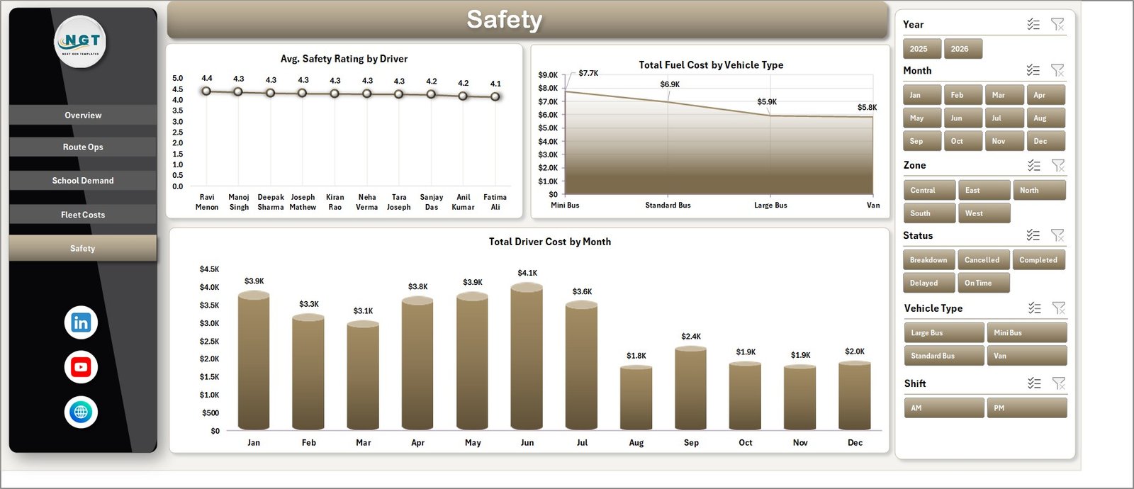
The Safety page helps supervisors connect driver rating, vehicle type, and driver cost trends in one view.
Avg. Safety Rating by Driver: Compares average safety rating by driver. It helps identify strong performers and drivers who may need coaching.
Total Fuel Cost by Vehicle Type: Reviews fuel cost by vehicle type. It can support decisions about vehicle assignments, inspection priority, and cost review.
Total Driver Cost by Month: Shows driver cost trends across months. Use it to compare staffing cost movement with demand, trips, or safety follow-up.
6 – Data Sheet Tab
The Data Sheet is where users enter or replace sample transportation data. Keep the same column format so the dashboard, pivot tables, slicers, and charts continue to work correctly.

7 – Support Sheet Tab
The Support Sheet contains the pivot tables used to create the dynamic dashboard. After updating the Data Sheet, go to the Excel Data ribbon and click Refresh All. The pivots and connected charts will refresh, and this sheet can be hidden during normal use.

School Transportation Services Dashboard in Excel vs. Google Sheets vs. Paid School Transport SaaS – Feature Comparison
| Feature | This Excel dashboard | Google Sheets alternative | Paid school transport SaaS |
|---|---|---|---|
| Cost | $17.99 one-time sale price | Manual build or template cost | Usually monthly, annual, or per-student |
| Platform | Microsoft Excel | Google Sheets in Drive | Vendor-hosted web app |
| Setup time | Replace data and refresh pivots | Build or customize formulas and charts | Configure account, routes, users, and settings |
| Real-time team collaboration | Available through OneDrive or SharePoint if needed | Native Google sharing | Usually included by plan |
| Mobile access | Excel app or shared file access | Google Sheets app or browser | Vendor mobile app or browser |
| Customizable fields | Editable workbook structure | Editable sheet structure | Limited by vendor configuration |
| Share with link | Possible through Microsoft sharing | Possible through Google Drive | Usually login-based |
| Year-1 cost at 5 users | $17.99 before any Microsoft licensing | Template plus Workspace cost if applicable | Can grow with users, buses, routes, or students |
| Fleet cost analysis | Fuel, maintenance, driver cost, and operating cost charts included | Must be built or customized | Depends on software plan |
| Safety review | Avg. Safety Rating by Driver included | Must be built or customized | Depends on software plan |
Who Should Use This Template
This dashboard is useful for school administrators, transportation coordinators, fleet supervisors, route managers, school finance officers, and operations teams that need regular reporting on transport demand, fees, distance, incidents, costs, and safety.
It is not designed to replace GPS tracking, live dispatch, route optimization software, parent notification systems, fee payment gateways, or compliance systems. It is a reporting and analysis workbook.
Real-World Use Cases
Anita, school operations manager: uses Route Ops every Monday to check student load by route and trips by shift before assigning buses.
Marcus, fleet supervisor: reviews fuel, maintenance, and driver costs each month to find vehicle types and routes that need attention.
Priya, finance officer: uses Total Service Fee by Month and Operating Cost by School for monthly reporting to management.
Advantages of School Transportation Services Dashboard in Excel
- Fast setup for teams already using Excel.
- No recurring dashboard subscription.
- Clear split between executive overview, route operations, demand, cost, and safety.
- Easy refresh workflow using the Data Sheet and Support Sheet.
- Editable structure for school-specific reporting needs.
Opportunities for Improvement
Teams can extend the workbook by adding GPS exports, attendance pickup/drop-off flags, parent complaint categories, driver training status, bus capacity percentage, or route profitability metrics. Larger transport teams may also connect the workbook to Power Query for cleaner imports from multiple source files.
Best Practices
- Keep one row per trip, route, or service record depending on the workbook structure.
- Do not rename columns unless you also update the pivots and charts.
- Use consistent labels for schools, routes, zones, shifts, vehicle types, and statuses.
- Refresh all pivot tables after every major data update.
- Keep a backup copy before making structural changes.
Explore Relevant Templates
- School Transportation Services Dashboard in Excel
- School Admin Dashboard in Excel
- Transportation Services KPI Dashboard in Excel
- Logistics and Transportation Hub
Frequently Asked Questions
What does the School Transportation Services Dashboard in Excel track?
It tracks service fee, students, distance, incidents, trip status, shifts, routes, zones, operating cost, fuel cost, maintenance cost, driver cost, and safety rating based on the workbook data.
How many pages are included?
The workbook includes 7 tabs: Overview, Route Ops, School Demand, Fleet Costs, Safety, Data Sheet, and Support Sheet.
How do I update the dashboard?
Replace the sample records in the Data Sheet, then use Data > Refresh All in Excel to update the pivots and charts.
Can I hide the Support Sheet?
Yes. The Support Sheet contains pivot tables that power the dashboard and can be hidden during normal use.
Does this include live GPS tracking?
No. This is an Excel reporting dashboard. It does not provide live vehicle tracking, routing, dispatch, or parent notifications.
Can I customize the dashboard?
Yes. You can customize the workbook, but keep the data structure aligned with the pivot tables unless you are comfortable editing pivots and charts.
About the Author
Built by PK – Microsoft Certified Professional with 15+ years of Excel, Google Sheets, and Power BI experience. Founder of NextGenTemplates, reaching 300K+ subscribers across YouTube channels. Every template is hand-built and tested before release.
Conclusion
The School Transportation Services Dashboard in Excel gives schools a practical way to review transport service fees, student demand, route distance, incidents, fleet costs, driver costs, and safety performance in one Excel workbook. It is best for teams that want a clear reporting system without committing to a full transport SaaS platform.
Visit youtube.com/@PKAnExcelExpert for step-by-step Excel tutorials.