Recycling infrastructure is no longer a simple monthly tonnage report. Teams often need to track collection cost, processing cost, total waste tonnage, recycled tonnage, recycling rate, facility readiness, project delays, funding sources, operators, and municipal performance at the same time. The Recycling Infrastructure Dashboard in Power BI brings those signals into a single report experience, helping sustainability and operations teams review performance across 5 focused pages.
Power BI is a strong fit for this kind of work because it combines data modeling, interactive filtering, and visual storytelling in one desktop file. Microsoft also provides detailed documentation for publishing and sharing reports in the Power BI ecosystem; you can review the official guidance on Microsoft Learn’s Power BI overview. This dashboard gives teams a ready layout they can adapt instead of starting with a blank report canvas.
Click here to purchase Recycling Infrastructure Dashboard in Power BI
Overview Page
Key Features of Recycling Infrastructure Dashboard in Power BI
The dashboard includes 5 report pages: Overview, Material Flow, Cost Analysis, Project Status, and Facility Ops. Each page focuses on a specific management question, so users can move from high-level performance to operational detail without overloading one page with every visual.
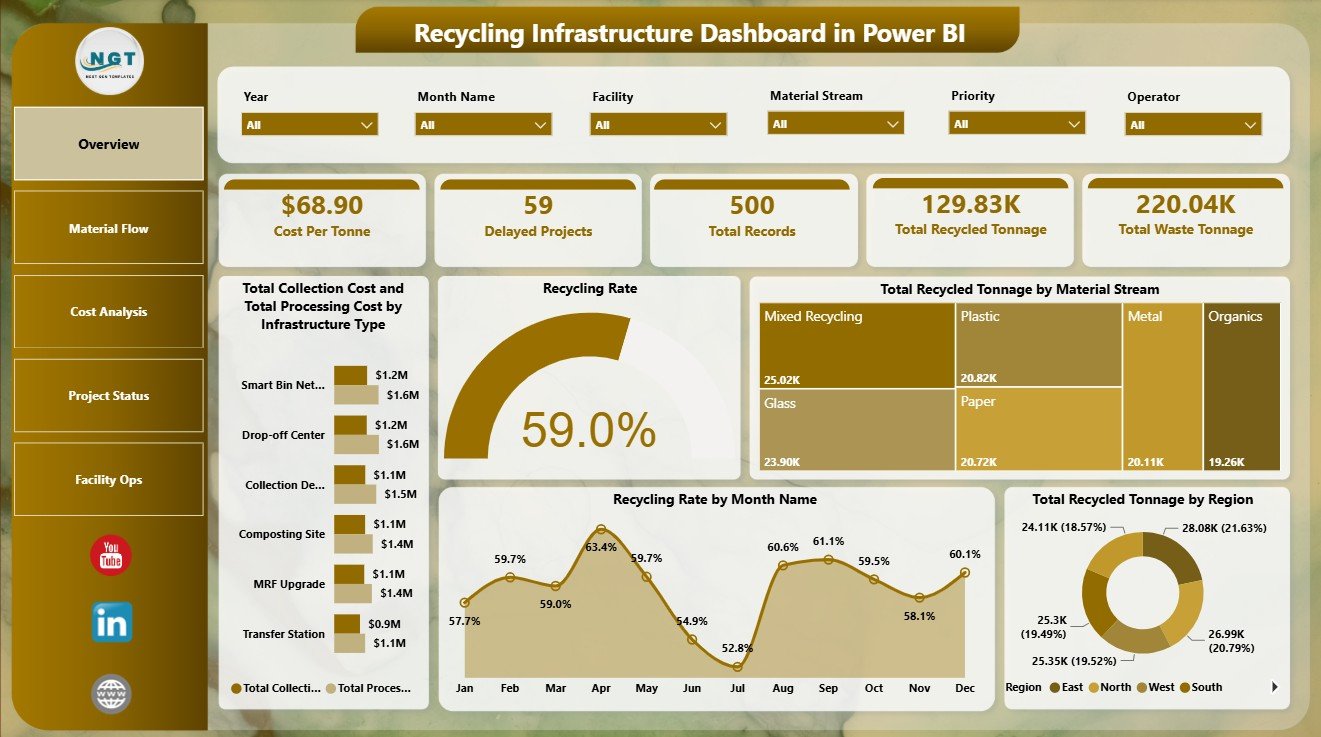
The Overview page gives quick KPI cards for Cost Per Tonne, Delayed Projects, Total Records, Total Recycled Tonnage, and Total Waste Tonnage. These cards are useful for executive reviews because they bring the core recycling infrastructure measures to the top of the report.
Interactive slicers allow users to filter the dashboard quickly. Depending on the data model fields, teams can filter by region, month, operator, facility, infrastructure type, material stream, project phase, funding source, or municipality to study a narrower operating segment.
Dashboard Pages Explanation
Overview Page
The Overview page starts with KPI cards for Cost Per Tonne, Delayed Projects, Total Records, Total Recycled Tonnage, and Total Waste Tonnage. Together, these cards show whether the recycling program is efficient, whether projects are falling behind, and how much operational data is represented.
Total Collection Cost and Total Processing Cost by Infrastructure Type: This chart compares collection and processing cost across infrastructure categories. It helps identify which infrastructure types carry the highest cost load and where cost-control reviews may be needed.
Recycling Rate by Overall Dashboard: This visual gives a quick view of recycling performance for the current filter selection. It is useful for reviewing whether selected regions, operators, facilities, or months are performing above or below expectation.
Total Recycled Tonnage by Material Stream: This chart shows which material streams contribute the most recycled tonnage. Teams can use it to understand the strongest recovery categories and identify streams that may need process improvement.
Recycling Rate by Month Name: This trend-style view highlights how recycling rate changes by month. It helps teams identify seasonal patterns, disruptions, or months where collection and processing performance shifted.
Total Recycled Tonnage by Region: This regional analysis shows where recycled volume is concentrated. It supports comparisons between municipalities, service zones, or operating territories.
Material Flow
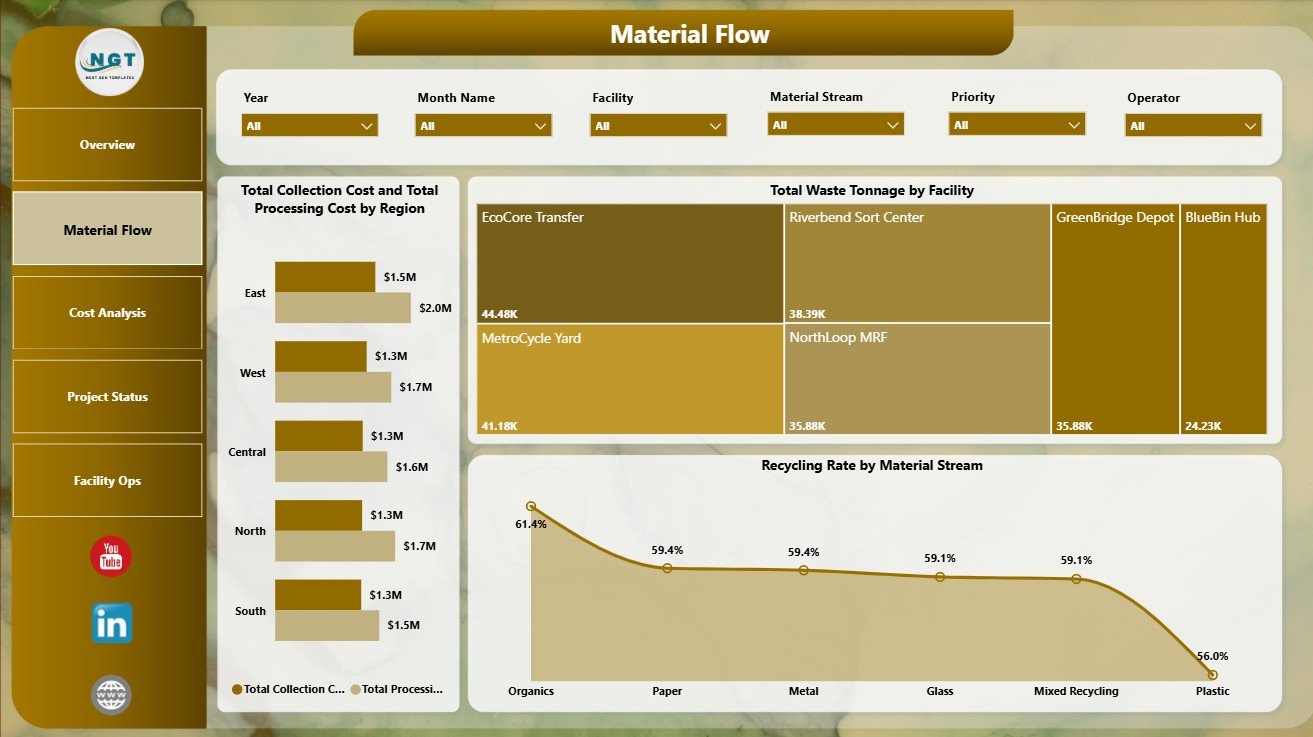
The Material Flow page focuses on how waste and recyclable materials move through the recycling infrastructure network. It includes Total Collection Cost and Total Processing Cost by Region, Total Waste Tonnage by Facility, and Recycling Rate by Material Stream.
Total Collection Cost and Total Processing Cost by Region: This chart compares regional cost patterns across the two major cost categories. It can reveal locations where transportation, handling, labor, or processing arrangements may be creating higher total cost.
Total Waste Tonnage by Facility: This visual ranks or compares facilities by the waste volume they handle. It is useful for capacity review, facility planning, and identifying high-load facilities that may need operational attention.
Recycling Rate by Material Stream: This chart compares recycling effectiveness by material type. It helps teams see whether paper, plastics, metals, organics, glass, or other streams are converting efficiently into recycled tonnage.
Cost Analysis
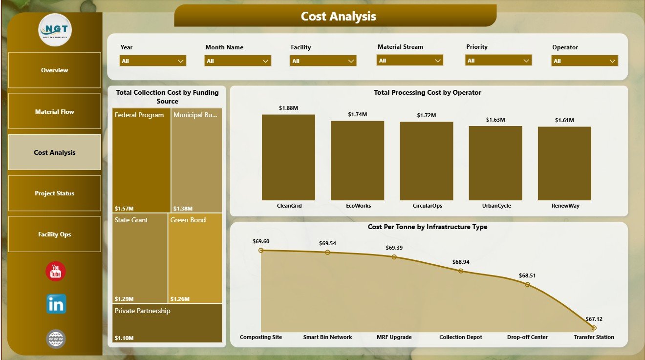
The Cost Analysis page is designed for financial and operating reviews. It includes Total Collection Cost by Funding Source, Total Processing Cost by Operator, and Cost Per Tonne by Infrastructure Type.
Total Collection Cost by Funding Source: This chart shows how collection cost is distributed across funding sources. It helps finance, grant, and public-sector teams understand which funding streams support the highest share of collection activity.
Total Processing Cost by Operator: This visual compares operator-level processing cost. It can support vendor reviews, contract discussions, and operational benchmarking when operators have comparable scope.
Cost Per Tonne by Infrastructure Type: This chart converts cost into a practical unit measure. It helps users compare the relative efficiency of infrastructure types without relying only on total spend.
Project Status
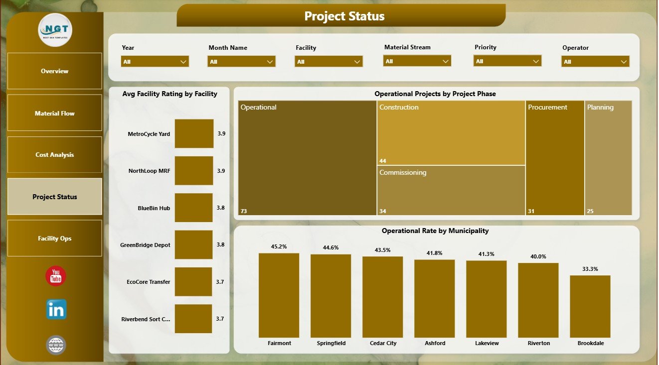
The Project Status page helps teams understand infrastructure readiness and delivery progress. It includes Avg Facility Rating by Facility, Operational Projects by Project Phase, and Operational Rate by Municipality.
Avg Facility Rating by Facility: This chart compares facility condition or performance ratings. It helps identify facilities that may need inspection, investment, maintenance, or process support.
Operational Projects by Project Phase: This view shows how operational projects are distributed across phases. It helps project managers understand whether work is concentrated in planning, implementation, delayed, or operational stages.
Operational Rate by Municipality: This chart compares municipality-level operational performance. It supports public-sector reporting and helps highlight areas where infrastructure is running smoothly or lagging behind.
Facility Ops
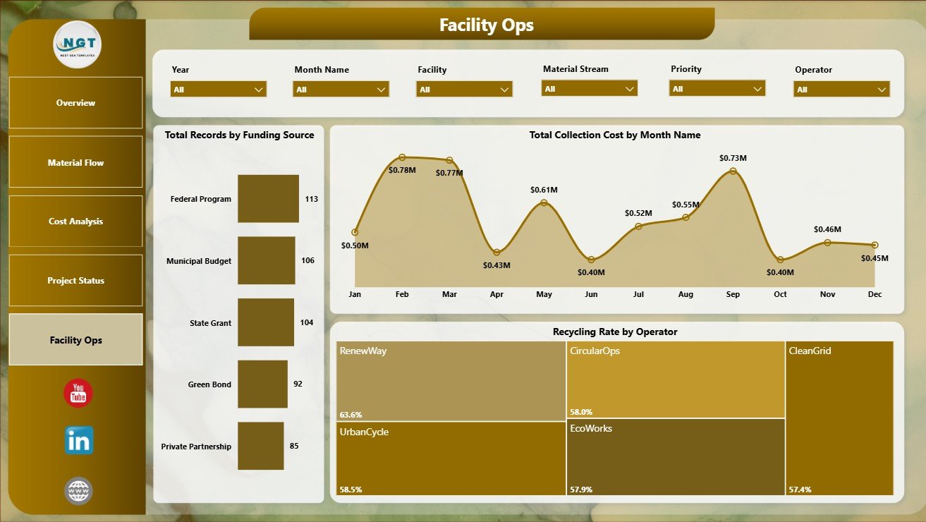
The Facility Ops page is useful for recurring operational review. It includes Total Records by Funding Source, Total Collection Cost by Month Name, and Recycling Rate by Operator.
Total Records by Funding Source: This chart shows how the dataset is distributed by funding source. It helps users understand whether certain funding programs dominate the current records and whether data coverage is balanced.
Total Collection Cost by Month Name: This chart shows how collection cost changes through the year. It is useful for spotting seasonal cost increases, unusual months, or budget timing patterns.
Recycling Rate by Operator: This visual compares operator performance through the recycling rate metric. It can help managers recognize strong operators and investigate locations or vendors with lower recovery performance.
Recycling Infrastructure Dashboard in Power BI vs. Tableau vs. Paid CRM/SaaS – Feature Comparison
| Feature | This Power BI dashboard | Tableau alternative | Paid SaaS alternative |
|---|---|---|---|
| Cost | One-time template purchase | Separate Tableau licensing required | Recurring subscription |
| Platform | Power BI Desktop and Power BI Service | Tableau Desktop or Cloud | Vendor-hosted web platform |
| Setup time | Fast if your source data is ready | Requires dashboard build or conversion | Depends on onboarding cycle |
| Customizable fields | Editable in Power BI Desktop | Editable in Tableau | Limited by vendor configuration |
| Year-1 cost at 5 users | Template cost plus Microsoft licensing decisions | Often higher due to BI licensing | Can scale quickly with subscription seats |
| Recycling-specific pages | Included: Overview, Material Flow, Cost Analysis, Project Status, Facility Ops | Usually custom build required | Depends on niche vendor features |
Who Should Use This Template
This template is designed for municipal recycling managers, public works departments, environmental analysts, sustainability consultants, waste management operators, infrastructure planning teams, and executives who need a clear way to review recycling operations.
It is especially useful when a team already has recycling data but lacks a clean reporting layer. If your source data contains region, facility, operator, material stream, cost, month, tonnage, funding source, project phase, and municipality fields, this dashboard can shorten the path from raw records to management-ready reporting.
Real-World Use Cases
Monthly municipal review: A city team can use the Overview and Facility Ops pages to review monthly cost movement, recycling rate, delayed projects, and operator performance.
Consulting assessment: An environmental consultant can use the Material Flow and Cost Analysis pages to diagnose regional cost pressure, material stream performance, and high-volume facilities.
Infrastructure funding review: A public-sector program lead can use the Project Status page to compare facility ratings, operational project phases, and municipality performance before budget allocation meetings.
Advantages of Recycling Infrastructure Dashboard in Power BI
The main advantage is speed. Instead of designing every page from scratch, users start with a structured 5-page reporting layout. The dashboard separates executive overview, material flow, cost analysis, project status, and facility operations, which makes the report easier to navigate.
Another advantage is adaptability. Because the template is in Power BI, users can revise visuals, connect their own data, edit measures, add pages, and publish through standard Microsoft workflows.
Opportunities for Improvement
No dashboard can fix inconsistent source data on its own. Teams should standardize facility names, operator names, region labels, material stream categories, funding source values, and project phase definitions before using the report for leadership decisions.
Advanced users may want to extend the model with emissions estimates, diversion targets, contamination rates, route-level collection data, equipment downtime, or budget forecast fields.
Best Practices
Start with the Overview page and confirm that the KPI cards match your expected totals. If Cost Per Tonne, Total Waste Tonnage, or Total Recycled Tonnage looks wrong, check the source table before reviewing detailed charts.
Use slicers intentionally. Filter by one dimension at a time when diagnosing performance, such as one region, one operator, or one material stream. This makes it easier to explain why a metric changes.
Keep a data dictionary. Define what counts as waste tonnage, recycled tonnage, delayed project, operational project, facility rating, processing cost, and collection cost. Clear definitions improve trust in the dashboard.
Explore Relevant Templates
You can browse more Power BI dashboard templates on NextGenTemplates Power BI and explore Power BI dashboard templates. You can also review Recycling Infrastructure Dashboard in Excel and Recycling Infrastructure KPI Dashboard in Power BI.
Frequently Asked Questions
What is the Recycling Infrastructure Dashboard in Power BI?
It is a downloadable Power BI dashboard template for analyzing recycling costs, waste tonnage, recycled tonnage, material streams, regions, facilities, project status, and operator performance.
Who can use this dashboard?
Municipal recycling teams, environmental consultants, sustainability analysts, public works departments, waste operators, and infrastructure managers can use it for reporting and analysis.
Can I replace the sample data?
Yes. Open the file in Power BI Desktop, connect or paste your own source data, map the required fields, and refresh the report.
Does it include multiple dashboard pages?
Yes. It includes Overview, Material Flow, Cost Analysis, Project Status, and Facility Ops pages.
Can I customize the charts?
Yes. Power BI lets you edit visuals, measures, colors, filters, pages, and data model relationships.
Is Power BI Desktop required?
Yes. You should use Power BI Desktop to open and edit the .pbix file. Power BI Desktop is available from Microsoft.
About the Author
Built by PK – Microsoft Certified Professional with 15+ years of Excel, Google Sheets, and Power BI experience. Founder of NextGenTemplates, reaching 300K+ subscribers across YouTube channels. Every template is hand-built and tested before release.
Conclusion
The Recycling Infrastructure Dashboard in Power BI gives recycling and environmental teams a focused way to review cost, tonnage, material flow, project status, and facility operations. It is best for teams that want a ready Power BI reporting structure they can adapt to their own data and internal reporting process.
For more tutorials and dashboard guidance, visit PK An Excel Expert on YouTube.