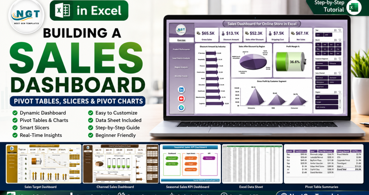
A sales dashboard in Excel works best when PivotTables do the heavy lifting first, slicers control the questions, and Pivot Charts turn the answers into a dashboard view. Excel gives every worksheet up to 1,048,576 rows and 16,384 columns, which is enough for many monthly sales exports before you need a database or BI platform. The practical build is simple: clean the sales table, convert it to an Excel Table, create PivotTables for the core measures, connect slicers, and build Pivot Charts for leadership-ready reporting.
This guide shows a pivot-table-first build for a sales dashboard in Excel. The goal is to create a reporting engine that can be refreshed every week or month without rebuilding formulas, charts, filters, and KPI cards from scratch. Microsoft describes PivotTables as a way to summarize, analyze, explore, and present summary data, while Pivot Charts add visual comparisons, patterns, and trends.
Use this process for retail sales, e-commerce orders, channel sales, seasonal performance, sales targets, rep scorecards, product performance, and regional sales reporting. If you need a faster starting point, the product showcase near the end highlights ready-made sales dashboard templates.
Key Features of a Sales Dashboard in Excel
A useful sales dashboard in Excel should answer the manager’s first questions in seconds: how much did we sell, where did it come from, what changed, which product or channel is winning, and are we on target?
- Pivot-table-first structure: Build KPI summaries from PivotTables instead of fragile manual formulas spread across the dashboard page.
- Interactive slicers: Filter the dashboard by month, region, product, channel, sales rep, customer segment, or store type.
- Pivot Charts: Visualize net sales, gross sales, profit margin, target achievement, discount impact, and monthly trends.
- Refresh workflow: Replace or append sales data, refresh all PivotTables, and let connected visuals update.
- Clean layout: Keep KPI cards at the top, trend charts in the middle, and drilldown visuals below.
- Reusable model: Keep source data separate from support PivotTables and the final dashboard view.
Dashboard Pages Explanation
A pivot-based sales dashboard can be a single-page dashboard or a multi-page workbook. Executives need a one-screen summary, while managers often need separate views for product, region, channel, rep, and targets.
1. Data Sheet
The Data Sheet is where raw sales data should live. Use one row per transaction, order, invoice line, quote, rep target, or monthly sales record. Typical columns include Date, Product, Category, Region, Channel, Sales Rep, Quantity, Gross Sales, Discount, Net Sales, Cost, Gross Profit, Target, and Status.
Before building PivotTables, convert the data range into an Excel Table so new rows can be added cleanly. Avoid merged cells, blank headers, repeated subtotals, and manually typed total rows inside the source table.
2. Support Sheet
The Support Sheet contains the PivotTables that power the dashboard. Keep them here instead of crowding the dashboard page. Start with Total Sales, Net Sales, Gross Profit, Profit Margin %, Total Orders, Average Order Value, Target, Achievement %, and Variance. Then create separate pivots for trends, products, regions, channels, reps, and target tracking.
3. Overview Page
The Overview Page is the leadership summary. Place four to six KPI cards across the top, such as Gross Sales, Net Sales, Profit Margin %, Target Achievement %, Total Orders, and Average Order Value. Under that, add a monthly trend chart and breakdown charts for product category, region, channel, or customer segment.
Use slicers for fields managers naturally ask about: Month, Region, Product Category, Sales Rep, and Channel. Connect slicers to every relevant PivotTable so one click changes the whole dashboard view.
4. Product Performance Page
The Product Performance Page shows what is selling and what is profitable. Build PivotTables for Net Sales by Product, Gross Profit by Category, Quantity by SKU, Discount by Category, and Profit Margin % by Sub-Category.
5. Channel, Region, or Rep Page
The second drilldown page depends on your sales model. A distributor should use a channel page, a retail chain should use a region or store page, and a B2B team should use a sales rep page. Compare sales volume, margin, target achievement, and trend movement.
Sales Dashboard in Excel vs. Google Sheets vs. Paid CRM/SaaS – Feature Comparison
| Feature | This Excel dashboard approach | Google Sheets alternative | Paid CRM/SaaS alternative |
|---|---|---|---|
| Cost | One-time build or template purchase | Low software cost, but logic still needs building | Recurring subscription |
| Platform | Excel with PivotTables, slicers, and Pivot Charts | Browser spreadsheet | Salesforce, HubSpot, Pipedrive, or similar |
| Setup time | Fast after the data table and pivots are structured | Fast for simple collaboration | Depends on setup, fields, and workflows |
| Real-time team collaboration | Possible through OneDrive or SharePoint | Native collaboration | Usually included |
| Mobile access | Limited through Excel mobile or shared files | Good browser and mobile access | Usually strong mobile access |
| Customizable fields | Fully editable workbook | Editable, but large models can slow down | Configurable by plan and permissions |
| Share with link | Possible through Microsoft sharing | Native link sharing | Login-controlled sharing |
| Year-1 cost at 5 users | Build/template cost plus Excel licensing | Workspace cost plus build time | Can rise with CRM, reporting, automation, and add-ons |
| Pivot-based analysis | Native PivotTables, slicers, timelines, and Pivot Charts | Pivot alternatives, not Excel pivots | Report-builder driven |
Who Should Use This Template
This sales dashboard build is best for sales managers, e-commerce founders, retail store owners, distributor teams, channel managers, finance analysts, business owners, and Excel users who already receive structured sales exports.
It is not the right fit when you need live CRM workflow automation, row-level security, automatic API imports, multi-user data entry controls, or governed enterprise reporting. In those cases, Excel can still be a useful analysis layer.
Real-World Use Cases
E-commerce weekly review: An online store owner exports orders, refreshes PivotTables, and reviews sales by product, channel, discount, region, and month.
Channel sales meeting: A sales manager filters by distributor, retail, wholesale, marketplace, and direct channel to compare net sales and margin.
Seasonal campaign planning: A retail team compares current sales with prior year sales and adjusts promotions before the peak period ends.
Target tracking: A regional leader compares actuals against targets by month, region, rep, and product before the quarter closes.
Advantages of Sales Dashboard in Excel
The biggest advantage is ownership. Your sales data stays in a workbook you control, and the logic can be inspected, edited, protected, copied, or extended. Once the source table and PivotTables are ready, recurring refreshes become faster: add new data, use Refresh All, check slicers, and review the charts.
A sales dashboard in Excel can also be adapted for online store reporting, channel sales, seasonal KPIs, sales targets, product category analysis, rep performance, region reporting, and margin analysis without starting over.
Opportunities for Improvement
Excel dashboards are only as reliable as the data structure behind them. If product names, region names, channel labels, or sales rep names change every month, slicers and PivotTables become messy. Use validation lists and consistent naming rules.
If your sales export is always in the same format, Power Query can reduce copy-paste work. Also define every KPI: Net Sales, Gross Profit, Profit Margin %, Achievement %, Target Met %, Average Order Value, and Sales After Discount must have clear formulas.
Best Practices
- Start with the source table: Keep one row per sales record and one column per field.
- Use PivotTables before charts: Make the summary logic work first, then build visuals from it.
- Separate data, support, and dashboard sheets: This keeps the workbook easier to refresh and maintain.
- Connect slicers carefully: Review Report Connections and link each slicer to the right PivotTables.
- Use Pivot Charts for interactive visuals: They stay connected to the PivotTable logic and respond to slicers.
- Refresh after every data update: Microsoft documents PivotTable refresh options through the Data tab and PivotTable tools.
- Protect the dashboard page: Let users filter and review, but prevent accidental movement of charts, slicers, and formulas.
For Microsoft references, see PivotTables and PivotCharts, slicers, and Excel limits.
Explore Relevant Templates
If you want a faster route, these ready-made NextGenTemplates sales dashboards give you structured workbook pages, charts, slicers, and editable sales data sheets.
Sales Dashboard For Online Store in Excel
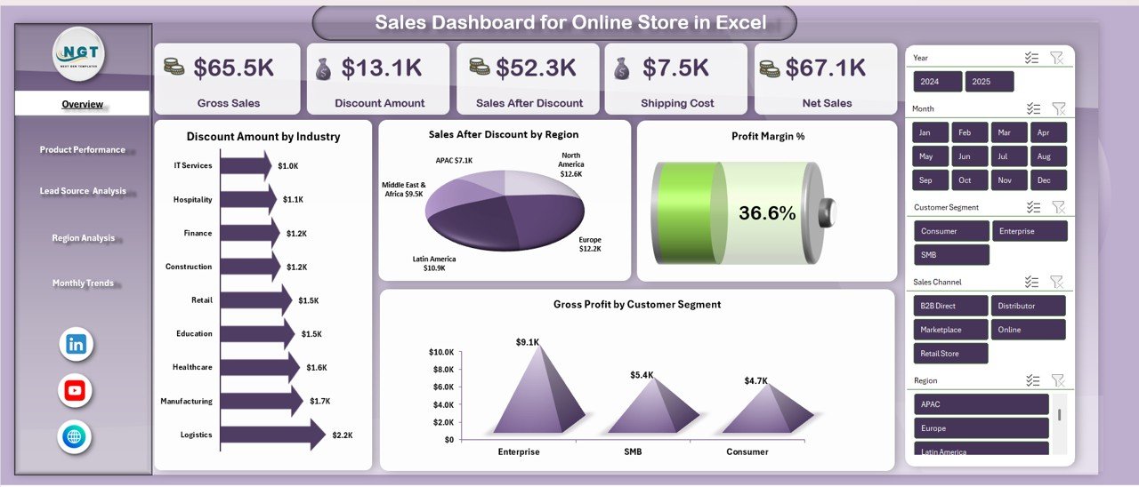
Sales Dashboard For Online Store in Excel is built for e-commerce sellers who need Gross Sales, Net Sales, Discount, Shipping Cost, Profit Margin %, COGS, Gross Profit, product performance, lead source performance, regional results, and monthly trends.
CTA: View the Online Store Sales Dashboard.
Channel Sales Dashboard in Excel
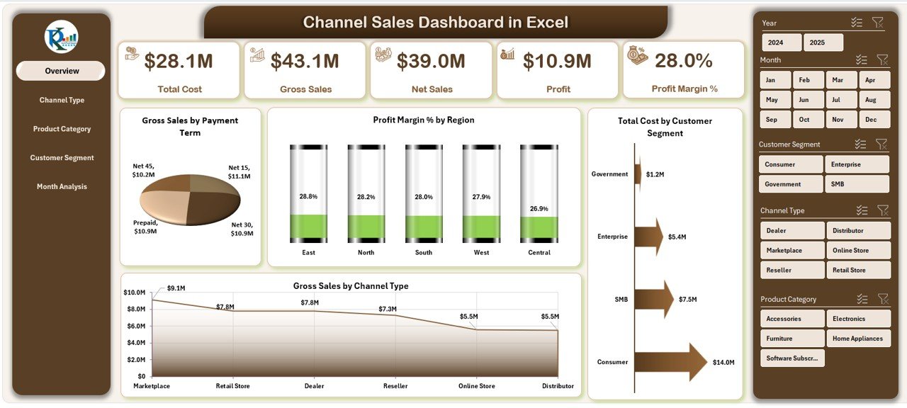
Channel Sales Dashboard in Excel helps sales teams compare direct, distributor, retail, wholesale, online, and partner channel performance across sales, cost, margin, customer segment, and region.
CTA: View the Channel Sales Dashboard.
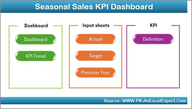
Seasonal Sales KPI Dashboard In Excel
Seasonal Sales KPI Dashboard In Excel helps teams compare MTD, YTD, targets, and previous year performance during peak sales periods.
CTA: View the Seasonal Sales KPI Dashboard.
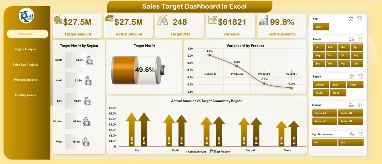
Sales Target Dashboard in Excel
Sales Target Dashboard in Excel is best when the main question is actual sales versus target across regions, reps, products, months, achievement %, target met %, and variance %.
CTA: View the Sales Target Dashboard.
Frequently Asked Questions
What is the best way to build a sales dashboard in Excel?
Start with a clean Excel Table, build PivotTables for the important metrics, connect slicers, and create Pivot Charts for the dashboard view.
Should I use PivotTables or formulas for a sales dashboard?
Use PivotTables for grouped reporting by month, product, region, channel, or rep. Use formulas for KPI cards, helper calculations, and custom metrics.
Can slicers control multiple PivotTables?
Yes. Use Report Connections to decide which PivotTables respond to each slicer.
Can an Excel sales dashboard replace a CRM?
No. Excel is a reporting layer. Use a CRM when you need pipeline management, permissions, activity tracking, automation, or live customer history.
About the Author
Built by PK – Microsoft Certified Professional with 15+ years of Excel, Google Sheets, and Power BI experience. Founder of NextGenTemplates, reaching 300K+ subscribers across YouTube channels. Every template is hand-built and tested before release.
Conclusion
A sales dashboard in Excel becomes much easier to maintain when PivotTables, slicers, and Pivot Charts form the foundation. Start with clean data, create the support pivots, connect slicers, build the dashboard view, and refresh the workbook whenever new sales data arrives. This approach gives managers a repeatable reporting system for online stores, channel sales, seasonal KPIs, sales targets, product performance, and regional reviews.
For more Excel dashboard tutorials, visit PK An Excel Expert on YouTube. For product walkthroughs, visit NextGenTemplates on YouTube.
Last updated: July 22, 2026